New analysis of the effectiveness of sites from S.Spivak
Today I stumbled upon a piece of paper on the Composition on the "new" method of analyzing the effectiveness of the site. in fact, it's all about the same: how can I increase my conversion? :) Key points:
- there is an end result that we want to achieve from the user
- before the user performs this action, he will make a few clicks on the site, falling on different sections, different pages
- if each section is assigned its own label and then it is divided into attendance and shown in color, it will be beautiful and, probably, effective
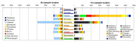
ultimately, it all looks like this (again, the picture from the Composition):
Well, actually, thoughts about all this joy:
to me personally, to the end, and it is not very clear what to do in the end, after seeing a similar picture. well, it is possible to block inside the main corridor along which the user goes all the links to the "subsidiary" pages, and on the subsidiary pages through the word put links to return to this corridor. at the same time it seems like it turns out:
1. Auxiliary pages are used only for indexing by search engines and attracting traffic, i.e. only as additional entry points, alternative to the main page
2. and, accordingly, the user gives a big red link along the center of each page “click here, pay money” - then, using this logic, everything will line up quite nicely :)
but then why bother doing big content sites? You can limit yourself to a simple business card of two pages: the main one is the coordinates of the company and a very cursory list of the products offered, and the second is the application form :))
')
PS
this is my first entry, please do not judge strictly, since what is wrong :)
- there is an end result that we want to achieve from the user
- before the user performs this action, he will make a few clicks on the site, falling on different sections, different pages
- if each section is assigned its own label and then it is divided into attendance and shown in color, it will be beautiful and, probably, effective
ultimately, it all looks like this (again, the picture from the Composition):
Well, actually, thoughts about all this joy:
to me personally, to the end, and it is not very clear what to do in the end, after seeing a similar picture. well, it is possible to block inside the main corridor along which the user goes all the links to the "subsidiary" pages, and on the subsidiary pages through the word put links to return to this corridor. at the same time it seems like it turns out:
1. Auxiliary pages are used only for indexing by search engines and attracting traffic, i.e. only as additional entry points, alternative to the main page
2. and, accordingly, the user gives a big red link along the center of each page “click here, pay money” - then, using this logic, everything will line up quite nicely :)
but then why bother doing big content sites? You can limit yourself to a simple business card of two pages: the main one is the coordinates of the company and a very cursory list of the products offered, and the second is the application form :))
')
PS
this is my first entry, please do not judge strictly, since what is wrong :)
Source: https://habr.com/ru/post/5764/
All Articles