About how the eyes perceive the picture
Ever wondered how the eye reads a picture? Why often when looking at a photo do we feel that some parts of the image attract the eye so much that it is impossible to tear off, to focus on other details? As an attempt to answer this question, a group of psychologists and physiologists in the 60s created a theory of visual perception. The theory was developed: at the moment there are at least 3 mathematical tools that allow you to simulate the movement of the pupil reading the picture and associate this movement with the concentration of attention on certain parts of the image.
Two or three years ago I was closely involved in modeling attention when viewing images, and here the other day I was asked to show the work of such a program. I reached into the dusty corner behind the archives of the raws, unpacked, began to compile, decided to fix a couple of bugs in the algorithms and ... got carried away! I present to you the fruit of a two-day effort: a few pictures and two different ways to model how a person perceives a picture.
Pictures are presented as triptychs. The first part is the original picture. The middle part is a heat map. The more intense the green glow is, the more likely it is that this region will attract your attention. The last picture is the look dynamics. This model shows how the gaze slides over the image, where it can go next. The gaze moves more easily from light parts to darker ones and vice versa — in order to shift the focus of attention from darker parts to lighter parts, it will probably take some effort.
')
When viewing pictures, you need to understand that the mathematical apparatus that provides for modeling the focus of a person’s attention does not take into account psychological aspects of perception, for example, such or such . The pictures show how the human eye moves, if it does not detect recognizable images in the picture.
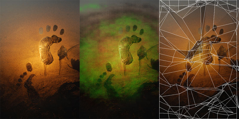
The first picture shows how a typical photo-plot like “a certain object in the middle of the frame” is perceived. It is especially interesting how the glance rushes towards the center, but does not reach it. The look as if walking, caressing with light touches the central area in which the object is inscribed. In the picture with the dynamics, all the compositional features are clearly visible in the form of secondary focuses of attention and the vector of striving upward.
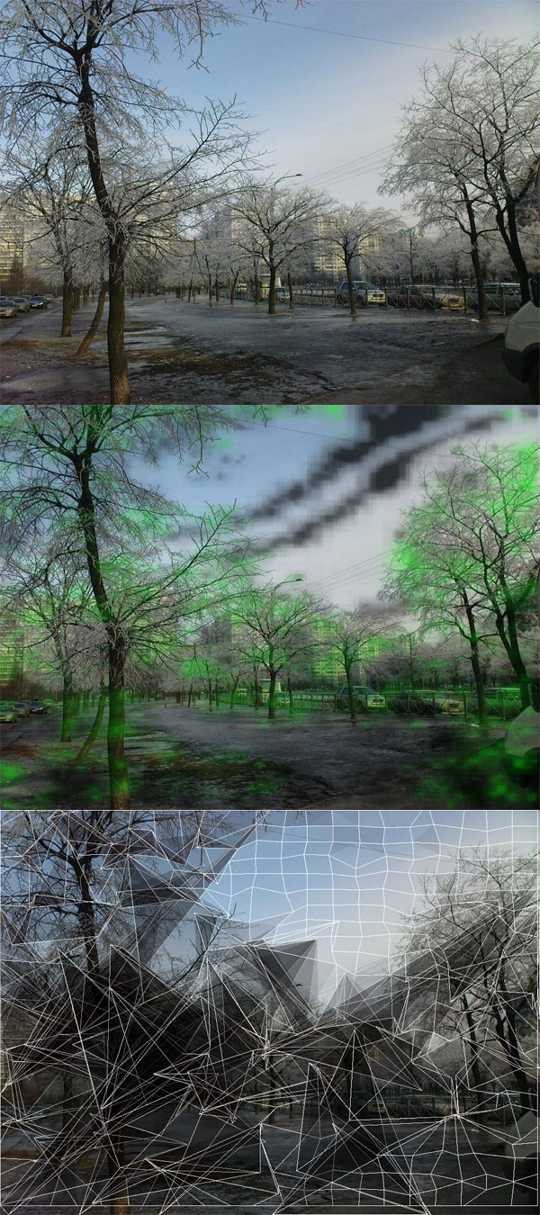
But the usual landscape. Please note that if you look at the bottom of the picture, your gaze rushes towards the trunks of the trees, and if you look up or down from the trees, then in the middle of the sky you can clearly see a “potential hole” where your eyes involuntarily fall.

A little bit about web pages. Which parts of the page do you think are the most attractive for attention? What is most important to show? Of course, advertising!
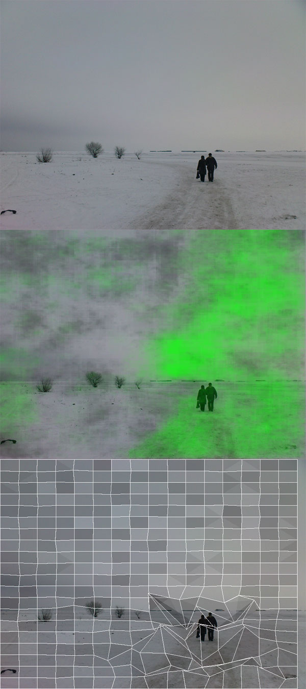
Landscape with a claim to the composition. And you can immediately see how this composition is filled up - to shift these people down and to the right just by 1 square and the golden section would be sustained! And so attention is concentrated between the edge of the picture and the silhouettes of people.

But I will show this photo only to show how automatic analysis starts to lag due to psychological aspects of perception. When viewing photos, people highlight faces and unknowingly pay more attention to them. The car, in this case, too, is perceived as the face of a strange beast. If we had conducted eye tracking of this picture, we would have noticed that the maximum attention would be “on the forehead” of Chrysler and on the person’s face. By the next picture, by the way, this also applies.
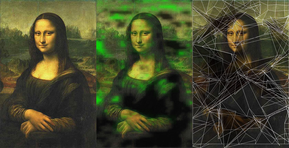
Our "all" Mona Lisa. Let's forget that faces attract the eye and see how the picture is perceived, if we consider it as a whole. The heat map will not give us anything here, but the dynamics shows interesting things! It turns out that to the right of the face there is a square pointing to the nose with sides proportional to the golden section. Moreover, if you look closely at the 4-cornered polygons covering the eyes, it turns out that their sides almost correspond to the harmonic series (the discrepancies fit the algorithm error)! So envy after this knowledge of Leonardo in geometry ...
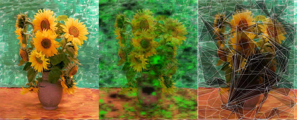
Well, let's move on to my favorite impressionists. The heat map immediately shows that either the algorithm is lagging or the picture is too complicated for perception. Isn't that why many people perceive Van Gogh so hard? A bunch of outside spotlights that create a grid of almost white noise ... Against this background, it is so difficult to catch flowers in detail, except that the pot can be viewed thoughtfully. But everything changes the visualization of the dynamics! It turns out that if you distract from the details of the strokes and take a picture from afar, you can see a clear diagonal axis with an entry point on the table and an explosive ending in the form of flowers! The picture is not static, the picture lives!
Two or three years ago I was closely involved in modeling attention when viewing images, and here the other day I was asked to show the work of such a program. I reached into the dusty corner behind the archives of the raws, unpacked, began to compile, decided to fix a couple of bugs in the algorithms and ... got carried away! I present to you the fruit of a two-day effort: a few pictures and two different ways to model how a person perceives a picture.
Pictures are presented as triptychs. The first part is the original picture. The middle part is a heat map. The more intense the green glow is, the more likely it is that this region will attract your attention. The last picture is the look dynamics. This model shows how the gaze slides over the image, where it can go next. The gaze moves more easily from light parts to darker ones and vice versa — in order to shift the focus of attention from darker parts to lighter parts, it will probably take some effort.
')
When viewing pictures, you need to understand that the mathematical apparatus that provides for modeling the focus of a person’s attention does not take into account psychological aspects of perception, for example, such or such . The pictures show how the human eye moves, if it does not detect recognizable images in the picture.
The first picture shows how a typical photo-plot like “a certain object in the middle of the frame” is perceived. It is especially interesting how the glance rushes towards the center, but does not reach it. The look as if walking, caressing with light touches the central area in which the object is inscribed. In the picture with the dynamics, all the compositional features are clearly visible in the form of secondary focuses of attention and the vector of striving upward.
But the usual landscape. Please note that if you look at the bottom of the picture, your gaze rushes towards the trunks of the trees, and if you look up or down from the trees, then in the middle of the sky you can clearly see a “potential hole” where your eyes involuntarily fall.
A little bit about web pages. Which parts of the page do you think are the most attractive for attention? What is most important to show? Of course, advertising!
Landscape with a claim to the composition. And you can immediately see how this composition is filled up - to shift these people down and to the right just by 1 square and the golden section would be sustained! And so attention is concentrated between the edge of the picture and the silhouettes of people.
But I will show this photo only to show how automatic analysis starts to lag due to psychological aspects of perception. When viewing photos, people highlight faces and unknowingly pay more attention to them. The car, in this case, too, is perceived as the face of a strange beast. If we had conducted eye tracking of this picture, we would have noticed that the maximum attention would be “on the forehead” of Chrysler and on the person’s face. By the next picture, by the way, this also applies.
Our "all" Mona Lisa. Let's forget that faces attract the eye and see how the picture is perceived, if we consider it as a whole. The heat map will not give us anything here, but the dynamics shows interesting things! It turns out that to the right of the face there is a square pointing to the nose with sides proportional to the golden section. Moreover, if you look closely at the 4-cornered polygons covering the eyes, it turns out that their sides almost correspond to the harmonic series (the discrepancies fit the algorithm error)! So envy after this knowledge of Leonardo in geometry ...
Well, let's move on to my favorite impressionists. The heat map immediately shows that either the algorithm is lagging or the picture is too complicated for perception. Isn't that why many people perceive Van Gogh so hard? A bunch of outside spotlights that create a grid of almost white noise ... Against this background, it is so difficult to catch flowers in detail, except that the pot can be viewed thoughtfully. But everything changes the visualization of the dynamics! It turns out that if you distract from the details of the strokes and take a picture from afar, you can see a clear diagonal axis with an entry point on the table and an explosive ending in the form of flowers! The picture is not static, the picture lives!
Source: https://habr.com/ru/post/57403/
All Articles