Takete and Maluma. Practical use of the phenomenon
“Beeline and MTS unexpectedly changed logos like this one day”:
“What do you think of this symbol is MTS, and what is Beeline?”
')
With such a question, I pestered my colleagues, and put the received answers in a notebook and thoughtfully snorted. At the end of the article will be the results of the survey, but for now I will explain what is its meaning.
The phenomenon of the comparison of meaningless words by a person to meaningless figures according to their form has long been known and described. What do you think of this Maluma and what of Takete?
V. Koehler (W. Kohler) in 1947 showed that most people call the rounded figure of Malum, and the angular one - Taketa. This means that people have mechanisms for the emergence of strong associations between words and figures, regardless of their meaning. And if so, you just need to use these mechanisms.
Developing a theme under the cut. If you are interested in the use of psychology in design, I have described some other ideas on my website.
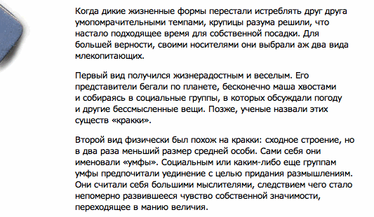
So, the first thing that comes to mind is to create images in the reader's head through words. Once upon a time, I wrote a little fantastic tale in which two kinds of creatures lived. The first of them - "Krakki" - were mobile, cheerful and cheerful animals. Another kind of lazy fat thinkers called himself "Umfs."
The name of the animals I tried to convey their appearance. It turned out or not - to judge only the readers. However, remember how things are with the screenings. How did you imagine any hero of the book that was filmed? Did your hero's presentation coincide with the on-screen image? Did this coincide with the expectations of other readers of the book? If yes, then most likely the writer was not mistaken with the choice of the right words for the name of the hero and his description.
But suddenly your book will be translated and it will be read by representatives of another culture? What images will they have when reading? After all, such a comparison may depend on the language? In fact, there are studies that show that this is not necessary. B. Berlin in 1994 showed how English-speaking people with probability exceeding the case correctly sorted the words from the language Huambisa (Peru), meaning the names of birds and fish. R. Davis in 1961 found that children of 8-14 years old living on a remote peninsula on Lake Tanganyika in central Africa and who speak Swahili and Bantu dialect of Kitongwe (in short, certainly not English), compared the same figures to Ulume and Tauta, that their peers are from England.
Various researchers say that such things can occur due to the fact that people mentally articulate readable words. The form of movement of the speech apparatus in this case can determine the shape of the represented figure.
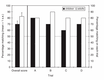
Daphne Maurer, Thanujeni Pathman and Catherine J. Mondloch conducted a study in 2006 among children 2.5 years old and adults. It showed that both children and adults compare round full figures to words in which rounded vowels predominate, and angular figures to words with non-rounded vowels.
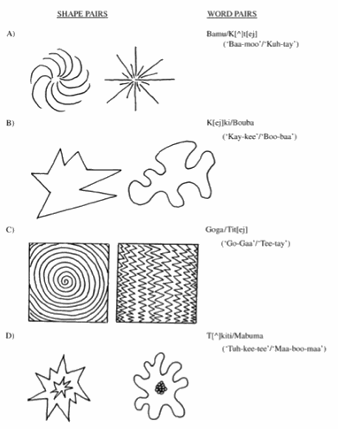
The percentage of correct comparison in adults was higher, which partially confirms the theory of articulation. However, the percentage of correct comparison of children who have not yet fully mastered it, was still much more than a coincidence, which means that something else was involved in the process.
But back to the echo. Since we found out that the phenomenon works on both adults and children, we can use it in all applied areas of design, including products for young growth. Here is a randomly seen banner using the idea.
If we speak “according to an adult”, then the phenomenon opens up a great opportunity in identity. However, it can also conceal danger. I would suggest that such a logo would be wrong. A person at an unconscious level will oppose the association.

Companies spend big money on linking their company name in their minds to their logo. Corporate symbols hit the eyes and ears on a broad front and from any ambush. However, some of the effort can be saved if you use the fundamental psychological characteristics of a person.
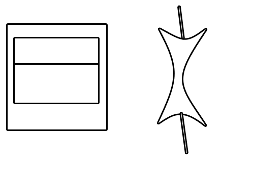
MTS and Beeline now have clear images in people's heads. Although if you reset all the visual variables in their signs except the shape and texture, all that they have left is this:
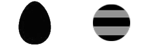
Will a person who has never heard about Beeline or MTS be able to determine what is what by these images? I tried to present these brands as empty sounds. It seemed to me that Emtees has more rounded consonants than the biline, so I drew them in the notebook exactly such new logos. Unfortunately, there were no foreigners at hand, so I had to demand to identify cellular operators from colleagues and discard the answers of those who saw in the “redesign” various options for eggs and strips.
Logos, of course, a simple joke, but the results of the survey impressed me. After polling 20 people, I received 80% of the votes that were in line with the idea. The left figure is MTS, the right one is Beeline.
“What do you think of this symbol is MTS, and what is Beeline?”
')
With such a question, I pestered my colleagues, and put the received answers in a notebook and thoughtfully snorted. At the end of the article will be the results of the survey, but for now I will explain what is its meaning.
The phenomenon of the comparison of meaningless words by a person to meaningless figures according to their form has long been known and described. What do you think of this Maluma and what of Takete?
V. Koehler (W. Kohler) in 1947 showed that most people call the rounded figure of Malum, and the angular one - Taketa. This means that people have mechanisms for the emergence of strong associations between words and figures, regardless of their meaning. And if so, you just need to use these mechanisms.
Developing a theme under the cut. If you are interested in the use of psychology in design, I have described some other ideas on my website.
So, the first thing that comes to mind is to create images in the reader's head through words. Once upon a time, I wrote a little fantastic tale in which two kinds of creatures lived. The first of them - "Krakki" - were mobile, cheerful and cheerful animals. Another kind of lazy fat thinkers called himself "Umfs."
The name of the animals I tried to convey their appearance. It turned out or not - to judge only the readers. However, remember how things are with the screenings. How did you imagine any hero of the book that was filmed? Did your hero's presentation coincide with the on-screen image? Did this coincide with the expectations of other readers of the book? If yes, then most likely the writer was not mistaken with the choice of the right words for the name of the hero and his description.
But suddenly your book will be translated and it will be read by representatives of another culture? What images will they have when reading? After all, such a comparison may depend on the language? In fact, there are studies that show that this is not necessary. B. Berlin in 1994 showed how English-speaking people with probability exceeding the case correctly sorted the words from the language Huambisa (Peru), meaning the names of birds and fish. R. Davis in 1961 found that children of 8-14 years old living on a remote peninsula on Lake Tanganyika in central Africa and who speak Swahili and Bantu dialect of Kitongwe (in short, certainly not English), compared the same figures to Ulume and Tauta, that their peers are from England.
Various researchers say that such things can occur due to the fact that people mentally articulate readable words. The form of movement of the speech apparatus in this case can determine the shape of the represented figure.
Daphne Maurer, Thanujeni Pathman and Catherine J. Mondloch conducted a study in 2006 among children 2.5 years old and adults. It showed that both children and adults compare round full figures to words in which rounded vowels predominate, and angular figures to words with non-rounded vowels.
The percentage of correct comparison in adults was higher, which partially confirms the theory of articulation. However, the percentage of correct comparison of children who have not yet fully mastered it, was still much more than a coincidence, which means that something else was involved in the process.
But back to the echo. Since we found out that the phenomenon works on both adults and children, we can use it in all applied areas of design, including products for young growth. Here is a randomly seen banner using the idea.
If we speak “according to an adult”, then the phenomenon opens up a great opportunity in identity. However, it can also conceal danger. I would suggest that such a logo would be wrong. A person at an unconscious level will oppose the association.
Companies spend big money on linking their company name in their minds to their logo. Corporate symbols hit the eyes and ears on a broad front and from any ambush. However, some of the effort can be saved if you use the fundamental psychological characteristics of a person.
MTS and Beeline now have clear images in people's heads. Although if you reset all the visual variables in their signs except the shape and texture, all that they have left is this:
Will a person who has never heard about Beeline or MTS be able to determine what is what by these images? I tried to present these brands as empty sounds. It seemed to me that Emtees has more rounded consonants than the biline, so I drew them in the notebook exactly such new logos. Unfortunately, there were no foreigners at hand, so I had to demand to identify cellular operators from colleagues and discard the answers of those who saw in the “redesign” various options for eggs and strips.
Logos, of course, a simple joke, but the results of the survey impressed me. After polling 20 people, I received 80% of the votes that were in line with the idea. The left figure is MTS, the right one is Beeline.
Source: https://habr.com/ru/post/57221/
All Articles