No items in the cart? Put there zest!
Now I will demonstrate one of our “ microinterface ” finds using a simple example.
If the item is added to the cart, the issue with the block content is removed. We write how many goods there are, for what amount, we give a link to the ordering.
Usually they write there are no items in the basket. Particularly "gifted" manage to write something like "in the basket 0 goods worth 0 rubles." And give a link to checkout with this.
')
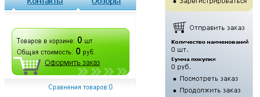
This is what a company that calls itself “Studio No. 4 on the Runet” does.
But this block constantly takes up valuable space on the page. Collapse? Hide? Reduce? It is impossible. It should be here all the time, if we do not want to lose some of the customers, bewildered by unexpected transformations.
It is desirable that the user noticed and recorded the place where the entrance to the basket would later be. After all, the order is not always made immediately after adding the product. Often they add goods, then they see what else they have, and after that they go to the basket.
Is it possible to use this place more favorably? Of course! Look at one of our solutions, applied on the website of the company mollspb .
If there is a product in the basket, the unit behaves as it should in such situations:

But if there are no goods in the basket yet, we will advertise something in this block:

Please note: the block still performs its function adequately, and the advertising text is organically combined with it.
Most things can be improved. Even this our find.
I borrowed the word “ microinterface ” from microelectronics and I propose to use it to designate blocks similar to those considered.
If the item is added to the cart, the issue with the block content is removed. We write how many goods there are, for what amount, we give a link to the ordering.
But what to put in this block, if the basket is empty?
Usually they write there are no items in the basket. Particularly "gifted" manage to write something like "in the basket 0 goods worth 0 rubles." And give a link to checkout with this.
')
This is what a company that calls itself “Studio No. 4 on the Runet” does.
But this block constantly takes up valuable space on the page. Collapse? Hide? Reduce? It is impossible. It should be here all the time, if we do not want to lose some of the customers, bewildered by unexpected transformations.
It is desirable that the user noticed and recorded the place where the entrance to the basket would later be. After all, the order is not always made immediately after adding the product. Often they add goods, then they see what else they have, and after that they go to the basket.
Our solution
Is it possible to use this place more favorably? Of course! Look at one of our solutions, applied on the website of the company mollspb .
If there is a product in the basket, the unit behaves as it should in such situations:
But if there are no goods in the basket yet, we will advertise something in this block:
Please note: the block still performs its function adequately, and the advertising text is organically combined with it.
Most things can be improved. Even this our find.
What is a microinterface
I borrowed the word “ microinterface ” from microelectronics and I propose to use it to designate blocks similar to those considered.
Source: https://habr.com/ru/post/56010/
All Articles