About identity in logos
A lot of things have been written about design (web and printing), about typography, about identity and how some elements psychologically influence us, implant secret subtexts into our subconscious or direct us along the right path for the artist.
In this article I would like to write a little about the font, more precisely about its property "to store information about whose font it is", i.e. about identity.
')
My conclusion:
The font in the logo does not store or practically does not store the information about the "owner".
Now, a bunch of "fu" probably fell on me. But I do not despair) and I will tell a little why I began to think so.
For example, take the fonts of famous logos.

Say recognizable? I will say for sure! But all the magic is not in fonts, but in chips, in some special form.
You can say that the Reebo font you will recognize without the two nice little letters "e", yes - you can, I say. But I can assume that you are a type designer or, on a pinch, a designer;). I conducted a small survey and it was cool to find out that without this trick, even a person who wears sneakers from this company did not recognize the font of their favorite brand.
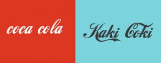
Even an unusual color scheme does not bring down the thought of your favorite drink with phosphoric acid.
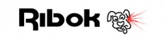
But ribok without their "e" after the first glass of cola will wipe out of memory).
With this, like, figured out, need "fishhechki" - this is understandable.
True, there is another item. The logo should reflect the essence of the brand, its sacred meaning and fundamental canons. So - "as the ship will be called so it will float" - this is also, most likely, not true, although, of course, there will be people who will pay increased attention to this phrase, and they will also argue by example.
Why, for example, is the adidas brand so popular? Or, say, stripes represent sport or the achievement of results? NOT! Whoever digs deeper - learns that Adolf Dassler and his brother used two strips on their products, but after a quarrel the brothers dispersed and the third band appeared as a symbol of the separation of the two brothers. (By the way, the second brother organized his firm RuDa from Rudolf Dassler, later it began to be called PUMA)
A quality product will make the company a leader, not a logo.
We will return the Bavarian Motor Plant. They produced engines for aircraft and, naturally, a stylized propeller from the aircraft entered the logo. As a result of the bans imposed on Germany, engines for BMW aircraft were no longer produced. Motorbikes, motorcycles and now - black boomer, but the emblem was only subject to restyling with the times, but not to redesign
And you know - the boomers did not fly because of the propeller in the most prominent place.
No, I am not against large amounts, which are often laid out for the logo and corporate style, I myself am the designer and not against money. But you should not dwell on the words identity, naming, branding, you need to work as designers, and those for whom they do this design.
For hard work brothers!
This is my first little article, so do not judge strictly how it is written, but I will ask you to judge what it is written with all the severity inherent to you;)
Same thing in LJ
In this article I would like to write a little about the font, more precisely about its property "to store information about whose font it is", i.e. about identity.
')
My conclusion:
The font in the logo does not store or practically does not store the information about the "owner".
Now, a bunch of "fu" probably fell on me. But I do not despair) and I will tell a little why I began to think so.
For example, take the fonts of famous logos.
Say recognizable? I will say for sure! But all the magic is not in fonts, but in chips, in some special form.
You can say that the Reebo font you will recognize without the two nice little letters "e", yes - you can, I say. But I can assume that you are a type designer or, on a pinch, a designer;). I conducted a small survey and it was cool to find out that without this trick, even a person who wears sneakers from this company did not recognize the font of their favorite brand.
Even an unusual color scheme does not bring down the thought of your favorite drink with phosphoric acid.
But ribok without their "e" after the first glass of cola will wipe out of memory).
With this, like, figured out, need "fishhechki" - this is understandable.
True, there is another item. The logo should reflect the essence of the brand, its sacred meaning and fundamental canons. So - "as the ship will be called so it will float" - this is also, most likely, not true, although, of course, there will be people who will pay increased attention to this phrase, and they will also argue by example.
Why, for example, is the adidas brand so popular? Or, say, stripes represent sport or the achievement of results? NOT! Whoever digs deeper - learns that Adolf Dassler and his brother used two strips on their products, but after a quarrel the brothers dispersed and the third band appeared as a symbol of the separation of the two brothers. (By the way, the second brother organized his firm RuDa from Rudolf Dassler, later it began to be called PUMA)
A quality product will make the company a leader, not a logo.
We will return the Bavarian Motor Plant. They produced engines for aircraft and, naturally, a stylized propeller from the aircraft entered the logo. As a result of the bans imposed on Germany, engines for BMW aircraft were no longer produced. Motorbikes, motorcycles and now - black boomer, but the emblem was only subject to restyling with the times, but not to redesign
And you know - the boomers did not fly because of the propeller in the most prominent place.
No, I am not against large amounts, which are often laid out for the logo and corporate style, I myself am the designer and not against money. But you should not dwell on the words identity, naming, branding, you need to work as designers, and those for whom they do this design.
For hard work brothers!
This is my first little article, so do not judge strictly how it is written, but I will ask you to judge what it is written with all the severity inherent to you;)
Same thing in LJ
Source: https://habr.com/ru/post/54632/
All Articles