Anti-design
The goal - making a profit - can be achieved both by actions that we are accustomed to perceive “with a plus sign”, and those that we see “with a minus sign”.
In marketing, there is the concept of "demarketing", actions aimed at reducing demand. The company can benefit from this in certain conditions. An analogue of demarketing for solving problems of reducing data availability is anti-design.
Anti-design is not just ignoring or ignorance of the laws of design. This is a deliberate non-compliance with them for the benefit.
')
For example, in full accordance with the law “1 + 1 = 3”, a warning about the dangers of smoking becomes an unreadable mess. The eye will simply ignore it. This of course goes hand in hand with cigarette manufacturers.

More examples and arguments in my post here
nordisk.pp.ru/design/45
or with some changes under the cut
License plates on cars should serve one purpose - to identify the owner. Therefore, the information on them should be as visible and easy to remember. In some countries, the driver himself can invent a combination of letters on a sign such as JEFF, MADMAX or something else. The police should fully support this practice, because people usually come up with meaningful phrases that are easy to remember. In this American sign, the owner state is indicated graphically. Even catching a glimpse of a sign, a policeman or a passer-by will know where a quickly hiding car is assigned.

The American sign is not perfect, but the designations on Russian license plates are an unparalleled mess of arbitrary letters, numbers of different sizes, positions, and graphic garbage in the form of frames. At a glance at best, three digits will be stored. To find out the region, you need to go to the directory.

Of course, I don’t blame the authors of these numbers for confusing people, but see what happens. On the basis of bad design of our signs, a whole shadow market of trade in “beautiful” numbers has developed. The situation is absurd. This is beneficial to corrupt police officers, but buyers of “beauty” o777oo-177, by developing corruption, unknowingly help the police in their identification. It turns out that there are more chances to disappear imperceptible - for an ordinary owner of a difficult to read number.
By the way, Soviet automobile standards were much more focused on ease of perception.

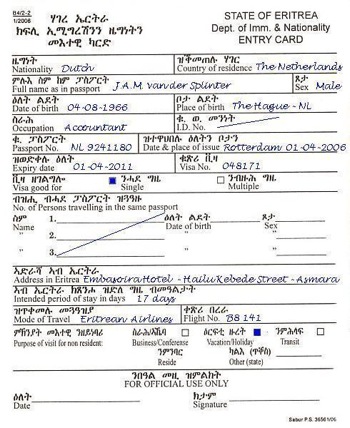
Confusing, poorly designed forms, the authorities make it difficult to access information. I can not judge intentionally whether they do it or not, but this impression is created. Some people cannot overcome the set barriers of perception, resulting in the emergence of entire companies and markets that help in the design of documents. In fact, they sell access to information that is formally open, but is really strongly hidden. It is very bad when this is done intentionally. It develops corruption and breeds “racial” markets.
Design: in the design and design plan is a tool for achieving goals. It is generally accepted that good design is when the goal is achieved to facilitate the perception of information. However, the goal can be just the opposite - to make it difficult to perceive information, and it can be achieved just as skillfully by applying the same design laws, but vice versa.
Anti-design is a tool to deliberately confuse a person, consciously give him the requested information in such a way as to make it as difficult for him to use.
In marketing, there is the concept of "demarketing", actions aimed at reducing demand. The company can benefit from this in certain conditions. An analogue of demarketing for solving problems of reducing data availability is anti-design.
Anti-design is not just ignoring or ignorance of the laws of design. This is a deliberate non-compliance with them for the benefit.
')
For example, in full accordance with the law “1 + 1 = 3”, a warning about the dangers of smoking becomes an unreadable mess. The eye will simply ignore it. This of course goes hand in hand with cigarette manufacturers.
More examples and arguments in my post here
nordisk.pp.ru/design/45
or with some changes under the cut
License plates on cars should serve one purpose - to identify the owner. Therefore, the information on them should be as visible and easy to remember. In some countries, the driver himself can invent a combination of letters on a sign such as JEFF, MADMAX or something else. The police should fully support this practice, because people usually come up with meaningful phrases that are easy to remember. In this American sign, the owner state is indicated graphically. Even catching a glimpse of a sign, a policeman or a passer-by will know where a quickly hiding car is assigned.
The American sign is not perfect, but the designations on Russian license plates are an unparalleled mess of arbitrary letters, numbers of different sizes, positions, and graphic garbage in the form of frames. At a glance at best, three digits will be stored. To find out the region, you need to go to the directory.
Of course, I don’t blame the authors of these numbers for confusing people, but see what happens. On the basis of bad design of our signs, a whole shadow market of trade in “beautiful” numbers has developed. The situation is absurd. This is beneficial to corrupt police officers, but buyers of “beauty” o777oo-177, by developing corruption, unknowingly help the police in their identification. It turns out that there are more chances to disappear imperceptible - for an ordinary owner of a difficult to read number.
By the way, Soviet automobile standards were much more focused on ease of perception.
Confusing, poorly designed forms, the authorities make it difficult to access information. I can not judge intentionally whether they do it or not, but this impression is created. Some people cannot overcome the set barriers of perception, resulting in the emergence of entire companies and markets that help in the design of documents. In fact, they sell access to information that is formally open, but is really strongly hidden. It is very bad when this is done intentionally. It develops corruption and breeds “racial” markets.
Design: in the design and design plan is a tool for achieving goals. It is generally accepted that good design is when the goal is achieved to facilitate the perception of information. However, the goal can be just the opposite - to make it difficult to perceive information, and it can be achieved just as skillfully by applying the same design laws, but vice versa.
Anti-design is a tool to deliberately confuse a person, consciously give him the requested information in such a way as to make it as difficult for him to use.
Source: https://habr.com/ru/post/54561/
All Articles