The evolution of interface design operating systems from 1981 to 2009
Translation of " Operating System Interface Design Between 1981-2009 "
 A graphical user interface (GUI - Graphical User Interface) is a tool that allows users to interact with the hardware components of a computer in a comfortable and convenient way.
Over the years, an even greater number of graphical interfaces have been created for a large number of operating systems such as OS / 2, Macintosh, Windows, AmigaOS, Linux, Symbian OS, and so on.
Let's try to look at the evolution of the interface design of these systems, starting in the 80s.
I must note that this topic shows only significant achievements and stages in the field of graphic design (and not operating systems in general), and not all systems exist to this day.
')
The first GUI was developed at the Xerox Palo Alto Research Center (PARC) in the distant 70s. This development launched a new era of innovation in computer graphics.
The first personal computer that used the new graphical interface was Xerox Alto, created in 1973. It was not a commercial product and was intended primarily for university research.

1981-1985
Xerox 8010 Star (1981)
It was the first system presented as an integrated desktop computer, including software applications and a graphical interface. The computer was known as The Xerox Star, later renamed ViewPoint and later Global View.

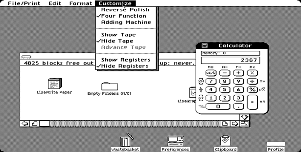
Apple Lisa Office System 1 (P1983)
Also known as Lisa OS, although in this case the abbreviation is too ambiguous for its name Office System. It was created by Apple with the intention to make a laptop to work with documents.
But, unfortunately, this system was “killed” by the Apple Macintosh operating system, which was more accessible at that time.
There were also upgrades to the Lisa OS system to Lisa OS 2 in 1983 and Lisa OS 7/7 3.1 in 1984, but these changes affected only the system itself and not its interface.
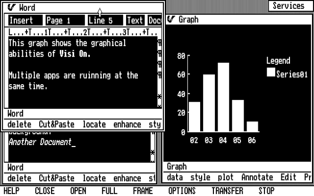
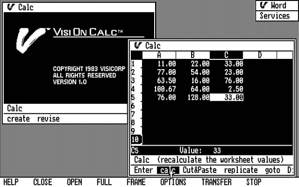
VisiCorp Visi On (1984)
Visi On was the first interface developed for the IBM PC. This system was targeted at large corporations and was quite expensive. The interface used a mouse, had a built-in installer and help system, but did not use icons.
Mac OS System 1.0 (introduced in 1984)
System 1.0 was the first operating system created for the Macintosh. She already had several details of the modern operating system - it was based on the window principle and contained icons. windows could be dragged with the mouse and files and folders could be copied by dragging to the destination.

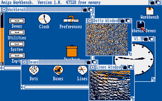
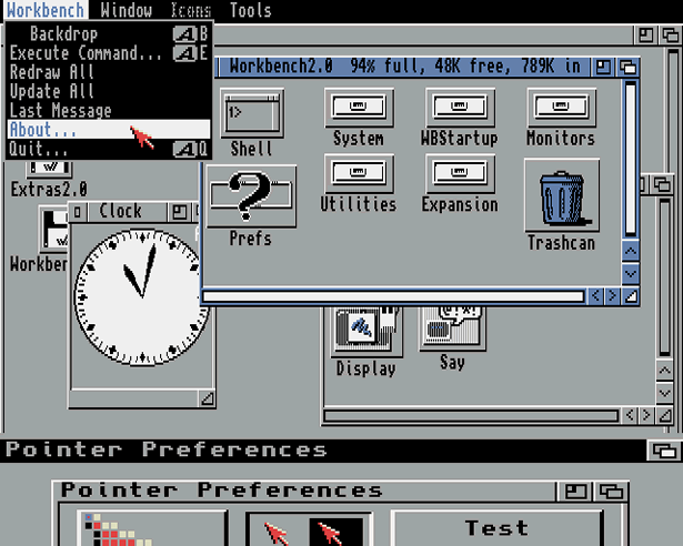
Amiga Workbench 1.0 (1985)
After its release, the Amiga seemed to be ahead of its time. The GUI included for example: color graphics (4 colors: black, white, blue and orange), for the most part supported multitasking, stereo sound and icons with several states (highlighted and not highlighted).

Windows 1.0x (1985)
This year, Microsoft finally picked up the universal interface and released Windows 1.0, its first GUI-based operating system. The system had 32x32 pixel icons color graphics. However, the most interesting innovation (though later disappeared) was the icon of the animated analog clock (with arrows :)).
GEM (1985)
GEM (Graphical Environment Manager) created by Digital Research, Inc. (DRI) was window type. It was originally designed for use with the operating system CP / M based on the Intel 8088 microprocessor and Motorola 68000, but was later modified for use in DOS. Most people will remember GEM as a GUI for Atari ST computers, and it was also used for the IBM series of compatible computers from Amstrad. He also served as the engine for Ventura Publisher and several other DOS programs. It was also ported to other computers, but did not gain popularity on them.

1986 - 1990
IRIX 3 (released in 1986, first release in 1984)
The 64-bit IRIX operating system was created for UNIX. An interesting feature of its GUI is support for vector icons. This feature was built into this system long before the start of Mac OS X.
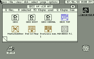
GEOS (1986)
GEOS (Graphic Environment Operating System) was developed by Berkeley Softworks (later GeoWorks). It was originally developed for Commodore 64 and included a graphical word processor called geoWrite and a drawing program called geoPaint.
Windows 2.0x (1987)
In this version, window management has been significantly improved. Now it became possible to overlap, resize, maximize, enlarge and shrink windows.
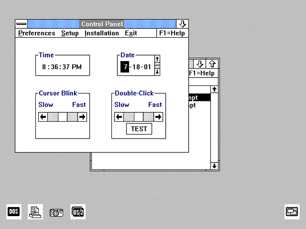
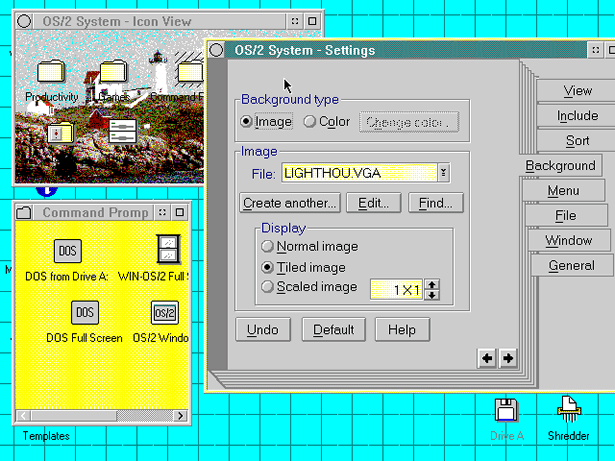
OS / 2 1.x (1988)
Initially, OS / 2 was the brainchild of IBM and Microsoft, but in 1991 the two companies split into Microsoft with their own GUI technology for Windows OS and IBM continuing to develop OS / 2. The interface used in OS / 2 was called Presentation Manager. This GUI version only supported monochrome icons.
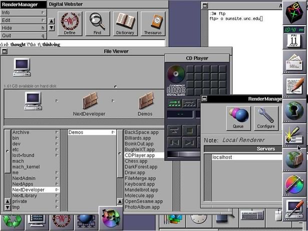
NeXTSTEP / OPENSTEP 1.0 (1989)
Steve Jobs was interested in creating an ideal computer for research laboratories and universities. Subsequently, this idea turned into a startup called NeXT Computer Inc.
The first NeXT computer was introduced in 1988, but significant progress was made in 1989 with the release of the NeXTSTEP 1.0 GUI, which later turned into OPENSTEP.
The interface icons have become larger (48 × 48) and used more colors. Initially, the GUI was monochrome, but since version 1.0, there is support for color monitors. This screenshot shows what its late interface looked like.
OS / 2 1.20 (1989)
The next version of the GUI shows some improvements in many areas. Icons began to look nicer and smoothed windows.

Windows 3.0 (1990)
By this version, developers from Microsoft understood all the real advantages of the GUI and began to significantly improve it.
The operating system itself began to support standards, and an extended mode for the 386 architecture, which began to require more memory than 640 kilobytes and more hard disk space, as a result, resolutions like Super VGA 800 × 600 and XGA 1024 × 768 became possible.
At the same time, Microsoft invited artist and graphic designer Susan Kare to develop the design of Windows 3.0 icons and create a unique image of their GUI.
1991 - 1995
Amiga Workbench 2.04 (1991)
A lot of improvements have been made for this GUI version. The color scheme was changed and volumetric design elements were introduced. The desktop could be divided vertically into two screens with its own resolutions and color depth, although today it seems a bit strange. The standard resolution was 640 × 256, but the hardware supported large resolutions.
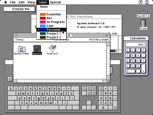
Mac OS System 7 (1991)
Mac OS version 7.0 was the first Mac system to support color. To the icons were added shades of gray, blue and yellow.
Windows 3.1 (1992)
This version of Windows included pre-installed TrueType fonts. At that time, this actually determined the use of Windows as a publishing platform.
This functionality was previously available only in Windows 3.0 using Adobe Type Manager (ATM) - the system of working with fonts from Adobe. Also, this version contained a color scheme called “Hotdog Stand”, containing bright shades of red, yellow and black.
This scheme was created to facilitate the perception of textual and graphical information by people with color vision impairments.

OS / 2 2.0 (1992)
It was the first GUI that was aimed at supporting multilingual interfaces, it was also the first with which usability and accessibility tests were conducted. The interface was created using object-oriented design. Each file and folder was represented by objects that could be associated with other files, folders, and programs. Also supported technology «drag and drop» and the ability to change the theme.

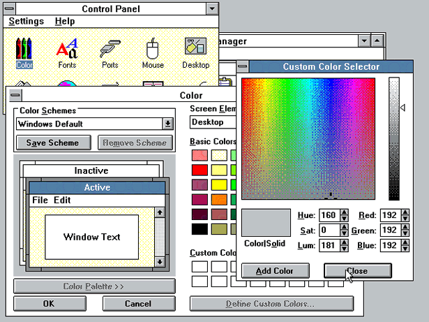
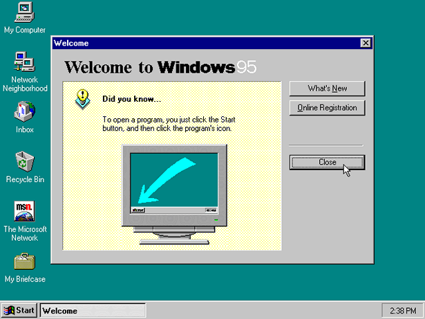
Windows 95 (1995)
In Windows 95, the user interface has been completely redesigned. It was the first version of Windows in which in the corner of each window a button appeared with a cross covering it.
Various states of icons and controls have been added (such as: available, unavailable, selected, checked, etc.). Just the first time the famous Start button appeared.
For Microsoft, this was a huge step forward for both the operating system and the unification of the GUI.
1996 - 2000
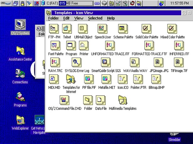
OS / 2 Warp 4 (1996)
In 1996, IBM introduced OS / 2 Warp 4, which introduced significant improvements in the appearance of the desktop.
The icons were located on the desktop, where the user could also place their own files and folders. The shredder that appeared appeared was an analogue of the Recycle Bin from Windows or a trash can (?) (Trash) from Mac OS, except that he immediately deleted the documents placed in it, instead of storing a copy of them with the possibility of recovery.
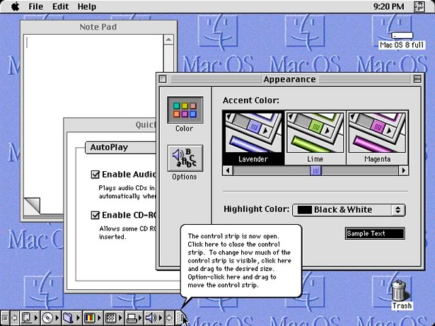
Mac OS System 8 (1997)
The standard icons for this GUI version were 256 color. Also, Mac OS 8 was one of the first systems to apply an isometric view of icon images, also called pseudo-3D icons. The platinum-gray theme, first used here, has become the hallmark of subsequent versions of this system.
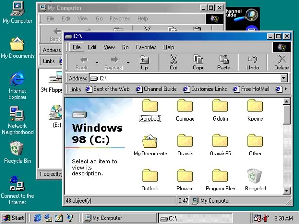
Windows 98 (1998)
The style of the icons resembled Windows 95, but the system has already used more than 256 colors to display the graphical interface. Windows Explorer has almost completely changed, and for the first time, Active Desktop has appeared.
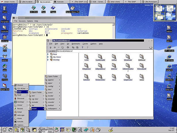
KDE 1.0 (1998)
So in the release, the KDE team described its project: “KDE is a modern desktop environment for computers running UNIX. KDE is trying to fill the need for a fast and convenient interface for Unix systems, reminiscent of MacOS and Window95 / NT analogs of the environment. A completely free and open computer platform is available to everyone for free, including the source code for modification. ”
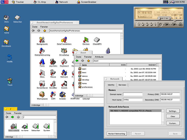
BeOs 4.5 (1999)
The BeOS operating system was designed for personal computers. It was originally written in Be Inc. in 1991 to run on BeBox machines. Later, it was created to bring together the benefits of new technologies and hardware, such as symmetric multitasking using a modular I / O system, almost complete multithreading, almost complete multitasking, and a 64-bit journaling file system known as BFS. The BeOS graphical user interface was based on the principles of a clear, clean and not frivolous design.
GNOME 1.0 (1999)
The GNOME interface was mainly created for Linux Red Hat, but later versions appeared for other Linux distributions.

2001 - 2005
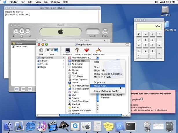
Mac OS X (2001)
In the early 2000s, Apple announced its new Aqua interface and in 2001 the company introduced it with its new Mac OS X operating system.
The default 32x32 and 48x48 pixel icons have been replaced with large 128x128 pixel icons using anti-aliasing and translucency.
However, after the release of this GUI, a lot of criticism appeared. Apparently, users were not ready for such drastic changes, but soon they adopted a new style, and today this GUI is the basis for all Mac OS X systems.
Windows XP (2001)
Microsoft tried to completely change the user interface with each new platform, Windows XP is no exception. It became possible to change the styles for the GUI, users could completely change the appearance and behavior of the interface. By default, the icons were 48x48 pixels in size and used millions of colors.

KDE 3 (2002)
Since version 1.0, the KDE environment has improved significantly. All graphics and icons were perfected and unified execution.

2007 - 2009 (up to the present)
Windows Vista (2007)
This was Microsoft’s response to its competitors. A lot of 3D and animation has also been added. Starting with Windows 98, Microsoft has always tried to improve the desktop. In Windows Vista, widgets and a few improvements came along with the abandonment of Active Desktop.

Mac OS X Leopard (2007)
Apple in the sixth generation of its Mac OS X system has once again raised the bar of the user interface. The basis of the GUI was still the “Aqua” interface with its glossy scrollbar and platinum-gray and blue colors. New details of the interface began to look even more naturalistic and voluminous, with a 3D dock and lots of animation and interactivity.

GNOME 2.24 (2008)
GNOME has worked hard to create themes and wallpapers in version 2.2.4 in keeping with its goal of "Making your computer look good." A competition was organized to collect the most fascinating images for use as a desktop background, which they included in version 2.24.

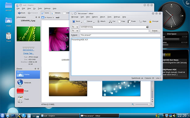
KDE (v4.0 - January 2008, v4.2 - March 2009)
Version 4 of KDE showed many new enhancements to the environment and interface, such as animation, anti-aliasing, an effective window management system, and support for desktop widgets. Desktop icons change easily and each design element is easily configured. The most noticeable changes occurred with the icons, themes and sounds that were provided by the Oxygen Project team. These icons have become the most photorealistic. And probably the greatest improvement in the entire history of KDE, the fact that the environment is now free to run on both Windows and Mac OS X platforms.
push:
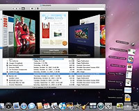
Windows 7 (presumably the end of 2009)
The operating system of the Windows family is now in beta testing. Of the changes that have emerged, it is worth noting support for multi-touch displays and the appearance of a new taskbar. More details such as turbomilk .

The screenshots of 10 years and more ago seemed especially interesting to me, comparing how much has changed in such a relatively short period of time.
Source: https://habr.com/ru/post/54469/
All Articles