Using usability guidelines to improve web development
This article was created based on the presentation made at the SQA Days conference. The article was first published on GUI.ru and now I would like to discuss usability guideline with habramen
Ease of use of the product, high user qualities - an important competitive advantage in the market, where most manufacturers offer approximately the same functionality. The most relevant example is the mobile phone market, where convenient to use phones are now the most in demand and sell well (the success of the iPhone and the transition to the touch screen are related to this).
What should be understood by usability? The definition of usability is given in ISO 9241-11 as the degree of efficiency, productivity, and satisfaction with which a product can be used by certain users to achieve certain tasks in a specific context.
')
We encounter mistakes that negatively affect our productivity and satisfaction in real life everywhere. Whether it is the duty to fill in unnecessary fields in the application and reference forms; mandatory requirements to provide some documents and certificates that are objectively not necessary, but which are required by the procedure; idle in lines and traffic jams, etc.
There is nothing surprising in the fact that this practice is transferred to everything that a person creates, including software and websites. We must understand that no one creates bad systems on purpose. Even the most experienced specialists and large manufacturers make mistakes.
 As an example, consider a form whose fields can only be filled in a strictly defined format. In the process of testing this form may not cause suspicion even to the most sensitive QA. Formally, it passes the test - when entering data not in a format, it will show an error, if you enter the correct ones, it skips on.
But how will those who will work with this form in the future? Each field is filled by trial and error, which becomes a real nightmare for users. This leads to inefficient work. Such implementation of the remaining screen forms in the program will necessarily lead to complaints of inconvenience in the work and rejection of automation. And this, in turn, can lead to the failure of the entire project for the introduction of new software. To change the situation, one should change the paradigm of thinking during development: it is better to prevent the appearance of errors than to limit ourselves to measures to eliminate them.
High usability indicators of the product are achieved by introducing User Centered Design or User-oriented Design into the development of the approach. This approach is characterized by the active involvement of the user in the development process to achieve an understanding of user requirements and proper distribution of functions between users and technologies, as well as the iterative nature of the approach and its multidisciplinary approach (ISO 13407). The practice of User Centered Design allows you to reduce development costs and increases product efficiency, both in business terms (additional profit) and user satisfaction (increased loyalty to the product and the company-developer). This approach is applied throughout the software development life cycle and includes: requirements definition, analysis, design, testing, evaluation, and subsequent refinement of the interface. At the moment, large companies, both Western (Microsoft, Google), and Russian (Beeline, RTS, 1C) are incorporating UCD practices into their processes. This approach requires a certain level of maturity from the company, well-defined processes and some investments (training, organizational expenses, hiring staff, etc.).
One of the available ways to improve the user quality of the products and improve the professional level of employees is the use of usability guidelines (“usability guidelines”, style guide, interface specification, rules, etc.)
Usability guidelines is a document that describes the rules for applying both general and specific specific interface elements. Formation and verification of compliance with usability guidelines is a technique that allows us to improve the usability of a site or software whose objectives are typical or reducible to typical. Guidelines are also used to standardize and provide some general acceptable level of quality. The guideline contains rules - “heuristics”, often worked out empirically - which are followed when developing the site. These rules can concern both very small, separate elements of the interface, and large parts of the interaction.
As a rule, heuristics are formulated so that according to each rule it can be said whether it is “supported” in the interface or “violated” (check list), avoiding subjective evaluations.
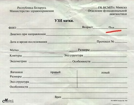
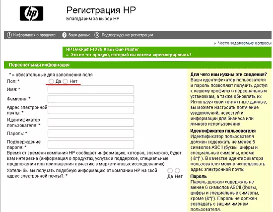
Consider a few rules. For example: “1.1 Fields required are marked with an asterisk in front of their name. The form has an explanation of the designation of the required fields. "
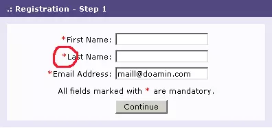
This rule was added because of the hypothesis that reading from left to right, the user will quickly see the required fields and fill them out immediately. But there are exceptions to the rules. For this purpose, it consists in the fact that for the field authorization form no asterisks are marked. For forms where all fields are required, you can not mark each, but you must write that all fields are required. This is best done on top of the form, above all fields.
Or another rule: “1.2 The field names are aligned on the right side. The distance from the name to the field for all fields is the same. " This rule is derived on the basis that right-justified alignment avoids a ridge of text. Also, long distances (if the alignment was on the left side) greatly complicate the association of the field name with the field itself. Not rarely have to check the correctness of filling several times.
Another rule: "3.3. For input fields of quantitative characteristics (length, weight, height, speed, distance, size, etc.), it is necessary to specify the units of measurement." As you understand, the rule allows you to get rid of the confusion that would arise if the units of measurement were not signed.
Work on usability guidelines. Using the links from the presentation, you will receive, perhaps, the largest collection of guidelines. Examine them. Take what suits you.
Discuss the list of rules with department heads and colleagues. Put the document in open access (for example, in a local wiki). Let everyone have the opportunity to read, discuss and share their thoughts. Give the guideline a "crisp". According to the results of communication, make adjustments. Do not rush to make absolutely all the wishes and the proposed rules.
The most important and difficult thing to do next is to ensure that the created document becomes an internal standard. Only in this case, we can talk about system quality improvement. The standard must read and comply with all employees involved in creating value for the client.
Create a category of "usability" in your bug-tracking system. Tell colleagues about innovations. Explain that usability bugs are as important as everyone else. In 1C, for example, there are entire builds after fixing usability bugs alone.
Periodically review existing and add new rules (kaizen). Make changes to the guideline along with changes in the interface and new modifications of your software.
I took the first point of view on style guides in Alan Cooper's book “The Mental Hospital in the Hands of Patients” and that large companies force developers to use them. Microsoft and Apple are promoting interface style guides, extolling their power and benefits, and at first glance it may seem that these companies are the most competent source of such information. Both platform creators use a hidden form of coercion, trying to force manufacturers to adhere to the standard. An independent software developer who does not follow the recommendations of the style guide will not be able to declare “platform compatibility”, depriving his product of an important plus in terms of marketing. Thus, the majority of companies creating custom applications are ready to follow the recommendations of the platform developer. In the meantime, the platform developers themselves are free to experiment and set in motion innovations as they wish. They can, without remorse, neglect their own style guides.
Another point of view is that the use of guidelines allows you to create interfaces that are perfectly compatible with the products and services of manufacturers, reducing the number of errors in the created PI for third-party developers.
Following manufacturer guidelines makes the interface consistent. For example, the company 1C transfers to its partners for customization 1C Accounting guidelines on the disk.
Microsoft demonstrated its two points of view in its guideline , citing an example of what can happen if you do not follow their recommendations.
This guideline contains a number of rules and guidelines for creating the Ribbon Bar (a new concept for the Office 2007 software interface). For example, the most frequent functions are placed in the middle of the bar, then the frequency goes from left to right.
In the interface you saw, one screen and one message box. We will sort them out by applying the rules of the guideline.

It can be seen that the rule for the form: “1.2 The field names are aligned on the right side. The distance from the name to the field for all fields is the same "is observed. As a rule: “2.2 The inscriptions on the buttons begin with a capital letter. If the inscription consists of several words, then each word begins with a capital letter, except for prepositions. ” But "Signatures to the interface elements begin with a capital letter and end with a colon" is not respected. The captions "enter password:" and "confirm password:" begin with a capital letter, but must begin with a capital letter. Writing a bug in your usability bugtracking system.

What is wrong in this message box? For example, the rule: "2.8 Negative action button" Delete "," Erase "," Cancel ") is always the rightmost" is observed. Can not be said about the rule: “2.2 The inscriptions on the buttons begin with a capital letter. If the inscription consists of several words, then each word begins with a capital letter, except for prepositions. ” The “cancel” button is written with a small letter, although the rule for the “OK” button is observed.
Ease of use of the product, high user qualities - an important competitive advantage in the market, where most manufacturers offer approximately the same functionality. The most relevant example is the mobile phone market, where convenient to use phones are now the most in demand and sell well (the success of the iPhone and the transition to the touch screen are related to this).
What should be understood by usability? The definition of usability is given in ISO 9241-11 as the degree of efficiency, productivity, and satisfaction with which a product can be used by certain users to achieve certain tasks in a specific context.
')
We encounter mistakes that negatively affect our productivity and satisfaction in real life everywhere. Whether it is the duty to fill in unnecessary fields in the application and reference forms; mandatory requirements to provide some documents and certificates that are objectively not necessary, but which are required by the procedure; idle in lines and traffic jams, etc.
There is nothing surprising in the fact that this practice is transferred to everything that a person creates, including software and websites. We must understand that no one creates bad systems on purpose. Even the most experienced specialists and large manufacturers make mistakes.
Changing the development paradigm
Albert Einstein said that the problem cannot be solved while inside the system that generated it. As long as the requirement of high user qualities and the use of usability practices do not become an integral part of the software production process, products and websites that are hard or even impossible to use will be born. As an example, consider a form whose fields can only be filled in a strictly defined format. In the process of testing this form may not cause suspicion even to the most sensitive QA. Formally, it passes the test - when entering data not in a format, it will show an error, if you enter the correct ones, it skips on.But how will those who will work with this form in the future? Each field is filled by trial and error, which becomes a real nightmare for users. This leads to inefficient work. Such implementation of the remaining screen forms in the program will necessarily lead to complaints of inconvenience in the work and rejection of automation. And this, in turn, can lead to the failure of the entire project for the introduction of new software. To change the situation, one should change the paradigm of thinking during development: it is better to prevent the appearance of errors than to limit ourselves to measures to eliminate them.
High usability indicators of the product are achieved by introducing User Centered Design or User-oriented Design into the development of the approach. This approach is characterized by the active involvement of the user in the development process to achieve an understanding of user requirements and proper distribution of functions between users and technologies, as well as the iterative nature of the approach and its multidisciplinary approach (ISO 13407). The practice of User Centered Design allows you to reduce development costs and increases product efficiency, both in business terms (additional profit) and user satisfaction (increased loyalty to the product and the company-developer). This approach is applied throughout the software development life cycle and includes: requirements definition, analysis, design, testing, evaluation, and subsequent refinement of the interface. At the moment, large companies, both Western (Microsoft, Google), and Russian (Beeline, RTS, 1C) are incorporating UCD practices into their processes. This approach requires a certain level of maturity from the company, well-defined processes and some investments (training, organizational expenses, hiring staff, etc.).
Usability guidelines
Being a realist, I understand that these requirements are still too high for the majority of small and medium-sized companies of web developers and web studios in Russia, and especially Belarus. Their main needs in this area are to determine (set) the required level of usability for their projects and products quickly, at low cost, form requirements and recommendations, set criteria (metrics) for further evaluation and analysis.One of the available ways to improve the user quality of the products and improve the professional level of employees is the use of usability guidelines (“usability guidelines”, style guide, interface specification, rules, etc.)
Usability guidelines is a document that describes the rules for applying both general and specific specific interface elements. Formation and verification of compliance with usability guidelines is a technique that allows us to improve the usability of a site or software whose objectives are typical or reducible to typical. Guidelines are also used to standardize and provide some general acceptable level of quality. The guideline contains rules - “heuristics”, often worked out empirically - which are followed when developing the site. These rules can concern both very small, separate elements of the interface, and large parts of the interaction.
As a rule, heuristics are formulated so that according to each rule it can be said whether it is “supported” in the interface or “violated” (check list), avoiding subjective evaluations.
Virtues
The method has a number of advantages:- Does not require additional costs.
For implementation and testing using the checklist, no additional costs are required, as in usability testing involving real users or other works using the UCD method. - Easy to implement.
The use of usability guidelines does not require changes in existing development processes and high costs of training and implementation. - Quickly "imparted."
After several projects, when the usability guidelines will be accepted as a corporate standard, the rules described in the guideline will be executed subconsciously (without looking at the document). This is similar to how programmers, after several projects, stop thinking about the rules of the Hungarian notation (naming convention of variables) - Shows specific interface problems and gives a description of solutions.
Thanks to the guideline you get a specific description of what problems are in the interface and clear instructions for eliminating them. - Raises the general "bar" of quality.
Dependence of interface quality and product usability on the quality of work of specific employees is reduced. If earlier it was possible to say that someone makes more careful, with fewer errors, and someone worse. Now, some acceptable level of quality is achieved by all. In addition, the guideline contributes to the rapid achievement of this level among new employees. - Does not require special knowledge to conduct testing.
There is no need to have any special training for testing the checklist. The list testing process is a compliance check.
disadvantages
To be objective, it is worth mentioning some flaws, which, however, flaws can be called conditional.- Incomplete content.
Each product has its own characteristics and often its own interface elements. Create a universal guideline fails. - Guideline does not solve interaction problems.
In the rules it is almost impossible to take into account the context of use, features of users and their tasks. These issues are solved in each case in its own way. The list only guarantees the absence of gross errors. - Compiling checklists will take some time and patience, experience, the study of best practices, and of course some knowledge in usability.
You can involve experts in such work. It will not be superfluous to revise your guideline expert.
Content
As a basis for my guideline, I used the checklist of Vlad Golovach and Research Based Web-design and Usability guidelines, which I supplemented with the rules derived from the practice of web-development of the company in which I worked. In drawing up your guideline, you can use both the lists I mentioned and mine. Currently it contains rules (heuristics), grouped by the following elements:- Forms
- Buttons
- Input fields
- Lists
- System messages and error handling
- Flags and Switches
- Text
- Step by Step Actions (Master)
- Captcha
Consider a few rules. For example: “1.1 Fields required are marked with an asterisk in front of their name. The form has an explanation of the designation of the required fields. "
This rule was added because of the hypothesis that reading from left to right, the user will quickly see the required fields and fill them out immediately. But there are exceptions to the rules. For this purpose, it consists in the fact that for the field authorization form no asterisks are marked. For forms where all fields are required, you can not mark each, but you must write that all fields are required. This is best done on top of the form, above all fields.
Or another rule: “1.2 The field names are aligned on the right side. The distance from the name to the field for all fields is the same. " This rule is derived on the basis that right-justified alignment avoids a ridge of text. Also, long distances (if the alignment was on the left side) greatly complicate the association of the field name with the field itself. Not rarely have to check the correctness of filling several times.
Another rule: "3.3. For input fields of quantitative characteristics (length, weight, height, speed, distance, size, etc.), it is necessary to specify the units of measurement." As you understand, the rule allows you to get rid of the confusion that would arise if the units of measurement were not signed.
Guidelines for writing guidelines
- In each case, you need to develop your own checklist, since it must take into account the specifics of the software being developed and the capabilities of the development tools.
- Make absolute rules. That is, the rules should not contain subjective requirements (such as “navigation should be done well”). Absolute rules unify the interface.
- Introduce rules eliminating differences and discrepancies. When there are two equivalent options for an interface solution, make any of them a rule. At a minimum, this guarantees interface consistency.
Around the world, usability testing is conducted, as a result of which the most ergonomic solutions are determined. Based on the results of these tests, recommendations are made to resolve the differences. As an example, the order of the “Ok” and “Cancel” buttons in various operating systems can be given. If the “Cancel” button (canceling the action) is located at the far right in the Windows dialog boxes, then on the MacOS it is on the contrary the “Ok” button (confirming the action). Following the links, you can read the details of these studies . In my opinion, it’s more important not to look for evidence on how to place the two buttons, but to guarantee that this arrangement will be the same in different parts of the interface. - Keep time-tested, best decisions as rules.
In the course of work, you get feedback from users or customers, your support service receives tickets, or maybe you just study the products of competitors — everywhere you find successful interface solutions. Introducing such solutions, describe them in a guide.
I recommend to read the article " Placing the buttons" Forward "and" Back "in the forms "
Implementation
We turn to a very important issue - the introduction of guidelines in the workflow. The first thing to do is to “infect” quality management and usability. Without the support of the leadership, any, even the best idea, “hangs up” and is not brought to the end. Tell us about the positive contribution of usability. For example, for software development it is:- Reduced development costs
- Reduced development time
- Reduced product support costs
- Reducing the cost of product rework
Work on usability guidelines. Using the links from the presentation, you will receive, perhaps, the largest collection of guidelines. Examine them. Take what suits you.
Discuss the list of rules with department heads and colleagues. Put the document in open access (for example, in a local wiki). Let everyone have the opportunity to read, discuss and share their thoughts. Give the guideline a "crisp". According to the results of communication, make adjustments. Do not rush to make absolutely all the wishes and the proposed rules.
The most important and difficult thing to do next is to ensure that the created document becomes an internal standard. Only in this case, we can talk about system quality improvement. The standard must read and comply with all employees involved in creating value for the client.
Create a category of "usability" in your bug-tracking system. Tell colleagues about innovations. Explain that usability bugs are as important as everyone else. In 1C, for example, there are entire builds after fixing usability bugs alone.
Periodically review existing and add new rules (kaizen). Make changes to the guideline along with changes in the interface and new modifications of your software.
Guidelines for software development market leaders
Among the companies that create and maintain their usability guidelines are well-known and large companies such as: SAP, Microsoft, Apple, Sun, Oracle, Nokia.I took the first point of view on style guides in Alan Cooper's book “The Mental Hospital in the Hands of Patients” and that large companies force developers to use them. Microsoft and Apple are promoting interface style guides, extolling their power and benefits, and at first glance it may seem that these companies are the most competent source of such information. Both platform creators use a hidden form of coercion, trying to force manufacturers to adhere to the standard. An independent software developer who does not follow the recommendations of the style guide will not be able to declare “platform compatibility”, depriving his product of an important plus in terms of marketing. Thus, the majority of companies creating custom applications are ready to follow the recommendations of the platform developer. In the meantime, the platform developers themselves are free to experiment and set in motion innovations as they wish. They can, without remorse, neglect their own style guides.
Another point of view is that the use of guidelines allows you to create interfaces that are perfectly compatible with the products and services of manufacturers, reducing the number of errors in the created PI for third-party developers.
Following manufacturer guidelines makes the interface consistent. For example, the company 1C transfers to its partners for customization 1C Accounting guidelines on the disk.
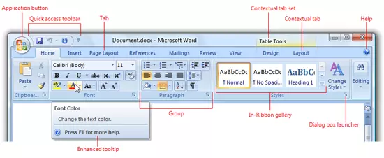
Microsoft demonstrated its two points of view in its guideline , citing an example of what can happen if you do not follow their recommendations.
This guideline contains a number of rules and guidelines for creating the Ribbon Bar (a new concept for the Office 2007 software interface). For example, the most frequent functions are placed in the middle of the bar, then the frequency goes from left to right.
Testing
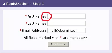
I will demonstrate testing using the guideline on a live example.In the interface you saw, one screen and one message box. We will sort them out by applying the rules of the guideline.
It can be seen that the rule for the form: “1.2 The field names are aligned on the right side. The distance from the name to the field for all fields is the same "is observed. As a rule: “2.2 The inscriptions on the buttons begin with a capital letter. If the inscription consists of several words, then each word begins with a capital letter, except for prepositions. ” But "Signatures to the interface elements begin with a capital letter and end with a colon" is not respected. The captions "enter password:" and "confirm password:" begin with a capital letter, but must begin with a capital letter. Writing a bug in your usability bugtracking system.
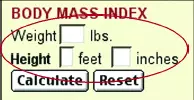
What is wrong in this message box? For example, the rule: "2.8 Negative action button" Delete "," Erase "," Cancel ") is always the rightmost" is observed. Can not be said about the rule: “2.2 The inscriptions on the buttons begin with a capital letter. If the inscription consists of several words, then each word begins with a capital letter, except for prepositions. ” The “cancel” button is written with a small letter, although the rule for the “OK” button is observed.
Additionally
- The book by Matthew Linderman, Jason Fried (from the company of 37 signals) “How to create a visited site and avoid common mistakes”
- Book Jeff Johnson "GUI Bloopers 2.0" (on ozon.ru )
- Usability Guideline Article Author
- Microsoft Ribbons Guidelines
- Apple User experience
- Interface checklist (Vladislav Golovach, Alexander Belyshkin. Usethics)
Source: https://habr.com/ru/post/52935/
All Articles