What is the best way to visualize Banana Research?
I stumbled on an interesting study the other day that was published on a blog about marketing .
The results, of course, are impressive. But the visualization of numbers is simply horrible. It takes a lot of time to get the picture in mind. And especially in times of crisis, we need to save staff time.
Let's see how you can make the numbers more visible.
Question number 1:
Do people like bananas?
Yes, people love bananas - 73.8%.
And more bananas are loved by the weaker sex (79.3% versus 61.5%).
')
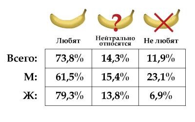
The table is not the best way to represent numbers. Convert to chart.
Legend "Neutral relate" and "Dislike" leave, they are cool. To "love" add a heart for uniformity.
We also introduce the “M” and “F” pictograms and add the number of respondents: “13” and “29”. Without it, it is difficult to understand how the “Total” is calculated.
We will get rid of the tenths - nobody will remember them anyway, but only confuse them. We do not have an election campaign to worry about such accuracy. And the signs will be as much as 50% less!
Chart ready! Agree, it is clearer.

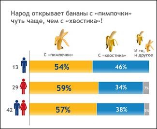
We proceed in a similar way with the presentation of the results of question No. 2
“On which side do people open bananas?”
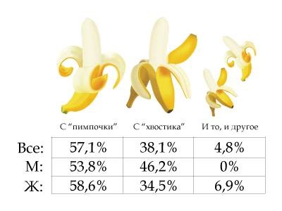
Instead of a complex table, we make a beautiful diagram.
But question number 3 is more interesting to parse.
The effect of age on the opening side
Some correlation “Age - side of opening” was found - with age people become more inclined to open bananas with a tail.
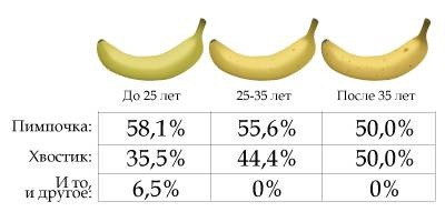
This is a good example of how you can "manipulate" the audience: after all, the ranges are chosen arbitrarily, and even at different intervals.
For example, you can imagine the following picture with a “pimp”: “Up to 20 years: 45%”, “20-30: 50%”, “more than 30: 55%”. And we will get absolutely opposite results: with age they prefer to open “from the point of view”.
To truthfully reflect the information, it is necessary to place all 42 respondents on a scatter chart. And then add dependency.
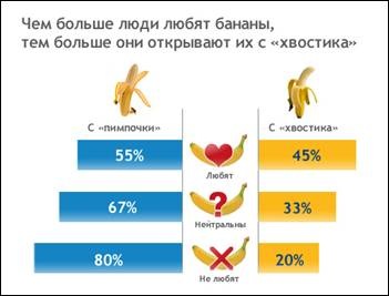
Well, the last question number 4.
Attitude to bananas - opening side
There is also a correlation “Attitude towards bananas - the opening side”: people who love bananas are more prone to opening a banana with a tail than they do not.
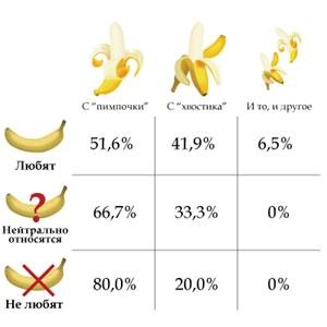
Well, how can you quickly understand the correlation from the table?
Convert to chart. Moreover, we ignore 6.5% of lovers of both (this is not so important, and the complexity of perception increases by an order of magnitude). And we distribute 6.5% between the categories “with a pimp” and “with a tail”.
Present the figures more clearly! Simplify life for people!
PS: Sign up for a webinar (online conference) on the topic " Manipulative diagramology ", which will be held on March 5, 2009 from 15.00 to 16.30
The results, of course, are impressive. But the visualization of numbers is simply horrible. It takes a lot of time to get the picture in mind. And especially in times of crisis, we need to save staff time.
Let's see how you can make the numbers more visible.
Question number 1:
Do people like bananas?
Yes, people love bananas - 73.8%.
And more bananas are loved by the weaker sex (79.3% versus 61.5%).
')
The table is not the best way to represent numbers. Convert to chart.
Legend "Neutral relate" and "Dislike" leave, they are cool. To "love" add a heart for uniformity.
We also introduce the “M” and “F” pictograms and add the number of respondents: “13” and “29”. Without it, it is difficult to understand how the “Total” is calculated.
We will get rid of the tenths - nobody will remember them anyway, but only confuse them. We do not have an election campaign to worry about such accuracy. And the signs will be as much as 50% less!
Chart ready! Agree, it is clearer.
We proceed in a similar way with the presentation of the results of question No. 2
“On which side do people open bananas?”
Instead of a complex table, we make a beautiful diagram.
But question number 3 is more interesting to parse.
The effect of age on the opening side
Some correlation “Age - side of opening” was found - with age people become more inclined to open bananas with a tail.
This is a good example of how you can "manipulate" the audience: after all, the ranges are chosen arbitrarily, and even at different intervals.
For example, you can imagine the following picture with a “pimp”: “Up to 20 years: 45%”, “20-30: 50%”, “more than 30: 55%”. And we will get absolutely opposite results: with age they prefer to open “from the point of view”.
To truthfully reflect the information, it is necessary to place all 42 respondents on a scatter chart. And then add dependency.
Well, the last question number 4.
Attitude to bananas - opening side
There is also a correlation “Attitude towards bananas - the opening side”: people who love bananas are more prone to opening a banana with a tail than they do not.
Well, how can you quickly understand the correlation from the table?
Convert to chart. Moreover, we ignore 6.5% of lovers of both (this is not so important, and the complexity of perception increases by an order of magnitude). And we distribute 6.5% between the categories “with a pimp” and “with a tail”.
Present the figures more clearly! Simplify life for people!
PS: Sign up for a webinar (online conference) on the topic " Manipulative diagramology ", which will be held on March 5, 2009 from 15.00 to 16.30
Source: https://habr.com/ru/post/51577/
All Articles