Web 2.0 Style Design Guide
In this guide, I will list various kinds of common Web 2.0 style graphic design elements.
Then I will try to explain for what reason they became popular and where and when you could apply these elements in your projects.
EVERYTHING BY THE ORDER:
Below you can see a list that lists common features of typical Web 2.0 sites.
')
Obviously, you do not need to embed all the elements on the site in order for it to work well.
Simplicity
Center placement
A small number of columns
Split top section
Sites of solid background
Simple navigation
Bold logos
Large text
Bold text in the prefaces, annotations
Bright, juicy colors
Expensive surfaces
Gradient
Reflections and reflexes
Attractive icons
Starfleshi (sorry, I don’t know a Russian word)
Just in case:
It should be clearly understood that these design pieces should be used only for their intended purpose and in moderation. There are many bad examples where the designer did not correctly use these techniques, abused them, or violated the “harmony” of the site. You can not take all the elements, scatter them in different corners of the page and get a good eye-pleasing site. Creating a website requires a full understanding of the case, a sense of edge and a lot of patience.
Web 2.0
Many people use the term "Web 2.0" to describe:
Reviving the economy on the Internet;
New technological level of interaction between websites and services;
Social phenomena arising from new types of online communities and social networks.
There are many who attribute Web 2.0 to a recent school of web design. I use this term with confidence in this context.
I'm going to, by giving examples of great Web 2.0 sites, explain how each one is good, and how you can use these good points in your projects.
If I were to describe Web 2.0 in one word, I said the word "Simplicity." Perhaps, with simplicity, I will begin my leadership.
I believe in simplicity. I think that the future of the web is behind it.
Today's simple, bold, elegant designs do more with less:
They make it possible for designers to get the desired indicator from the site, guiding the visitor with the help of the smallest, well-chosen visual elements;
They use fewer words, but speak more, and properly selected images to create the desired feeling;
They reject the idea that we cannot guess what people want from our sites.
Web design is simpler than ever, which is good.
Web 2.0 design is focused, not cluttered, simple.
I really believe in simplicity. This does not mean that all sites should be minimalist, but we should use only that (minimum) that is necessary to achieve the goal.
Here are some examples:

What is so good simplicity?
Sites have goals and all web pages go to them;
Attention users - the final resource;
Such design work helps users find what they need;
"Raisins" on the screen attract the eye. But the more often the user is distracted by such trifles, the less often he notices the necessary material;
Thus, we must make the necessary information available, and also minimize to the minimum (not to refuse completely) extraneous “raisins”. This is simplicity.
When and how to make a simple design.
When?
Is always.
How?
There are two aspects to success in simplicity:
Remove unwanted items without sacrificing efficiency;
Try to resort to alternative solutions that allow to achieve the same result, but in a simpler way.
Whenever you are design, make it a rule to delete all unnecessary visual elements.
A large number of "raisins" degrades the quality of the page, because it will distract attention from the main content and navigation.
Use visual details — lines, shapes, words, colors — to point out the information you need, not just for decoration.
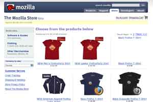
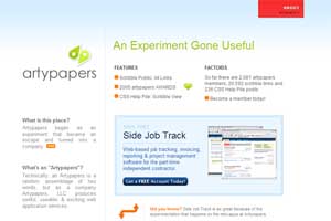
Here is an example of a design that cannot boast of sufficient simplicity.
The “Yaxay” interface contains a large amount of graphics, but most of it is used for beauty, it is part of the background of the page. Only a small fraction of these graphics is necessary, interacting with the user, helping him to find the necessary information.
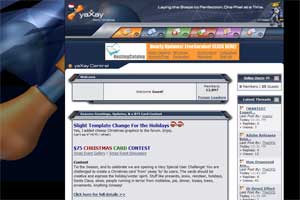

See how there are a lot of different "ryushechek", and you will notice that the really necessary graphics, which simplify navigation and finding the right material, are very few.
Edward Taft is a recognized guru in the field of analytical design, using the terms “data ink” (that is, details that help deliver information) and “non-data ink” (that is, simply useless details) to describe this phenomenon.
One of the ways for Taffeta to evaluate the design effectiveness is to use the ratio of “data ink” to “non-data ink” . The higher the “data ink” indicator, the greater the likelihood that the design will be effective.
As for Yaxay, I will call him “piled up”, as it contains many stripes, tonal changes, different figures ...
Among all this "range" you can select only a couple of useful elements:
site logo;
navigation menu icons.
All the rest is “piling up”, since it does not carry any benefit - this is the very “non-data ink” .
I am not against the rich, complex or beautiful in web design
Simplicity means:
Of course, often we are dealing not with difficult data , but with easy information .
================================================= ==
Regardless of the chosen method of presenting the material (difficult or easy), you are equally conscious and careful in choosing the graphics.
================================================= ==
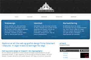
Take the example below:
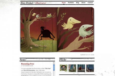
Alex Dukal's website is rich, interesting and attractive. Alex uses a number of methods to attract your attention, makes you feel warm about the quality of his work.
But on the plus side, the site is fairly simple, because the author uses graphics and colors with care and forethought. It is economical (strictly), but at the same time rich.
================================================= ==
================================================= ==
In principle, the vast majority of current sites align the site in the center of the window. A relatively small number of sites is aligned to the left or displayed on the whole screen.
What good is center alignment?
This “Web 2.0” style is simple, bold and uncomplicated. Hence, the sites located in the center are more simple, bold and uncomplicated :)
As we began to save more on graphics (and content), we should not think about where to squeeze more information.
When and how to use center alignment
I want to say that this advice is not obligatory - you always have rights to do it your way, for example, if you need more space for creativity, or to fit a large amount of information on a small screen area (web applications: Google Mail, Google Reader .. .)
Several years ago, the site of the three columns was the norm, and of the four - not a rare occurrence.
Today, the most common sites of the two columns, and the line in three columns is the maximum allowable rate.
Why use fewer columns
Less is more. The smaller the columns, the more pleasant the site looks. We set out less information more clearly.
In fact, this is accompanied by the dominance of the pages placed in the center. Since we do not fill the screens completely and do not even try to use all of its space, a large number of columns are simply not necessary.
Select the desired number of columns
Of course, you can say that you do not need to use more than three columns - this is simply not necessary.
But for each rule there are exceptions, so now I will try to give you a few examples where the use of more than three columns was justified.
Then I will try to explain for what reason they became popular and where and when you could apply these elements in your projects.
EVERYTHING BY THE ORDER:
Below you can see a list that lists common features of typical Web 2.0 sites.
')
Obviously, you do not need to embed all the elements on the site in order for it to work well.
Simplicity
Center placement
A small number of columns
Split top section
Sites of solid background
Simple navigation
Bold logos
Large text
Bold text in the prefaces, annotations
Bright, juicy colors
Expensive surfaces
Gradient
Reflections and reflexes
Attractive icons
Starfleshi (sorry, I don’t know a Russian word)
Just in case:
It should be clearly understood that these design pieces should be used only for their intended purpose and in moderation. There are many bad examples where the designer did not correctly use these techniques, abused them, or violated the “harmony” of the site. You can not take all the elements, scatter them in different corners of the page and get a good eye-pleasing site. Creating a website requires a full understanding of the case, a sense of edge and a lot of patience.
Web 2.0
Many people use the term "Web 2.0" to describe:
Reviving the economy on the Internet;
New technological level of interaction between websites and services;
Social phenomena arising from new types of online communities and social networks.
There are many who attribute Web 2.0 to a recent school of web design. I use this term with confidence in this context.
I'm going to, by giving examples of great Web 2.0 sites, explain how each one is good, and how you can use these good points in your projects.
If I were to describe Web 2.0 in one word, I said the word "Simplicity." Perhaps, with simplicity, I will begin my leadership.
I believe in simplicity. I think that the future of the web is behind it.
Today's simple, bold, elegant designs do more with less:
They make it possible for designers to get the desired indicator from the site, guiding the visitor with the help of the smallest, well-chosen visual elements;
They use fewer words, but speak more, and properly selected images to create the desired feeling;
They reject the idea that we cannot guess what people want from our sites.
Web design is simpler than ever, which is good.
Web 2.0 design is focused, not cluttered, simple.
I really believe in simplicity. This does not mean that all sites should be minimalist, but we should use only that (minimum) that is necessary to achieve the goal.
Here are some examples:
What is so good simplicity?
Sites have goals and all web pages go to them;
Attention users - the final resource;
Such design work helps users find what they need;
"Raisins" on the screen attract the eye. But the more often the user is distracted by such trifles, the less often he notices the necessary material;
Thus, we must make the necessary information available, and also minimize to the minimum (not to refuse completely) extraneous “raisins”. This is simplicity.
When and how to make a simple design.
When?
Is always.
How?
There are two aspects to success in simplicity:
Remove unwanted items without sacrificing efficiency;
Try to resort to alternative solutions that allow to achieve the same result, but in a simpler way.
Whenever you are design, make it a rule to delete all unnecessary visual elements.
A large number of "raisins" degrades the quality of the page, because it will distract attention from the main content and navigation.
Use visual details — lines, shapes, words, colors — to point out the information you need, not just for decoration.
Here is an example of a design that cannot boast of sufficient simplicity.
The “Yaxay” interface contains a large amount of graphics, but most of it is used for beauty, it is part of the background of the page. Only a small fraction of these graphics is necessary, interacting with the user, helping him to find the necessary information.
See how there are a lot of different "ryushechek", and you will notice that the really necessary graphics, which simplify navigation and finding the right material, are very few.
Edward Taft is a recognized guru in the field of analytical design, using the terms “data ink” (that is, details that help deliver information) and “non-data ink” (that is, simply useless details) to describe this phenomenon.
One of the ways for Taffeta to evaluate the design effectiveness is to use the ratio of “data ink” to “non-data ink” . The higher the “data ink” indicator, the greater the likelihood that the design will be effective.
As for Yaxay, I will call him “piled up”, as it contains many stripes, tonal changes, different figures ...
Among all this "range" you can select only a couple of useful elements:
site logo;
navigation menu icons.
All the rest is “piling up”, since it does not carry any benefit - this is the very “non-data ink” .
I am not against the rich, complex or beautiful in web design
Simplicity means:
Use as many graphics as you need to facilitate the submission of information.
Of course, often we are dealing not with difficult data , but with easy information .
================================================= ==
Regardless of the chosen method of presenting the material (difficult or easy), you are equally conscious and careful in choosing the graphics.
================================================= ==
Take the example below:
Alex Dukal's website is rich, interesting and attractive. Alex uses a number of methods to attract your attention, makes you feel warm about the quality of his work.
But on the plus side, the site is fairly simple, because the author uses graphics and colors with care and forethought. It is economical (strictly), but at the same time rich.
================================================= ==
================================================= ==
In principle, the vast majority of current sites align the site in the center of the window. A relatively small number of sites is aligned to the left or displayed on the whole screen.
What good is center alignment?
This “Web 2.0” style is simple, bold and uncomplicated. Hence, the sites located in the center are more simple, bold and uncomplicated :)
As we began to save more on graphics (and content), we should not think about where to squeeze more information.
When and how to use center alignment
I want to say that this advice is not obligatory - you always have rights to do it your way, for example, if you need more space for creativity, or to fit a large amount of information on a small screen area (web applications: Google Mail, Google Reader .. .)
Several years ago, the site of the three columns was the norm, and of the four - not a rare occurrence.
Today, the most common sites of the two columns, and the line in three columns is the maximum allowable rate.
Why use fewer columns
Less is more. The smaller the columns, the more pleasant the site looks. We set out less information more clearly.
In fact, this is accompanied by the dominance of the pages placed in the center. Since we do not fill the screens completely and do not even try to use all of its space, a large number of columns are simply not necessary.
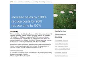
 37Signals in this regard has always been ahead. 37Signals in this regard has always been ahead.It uses 2 columns. This is a great example of simplicity. With this design, it is simply impossible not to see the message. |
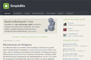
 Apple is the leader in elegance simplicity. Apple is the leader in elegance simplicity.It seems that Apple has re-designed the layout of pages a million times (after each phrase “why is it needed here?”), Until this most beautiful design appeared. There is no other way to explain such a simple, understandable navigation. |
Select the desired number of columns
Of course, you can say that you do not need to use more than three columns - this is simply not necessary.
But for each rule there are exceptions, so now I will try to give you a few examples where the use of more than three columns was justified.
Source: https://habr.com/ru/post/5117/
All Articles