Memo to the site designer
The second version of the article, expanded and supplemented.
Most of them were preparing for my speech at RIT: Client Technologies , which, unfortunately, I did not reach.
')

Unfortunately, a huge army of even experienced, “fashionable” and spectacular designers forget that the result of their creativity should be a website , and not just a“super-screenshot” suitable only for portfolios.
Initially, this memo was written by me for internal use but, overgrown with materials, grew into an independent article. I did not discover America, but simply put together and formulated a number of requirements that the designer must take into account in the process of designing and designing the site.
This is a very simple and often violated rule. Especially young designers.
I highly recommend to everyone: take a pencil and paper. Think about the tasks and idea of the site. Make quick draft sketches, find the composition, approximate grid, arrangement of blocks and elements, handwriting required illustrations. And only after that sit down at the computer.
Such a simple move is at times more productive, saves a lot of time and helps to find more interesting solutions.
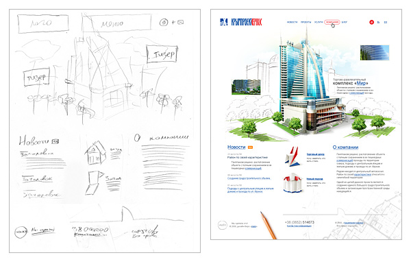
An example of a quick draft and the result
This is the second simple rule. And it is also often broken.
Classical teaching of drawing and painting teaches: “Move from the larger to the smaller, from the general to the particular. First, study the overall composition, the largest masses and volumes, the largest spots, and then refine, specify, saturate with details. ”
This rule applies in its entirety to all aspects and genres of design.
Think over your project, find the idea and composition, draw a series of sketches. And then, systematically, embody these sketches, starting with the grid, the layout of blocks, elements, large color spots. And consistently fill them with details.
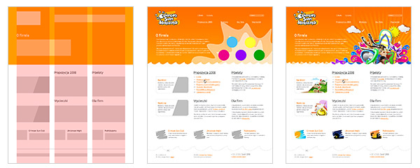
An example of step-by-step refinement and refinement of the layout from the general to the particular.
Admittedly, I often sawhow self-taught artists, nuggets, began to paint a portrait of a man from the eye, or from the finger of his left foot. And more than once I have seen some designers start to draw a site with some kind of one-private icon. And in both cases, to my surprise, an interesting result was obtained.
But it is a long way, often requiring big adjustments and rework in the design process. Perhaps it is applicable for creativity, but in thedesign profession , when in a certain period you need to get a good result, I believe that such an approach is unacceptable. We need guaranteed process technologies to get guaranteed results in a clear time frame. And not just “work out” .
So, to summarize: " From the biggest to the smallest, from the general to the particular ."
One of the first decisions in the process of creating a design is a modular grid. A single frame and layout of all the main blocks and elements, passing through all pages of the site.
Grids are simple and complex, flexible in use and not very. It is not so important. It is important that if you design a specific grid of modules when designing a design, please follow it. From the first to the last page of your project. And if in the process of drawing internal pages you have elements that do not fit into the adopted grid, it means you didn’t spend enough time designing it.
Following a single modular grid within the project will not only increase the integrity and consistency of the perception of the site, but also greatly simplify the work of developers.
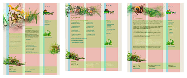
An example of the use of modular grid
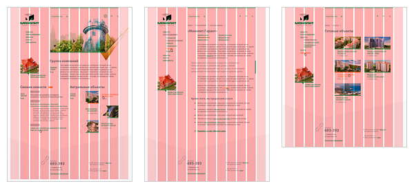
An example of the use of modular grid
Nowadays, when all users have a wide variety of monitors, it makes sense to make mostly “rubber” sites. Those. sites that scale to the user's monitor resolution.
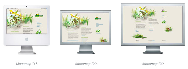
Display elastic site on various monitors
So, making a "rubber" design do not forget that:
Optimal for using the so-called"semi-rubber", i.e. The site is stretched and compressed to a certain limit.
The first thing to start with is to find the minimum site compression.
The minimum width of the site, of course, determined by the objectives of the site and its target audience. In fact, now there are only two minimum parameters: 760 px and 990 px . The first is optimal for corporate sites or resources designed for the most mass and disparate audience (for example, mass services: email, search, news, etc.). The second one is suitable for image and promotion destination websites.
We check and, if necessary, adjust, each element of the modular grid so that there are no overlaps / overlaps of elements against each other with minimal compression of the site.
The maximum width of the site may be different, but, as a rule, the recommended range for stretching is not more thanone and a half to two times the size of the minimum compression. This is due to the fact that when the site is stretched by more than one and a half times, the composition usually collapses.
It is necessary to determine what will happen with the entire site, with the size of the user's monitor over the maximum width. We decide where it will be leveled. Right? Left? In the center?
We achieve a complete view of the site and its natural transition to the environment at a resolution above the maximum. It is unacceptable that the site on a large monitor looked like "cut off."
We draw all the illustrations and non-repeating backgrounds from the principle “whoever has a bigger monitor will see more”. Usually, the width of the illustrations is due to the width of the modular grid blocks in the max state.
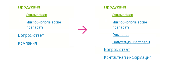
In the larger scope of tasks, if it is not abusiness card site or a promotional site, you need to consider that the number of pages and sections of the site can grow and change.
Therefore:
Navigation should be designed so that the addition of new menu items, and even more so the change in the name of the items was painless. It is unacceptable that the addition of a new section leads to a revision of navigation.
An example of a "painless" change / add a tree navigation of the first and second level
In some cases, it is necessary to provide for the appearance / addition of information / functional blocks on the site that are painless for the appearance.
An example of a “painless” move,
change / delete site blocks
Given the on-screen scalability, as well as the addition of new materials to the site, it is recommended to give preference to text headers and navigation.
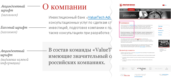
Most of the sites look whole and complete when building a design based onone or three fonts.
Base font - the main font of the site materials.
Accident - font for headers.
In some cases, additional fonts are introduced for:
The designer must plan a common overall indent / spacing size scheme for all elements on the site, a hierarchy of headings and navigation elements (for example, for a tree menu or tag cloud). It should be solid and used on all pages of the site.
All subsequent registration of information on the site should be based on the general scheme.
Font scheme of a simple corporate website
The designer must plan what will happen to the elements that react to user actions.
Consider the typical elements.

Fragment of the site layout, which shows the three states of navigation: the usual menu view, the menu item with the cursor hovering, the selection of the current section.
Depending on the type and scale of the site, you need to show a number of states of the navigation point.
Typical set:
At the same time, the minimum set for all navigation elements, including switches and controls, is the normal and active view. Those. the minimum for all controls and navigation elements is “on / off”.

Different states of the navigation item
Links located in the text are always underlined and should be different in color from the main text.
It is desirable, and in the navigation is necessary to provide the appearance of the link, when you hover the cursor.
In large volumes of text and in the issuance of heterogeneous information (for example, the table of contents of articles, site maps, etc.), it is necessary to provide an appearance for the visited links. And they also require their appearance when you hover.
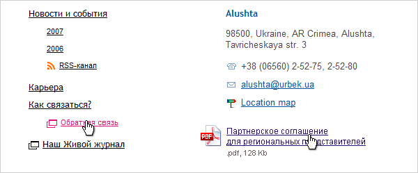
For links that provide additional features, especially when used in the text , it is recommended to provide a small icon that tells the user about the additional properties of the link.
These icons require links:
Examples of the use of additional icons "in life."
PseudoLinks, i.e. Links that do not lead to another page, but open / hide information on the current page, without reloading it, are indicated by a dotted underline. In all other respects, everything that is stated for normal links applies to them.
One example of using pseudo links.
Tabs are a mixture of a navigation element and a control.
For them, we take into account the state:

A fragment of the site on which three states of tabs are visible at once: the active tab, the cursor is hovering and the usual, inactive, state.
We foresee the cursor response when hovering. Especially, if we are talking about non-standard controls, such as navigation,pseudo-links and tabs ( hand ), tips ( help ), resizing the element and dragging.
Information rules on the Internet. The site is just a way to deliver it. The external design of the site is just a frame that sets the emotional attitude and reinforces the brand.
It is by studying the information that the user spends the largest part of his time on the site. And it is for this reason that due attention should be paid to the design of the content.
The objectives of the site and its content is always different. Therefore, to make out this content is also always necessary in different ways.
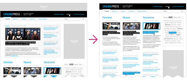
Fragment of the news site on which the designer showed most of the typical elements for the design of the content.
At once it must be said that it is impossible to foresee in advance all possible design options. We consider only the typical.
For example, for a corporate site:

Ideally, you need to operate with real content. If this is not the case, then at a minimum, the “fish” should beas typical as possible for the page to be designed in terms of its type and volume. This will avoid gaps in the design and an annoying look of the site after commissioning.
It is completely unacceptable to use "fish" from another language, because Text sizes and average word length vary. For example in English and Russian is very noticeable.

Different drawing of identical in content blocks of text in different languages.
These requirements are not dogma. From any rules you can sometimes deviate. Only this should be done not out of ignorance, but consciously .
Pavel Kolodyazhny.Art director and founder of the make design bureau.
He specializes inweb site development and interface design.
Total experience in design - 9 years. As an authorand co-author involved in the birth of more than a hundred sites and about three dozen interfaces. Among the works there are projects for companies such as Sunbay Software, Space Andventures, Pulsar Software Systems, Canon Inc., Yandex, Yamaha Motors. Despite previous achievements, he believes that the most interesting projects are still ahead.
To all my colleagues and employees, as all the examples are fragments of the work of our bureau.
Evgeny Cheporov, who pushed me to create an article.
Vlad Denisov, who helped me with illustrative examples.
Yaroslav Trofimov (from Inspire) for his advice and constructive criticism of the texts.
Ira Yantsev, for proofreading, the translation of the English version and for convincing me to finish the article when I wanted to quit.
To all users of LiveJournal and Habrahabr , for comments, feedback and questions, thanks to which I have finalized and expanded this material.
Most of them were preparing for my speech at RIT: Client Technologies , which, unfortunately, I did not reach.
')
Unfortunately, a huge army of even experienced, “fashionable” and spectacular designers forget that the result of their creativity should be a website , and not just a
Initially, this memo was written by me for internal use but, overgrown with materials, grew into an independent article. I did not discover America, but simply put together and formulated a number of requirements that the designer must take into account in the process of designing and designing the site.
First we think, then we do
This is a very simple and often violated rule. Especially young designers.
I highly recommend to everyone: take a pencil and paper. Think about the tasks and idea of the site. Make quick draft sketches, find the composition, approximate grid, arrangement of blocks and elements, handwriting required illustrations. And only after that sit down at the computer.
Such a simple move is at times more productive, saves a lot of time and helps to find more interesting solutions.
An example of a quick draft and the result
From big to small, from general to particular
This is the second simple rule. And it is also often broken.
Classical teaching of drawing and painting teaches: “Move from the larger to the smaller, from the general to the particular. First, study the overall composition, the largest masses and volumes, the largest spots, and then refine, specify, saturate with details. ”
This rule applies in its entirety to all aspects and genres of design.
Think over your project, find the idea and composition, draw a series of sketches. And then, systematically, embody these sketches, starting with the grid, the layout of blocks, elements, large color spots. And consistently fill them with details.
An example of step-by-step refinement and refinement of the layout from the general to the particular.
Admittedly, I often saw
But it is a long way, often requiring big adjustments and rework in the design process. Perhaps it is applicable for creativity, but in the
So, to summarize: " From the biggest to the smallest, from the general to the particular ."
Modular grid
One of the first decisions in the process of creating a design is a modular grid. A single frame and layout of all the main blocks and elements, passing through all pages of the site.
Grids are simple and complex, flexible in use and not very. It is not so important. It is important that if you design a specific grid of modules when designing a design, please follow it. From the first to the last page of your project. And if in the process of drawing internal pages you have elements that do not fit into the adopted grid, it means you didn’t spend enough time designing it.
Following a single modular grid within the project will not only increase the integrity and consistency of the perception of the site, but also greatly simplify the work of developers.
An example of the use of modular grid
An example of the use of modular grid
Scalability
Nowadays, when all users have a wide variety of monitors, it makes sense to make mostly “rubber” sites. Those. sites that scale to the user's monitor resolution.
Display elastic site on various monitors
So, making a "rubber" design do not forget that:
- The overall composition should not be disturbed at any resolution of the monitor by the visitor.
- All elements are scaled according to the size of the user's screen and font size.
- All modular grid, blocks and other horizontals are scaled in percent.
- All fonts, indents, almost all verticals are scaled in em . In many cases, this even applies to the border .
- The exception may be only pictures. And the fact that the hard size in px for many images is only a vertical limit.
"Compression-stretching"
Optimal for using the so-called
min
The first thing to start with is to find the minimum site compression.
The minimum width of the site, of course, determined by the objectives of the site and its target audience. In fact, now there are only two minimum parameters: 760 px and 990 px . The first is optimal for corporate sites or resources designed for the most mass and disparate audience (for example, mass services: email, search, news, etc.). The second one is suitable for image and promotion destination websites.
We check and, if necessary, adjust, each element of the modular grid so that there are no overlaps / overlaps of elements against each other with minimal compression of the site.
max
The maximum width of the site may be different, but, as a rule, the recommended range for stretching is not more than
It is necessary to determine what will happen with the entire site, with the size of the user's monitor over the maximum width. We decide where it will be leveled. Right? Left? In the center?
We achieve a complete view of the site and its natural transition to the environment at a resolution above the maximum. It is unacceptable that the site on a large monitor looked like "cut off."
We draw all the illustrations and non-repeating backgrounds from the principle “whoever has a bigger monitor will see more”. Usually, the width of the illustrations is due to the width of the modular grid blocks in the max state.
Reserve for site growth
In the larger scope of tasks, if it is not a
Therefore:
Navigation should be designed so that the addition of new menu items, and even more so the change in the name of the items was painless. It is unacceptable that the addition of a new section leads to a revision of navigation.
An example of a "painless" change / add a tree navigation of the first and second level
In some cases, it is necessary to provide for the appearance / addition of information / functional blocks on the site that are painless for the appearance.
An example of a “painless” move,
change / delete site blocks
Given the on-screen scalability, as well as the addition of new materials to the site, it is recommended to give preference to text headers and navigation.
Font scheme
Most of the sites look whole and complete when building a design based on
Base font - the main font of the site materials.
Accident - font for headers.
In some cases, additional fonts are introduced for:
- menu and navigation;
- selection blocks (important information, quotes, callouts);
- for small text, in order to improve readability.
The designer must plan a common overall indent / spacing size scheme for all elements on the site, a hierarchy of headings and navigation elements (for example, for a tree menu or tag cloud). It should be solid and used on all pages of the site.
All subsequent registration of information on the site should be based on the general scheme.
Font scheme of a simple corporate website
User reaction
The designer must plan what will happen to the elements that react to user actions.
Consider the typical elements.
Navigation
Fragment of the site layout, which shows the three states of navigation: the usual menu view, the menu item with the cursor hovering, the selection of the current section.
Depending on the type and scale of the site, you need to show a number of states of the navigation point.
Typical set:
- Normal view.
- We hover over.
- We are in this section.
- We are in this section, but have gone deeper.
- We hover over the item of the parent section.
At the same time, the minimum set for all navigation elements, including switches and controls, is the normal and active view. Those. the minimum for all controls and navigation elements is “on / off”.
Different states of the navigation item
Links
Links located in the text are always underlined and should be different in color from the main text.
It is desirable, and in the navigation is necessary to provide the appearance of the link, when you hover the cursor.
In large volumes of text and in the issuance of heterogeneous information (for example, the table of contents of articles, site maps, etc.), it is necessary to provide an appearance for the visited links. And they also require their appearance when you hover.
Links with additional properties
For links that provide additional features, especially when used in the text , it is recommended to provide a small icon that tells the user about the additional properties of the link.
These icons require links:
- alternative data acquisition (RSS, PDA, print version)
- downloading files located on the server
- appeal to popular resources (Yandex, Google, Flickr, LJ, map services, Wikipedia, etc.)
- e-mail addresses
- opening forms
- open link in new window
Examples of the use of additional icons "in life."
Pseudo-links
PseudoLinks, i.e. Links that do not lead to another page, but open / hide information on the current page, without reloading it, are indicated by a dotted underline. In all other respects, everything that is stated for normal links applies to them.
One example of using pseudo links.
Tabs
Tabs are a mixture of a navigation element and a control.
For them, we take into account the state:
- tab is inactive
- hover cursor (opt)
- content loader (opt)
- tab active
A fragment of the site on which three states of tabs are visible at once: the active tab, the cursor is hovering and the usual, inactive, state.
Cursor
We foresee the cursor response when hovering. Especially, if we are talking about non-standard controls, such as navigation,
Making the content
Information rules on the Internet. The site is just a way to deliver it. The external design of the site is just a frame that sets the emotional attitude and reinforces the brand.
It is by studying the information that the user spends the largest part of his time on the site. And it is for this reason that due attention should be paid to the design of the content.
The objectives of the site and its content is always different. Therefore, to make out this content is also always necessary in different ways.
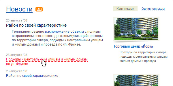
Fragment of the news site on which the designer showed most of the typical elements for the design of the content.
Elements of content
At once it must be said that it is impossible to foresee in advance all possible design options. We consider only the typical.
For example, for a corporate site:
- text paragraph;
- hierarchy of headings of
three or four levels; - links,
pseudo-links; - element highlighting important information;
- quote;
- unnumbered list;
- numbered list;
- nested lists;
- illustration on a strip, in the text;
- a table or several types of them;
- files for download;
- callouts;
- design of marginals, if any;
- submission of information in
2-3 columns (depending on the grid); - simple form.
A fish
Ideally, you need to operate with real content. If this is not the case, then at a minimum, the “fish” should be
It is completely unacceptable to use "fish" from another language, because Text sizes and average word length vary. For example in English and Russian is very noticeable.
Different drawing of identical in content blocks of text in different languages.
PS
These requirements are not dogma. From any rules you can sometimes deviate. Only this should be done not out of ignorance, but consciously .
about the author
Pavel Kolodyazhny.
He specializes in
Total experience in design - 9 years. As an author
Acknowledgments
To all my colleagues and employees, as all the examples are fragments of the work of our bureau.
Evgeny Cheporov, who pushed me to create an article.
Vlad Denisov, who helped me with illustrative examples.
Yaroslav Trofimov (from Inspire) for his advice and constructive criticism of the texts.
Ira Yantsev, for proofreading, the translation of the English version and for convincing me to finish the article when I wanted to quit.
To all users of LiveJournal and Habrahabr , for comments, feedback and questions, thanks to which I have finalized and expanded this material.
Source: https://habr.com/ru/post/50497/
All Articles