Forms for people
Now we will talk about web forms. I managed to accumulate some experience from the height of my own low flight and I will certainly share my thirst. All of which will be discussed below is not a turtle on which there are elephants. It's about the scotch that holds the turtle.
So…
Dear friend, for starters, I would advise you to put aside funds for drawing and layout. We start with a white sheet. And the first thing that is best guided by is a series of questions to yourself, the project manager, developers, and other people who take part in this epic creative action.
Any target audience requires and implies its own, specific nuances used in forms and this is a fact. Our task is to find a middle ground and do no harm to anyone.
')

Consider the simplest example. The registration form of the software support forum from SuperMegaSoft LLC against the registration form for ordering diamonds on the website of the jewelry e-shop “Biryulka”. Forms on the idea of the same. But, in one case, we deal with users who will intuitively recognize such concepts as “E-mail”, “User agreement”, “Account”, and in another case with magic organisms, which may be the first to hear these words.
Thus, we postpone for a short while all these data, so that we would later figure out.
Perhaps this is the most important question that should be answered in full.
Any form is: Elements of direct interaction (constrols) with the user and accompanying background information. Let's derive the following rules for ourselves:
We believe that we already have an invented list of information that we certainly need from the user for our server.
Separate the wheat from the chaff. Select the information that is required and must be indicated. We separate from this mass the one that is not needed at all even by our user, but is needed by the server (ID, Sessions, referrers, etc., etc.).
The result of the form is a step that follows after sending the form data to the server. The saddest thing about him is that quite a lot of creators forget about him, or worse, forget it. Can you imagine how much work the user spent hunching down and filling in the data in our epic form? He must be praised! Or, in extreme cases, to notify that he tried not for nothing, and he expects even more in the future.
You have it all! The current possibilities of creators are unlimited. We have: Client and Server. The client is usually called the person who does not know you at all, but he sees the result of your work and certainly wants to use it. Although, to be honest, everything is much duller, in our case we will use the concept of “Form”, “Data”, “Server”.
Technology. If we are talking about Web forms, we have a whole tree of possible paths.
All this is very cool. To use or not to use this or that technology is up to you. Each of these technologies is created and works for you and the user for the benefit. At the moment, the percentage of users for whom these technologies will not work is negligible and continues to be systematically destroyed.
We compose the form so that it fits into your design and takes its place in proportion to the functions it performs.
The form is generally a capricious thing. How exactly to tell the story, I will not for all known reasons. But to avoid situations when “the design is drawn by the best programmers” I will try to focus your attention on the following aspects:
We consider the elements of the form in the ideal.
Lyric : Designations raised to the <label> tag and tied to elements are doubly useful, because they automatically focus when you click on them on a form element to fill out.

A very large range of options to improve and simplify the selection for this item. From the usual input field with the requirement to fill in the specified format (for example DD.MM.YY) to the widget that provides a convenient choice.
And so on. You can continue in the same vein almost indefinitely, because there are no laws as such, and everything is shaping up to variations and possibilities with respect to current technologies and capabilities of browsers. Then I propose to continue on, but before that ...

This kind of form is used most often. It's too late to make discoveries. However.
Fields and information:
Authorization does not require anything complicated.
Check for data in two fields, and if anything goes wrong - remind about it. How we will check - it's up to you. Or after authorization attempt to display data. Or, during the input check the validity of the data entered, ...
Upon completion of authorization to redirect somewhere.
I really hope that the prepared material has helped you, and the world will become noticeably kinder from this. Thanks for attention.
So…
The first is where do the legs come from?
Dear friend, for starters, I would advise you to put aside funds for drawing and layout. We start with a white sheet. And the first thing that is best guided by is a series of questions to yourself, the project manager, developers, and other people who take part in this epic creative action.
- Who is the form for?
- What information is needed to understand and fill out the form?
- What is the result of filling out the form?
- What opportunities do we have?
For whom?
Any target audience requires and implies its own, specific nuances used in forms and this is a fact. Our task is to find a middle ground and do no harm to anyone.
')
Consider the simplest example. The registration form of the software support forum from SuperMegaSoft LLC against the registration form for ordering diamonds on the website of the jewelry e-shop “Biryulka”. Forms on the idea of the same. But, in one case, we deal with users who will intuitively recognize such concepts as “E-mail”, “User agreement”, “Account”, and in another case with magic organisms, which may be the first to hear these words.
Thus, we postpone for a short while all these data, so that we would later figure out.
What information is needed?
Perhaps this is the most important question that should be answered in full.
Any form is: Elements of direct interaction (constrols) with the user and accompanying background information. Let's derive the following rules for ourselves:
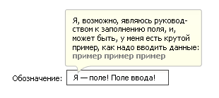
- Form must be indicated. Title, description, explanation. The user, even out of the corner of his eye looking at the form, must immediately understand what he will have to face. This rule is.
- Legend should be clear. Use concepts within the same language in which the entire site is written, or within the chosen localization.
- Each input field, a text field implies the input of some information. Initially, we are thinking from the most pessimistic point of view - a dumbass sits before our form. This means that he does not understand what to write, even if there is a “Name” signature addressed to this field. Sign in what format, quantity and in what language should be entered into the field. Show abstract examples.
- Designate and separate the sequence of filling data on the form. Separate data by type into groups. Provide filling out forms in several steps if it is complicated (for example, when the form includes more than 10 fields to fill out).
- Help users. Think of the easiest ways to fill out forms for users. Remember, saving time of visitors directly increases the loyalty of visitors in the future.
- Do not overdo it. Do not forget that there is always the opportunity to get rid of any elements in favor of simplifying the form.
We believe that we already have an invented list of information that we certainly need from the user for our server.
Separate the wheat from the chaff. Select the information that is required and must be indicated. We separate from this mass the one that is not needed at all even by our user, but is needed by the server (ID, Sessions, referrers, etc., etc.).
What is the result?
The result of the form is a step that follows after sending the form data to the server. The saddest thing about him is that quite a lot of creators forget about him, or worse, forget it. Can you imagine how much work the user spent hunching down and filling in the data in our epic form? He must be praised! Or, in extreme cases, to notify that he tried not for nothing, and he expects even more in the future.
What are the possibilities?
You have it all! The current possibilities of creators are unlimited. We have: Client and Server. The client is usually called the person who does not know you at all, but he sees the result of your work and certainly wants to use it. Although, to be honest, everything is much duller, in our case we will use the concept of “Form”, “Data”, “Server”.
Technology. If we are talking about Web forms, we have a whole tree of possible paths.
- The usual form with the submission of response information as it is checked on the server.
- Use javascript to validate and submit information in a form.
- Using Ajax technology.
All this is very cool. To use or not to use this or that technology is up to you. Each of these technologies is created and works for you and the user for the benefit. At the moment, the percentage of users for whom these technologies will not work is negligible and continues to be systematically destroyed.
Design and all that
We compose the form so that it fits into your design and takes its place in proportion to the functions it performs.
The form is generally a capricious thing. How exactly to tell the story, I will not for all known reasons. But to avoid situations when “the design is drawn by the best programmers” I will try to focus your attention on the following aspects:
- The amount and accuracy of the information submitted in the form directly depends on how correctly, how quickly and how often the user wants to fill it in at all. To increase the "performance" of users at times, sometimes you can just add one word.
- Nobody canceled readability of forms.
- Group
- sign items
- Set priority order
- Remember about indents. There is a line between how spaces between elements, signatures and hints can disrupt the correct perception or improve it to the maximum.
- Beauty requires sacrifice. Making a bet on the beautiful you will definitely try to break the general concept of perception. Do not forget to look back.
Sectional shape
We consider the elements of the form in the ideal.
Lyric : Designations raised to the <label> tag and tied to elements are doubly useful, because they automatically focus when you click on them on a form element to fill out.
Entry field
- label
- description
- data entry explanation example
- explanatory text for erroneous data (error text)
- Input Restriction / Correction
- Character and letter sets
- Register of characters
- Minimum / maximum amount of data entered
- Read only mode
Drop-down list.
- Label designation
- Description
- List, and group
- Item selected by default.
Text field
- Label
- Description
- Default text
- Expansion of data entry functionality (text formatting)
Button
- Termination
- Push lock mode (disabled)
Lists of radio buttons, switches (radio / checkbox)
- Group designation
- Description
- Label of each element
- Lock mode selection (disabled)
Date pointing / selection element
A very large range of options to improve and simplify the selection for this item. From the usual input field with the requirement to fill in the specified format (for example DD.MM.YY) to the widget that provides a convenient choice.
And so on. You can continue in the same vein almost indefinitely, because there are no laws as such, and everything is shaping up to variations and possibilities with respect to current technologies and capabilities of browsers. Then I propose to continue on, but before that ...
Example
Authorization form
This kind of form is used most often. It's too late to make discoveries. However.
Fields and information:
- Explanatory text. This is a short story about what is happening in this form. Why she and what will lead. It is believed that the majority knows about it. For those who do not know, refer to the information, which details what the user will receive if he can use this form after registering.
- Username / Email / ID / Login. Mandatory field of user identification. We must make it clear exactly what needs to be entered in this field. The most common mistake in this field is made by developers, designating it as Login, although it is necessary to enter E-mail as identification there. Or ID. Or "Username", although at first glance it is the same as "Login".
- Password / Code. This field is the most mysterious field in the world. I can only say that it is best to make it so long that the average number of stars is visible, and not disappear because of the short length beyond the borders. It prolongs life.
- The ability to save entered data for a certain period in cookies. Usually - a check mark with a designation (Remember me / Save data / Remember). It is very important that not all users understand that they are not photographed here and do not remember the outlines. Try to refer to the reference material.
- Button
destroy thedata. - Additional information, links.
Authorization does not require anything complicated.
Check for data in two fields, and if anything goes wrong - remind about it. How we will check - it's up to you. Or after authorization attempt to display data. Or, during the input check the validity of the data entered, ...
Upon completion of authorization to redirect somewhere.
Total
I really hope that the prepared material has helped you, and the world will become noticeably kinder from this. Thanks for attention.
Source: https://habr.com/ru/post/49326/
All Articles