Web 2.0 Design Guide published

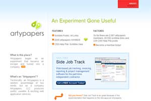
A detailed design guide for Web 2.0 has been published on the Web Design From Scratch website. This guide is a list of 15 design techniques that are most often used on the sites of the new generation, with specific examples and screenshots.
 Simplicity
The page should be as small as possible elements, nothing more. Of the two possible solutions, the best is always the best.
As a result of “clearing” the pages, the visitor’s view focuses on the content. Simplified navigation. Easier to draw the user's attention to something important.
')
In the design of Web 2.0 sites, you can use the term “drawing information” or “data pixels” (data ink). In general, Taft himself once said that the effectiveness of information design is expressed in the ratio of “informational” pixels on the screen to the total number of pixels.
Centered markup
Compared to the designer fashion of past years, now many more sites are located in the center in the browser, and not stretched to full screen or shifted to the left. Since the design of Web 2.0 is simpler and more economical, there is always a lot of good, clean white space on such sites.
Fewer speakers
A few years ago, a three-column design was the norm, and quite often even four met. Today, two speakers surprise no one, and three - the generally accepted maximum.
Separate upper section
At the top of the page is a horizontal section, which is separated from the rest of the content. Of course, this idea is nothing new and it has been used for a long time, but now it has become truly universally accepted.
 Colored blocks
In addition to the top section, other elements of the page can also be clearly highlighted in color. This can be a navigation zone, a main content zone or other areas.
The problem with bright colors is that they distract attention too much from other page elements. So in some cases it is better not to deviate from the usual white color.
Simple navigation
The navigation menu that is displayed on each page of the site should be large, clear and simple. As for hyperlinks, they should be clearly different from all other content on the page.
Increased size
On Web 2.0 sites, font size is usually larger than on previous generation sites. This rule is derived from the principles of simplicity and functional design.
 Big text inserts
On many sites there are headlines, logos and inscriptions of extremely large size. These inscriptions are usually implemented as a graphic element.
Clear logo
A clear, powerful and strong brand is created with a noticeable and memorable logo.
In addition to all of the above, six more design techniques are mentioned that are less common: the use of saturated colors; glamor surfaces (rich surfaces); gradients; reflections; elegant pictograms and even polygonal asterisks.
Source: https://habr.com/ru/post/4899/
All Articles