Ribbon? It's simple! or working with cascading style sheets (CSS) in Qt
Some time ago in one of the discussions I mentioned that the control “a-la ribbon” (which was used in MS Office 2007 for organizing the menu) is easily and naturally implemented by means of Qt.
I do not want to argue about whether the ribbon is comfortable or not (I myself tend more to the second opinion). But with his example, you can perfectly unleash the capabilities of cascading style sheets for Qt (which were introduced in Qt 4.2), which I will do. Immediately I apologize: I am not a designer, so from the aesthetic point of view, my QRibbon most likely will not reach its colleague from MS, but designers in MS, I think, in my area surpass me by 2 heads, and man-hours, I think, there was spent in slightly more. I just demonstrate the general principle and basic capabilities.
Since I am currently learning the Python language, it was he who was chosen for the demonstration, but for C ++ everything is done in exactly the same way. I apologize in advance: I just learn Python, so the code may be full of clumsiness, so please do not kick it painfully :)
')
So, let's begin!
Take the standard QTabWidget widget as a base because he here begs for it. We will make pages from widgets that have a horizontal layout (QHBoxLayout), the last element of which is QSpacerItem (I don’t know how to call it in Russian, but this is such an invisible thing that fills free space :)).
Now open QtDesigner and draw panels that we will add to the “pages” of our ribbon. Playback pixel by pixel in my plans is not included, I just show you how you can beat the different buttons and color them with the help of a style sheet. The first panel will do this:

It will have a large Paste button and 2 smaller buttons: Cut and Copy.
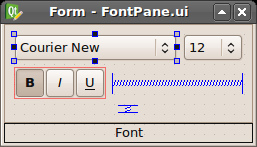
The second panel will be a panel of fonts. We will place combo boxes on it to select the font family and its size, as well as the “flipping” Bold, Italic and Underline buttons:
Each of the panels we will make a separate widget (a separate class). This class will load its ui-file (which we draw in the designer) and process the signals from the controls (I will skip this part, if not directly related to our topic).
So, let's add the base class of the panel (so far it does not carry any load, but later on it will be possible to set panels with some common properties, such as style) and 2 classes of panels:
Well, in the main function, add our panels to the page “Home”:
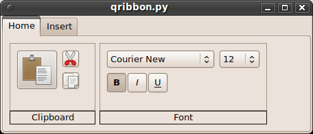
As a result, we get this miracle:
The outlines seem to look, but the ribbon is clearly “not a cake” ... Calm, just calm, we come to the most interesting!
So, create a helper function that reads and returns the contents of the file (we will use it to read the style sheets from the files) and add a line to the constructors of the QRibbon and Pane classes that read the corresponding style file:
I think it would be better if the Cut, Copy and Paste buttons are made flat. We go to QtDesigner and expose them to the corresponding attribute. Well, now let's do the most interesting: create a CSS that will transform our ribbon to unrecognizability!
First, let's look at the stylesheet for the main window (qribbon.qss). The 1-in-1 syntax is copied from CSS, so I will only give general comments, because the code speaks for itself:
Set the background color of the widgets:
Let's make the upper border of the panels more attractive:
It requires a little explanation. With the help of the first 4 parameters, the direction is set: from the left-upper corner to the lower left, i.e. vertically down. Next come the control points (take values from 0 to 1) and their colors. In this case, we have a simple gradient: it goes from zero to one without additional intermediate points.
Let's set a small indent for tabs:
Set indents for each tab in the tab bar, and also change the color of the text and create round corners for the tabs:
Change the color of the tab when you hover:
Here the gradient is a bit more complicated: it has 2 intermediate “control points”: 0.4 and 0.5.
Let us define an inactive taboo style of the lower border, which coincides with the upper border of the panels (see above):
Change the style of the active tab and remove its lower boundary:
Slightly change the style of the buttons:
Change the color of the “recessed” buttons:
Hide the "flat" buttons. Let only the contents be visible:
"Live" button at the time of clicking:
Let's see what happened:
Hmmm, it seems to be getting better, right? It remains to give a bit of charm to the panels with controls. Create a page.qss file:
That's all.
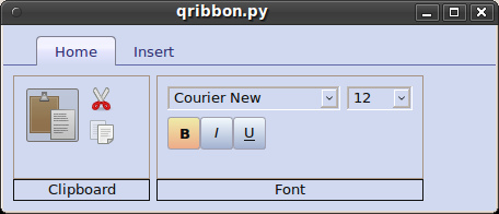
Now let's remember how our ribbon looked like before we applied the styles and compare it with what it looks like now:
Not bad, right? :) (combo boxes, of course, also customize, but I'll leave it as a home task)
For detailed documentation on using styles in Qt, please visit doc.trolltech.com/4.2/stylesheet.html
The only wish is for those who use this introductory manual and will use styles in their programs: place styles in external files. In this case, even if you slightly overdo it, the user will be able to play the UI without having to disassemble the program code.
Source archive here .
I do not want to argue about whether the ribbon is comfortable or not (I myself tend more to the second opinion). But with his example, you can perfectly unleash the capabilities of cascading style sheets for Qt (which were introduced in Qt 4.2), which I will do. Immediately I apologize: I am not a designer, so from the aesthetic point of view, my QRibbon most likely will not reach its colleague from MS, but designers in MS, I think, in my area surpass me by 2 heads, and man-hours, I think, there was spent in slightly more. I just demonstrate the general principle and basic capabilities.
Since I am currently learning the Python language, it was he who was chosen for the demonstration, but for C ++ everything is done in exactly the same way. I apologize in advance: I just learn Python, so the code may be full of clumsiness, so please do not kick it painfully :)
')
So, let's begin!
Create a skeleton
Take the standard QTabWidget widget as a base because he here begs for it. We will make pages from widgets that have a horizontal layout (QHBoxLayout), the last element of which is QSpacerItem (I don’t know how to call it in Russian, but this is such an invisible thing that fills free space :)).
#!/usr/bin/python from PyQt4 import Qt, uic import sys # Class that represents a ribbon page class Tab(Qt.QWidget) : def __init__(self) : Qt.QWidget.__init__(self) # create the spacer and the layout and set it as a widget main layout self.spacer = Qt.QSpacerItem(10, 10, Qt.QSizePolicy.Expanding) self.layout = Qt.QHBoxLayout() self.layout.addSpacerItem(self.spacer) self.setLayout(self.layout) # Class that represents a ribbon class QRibbon(Qt.QTabWidget) : def __init__ (self) : Qt.QTabWidget.__init__(self) self.resize(450, 170) # storage for tabs self.tabs = dict() def addTab(self, tabName) : # check if tab with this name already exists if not tabName in self.tabs : newTab = Tab() self.tabs[tabName] = newTab Qt.QTabWidget.addTab(self, newTab, tabName) def addPane(self, tabName, pane) : # check if tab with this name exists if tabName in self.tabs : tab = self.tabs[tabName] tab.layout.insertWidget(tab.layout.count() - 1, pane) if __name__ == "__main__" : app = Qt.QApplication(sys.argv) ribbon = QRibbon() # add a couple of tabs ribbon.addTab(ribbon.tr('Home')) ribbon.addTab(ribbon.tr('Insert')) ribbon.show() app.exec_() Now open QtDesigner and draw panels that we will add to the “pages” of our ribbon. Playback pixel by pixel in my plans is not included, I just show you how you can beat the different buttons and color them with the help of a style sheet. The first panel will do this:
It will have a large Paste button and 2 smaller buttons: Cut and Copy.
The second panel will be a panel of fonts. We will place combo boxes on it to select the font family and its size, as well as the “flipping” Bold, Italic and Underline buttons:
Each of the panels we will make a separate widget (a separate class). This class will load its ui-file (which we draw in the designer) and process the signals from the controls (I will skip this part, if not directly related to our topic).
So, let's add the base class of the panel (so far it does not carry any load, but later on it will be possible to set panels with some common properties, such as style) and 2 classes of panels:
class Pane(Qt.QWidget) : def __init__(self) : Qt.QWidget.__init__(self) class ClipboardPane(Pane) : def __init__(self) : Pane.__init__(self) uiClass, qtBaseClass = uic.loadUiType('edit.ui') self.ui = uiClass() self.ui.setupUi(self) # set icons for buttons self.ui.pasteBtn.setIcon(Qt.QIcon('paste.png')) self.ui.pasteBtn.setIconSize(Qt.QSize(48, 48)) self.ui.cutBtn.setIcon(Qt.QIcon('cut.png')) self.ui.copyBtn.setIcon(Qt.QIcon('copy.png')) class FontPane(Pane) : def __init__(self) : Pane.__init__(self) uiClass, qtBaseClass = uic.loadUiType('font.ui') self.ui = uiClass() self.ui.setupUi(self) Well, in the main function, add our panels to the page “Home”:
if __name__ == "__main__" : ... # add two panes to "Home" page ribbon.addPane(ribbon.tr('Home'), ClipboardPane()) ribbon.addPane(ribbon.tr('Home'), FontPane()) ... app.exec_() As a result, we get this miracle:
“Stop!” - I think to myself, - “something is wrong here” ....
The outlines seem to look, but the ribbon is clearly “not a cake” ... Calm, just calm, we come to the most interesting!
So, create a helper function that reads and returns the contents of the file (we will use it to read the style sheets from the files) and add a line to the constructors of the QRibbon and Pane classes that read the corresponding style file:
def readStyleSheet(fileName) : css = Qt.QString() file = Qt.QFile(fileName) if file.open(Qt.QIODevice.ReadOnly) : css = Qt.QString(file.readAll()) file.close() return css class QRibbon(Qt.QTabWidget) : def __init__ (self) : ... self.setStyleSheet(readStyleSheet('qribbon.qss')) class FontPane(Pane) : def __init__(self) : ... self.setStyleSheet(readStyleSheet('page.qss')) I think it would be better if the Cut, Copy and Paste buttons are made flat. We go to QtDesigner and expose them to the corresponding attribute. Well, now let's do the most interesting: create a CSS that will transform our ribbon to unrecognizability!
"Paint yourself"
First, let's look at the stylesheet for the main window (qribbon.qss). The 1-in-1 syntax is copied from CSS, so I will only give general comments, because the code speaks for itself:
Set the background color of the widgets:
QWidget { background-color: #d0d9f0; } Let's make the upper border of the panels more attractive:
QTabWidget::pane { border-top: 2px solid qlineargradient(x1:0, y1:0, x2:0, y2:1, stop:0 #90a0e0, stop:1.0 #303070); } It requires a little explanation. With the help of the first 4 parameters, the direction is set: from the left-upper corner to the lower left, i.e. vertically down. Next come the control points (take values from 0 to 1) and their colors. In this case, we have a simple gradient: it goes from zero to one without additional intermediate points.
Let's set a small indent for tabs:
QTabWidget::tab-bar { left: 30px; } Set indents for each tab in the tab bar, and also change the color of the text and create round corners for the tabs:
QTabBar::tab { padding: 5px 15px 3px 15px; margin-top: 10px; color: #303070; border-top-left-radius: 4px; border-top-right-radius: 4px; } Change the color of the tab when you hover:
QTabBar::tab:hover { background: qlineargradient(x1: 0, y1: 0, x2: 0, y2: 1, stop: 0 #fffaff, stop: 0.4 #fff0c0, stop: 0.5 #fff0c0, stop: 1.0 #d0d9f0); border: 1px solid #a4a063; } Here the gradient is a bit more complicated: it has 2 intermediate “control points”: 0.4 and 0.5.
Let us define an inactive taboo style of the lower border, which coincides with the upper border of the panels (see above):
QTabBar::tab:!selected { border-bottom: 2px solid qlineargradient(x1:0, y1:0, x2:0, y2:1, stop:0 #90a0e0, stop:1 #303070); } Change the style of the active tab and remove its lower boundary:
QTabBar::tab:selected { background: qlineargradient(x1: 0, y1: 0, x2: 0, y2: 1, stop: 0 #f0f0ff, stop: 0.4 #f4f4ff, stop: 0.5 #e7e7ff, stop: 1.0 #d0d9f0); border: 1px solid #808090; border-bottom: solid 0px; } Slightly change the style of the buttons:
QPushButton { background-color: qlineargradient(x1: 0, y1: 0, x2: 0, y2: 1, stop: 0 #f6fcff, stop: 1.0 #a0b0d0); border: 1px solid #a0a0b0; border-radius: 3px; } Change the color of the “recessed” buttons:
QPushButton:checked { background-color: qlineargradient(x1: 0, y1: 0, x2: 0, y2: 1, stop: 0 #f0eeaa, stop: 1 #eeaa88); } Hide the "flat" buttons. Let only the contents be visible:
QPushButton:flat { border: none; background: none; } "Live" button at the time of clicking:
QPushButton:pressed { background-color: #e0e3ff; } Let's see what happened:
Hmmm, it seems to be getting better, right? It remains to give a bit of charm to the panels with controls. Create a page.qss file:
QFrame { background-color: qlineargradient(x1: 0, y1: 0, x2: 0, y2: 1, stop: 0 #f6fcff, stop: 1.0 #a0b0d0); border: 1px solid #8080a0; border-top-left-radius: 4px; border-top-right-radius: 4px; } QLabel { color: #303070; background-color: qlineargradient(x1: 0, y1: 0, x2: 0, y2: 1, stop: 0 #c6cccf, stop: 1.0 #90a0b0); border-top-left-radius: 0px; border-top-right-radius: 0px; border-bottom-left-radius: 4px; border-bottom-right-radius: 4px; border-top: 0px; } That's all.
Now let's remember how our ribbon looked like before we applied the styles and compare it with what it looks like now:
Not bad, right? :) (combo boxes, of course, also customize, but I'll leave it as a home task)
For detailed documentation on using styles in Qt, please visit doc.trolltech.com/4.2/stylesheet.html
The only wish is for those who use this introductory manual and will use styles in their programs: place styles in external files. In this case, even if you slightly overdo it, the user will be able to play the UI without having to disassemble the program code.
Source archive here .
Source: https://habr.com/ru/post/48963/
All Articles