Criteria for 100% site readability
Translation of the Oliver Reichenstein article " The 100% Easy-2-Read Standard ".
Most sites are filled to the top with small text that hurts to read. But why? There is no reason to press so much information into the screen. This is a stupid collective error, which refers to the times when the screens were really small. So that…
')
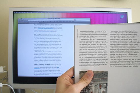
The size of the font you are reading now is not big. This is the size that the browser uses by default (meaning the author’s site , but it’s lying, radish!) .
We do not want to click the more / less buttons or change the browser settings. We want to start reading right away.
At the beginning, creating a good layout with large fonts is more difficult, but these difficulties will help you to design a simpler and clearer site ( eng ). Filling the site with a bunch of information is easy, unlike how to make the site easier to use. At first you will be shocked at how big the font size is, but in a day you don’t want to see a text size smaller than 100% for the main text (depending on what is in the settings) . It looks great at first glance, but after you start using it, you will quickly understand why the creators of all browsers have chosen such a default font size.
Let your text breathe. Using empty space is not a fad of a separate designer and is not related to the sense of beauty ( eng ).
The use of empty space reduces the voltage level, as it makes it easier to focus on the main thing. You do not need to fill the entire browser window. The fact that the empty space makes the site more pleasant is not an accidental effect: it is a logical consequence of constructive design. Who said that sites should be filled with a string?
Please make sure that the column is not too wide and that you have added empty space on the left and on the right so that it is easier for the eye to jump (from one part of the page to another). We (users) do not want to change the font or window size. We want to start reading it right away. Reasonable column width adjustment is nice; non-ending lines of text across the screen - no.
The simple rule: 10-15 words per line (this is for English; for Russian, where words are on average longer, you should take a smaller value) . For rubber layout, at 100% of the font size, half the window for the main column will be a good solution at most screen resolutions.
Here is what the reading experts say (exactly) :
HTML interlining is too low by default. If you enlarge it, the text will become more readable. 140% will be just right.
This is not even necessary to talk about. But if you use any of the following combinations:
- light gray text on dark gray background
- silver text on a snowy white background
- gray on yellow
- yellow on red
- green on red and so on ...
... it means that you are not a web designer, but only a designer-tyrant (as I translated “with an attitude”, thanks to the commentators) . If you insist on being your web designer, you should know that no one can even read what you wrote. Stop this absurdity and allow people to read what you write. Note that for screen design the strongest contrast is also imperfect, as the letters begin to flicker (flicker; it seems that there is a drawing irregularity) . Try # 333 on the #fff background.
We want to search for text, copy text, save text, play with the cursor and select / mark it while we read. The text in the images looks nice, but the pleasantness is not what the Internet is for ( eng ). It exists for communication and access to information, and this information should be easy to read, scale, quote, copy and transmit.
If you cannot make a website that looks good without text encased in images, you will need to start (learn, or what?) From the very beginning.
If you want more sites to be easier to read, tell others about this manifesto. Put a link to this page on your websites, blogs, so that people know how to make their websites more readable.
____ from the translator ____
Firefox 3.0.5 allows you to not depend on the desires of designers, it transparently remembers the zoom settings for each site (previously the add-on “No Squint” was needed).
Rostislav Chebykin in his book mentions that in CSS the font size (size) is preferable to indicate as
The author of the article, Oliver, would like to think about such problems in readability of his site as:
a) severe difficulties in finding a visited link in the text (almost no different from the main text),
b) it is difficult to read the date of writing the article and comments - they are simply not there.
Most sites are filled to the top with small text that hurts to read. But why? There is no reason to press so much information into the screen. This is a stupid collective error, which refers to the times when the screens were really small. So that…
Screen and magazine: 100% font size is not much. Photographer: Wilson Miner.
Do not make us change the font size.
We do not want to change the browser settings every time we visit a new site!')
Don't say crowded sites look better.
Crowded sites don't look good: they look nasty. Cluttering the pages of everyone in a row never improved usability. Being lazy, you fill us with all the information indiscriminately. We want you to think and select only the most important. We do not want to do your work.Don't say scrolling is bad
Because then it turns out that all sites are bad. There is nothing wrong with scrolling. Just as there is nothing wrong with turning the pages of a book.Do not say that the text is not important
95% of web design is typography ( eng ).Don't make us wear glasses
Instead, keep your head away from the monitor, lean back and continue reading (apparently your site) in a relaxed pose.Five simple rules
1. Leave the font size for the main text as is
The size of the font you are reading now is not big. This is the size that the browser uses by default (meaning the author’s site , but it’s lying, radish!) .
We do not want to click the more / less buttons or change the browser settings. We want to start reading right away.
At the beginning, creating a good layout with large fonts is more difficult, but these difficulties will help you to design a simpler and clearer site ( eng ). Filling the site with a bunch of information is easy, unlike how to make the site easier to use. At first you will be shocked at how big the font size is, but in a day you don’t want to see a text size smaller than 100% for the main text (depending on what is in the settings) . It looks great at first glance, but after you start using it, you will quickly understand why the creators of all browsers have chosen such a default font size.
2. Empty space is the active design element.
Let your text breathe. Using empty space is not a fad of a separate designer and is not related to the sense of beauty ( eng ).
“The width of the column should be proportional to the font size. Too wide columns tire the eyes and still have some (what?) Adverse psychological effect. Too compressed can also interfere, because they interrupt the process of reading and frustrate the reader, forcing the eyes to replace the line too often. "
Josef Muller-Brockmann, Grid Systems
The use of empty space reduces the voltage level, as it makes it easier to focus on the main thing. You do not need to fill the entire browser window. The fact that the empty space makes the site more pleasant is not an accidental effect: it is a logical consequence of constructive design. Who said that sites should be filled with a string?
Muller-Brockmann: “The question of column width is not only a question of the design or format of the site; the issue of clarity is equally important. "
Please make sure that the column is not too wide and that you have added empty space on the left and on the right so that it is easier for the eye to jump (from one part of the page to another). We (users) do not want to change the font or window size. We want to start reading it right away. Reasonable column width adjustment is nice; non-ending lines of text across the screen - no.
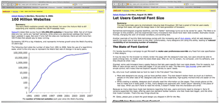
The usability king, Jacob Nielsen, recently added a putty space on his website and limited the maximum width of the content (left picture). In the previous version (the picture on the right) the article expanded to the full window. Slightly increase the line spacing, and you will be perfect, Jacob.
The simple rule: 10-15 words per line (this is for English; for Russian, where words are on average longer, you should take a smaller value) . For rubber layout, at 100% of the font size, half the window for the main column will be a good solution at most screen resolutions.
3. Change the line height to readable.
Here is what the reading experts say (exactly) :
Lines of text that are too closely interfere with the speed of reading because in this case the adjacent lines are read at the same time. The eye cannot focus on overly close lines and ... the reader spends energy in the wrong place and gets tired faster. All the same remains true for lines that are too far apart.
HTML interlining is too low by default. If you enlarge it, the text will become more readable. 140% will be just right.
4. Use contrasting colors.
This is not even necessary to talk about. But if you use any of the following combinations:
- light gray text on dark gray background
- silver text on a snowy white background
- gray on yellow
- yellow on red
- green on red and so on ...
... it means that you are not a web designer, but only a designer-tyrant (as I translated “with an attitude”, thanks to the commentators) . If you insist on being your web designer, you should know that no one can even read what you wrote. Stop this absurdity and allow people to read what you write. Note that for screen design the strongest contrast is also imperfect, as the letters begin to flicker (flicker; it seems that there is a drawing irregularity) . Try # 333 on the #fff background.
5. No text in the images!
We want to search for text, copy text, save text, play with the cursor and select / mark it while we read. The text in the images looks nice, but the pleasantness is not what the Internet is for ( eng ). It exists for communication and access to information, and this information should be easy to read, scale, quote, copy and transmit.
If you cannot make a website that looks good without text encased in images, you will need to start (learn, or what?) From the very beginning.
Tell people about it
If you want more sites to be easier to read, tell others about this manifesto. Put a link to this page on your websites, blogs, so that people know how to make their websites more readable.
____ from the translator ____
Firefox 3.0.5 allows you to not depend on the desires of designers, it transparently remembers the zoom settings for each site (previously the add-on “No Squint” was needed).
Rostislav Chebykin in his book mentions that in CSS the font size (size) is preferable to indicate as
font-size: 1em; for our case. Standard named designations ( large, medium, small ) and percentages ( font-size: 100%; ) are not suitable because in some cases they can lead to a different display of text.The author of the article, Oliver, would like to think about such problems in readability of his site as:
a) severe difficulties in finding a visited link in the text (almost no different from the main text),
b) it is difficult to read the date of writing the article and comments - they are simply not there.
Source: https://habr.com/ru/post/48862/
All Articles