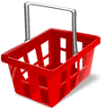
Shopping cart in a modern online store
 Hello, I want to write a series of articles about the usability of web interfaces, and I begin, if not strange, with a shopping cart .
In this article I will try to consider how most of the baskets look now, to analyze their advantages and disadvantages, and also try to create something more modern and convenient.
I warn you right away - I am writing for the first time, so much can be stated far from in the best way.
')
So, let's begin!
Why basket?
“So why the basket?” - you ask.
“What unites all online stores?” - I ask you.
When shopping at the next online store, you may not pay attention to the charms of design, convenience of the catalog or navigation, most likely you will not even know about all the services provided, but you will not be able to pass by the basket.
Standard basket
Let's look at a few baskets from randomly selected sites.

What do we see? It's nice when the basket has an intuitive icon and its name - for some it is “Basket” for others “My basket” or “Your basket”. I note that there is a product in all baskets, but unfortunately this is not clear for everyone. About some baskets the total amount of the selected goods is written, which is very convenient for large purchases.
Ideal basket
So, after seeing the whole variety of baskets, let's try to understand how the ideal basket should look like?
The ideal basket should look like a basket , which is easy to understand empty basket or full , it should not be like a banner , located in the usual place , as well as giving basic information about your purchases.
Consider the main points in more detail:
- “Look like a basket” - the icon should not be a bucket or a box, the more familiar it is, the easier it is to find it;
- “Empty basket or full” - change the icon depending on the quantity of goods, it is very convenient;
- “Does not look like a banner” - I think everyone knows the term “banner blindness”;
- “In the usual place” - usually baskets are placed on the left side of the site (usually above or below the menu) or in the upper right corner;
- "Giving the basic information" - looking at the basket, the buyer should immediately see how many goods he has already chosen and for what amount;
The first picture shows that there are similar baskets, but what will happen if you add an interactive? We do not see what kind of goods in the basket and it is not convenient. Let's make it so that when you hover the mouse, a list of products is displayed .

Modern basket
Now that we have seen the ideal, imagine yourself in a supermarket with an “ideal basket” in which the goods are not visible, but only the quantity and total amount and in order to see what is in it, you need to remove the cape and open the lock. Conveniently?
The modern basket is the “ideal basket” in the modern web. Part of the modern web are large monitor resolutions and interactive user interfaces. Let's try to put everything together and see what happens.

The picture shows that the ideal basket has become even more perfect - now at any moment we can see the entire list of goods with its image and a brief description. We can easily change the order and, if desired, the quantity of goods (in the figure it is not). You can add an item to the cart by simply “over-tying” its image onto the panel. If we do not want to see the selected product at the moment, we will simply hide the panel, but we will still have quick access to it. The panel is located on the right side of the page, due to which texts in the center become easier to read.
Imagine how convenient it will be to assemble a computer from components, seeing that it is already in the basket, or how nice it is to choose furniture with appliances to your new kitchen, remembering what style the refrigerator with a table was chosen.
Dream
Let's look at a few sites for example (sites selected for guessing):
- Oldie - we see a fixed width site, and to the right is an ominous emptiness ...
- Photo.ru is again a fixed site and again a void on a high resolution.
- Offo.ru - see the rubber site, but is it convenient to read the product description?
And now just imagine how these sites will appear with a new basket. Beauty!
Nuances
Of course, the basket that we got at the end is not a standard and it all depends on the specific site, but for the majority this solution will be very acceptable.
If your online store supports “pending goods” (the goods of which are currently unavailable, but which you promise to deliver), then perhaps there should be information about them next to the basket.
There are also shops that are not designed to buy a large number of goods at a time (for example, VIP-salons), then there is not much point in the list of goods, but still we do not forget about the “perfect basket”.
P.S
Exploring the open spaces of habrahabr stumbled upon the online store Gifts of Kamchatka in which the basket is made quite nice, but its disadvantage is that it is at the bottom of the page - it is not always before your eyes and dragging goods into it is not very convenient ... but what a pleasure!
That's all, I hope you enjoy my first job.
In the near future I plan to talk about the basket from the inside, about the process of placing an order, about catalogs and other equally important elements of online stores ... and then we will go further.
And yet - I am not a designer and I do not answer for the beauty of the sketches, the main idea;)
UPD: Unfortunately, the cycle of articles still does not work, but still there is still a desire :)
Source: https://habr.com/ru/post/46265/
All Articles