Mobile usability in e-Commerce: analysis of the TOP-20 online stores in Russia

We analyzed mobile versions of the TOP-20 online stores in Russia for 44 factors. We got a hellish table of ones and zeros, almost disappeared to it, but they gathered our strength and described how and what they “get” the buyer in the top segment of mobile e-Commerce.
To analyze mobile adaptation, we took the TOP-20 online stores from the DataInsight rating. These are the trendsetters that other players are targeting.
The parameters for the assessment are from a large similar study of western retail .
We did not take all the parameters, but identified 44 significant factors. They are grouped into nine groups:
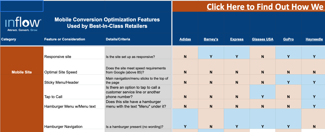
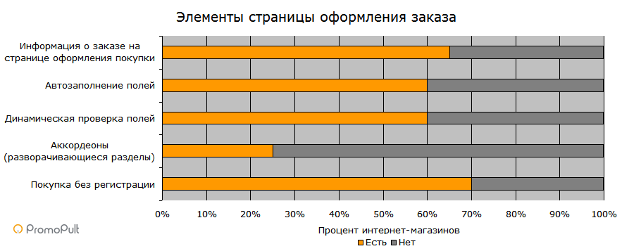
A table with the analysis results for each online store is here . In the article, we will go through each of the 44 elements of mobile usability and look for key trends. At each point, we indicate general statistics: how many stores use / do not use this technique.
Technology
Spoiler. Online stores are abandoning mobile versions in favor of "rubber" sites, but the download speed is still lame.
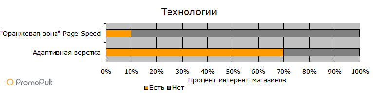
Adaptability vs mobile version
14/6
An adaptive site wins before the mobile version (on a separate subdomain of the form m.site.ru). It does not need to be additionally administered, there is no problem of duplication of content, the same source code is used, which reduces costs.
No wonder 70% of the top online stores in Russia work on the basis of adaptive sites. The mobile version is something from the past.
PageSpeed Insights Orange Zone: Everything is Sad
2/20
Online stores do not have a high page loading speed. High quality scripts and images leave their mark. This is especially reflected in the download speed in the mobile.
Only 1 out of 20 website goes into the green zone when checking with Google PageSpeed Insights . But even reaching the “orange” zone is still difficult - there is also only 1 site here. The remaining 18 sites gain less than 50 points and fall into the red zone.
Thus, if you work to speed up the site, then at least one factor will get an advantage over the top competitors in your niche. In light of Google’s transition to Mobile-first indexing, this is especially true.
Key elements of the template
Spoiler. There are obvious trends: a hamburger menu, a clickable phone number, a search field on the site in the header, and a noticeable basket icon. It’s better not to be creative here, but to keep up with market leaders.
As for fixing the menu, the promo at the bottom of the screen or adding the widget of an online consultant, you need testing in each case.
')
Fixed menu
11/9
The trend towards fixing key menu items at the top of the screen when scrolling the page is implicit, however there is an advantage. This is logical - the most important navigation elements are located in the menu. And it's good when they are at hand when scrolling.
Make sure that the menu does not take up too much screen space to the detriment of other items.
Clickable Phone Number
15/5
All phone numbers on the site must be clickable for instant call. There are no options. Copying a number by switching between phone applications is still a pain.

But, as you see, not all stores adhere to this obvious principle.
Hamburger Menu
19/1
The trend is still in favor of hamburgers, but here it is worth starting from the target site. For a more conservative audience, use the familiar text menu - a hamburger may be left unattended.
Shop Search
16/4
If you have several branded stores, add a search for the nearest store by visitor location. If your products are sold by other resellers, this option is less priority.

If you do not have outlets, add the ability to find the nearest delivery point.
See how popular the store search page is on your web analytics system. If she has high traffic, place a link to her in the menu in the header.
The context for online stores on a professional level and without an agency is in the PromoPult system . Automatic word matching, automatic ad generation, “smart” bid management. Ready-made industry solutions. Real-time statistics.
Conspicuous basket
17/3
It’s important not to be creative here. Everyone knows that the basket should look like a “basket” or “trolley”. Attempts to invent copyright icons or place a basket somewhere at the bottom of the screen result in users having to solve puzzles instead of buying goods.

Fixed promo at the bottom of the screen
4/16
Attach information about special offers or a special CTA at the bottom of the screen, as did the Platypus.
Automatic slide rotation in the main banner
7/13
More and more stores refuse to autorotate images in the upper banner. Among 20 sites, 7 still has such a banner. But 13 do not use this solution. In general, it seems that it's time to say goodbye to banners in the mobile version.
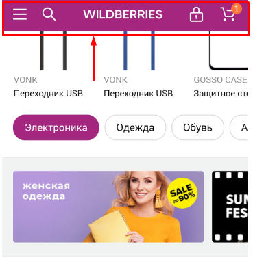
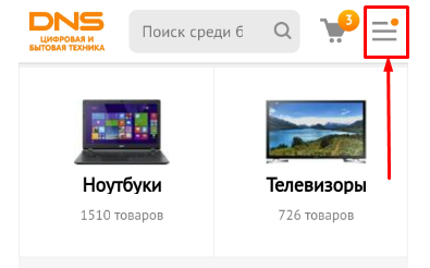
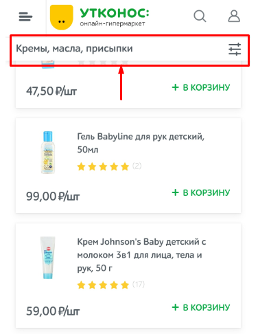
Header search field: must have
20/0
Do not hide the search in the menu, put it in the header. The best option is the magnifying glass icon, by tap on which the search field opens. So you save space.
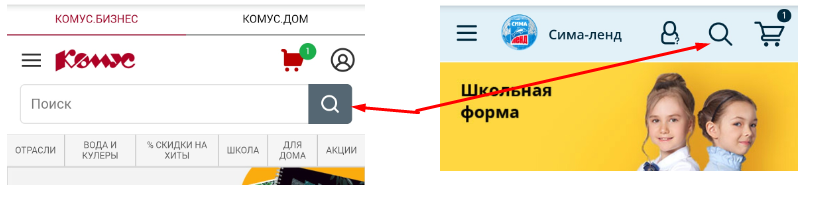
Left - search took a whole line on a small screen. On the right is a dynamic solution.
Online Consultant Widget
3/17
An online consultant is a useful option for eCommerce sites. But in the mobile, this decision is controversial: after all, the widget overlaps part of the content, and it's not easy to hide it.
Test the widget on your audience. Install an online consultant (if you don’t want to pay, there is a free GetSale consultant in the PromoPult conversion enhancement module), customize it to your corporate style and see how many calls / sales will be in a month. And there already make a decision - leave it or remove it.
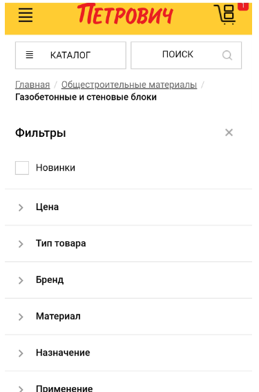
Filters in the catalog
Spoiler. Filters in the catalog are a must have. Desirable - with the simultaneous selection of several parameters. Do not forget about the filter for the price.
Convenient options are fixing the filter during scrolling (the main thing is that it does not take up much space) and indicating the color of the product in the filter is not with text, but with a color picture.
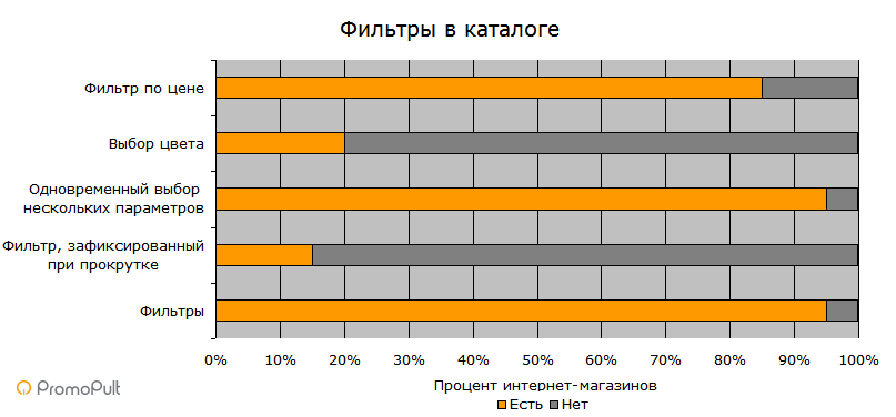
Filters
19/1
Filters simplify navigation. Active use of filters remains a clear trend.
Scrolling Locked Filter
3/17
This is a new solution for mobile interfaces that allows users to filter search results. It seems successful - as if it should be. When scrolling through a catalog, filters are always at hand.
But online stores are not in a hurry to implement filter fixing - perhaps they do not want to block an additional area of the screen (or it is difficult to implement in the adaptive version).
Simultaneous selection of several parameters
19/1
The user should be able to filter products at the same time in different categories. All analyzed sites use exactly these filters (on one site there are no filters at all, therefore there is no such option).

Color selection
4/16
For a better UX, it is recommended that you use color boxes / circles (or a combination of text and color markers) in the color filter - rather than a textual description of the color.
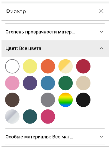
But domestic stores use mostly text.
Filter by price
17/3
Some sites refuse the filter for the price. They explain this by focusing on the product, rather than its value. But in most stores there is such a filter. And it is really useful.
Catalog Page Elements
Spoiler. Among the obvious trends are the ability to add products from the catalog to the basket, displaying product ratings and discounts. But scrolling through the images of goods in the catalog, viewing their options and auto-loading goods instead of pagination is still a novelty.

Auto-loading of goods instead of pagination
3/17
Tapping on the arrow “next page” is not as convenient as just flipping down. But the output of goods not by 10-20-50 per page, but by an “endless” ribbon, which is loaded as it scrolls, is still exotic.
From the point of view of usability, an intermediate solution is also convenient: when pagination is saved, but the "Show" button is added. It is easier for a mobile user to click on a large button and expand the list of products than to click on numbers / arrows.

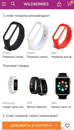
View multiple product images in a catalog
1/19
Usually in the catalog one image of the goods is presented. But there is a solution that allows you to scroll through images directly in the catalog without going to the product card. It’s convenient for a mobile user, since you don’t need to go to a new page once again. In domestic practice, this is still a novelty.
Mark "New"
10/10
For stores with a high return rate, the “New” mark is a way to attract visitors to products that they have not yet seen.
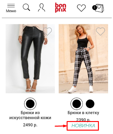
If updating the assortment for a permanent target audience is not your key task, pay attention to other qualities of the product and do not waste space on the “new!” Icon.
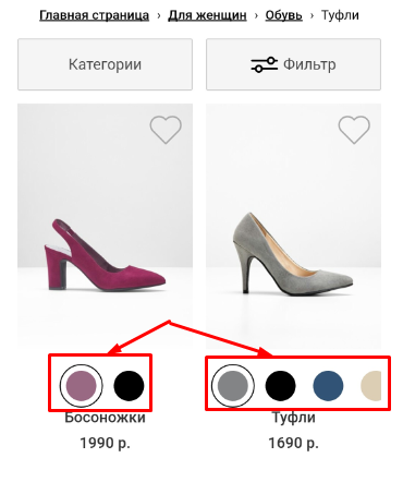
View product options on the categories page
2/18
On desktop versions of stores there is the opportunity to view color options for one product on the category page. On mobile, this option is better to refuse, since it is difficult to get your finger into the tiny icons for viewing options. It is better to limit yourself to the inscription "there are different colors" and show them already on the product page, where the pictures will take up more space and it will be more convenient to scroll through them.
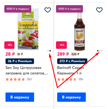
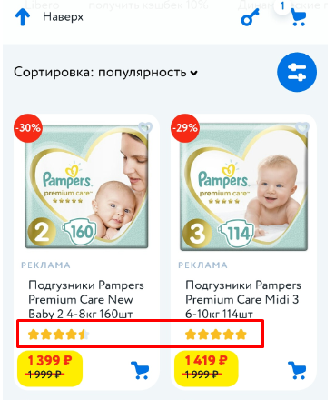
Product ratings on the categories page
15/5
You can’t say for sure how adding stars and indicating the number of reviews under the product image will affect sales. Judging by the fact that they are used by a large number of studied stores, it works. But still, it makes sense to test this parameter in each specific case - not all stores gain a lot of reviews for a large mass of goods.
Display of discounts - in categories and on the card
18/2
On the category page, discounted prices should be shown in larger print and, possibly, in color, next to the crossed out price without a discount. But the wording “you save so much” is better left for the product page - in order to save space.
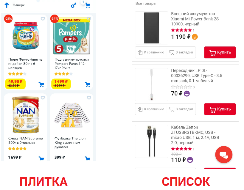
Tile vs list
9/11
For stores with a large assortment, for which fast and convenient browsing is important, the output of goods is preferable to tiles. However, in the premium segment or other categories where you need to give more information about the product, it is worth listing products.
Option "Add to Cart"
16/4
The ability to add goods to the basket without going to the description page makes sense for simple products that are well known to the buyer (for example, ordering food). In other cases, it is better to test - if users click on this button, leave it. Otherwise, do not waste your screen space.
Product Comparison
8/12
Often this option is inconvenient to use on mobile. Therefore, it needs to be either well thought out or completely abandoned in mobile versions.
Product Page Elements
Spoiler. Enlarged product images enhance the user experience. Useful and video products, they allow you to consider the product "live". It will not be superfluous to block sharing cards of goods in social networks and instant messengers.
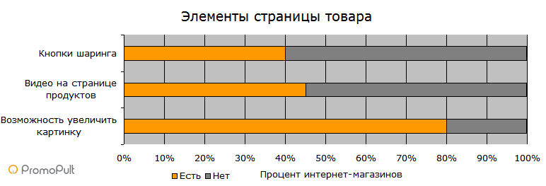
The ability to enlarge the picture
16/4
There are two options: increasing the image when you click on it or the ability to “stretch” it with your fingers. This is an option expected by users, so most sites use this practice.
Video on product page
9/11
9 sites out of 20 sites in the study post videos on product pages. Of course, for each product to remove the video is expensive. But for the most popular products, it’s worth it.
Social sharing buttons
8/12
This option is not so readily used by online stores. Perhaps the reason is its low popularity - if users need to share the link, they simply copy it from the browser line (and on a smartphone it’s easier to take a screenshot and immediately send it). But the button for sharing the page does not take up much space, so it will not be superfluous.
Personalization Elements
Spoiler. Cross-selling and up-selling elements that offer users products based on their preferences increase sales. Not to use them means to lose income.
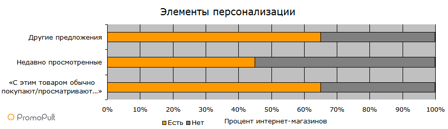
“They usually buy / browse with this product ...”
13/7
If the selected product requires mandatory additions, this block is definitely needed. Display it on the product page and after the product is added to the basket. So you increase cross-selling.
Recently viewed
9/11
This is a convenient opportunity to quickly return to a previously interested page. But only 45% of the analyzed stores have this option.
Other offers
13/7
Messages like “You will also like ...”, “More from this brand ...”, etc. become familiar elements of product pages of not only desktop, but also mobile stores.
Adding item to cart
Spoiler. Do not redirect the user to the basket after adding the product. But a preview of the basket in the pop-up window will be useful.
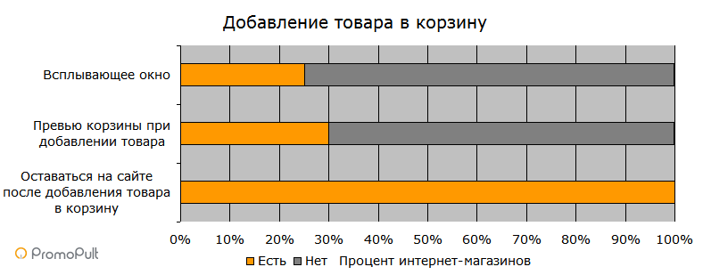
Stay on the site after adding the product to the cart
20/0
After adding the product to the basket, it is recommended to leave the user on the product page, and not redirect to the checkout section. This is what leaders do - which means it's justified.
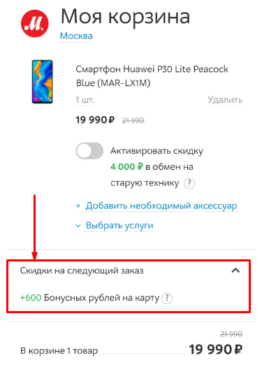
Preview basket when adding goods
6/14
This is a good way to show what is in the basket without going into it. But only 30% of stores have implemented it - so now you know how to get around them with at least one factor.
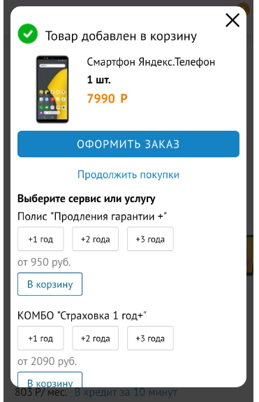
Recycle bin popup
5/15
A pop-up window is convenient for confirming the addition of goods to the basket. This window can display the entire contents of the basket. Closing it, the user remains on the product page.
Cart items
Spoiler. Shopping cart is an important conversion page. No mistakes can be made here. Be sure to display a product image with a brief description. Among the useful options are an indication of delivery times, a reminder of the benefits and the ability to save the basket. But duplication of the payment / order button can be abandoned.
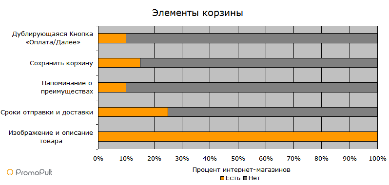
Product image and description
20/0
The basket should display a photo of each product. A brief description of the main characteristics (name, size, color, etc.) is also mandatory. Limited screen space does not mean that users do not care what is in their basket.
Delivery and Delivery Dates
5/15
If at this stage you cannot guarantee specific delivery times, indicate at least when you plan to send the goods.
Benefit Reminder
2/18
The basket will not be amiss to recall the bonuses that the buyer receives. For example, free delivery, next day delivery, free return, bonus, warranty period, etc.
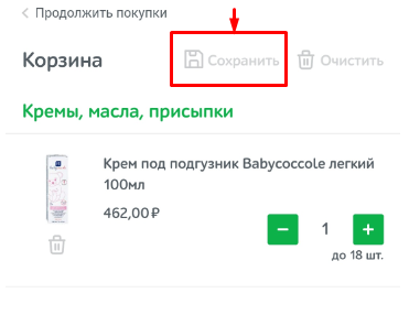
Save Cart
3/17
85% of sites from the sample refused the opportunity to save the basket and return to it in the future. However, do not rush to conclusions and remove such an option. This is a convenient option for users who regularly buy a similar set of products (for example, food). In other cases, this option allows you to keep a person who is not planning to buy now. (The question remains how to identify the buyer without registration and after the cookies burn out).
Button "Payment / Next"
2/18
For a while, there was a trend toward placing a button for switching to the payment page at the top and bottom of the basket. But almost all of them refused duplication of buttons.
Checkout Page Elements
Spoiler. Make ordering simple and straightforward. Do not force a person to register - foresee a one-click purchase. Implement dynamic validation and auto-complete fields. Also briefly indicate order information on the checkout page. So the user does not have to go back to clarify the order.
Purchase without registration
14/6
Some major brands can afford to require customers to register. But still, you should leave users the opportunity to buy without a login.
If you offer registration, explain why you need it (participation in a private club, additional bonuses, discounts, etc.).
Accordions (expandable sections)
5/15
Accordions are an economical solution for mobile sites. It is convenient for filling out individual sections on the checkout page. But not everyone uses it.
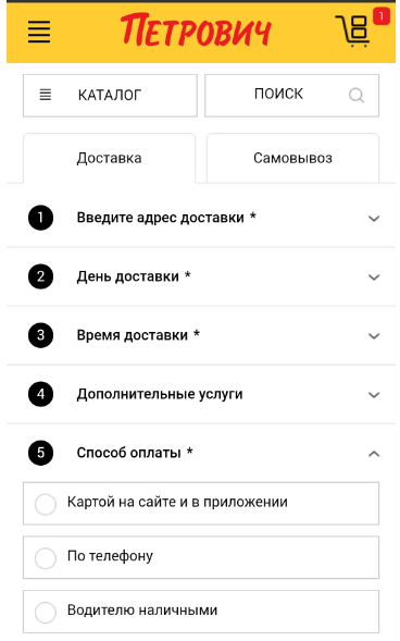
Dynamic field check
12/8
Checking the correctness of the entered data as the fields are filled (and not after the "send" button) saves users time and nerves - they immediately see what is filled in incorrectly. Surprisingly - not everyone does this.
Autocomplete fields
12/8
Autofill (address, phone, email, etc.) speeds up checkout and reduces the chance of errors.
Order information on the checkout page
13/7
A brief description of the order on the checkout page is useful because the buyer sees what goods he is purchasing (and if he has forgotten about something, he does not need to return to the basket and restart the checkout).
Usability for mobile devices is not a place for creativity
Exactly. When you browse the top online stores on your mobile, the feeling of déjà vu doesn’t leave you - where have you already seen this menu, somewhere there was a similar product card or basket. And this is good. Do not try to surprise the user with the exclusive layout of the menu or the appearance of the icons. Let everything be familiar and familiar.
Mobile usability is not about creativity, but about details. High speed of the site, convenient button size, noticeable elements, lack of piling and unnecessary options.
Try to drive the user less through the pages - everything should be at hand at the right time. For example, a person ordered a refrigerator, but remembered that he still needed a UPS, and then a cross-selling widget in a basket. Or he indicated the wrong phone format - and an error is displayed immediately. Pay attention to such moments.
And all will be well.
Source: https://habr.com/ru/post/461913/
All Articles