Hierarchical clustering of categorical data in R
The translation was prepared for students of the course “Applied Analytics on R” .

This was my first attempt to cluster clients based on real data, and it gave me valuable experience. There are many articles on the Internet about clustering using numerical variables, but finding solutions for categorical data, which is somewhat more difficult, was not so simple. Clustering methods for categorical data are still under development, and in another post I am going to try another one.
On the other hand, many people think that clustering categorical data may not produce meaningful results - and this is partly true (see the excellent discussion on CrossValidated ). At one point, I thought: “What am I doing? They can simply be divided into cohorts. ” However, cohort analysis is also not always advisable, especially with a significant number of categorical variables with a large number of levels: you can easily deal with 5-7 cohorts, but if you have 22 variables and each has 5 levels (for example, a customer survey with discrete estimates 1 , 2, 3, 4 and 5), and you need to understand what characteristic groups of clients you are dealing with - you will get 22x5 cohorts. No one wants to bother with such a task. And here clustering could help. So in this post I’ll talk about what I myself would like to know as soon as I started clustering.
')
The clustering process itself consists of three steps:
This post will be a kind of introduction that describes the basic principles of clustering and its implementation in the environment R.
The basis for clustering will be the dissimilarity matrix, which in mathematical terms describes how different the points in the data set are (removed) from each other. It allows you to further combine into groups those points that are closest to each other, or to separate the most distant from each other - this is the main idea of clustering.
At this stage, differences between data types are important, since the dissimilarity matrix is built on the basis of the distances between the individual data points. It is easy to imagine the distances between the points of numerical data (a well-known example is Euclidean distances ), but in the case of categorical data (factors in R), everything is not so obvious.
In order to construct a dissimilarity matrix in this case, the so-called Gover distance should be used. I will not delve into the mathematical part of this concept, I will simply provide links: here and there . For this, I prefer to use
The dissimilarity matrix is ready. For 200 observations, it is built quickly, but may require a very large amount of computation if you are dealing with a large data set.
In practice, it is very likely that you will first have to clean the data set, perform the necessary transformations from the rows into factors, and track the missing values. In my case, the data set also contained rows of missing values, which were beautifully clustered each time, so it seemed like it was a treasure, until I looked at the values (alas!).
You may already know that clustering is k-means and hierarchical . In this post, I focus on the second method, since it is more flexible and allows various approaches: you can choose either agglomerative (from bottom to top) or divisional (top to bottom) clustering algorithm.
Source: UC Business Analytics R Programming Guide
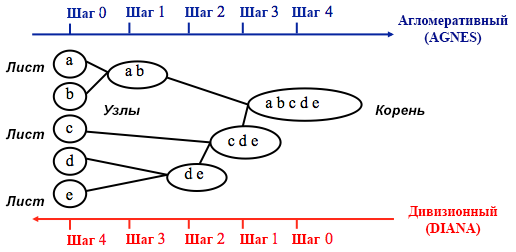
Agglomerative clustering begins with
Divisional clustering is performed in the opposite way - it is initially assumed that all n data points that we have are one large cluster, and then the least similar ones are divided into separate groups.
When deciding which of these methods to choose, it always makes sense to try all the options, however, in general, agglomerative clustering is better for identifying small clusters and is used by most computer programs, and divisional clustering is more suitable for identifying large clusters .
Personally, before deciding which method to use, I prefer to look at dendrograms - a graphical representation of clustering. As you will see later, some dendrograms are well balanced, while others are very chaotic.
# The main input for the code below is the dissimilarity (distance matrix)
At this stage, it is necessary to make a choice between different clustering algorithms and a different number of clusters. You can use different methods of assessment, not forgetting to be guided by common sense . I highlighted these words in bold and italics, because the meaningfulness of the choice is very important - the number of clusters and the method of dividing data into groups should be practical. The number of combinations of values of categorical variables is finite (since they are discrete), but not any breakdown based on them will be meaningful. You may also not want to have very few clusters - in this case they will be too generalized. In the end, it all depends on your goal and the tasks of the analysis.
In general, when creating clusters, you are interested in obtaining clearly defined groups of data points, so that the distance between such points within the cluster ( or compactness ) is minimal, and the distance between groups ( separability ) is the maximum possible. This is easy to understand intuitively: the distance between the points is a measure of their dissimilarity, obtained on the basis of the dissimilarity matrix. Thus, the assessment of the quality of clustering is based on the assessment of compactness and separability.
Next, I will demonstrate two approaches and show that one of them can give meaningless results.
In practice, these two methods often give different results, which can lead to some confusion - the maximum compactness and the clearest separation will be achieved with a different number of clusters, so common sense and understanding of what your data really means will play an important role when making a final decision.
There are also a number of metrics that you can analyze. I will add them directly to the code.
So, the average.within indicator, which represents the average distance between observations within clusters, decreases, as does within.cluster.ss (the sum of the squares of the distances between observations in a cluster). The average width of the silhouette (avg.silwidth) does not change so unambiguously, however, an inverse relationship can still be seen.
Notice how disproportionate cluster sizes are. I would not rush to work with an incomparable number of observations within clusters. One of the reasons is that the data set may be unbalanced, and some group of observations will outweigh all the others in the analysis - this is not good and will most likely lead to errors.
Notice how agglomerative hierarchical clustering based on the full communication method is balanced in terms of the number of observations per group.
So, we have created a graph of the "elbow". It shows how the sum of the squared distances between the observations (we use it as a measure of the proximity of the observations - the smaller it is, the closer the measurements inside the cluster are to each other) varies for a different number of clusters. Ideally, we should see a distinct “elbow bend” at the point where further clustering gives only a slight decrease in the sum of squares (SS). For the graph below, I would stop at about 7. Although in this case one of the clusters will consist of only two observations. Let's see what happens during agglomerative clustering.
Agglomerative "elbow" is similar to divisional, but the graph looks smoother - bends are not so pronounced. As with divisional clustering, I would focus on 7 clusters, however, when choosing between the two methods, I like the cluster sizes that are obtained by the agglomerative method better — it is better that they are comparable with each other.
When using the silhouette estimation method, you should choose the amount that gives the maximum silhouette coefficient, because you need clusters that are far enough apart to be considered separate.
The silhouette coefficient can range from –1 to 1, with 1 corresponding to good consistency within the clusters, and –1 not very good.
In the case of the above chart, you would choose 9 rather than 5 clusters.
For comparison: in the “simple” case, the silhouette graph is similar to the one below. Not quite like ours, but almost.
Source: Data Sailors
The silhouette width chart tells us: the more you split the data set, the clearer the clusters become. However, in the end you will reach individual points, and you do not need this. However, this is exactly what you will see if you start to increase the number of clusters k . For example, for
To summarize: the more you split the dataset, the better the clusters, but we cannot reach individual points (for example, in the chart above we selected 30 clusters, and we only have 200 data points).
So, agglomerative clustering in our case seems to me much more balanced: cluster sizes are more or less comparable (just look at a cluster of only two observations when dividing by the divisional method!), And I would stop at 7 clusters obtained by this method. Let's see how they look and what they are made of.
The data set consists of 6 variables that need to be visualized in 2D or 3D, so you have to work hard! The nature of categorical data also imposes some limitations, so ready-made solutions may not work. I need to: a) see how observations are divided into clusters, b) understand how observations are categorized. Therefore, I created a) a color dendrogram, b) a heat map of the number of observations per variable inside each cluster.
The heat map graphically shows how many observations are made for each factor level for the initial factors (the variables we started with). Dark blue color corresponds to a relatively large number of observations within the cluster. This heat map also shows that for the day of the week (sun, sat ... mon) and the basket size (large, med, small), the number of customers in each cell is almost the same - this may mean that these categories are not determinative for analysis, and Perhaps they do not need to be taken into account.
In this article, we calculated the dissimilarity matrix, tested the agglomerative and divisional methods of hierarchical clustering, and familiarized ourselves with the elbow and silhouette methods for assessing the quality of clusters.
Divisional and agglomerative hierarchical clustering is a good start to study the topic, but do not stop there if you want to really master cluster analysis. There are many other methods and techniques. The main difference from clustering numerical data is the calculation of the dissimilarity matrix. When assessing the quality of clustering, not all standard methods will give reliable and meaningful results - the silhouette method is very likely not suitable.
And finally, since some time has passed since I made this example, now I see a number of shortcomings in my approach and will be glad to any feedback. One of the significant problems of my analysis was not related to clustering as such - my data set was unbalanced in many ways, and this moment remained unaccounted for. This had a noticeable effect on clustering: 70% of clients belonged to one level of the “citizenship” factor, and this group dominated most of the clusters obtained, so it was difficult to calculate the differences within other levels of the factor. Next time I will try to balance the data set and compare the clustering results. But about this - in another post.
Finally, if you want to clone my code, here is the link to github: https://github.com/khunreus/cluster-categorical
I hope you enjoyed this article!
Hierarchical clustering guide (data preparation, clustering, visualization) - this blog will be interesting for those who are interested in business analytics in the R environment: http://uc-r.imtqy.com/hc_clustering and https: // uc-r. imtqy.com/kmeans_clustering
Clustering: http://www.sthda.com/english/articles/29-cluster-validation-essentials/97-cluster-validation-statistics-must-know-methods/
( k-): https://eight2late.wordpress.com/2015/07/22/a-gentle-introduction-to-cluster-analysis-using-r/
denextend, : https://cran.r-project.org/web/packages/dendextend/vignettes/introduction.html#the-set-function
, : https://www.r-statistics.com/2010/06/clustergram-visualization-and-diagnostics-for-cluster-analysis-r-code/
: https://jcoliver.imtqy.com/learn-r/008-ggplot-dendrograms-and-heatmaps.html
, https://www.ncbi.nlm.nih.gov/pmc/articles/PMC5025633/ (repository on GitHub: https://github.com/khunreus/EnsCat ).
This was my first attempt to cluster clients based on real data, and it gave me valuable experience. There are many articles on the Internet about clustering using numerical variables, but finding solutions for categorical data, which is somewhat more difficult, was not so simple. Clustering methods for categorical data are still under development, and in another post I am going to try another one.
On the other hand, many people think that clustering categorical data may not produce meaningful results - and this is partly true (see the excellent discussion on CrossValidated ). At one point, I thought: “What am I doing? They can simply be divided into cohorts. ” However, cohort analysis is also not always advisable, especially with a significant number of categorical variables with a large number of levels: you can easily deal with 5-7 cohorts, but if you have 22 variables and each has 5 levels (for example, a customer survey with discrete estimates 1 , 2, 3, 4 and 5), and you need to understand what characteristic groups of clients you are dealing with - you will get 22x5 cohorts. No one wants to bother with such a task. And here clustering could help. So in this post I’ll talk about what I myself would like to know as soon as I started clustering.
')
The clustering process itself consists of three steps:
- Building a matrix of dissimilarity is undoubtedly the most important decision in clustering. All subsequent steps will be based on the dissimilarity matrix you created.
- The choice of clustering method.
- Cluster Evaluation.
This post will be a kind of introduction that describes the basic principles of clustering and its implementation in the environment R.
Dissimilarity matrix
The basis for clustering will be the dissimilarity matrix, which in mathematical terms describes how different the points in the data set are (removed) from each other. It allows you to further combine into groups those points that are closest to each other, or to separate the most distant from each other - this is the main idea of clustering.
At this stage, differences between data types are important, since the dissimilarity matrix is built on the basis of the distances between the individual data points. It is easy to imagine the distances between the points of numerical data (a well-known example is Euclidean distances ), but in the case of categorical data (factors in R), everything is not so obvious.
In order to construct a dissimilarity matrix in this case, the so-called Gover distance should be used. I will not delve into the mathematical part of this concept, I will simply provide links: here and there . For this, I prefer to use
daisy() with the metric = c("gower") from the cluster package. #----- -----# # , , , , library(dplyr) # set.seed(40) # # ; data.frame() # , 200 1 200 id.s <- c(1:200) %>% factor() budget.s <- sample(c("small", "med", "large"), 200, replace = T) %>% factor(levels=c("small", "med", "large"), ordered = TRUE) origins.s <- sample(c("x", "y", "z"), 200, replace = T, prob = c(0.7, 0.15, 0.15)) area.s <- sample(c("area1", "area2", "area3", "area4"), 200, replace = T, prob = c(0.3, 0.1, 0.5, 0.2)) source.s <- sample(c("facebook", "email", "link", "app"), 200, replace = T, prob = c(0.1,0.2, 0.3, 0.4)) ## — dow.s <- sample(c("mon", "tue", "wed", "thu", "fri", "sat", "sun"), 200, replace = T, prob = c(0.1, 0.1, 0.2, 0.2, 0.1, 0.1, 0.2)) %>% factor(levels=c("mon", "tue", "wed", "thu", "fri", "sat", "sun"), ordered = TRUE) # dish.s <- sample(c("delicious", "the one you don't like", "pizza"), 200, replace = T) # data.frame() synthetic.customers <- data.frame(id.s, budget.s, origins.s, area.s, source.s, dow.s, dish.s) #----- -----# library(cluster) # # : daisy(), diana(), clusplot() gower.dist <- daisy(synthetic.customers[ ,2:7], metric = c("gower")) # class(gower.dist) ## , The dissimilarity matrix is ready. For 200 observations, it is built quickly, but may require a very large amount of computation if you are dealing with a large data set.
In practice, it is very likely that you will first have to clean the data set, perform the necessary transformations from the rows into factors, and track the missing values. In my case, the data set also contained rows of missing values, which were beautifully clustered each time, so it seemed like it was a treasure, until I looked at the values (alas!).
Clustering Algorithms
You may already know that clustering is k-means and hierarchical . In this post, I focus on the second method, since it is more flexible and allows various approaches: you can choose either agglomerative (from bottom to top) or divisional (top to bottom) clustering algorithm.
Source: UC Business Analytics R Programming Guide
Agglomerative clustering begins with
n clusters, where n is the number of observations: it is assumed that each of them is a separate cluster. Then the algorithm tries to find and group the most similar data points among themselves - this is how cluster formation begins.Divisional clustering is performed in the opposite way - it is initially assumed that all n data points that we have are one large cluster, and then the least similar ones are divided into separate groups.
When deciding which of these methods to choose, it always makes sense to try all the options, however, in general, agglomerative clustering is better for identifying small clusters and is used by most computer programs, and divisional clustering is more suitable for identifying large clusters .
Personally, before deciding which method to use, I prefer to look at dendrograms - a graphical representation of clustering. As you will see later, some dendrograms are well balanced, while others are very chaotic.
# The main input for the code below is the dissimilarity (distance matrix)
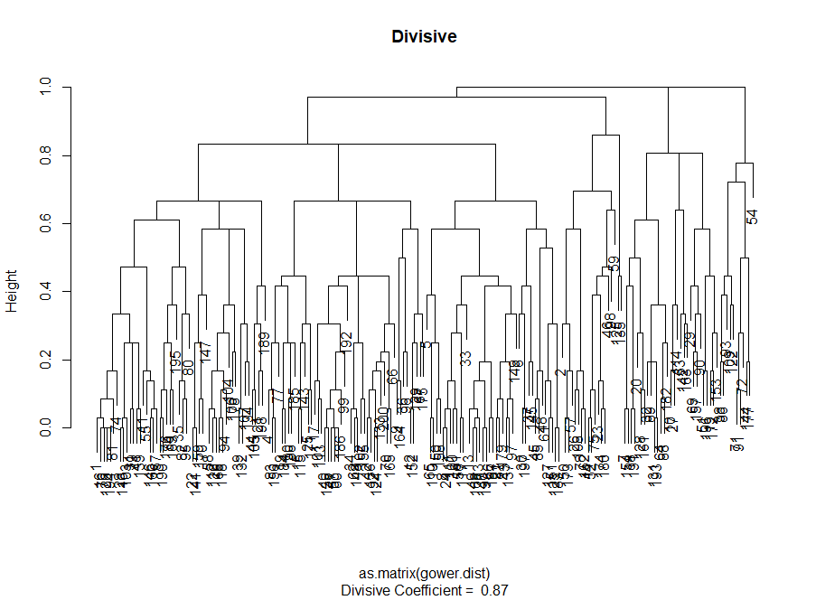
# # — — #------------ ------------# divisive.clust <- diana(as.matrix(gower.dist), diss = TRUE, keep.diss = TRUE) plot(divisive.clust, main = "Divisive") #------------ ------------# # # — , # (complete linkages) aggl.clust.c <- hclust(gower.dist, method = "complete") plot(aggl.clust.c, main = "Agglomerative, complete linkages") Clustering Quality Assessment
At this stage, it is necessary to make a choice between different clustering algorithms and a different number of clusters. You can use different methods of assessment, not forgetting to be guided by common sense . I highlighted these words in bold and italics, because the meaningfulness of the choice is very important - the number of clusters and the method of dividing data into groups should be practical. The number of combinations of values of categorical variables is finite (since they are discrete), but not any breakdown based on them will be meaningful. You may also not want to have very few clusters - in this case they will be too generalized. In the end, it all depends on your goal and the tasks of the analysis.
In general, when creating clusters, you are interested in obtaining clearly defined groups of data points, so that the distance between such points within the cluster ( or compactness ) is minimal, and the distance between groups ( separability ) is the maximum possible. This is easy to understand intuitively: the distance between the points is a measure of their dissimilarity, obtained on the basis of the dissimilarity matrix. Thus, the assessment of the quality of clustering is based on the assessment of compactness and separability.
Next, I will demonstrate two approaches and show that one of them can give meaningless results.
- Elbow method : start with it if the most important factor for your analysis is the compactness of the clusters, i.e. similarity within the groups.
- Silhouettes Assessment Method : The silhouette graph used as a measure of data consistency shows how close each of the points within the same cluster is to the points in neighboring clusters.
In practice, these two methods often give different results, which can lead to some confusion - the maximum compactness and the clearest separation will be achieved with a different number of clusters, so common sense and understanding of what your data really means will play an important role when making a final decision.
There are also a number of metrics that you can analyze. I will add them directly to the code.
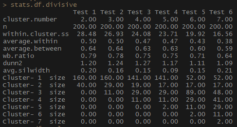
# , # , , — # , , , , library(fpc) cstats.table <- function(dist, tree, k) { clust.assess <- c("cluster.number","n","within.cluster.ss","average.within","average.between", "wb.ratio","dunn2","avg.silwidth") clust.size <- c("cluster.size") stats.names <- c() row.clust <- c() output.stats <- matrix(ncol = k, nrow = length(clust.assess)) cluster.sizes <- matrix(ncol = k, nrow = k) for(i in c(1:k)){ row.clust[i] <- paste("Cluster-", i, " size") } for(i in c(2:k)){ stats.names[i] <- paste("Test", i-1) for(j in seq_along(clust.assess)){ output.stats[j, i] <- unlist(cluster.stats(d = dist, clustering = cutree(tree, k = i))[clust.assess])[j] } for(d in 1:k) { cluster.sizes[d, i] <- unlist(cluster.stats(d = dist, clustering = cutree(tree, k = i))[clust.size])[d] dim(cluster.sizes[d, i]) <- c(length(cluster.sizes[i]), 1) cluster.sizes[d, i] } } output.stats.df <- data.frame(output.stats) cluster.sizes <- data.frame(cluster.sizes) cluster.sizes[is.na(cluster.sizes)] <- 0 rows.all <- c(clust.assess, row.clust) # rownames(output.stats.df) <- clust.assess output <- rbind(output.stats.df, cluster.sizes)[ ,-1] colnames(output) <- stats.names[2:k] rownames(output) <- rows.all is.num <- sapply(output, is.numeric) output[is.num] <- lapply(output[is.num], round, 2) output } # : 7 # , stats.df.divisive <- cstats.table(gower.dist, divisive.clust, 7) stats.df.divisive So, the average.within indicator, which represents the average distance between observations within clusters, decreases, as does within.cluster.ss (the sum of the squares of the distances between observations in a cluster). The average width of the silhouette (avg.silwidth) does not change so unambiguously, however, an inverse relationship can still be seen.
Notice how disproportionate cluster sizes are. I would not rush to work with an incomparable number of observations within clusters. One of the reasons is that the data set may be unbalanced, and some group of observations will outweigh all the others in the analysis - this is not good and will most likely lead to errors.
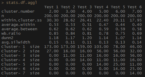
stats.df.aggl <-cstats.table(gower.dist, aggl.clust.c, 7) #stats.df.agglNotice how agglomerative hierarchical clustering based on the full communication method is balanced in terms of the number of observations per group.
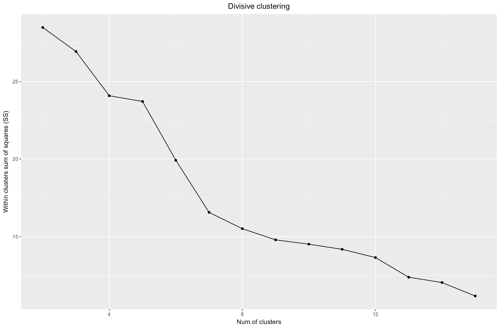
# --------- ---------# # «» # , 7 library(ggplot2) # # ggplot(data = data.frame(t(cstats.table(gower.dist, divisive.clust, 15))), aes(x=cluster.number, y=within.cluster.ss)) + geom_point()+ geom_line()+ ggtitle("Divisive clustering") + labs(x = "Num.of clusters", y = "Within clusters sum of squares (SS)") + theme(plot.title = element_text(hjust = 0.5)) So, we have created a graph of the "elbow". It shows how the sum of the squared distances between the observations (we use it as a measure of the proximity of the observations - the smaller it is, the closer the measurements inside the cluster are to each other) varies for a different number of clusters. Ideally, we should see a distinct “elbow bend” at the point where further clustering gives only a slight decrease in the sum of squares (SS). For the graph below, I would stop at about 7. Although in this case one of the clusters will consist of only two observations. Let's see what happens during agglomerative clustering.
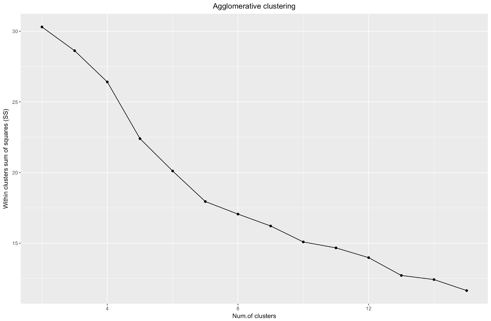
# ggplot(data = data.frame(t(cstats.table(gower.dist, aggl.clust.c, 15))), aes(x=cluster.number, y=within.cluster.ss)) + geom_point()+ geom_line()+ ggtitle("Agglomerative clustering") + labs(x = "Num.of clusters", y = "Within clusters sum of squares (SS)") + theme(plot.title = element_text(hjust = 0.5)) Agglomerative "elbow" is similar to divisional, but the graph looks smoother - bends are not so pronounced. As with divisional clustering, I would focus on 7 clusters, however, when choosing between the two methods, I like the cluster sizes that are obtained by the agglomerative method better — it is better that they are comparable with each other.
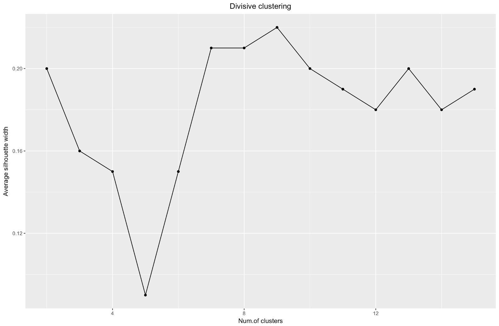
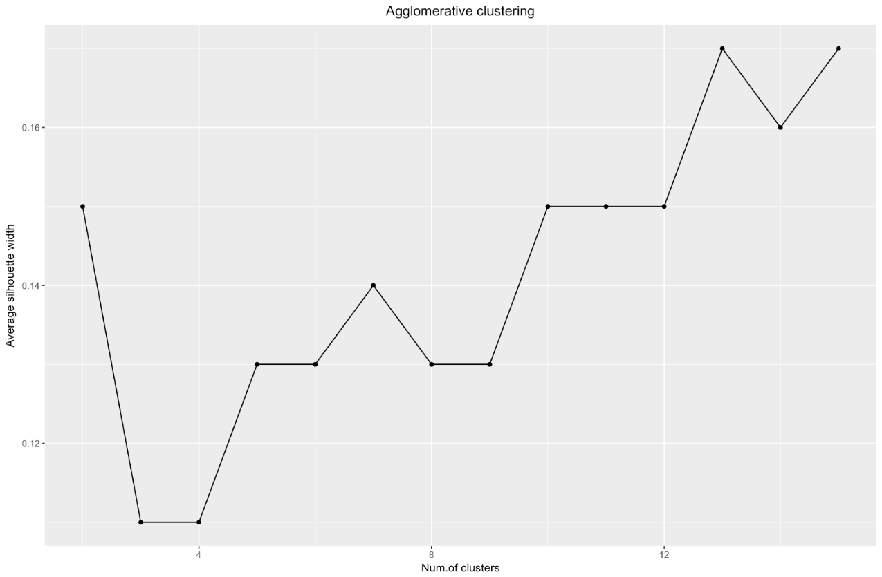
# ggplot(data = data.frame(t(cstats.table(gower.dist, divisive.clust, 15))), aes(x=cluster.number, y=avg.silwidth)) + geom_point()+ geom_line()+ ggtitle("Divisive clustering") + labs(x = "Num.of clusters", y = "Average silhouette width") + theme(plot.title = element_text(hjust = 0.5)) When using the silhouette estimation method, you should choose the amount that gives the maximum silhouette coefficient, because you need clusters that are far enough apart to be considered separate.
The silhouette coefficient can range from –1 to 1, with 1 corresponding to good consistency within the clusters, and –1 not very good.
In the case of the above chart, you would choose 9 rather than 5 clusters.
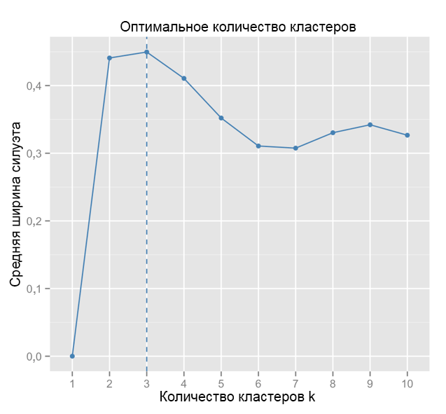
For comparison: in the “simple” case, the silhouette graph is similar to the one below. Not quite like ours, but almost.
Source: Data Sailors
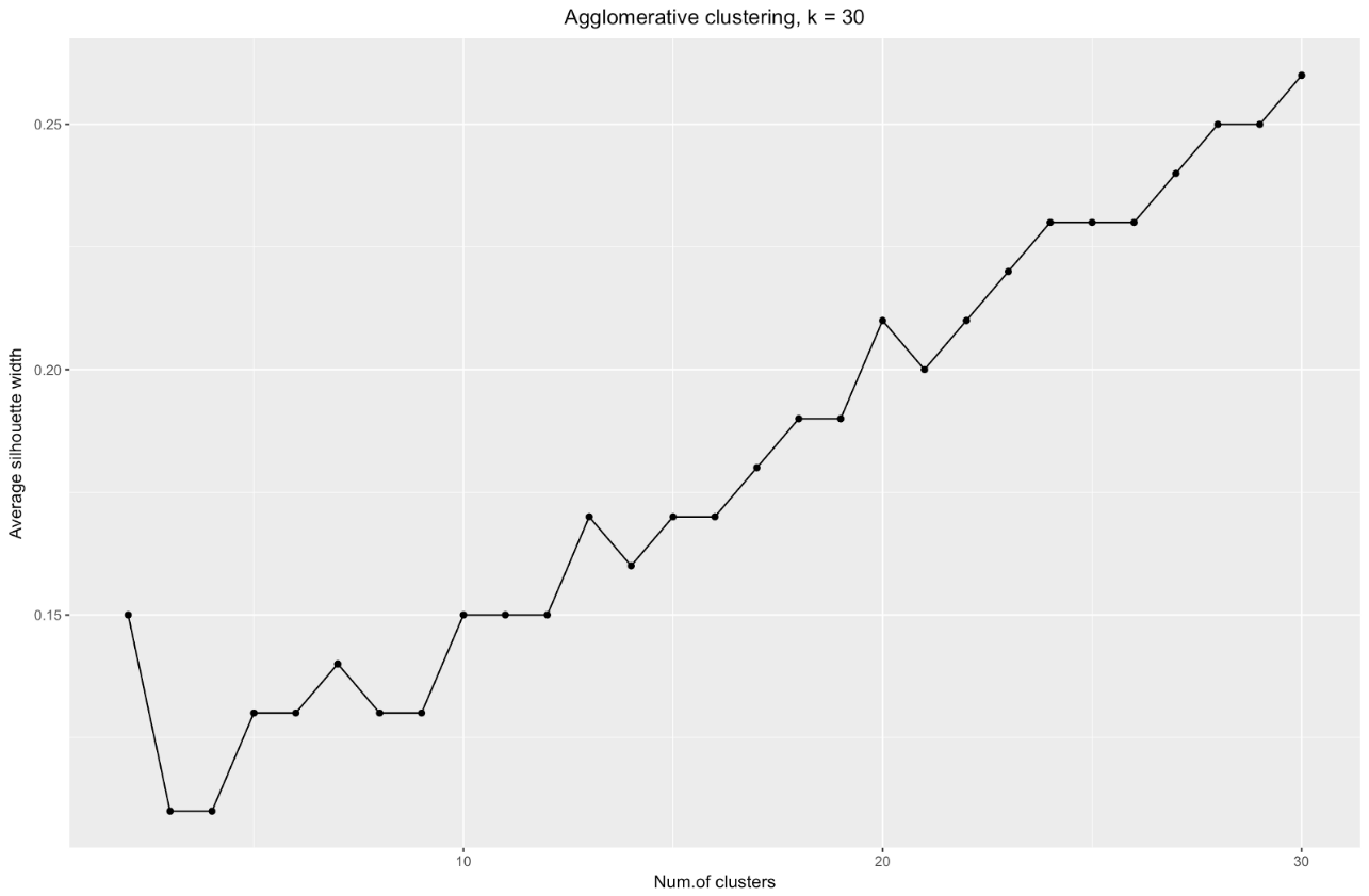
ggplot(data = data.frame(t(cstats.table(gower.dist, aggl.clust.c, 15))), aes(x=cluster.number, y=avg.silwidth)) + geom_point()+ geom_line()+ ggtitle("Agglomerative clustering") + labs(x = "Num.of clusters", y = "Average silhouette width") + theme(plot.title = element_text(hjust = 0.5)) The silhouette width chart tells us: the more you split the data set, the clearer the clusters become. However, in the end you will reach individual points, and you do not need this. However, this is exactly what you will see if you start to increase the number of clusters k . For example, for
k=30 I got the following graph:To summarize: the more you split the dataset, the better the clusters, but we cannot reach individual points (for example, in the chart above we selected 30 clusters, and we only have 200 data points).
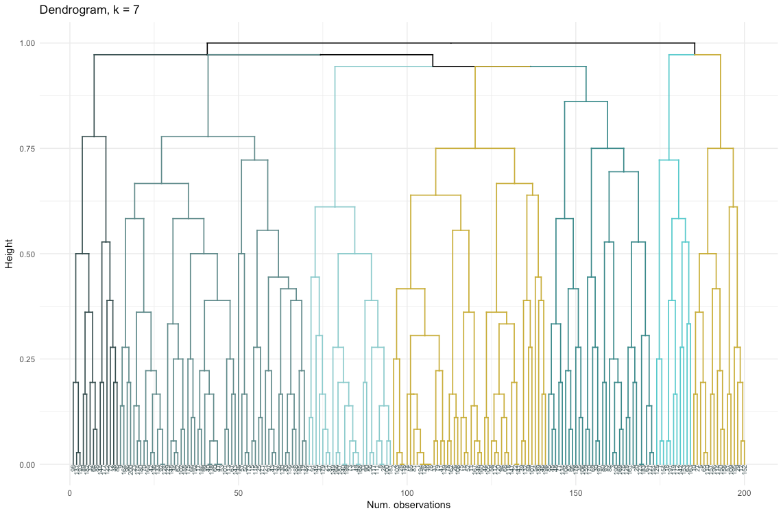
So, agglomerative clustering in our case seems to me much more balanced: cluster sizes are more or less comparable (just look at a cluster of only two observations when dividing by the divisional method!), And I would stop at 7 clusters obtained by this method. Let's see how they look and what they are made of.
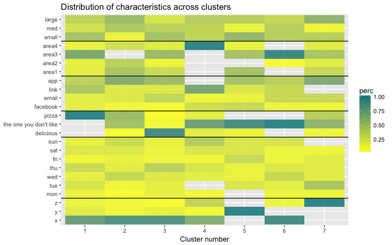
The data set consists of 6 variables that need to be visualized in 2D or 3D, so you have to work hard! The nature of categorical data also imposes some limitations, so ready-made solutions may not work. I need to: a) see how observations are divided into clusters, b) understand how observations are categorized. Therefore, I created a) a color dendrogram, b) a heat map of the number of observations per variable inside each cluster.
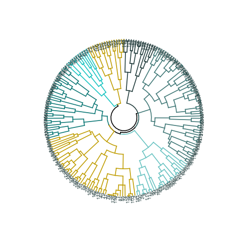
library("ggplot2") library("reshape2") library("purrr") library("dplyr") # library("dendextend") dendro <- as.dendrogram(aggl.clust.c) dendro.col <- dendro %>% set("branches_k_color", k = 7, value = c("darkslategray", "darkslategray4", "darkslategray3", "gold3", "darkcyan", "cyan3", "gold3")) %>% set("branches_lwd", 0.6) %>% set("labels_colors", value = c("darkslategray")) %>% set("labels_cex", 0.5) ggd1 <- as.ggdend(dendro.col) ggplot(ggd1, theme = theme_minimal()) + labs(x = "Num. observations", y = "Height", title = "Dendrogram, k = 7") # ( ) ggplot(ggd1, labels = T) + scale_y_reverse(expand = c(0.2, 0)) + coord_polar(theta="x") # — # — # , clust.num <- cutree(aggl.clust.c, k = 7) synthetic.customers.cl <- cbind(synthetic.customers, clust.num) cust.long <- melt(data.frame(lapply(synthetic.customers.cl, as.character), stringsAsFactors=FALSE), id = c("id.s", "clust.num"), factorsAsStrings=T) cust.long.q <- cust.long %>% group_by(clust.num, variable, value) %>% mutate(count = n_distinct(id.s)) %>% distinct(clust.num, variable, value, count) # heatmap.c , — , , heatmap.c <- ggplot(cust.long.q, aes(x = clust.num, y = factor(value, levels = c("x","y","z", "mon", "tue", "wed", "thu", "fri","sat","sun", "delicious", "the one you don't like", "pizza", "facebook", "email", "link", "app", "area1", "area2", "area3", "area4", "small", "med", "large"), ordered = T))) + geom_tile(aes(fill = count))+ scale_fill_gradient2(low = "darkslategray1", mid = "yellow", high = "turquoise4") # cust.long.p <- cust.long.q %>% group_by(clust.num, variable) %>% mutate(perc = count / sum(count)) %>% arrange(clust.num) heatmap.p <- ggplot(cust.long.p, aes(x = clust.num, y = factor(value, levels = c("x","y","z", "mon", "tue", "wed", "thu", "fri","sat", "sun", "delicious", "the one you don't like", "pizza", "facebook", "email", "link", "app", "area1", "area2", "area3", "area4", "small", "med", "large"), ordered = T))) + geom_tile(aes(fill = perc), alpha = 0.85)+ labs(title = "Distribution of characteristics across clusters", x = "Cluster number", y = NULL) + geom_hline(yintercept = 3.5) + geom_hline(yintercept = 10.5) + geom_hline(yintercept = 13.5) + geom_hline(yintercept = 17.5) + geom_hline(yintercept = 21.5) + scale_fill_gradient2(low = "darkslategray1", mid = "yellow", high = "turquoise4") heatmap.p The heat map graphically shows how many observations are made for each factor level for the initial factors (the variables we started with). Dark blue color corresponds to a relatively large number of observations within the cluster. This heat map also shows that for the day of the week (sun, sat ... mon) and the basket size (large, med, small), the number of customers in each cell is almost the same - this may mean that these categories are not determinative for analysis, and Perhaps they do not need to be taken into account.
Conclusion
In this article, we calculated the dissimilarity matrix, tested the agglomerative and divisional methods of hierarchical clustering, and familiarized ourselves with the elbow and silhouette methods for assessing the quality of clusters.
Divisional and agglomerative hierarchical clustering is a good start to study the topic, but do not stop there if you want to really master cluster analysis. There are many other methods and techniques. The main difference from clustering numerical data is the calculation of the dissimilarity matrix. When assessing the quality of clustering, not all standard methods will give reliable and meaningful results - the silhouette method is very likely not suitable.
And finally, since some time has passed since I made this example, now I see a number of shortcomings in my approach and will be glad to any feedback. One of the significant problems of my analysis was not related to clustering as such - my data set was unbalanced in many ways, and this moment remained unaccounted for. This had a noticeable effect on clustering: 70% of clients belonged to one level of the “citizenship” factor, and this group dominated most of the clusters obtained, so it was difficult to calculate the differences within other levels of the factor. Next time I will try to balance the data set and compare the clustering results. But about this - in another post.
Finally, if you want to clone my code, here is the link to github: https://github.com/khunreus/cluster-categorical
I hope you enjoyed this article!
Sources that helped me:
Hierarchical clustering guide (data preparation, clustering, visualization) - this blog will be interesting for those who are interested in business analytics in the R environment: http://uc-r.imtqy.com/hc_clustering and https: // uc-r. imtqy.com/kmeans_clustering
Clustering: http://www.sthda.com/english/articles/29-cluster-validation-essentials/97-cluster-validation-statistics-must-know-methods/
( k-): https://eight2late.wordpress.com/2015/07/22/a-gentle-introduction-to-cluster-analysis-using-r/
denextend, : https://cran.r-project.org/web/packages/dendextend/vignettes/introduction.html#the-set-function
, : https://www.r-statistics.com/2010/06/clustergram-visualization-and-diagnostics-for-cluster-analysis-r-code/
: https://jcoliver.imtqy.com/learn-r/008-ggplot-dendrograms-and-heatmaps.html
, https://www.ncbi.nlm.nih.gov/pmc/articles/PMC5025633/ (repository on GitHub: https://github.com/khunreus/EnsCat ).
Source: https://habr.com/ru/post/461741/
All Articles