Writing an Android App for Movie Fans - Part 2 (Design)

Hello, Habr!
In this article, we will consider the process of creating screens based on the layouts from the first part .
Screen layout
Main screen
The main screen will contain fragments and navigation menus. Let's write the menu, after creating the icons. To do this, open the drawable folder, click New and select Vector Assets . In the window that appears, click on Clip Art and select the Settings , Search and Content paste icons . The size will leave 24 by 24.
')
Create a strings file in the values folder and add the following lines:
<resources> <string name="title_home">Home</string> <string name="title_search">Search</string> <string name="title_settings">Settings</string> </resources> Putting all the lines in one file will simplify the further localization of the application.
If you want to add another language, for example, Russian, create a file with the Locale attribute, select the desired language in the Language list and add the same lines, after translating them.
Now we proceed directly to creating the menu. In the menu folder, create the Menu resourse file , name it " bottom_nav_menu " and add the following code to it:
<?xml version="1.0" encoding="utf-8"?> <menu xmlns:android="http://schemas.android.com/apk/res/android"> <item android:id="@+id/navigation_home" android:icon="@drawable/ic_content_paste_black_24dp" android:title="@string/title_home"/> <item android:id="@+id/navigation_search" android:icon="@drawable/ic_search_black_24dp" android:title="@string/title_search"/> <item android:id="@+id/navigation_settings" android:icon="@drawable/ic_settings_black_24dp" android:title="@string/title_settings"/> </menu> Create a styles file in the values folder and add the following code:
<resources> <style name="MyLinearLayout"> <item name="android:layout_width">match_parent</item> <item name="android:layout_height">match_parent</item> <item name="android:orientation">vertical</item> </style> </resources> Created styles are used for views to separate markup files and style files. They contain formatting attributes that are responsible for the appearance and behavior of elements. First, you can write all the attributes in the markup file, and then export them to the styles file by clicking the following combination: RMB -> Refactor -> Extract -> Style . Style will only be available inside views. Read more about this here .
After that, you can proceed directly to creating a layout for the Activity. In the layout folder, create a Layout resourse file , name it " activity_main " and add the following code:
<?xml version="1.0" encoding="utf-8"?> <FrameLayout xmlns:android="http://schemas.android.com/apk/res/android" xmlns:app="http://schemas.android.com/apk/res-auto" xmlns:tools="http://schemas.android.com/tools" tools:context=".MainActivity" style="@style/MyLinearLayout"> <FrameLayout android:layout_width="match_parent" android:layout_height="match_parent" android:id="@+id/fragment_container" android:layout_marginBottom="?attr/actionBarSize" /> <android.support.design.widget.BottomNavigationView android:layout_width="match_parent" android:layout_height="wrap_content" android:id="@+id/nav_view" app:menu="@menu/bottom_nav_menu" android:background="#6986c2" android:layout_gravity="bottom"/> </FrameLayout> Let's see what happened.

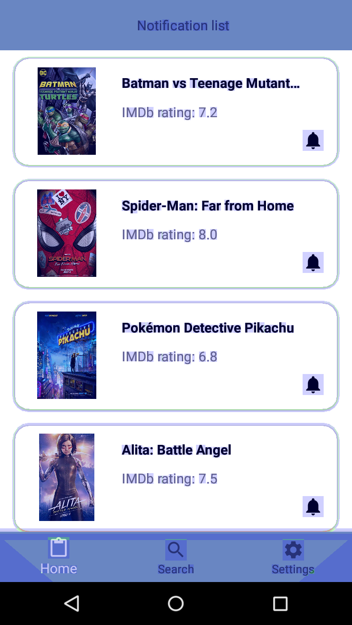
Home tab screen
Open the styles file and add styles for the Toolbar with a child TextView and RecyclerView:
<style name="MyToolbar"> <item name="android:layout_width">match_parent</item> <item name="android:layout_height">wrap_content</item> <item name="android:background">#6986c2</item> </style> <style name="Toolbar_TextView"> <item name="android:layout_width">match_parent</item> <item name="android:layout_height">match_parent</item> <item name="android:gravity">center</item> </style> <style name="MyRecyclerView"> <item name="android:layout_width">match_parent</item> <item name="android:layout_height">match_parent</item> <item name="android:background">#fff</item> </style> Add the following lines to the strings file:
<string name="desc_home">Notification list</string> <string name="movie_title">Movie title</string> <string name="default_imdb_rating">IMDb rating: 7,4</string> Now create a layout called " fragment_home " and add the following code to it:
<?xml version="1.0" encoding="utf-8"?> <LinearLayout xmlns:android="http://schemas.android.com/apk/res/android" style="@style/MyLinearLayout"> <android.support.v7.widget.Toolbar android:id="@+id/toolbar_home" style="@style/MyToolbar"> <TextView android:text="@string/desc_home" style="@style/Toolbar_TextView"/> </android.support.v7.widget.Toolbar> <android.support.v7.widget.RecyclerView android:id="@+id/recView_home" style="@style/MyRecyclerView"/> </LinearLayout> Add the Notification and Notification none icons to the drawable folder.
Let's move on to creating a list item. Add the file " item_movie " to the layout folder and write the following code in it:
<?xml version="1.0" encoding="utf-8"?> <android.support.v7.widget.CardView xmlns:android="http://schemas.android.com/apk/res/android" xmlns:app="http://schemas.android.com/apk/res-auto" xmlns:tools="http://schemas.android.com/tools" android:layout_width="match_parent" android:layout_height="120dp" app:cardCornerRadius="16dp" android:layout_marginLeft="16dp" android:layout_marginTop="8dp" android:layout_marginRight="16dp" android:layout_marginBottom="8dp" app:cardBackgroundColor="#00FFFFFF"> <ImageView android:layout_width="98dp" android:layout_height="98dp" app:srcCompat="@mipmap/ic_launcher" android:id="@+id/item_image" android:layout_gravity="center|start" android:layout_marginLeft="10dp"/> <TextView android:text="@string/movie_title" android:layout_width="wrap_content" android:layout_height="wrap_content" android:id="@+id/item_title" android:layout_marginTop="18dp" android:layout_marginLeft="120dp" android:textStyle="bold" android:textColor="@android:color/black" android:ellipsize="end" android:maxLines="1" android:layout_marginRight="16dp"/> <TextView android:text="@string/default_imdb_rating" android:layout_width="wrap_content" android:layout_height="wrap_content" android:id="@+id/item_rating" android:layout_marginLeft="120dp" android:layout_marginTop="50dp"/> <ImageView android:layout_width="wrap_content" android:layout_height="wrap_content" app:srcCompat="@drawable/ic_notifications_black_24dp" android:id="@+id/item_notification" android:layout_gravity="bottom|right" android:layout_marginRight="16dp" android:layout_marginBottom="16dp" tools:ignore="VectorDrawableCompat"/> </android.support.v7.widget.CardView> Let's look at the result:

Search tab screen
In the strings file, add the header for the Toolbar:
<string name="desc_settings">Preferences</string> And create a layout called " fragment_search ", simultaneously adding the following code block:
<?xml version="1.0" encoding="utf-8"?> <LinearLayout xmlns:android="http://schemas.android.com/apk/res/android" style="@style/MyLinearLayout"> <android.support.v7.widget.Toolbar android:id="@+id/toolbar_search" style="@style/MyToolbar"> <android.support.v7.widget.SearchView android:layout_width="match_parent" android:layout_height="match_parent" android:background="@drawable/border_search_view" android:layout_marginRight="15dp" android:id="@+id/search_view"/> </android.support.v7.widget.Toolbar> <android.support.v7.widget.RecyclerView android:id="@+id/recView_search" style="@style/MyRecyclerView"/> </LinearLayout> Let's see the result:

Screen for Settings tab
This screen turned out to be the most voluminous, because it has few repeating styles.
Add the code for TextView and CardView to the styles file:
<style name="MyTextView"> <item name="android:layout_width">wrap_content</item> <item name="android:layout_height">wrap_content</item> <item name="android:textStyle">bold</item> <item name="android:textColor">@android:color/black</item> <item name="android:layout_marginLeft">16dp</item> <item name="android:layout_marginTop">8dp</item> <item name="android:layout_marginBottom">8dp</item> <item name="android:typeface">normal</item> </style> <style name="MyCardView"> <item name="android:layout_width">match_parent</item> <item name="android:layout_height">wrap_content</item> <item name="android:layout_margin">16dp</item> </style> Also add a couple more lines to the strings file:
<string name="imdb_rating">IMDb rating</string> <string name="default_rating">6</string> <string name="movie_genres">Movie genres</string> You also need to add the Star border icon to the drawable folder.
Create a layout named " fragment_settings " and add the following code:
<?xml version="1.0" encoding="utf-8"?> <LinearLayout xmlns:android="http://schemas.android.com/apk/res/android" xmlns:app="http://schemas.android.com/apk/res-auto" xmlns:tools="http://schemas.android.com/tools" style="@style/MyLinearLayout" android:background="#fff"> <android.support.v7.widget.Toolbar style="@style/MyToolbar" android:id="@+id/toolbar_home" app:title="@string/desc_home"> <TextView android:text="@string/desc_settings" style="@style/Toolbar_TextView"/> </android.support.v7.widget.Toolbar> <android.support.v7.widget.CardView app:cardCornerRadius="16dp" app:cardBackgroundColor="#00FFFFFF" style="@style/MyCardView"> <ImageView android:layout_width="wrap_content" android:layout_height="wrap_content" app:srcCompat="@drawable/ic_star_border_black_24dp" android:layout_gravity="right" android:layout_marginRight="50dp" android:layout_marginTop="8dp" tools:ignore="VectorDrawableCompat"/> <TextView android:text="@string/default_rating" android:layout_width="wrap_content" android:layout_height="wrap_content" android:id="@+id/rating_value" android:layout_gravity="right" android:layout_marginRight="40dp" android:layout_marginTop="8dp" android:textColor="#666666"/> <TextView android:text="@string/imdb_rating" android:id="@+id/textView" style="@style/MyTextView"/> <SeekBar style="@style/Widget.AppCompat.SeekBar.Discrete" android:layout_width="match_parent" android:layout_height="wrap_content" android:max="10" android:progress="6" android:id="@+id/seek_bar" android:layout_marginLeft="16dp" android:layout_marginTop="50dp" android:layout_marginBottom="20dp" android:layout_marginRight="16dp"/> </android.support.v7.widget.CardView> <android.support.v7.widget.CardView app:cardCornerRadius="16dp" app:cardBackgroundColor="#00FFFFFF" style="@style/MyCardView"> <TextView android:text="@string/movie_genres" style="@style/MyTextView"/> <android.support.v7.widget.RecyclerView android:layout_width="match_parent" android:layout_height="match_parent" android:background="#00FFFFFF" android:layout_marginLeft="16dp" android:layout_marginTop="36dp" android:layout_marginBottom="16dp" android:layout_marginRight="16dp" android:id="@+id/recView_settings"/> </android.support.v7.widget.CardView> </LinearLayout> Create an item for the list. Add the file " item_genre " to the layout folder and write the following code:
<?xml version="1.0" encoding="utf-8"?> <CheckBox xmlns:android="http://schemas.android.com/apk/res/android" xmlns:tools="http://schemas.android.com/tools" tools:text="@string/movie_genres" android:layout_width="match_parent" android:layout_height="wrap_content" android:id="@+id/item_check_box" /> Let's look at the result:

Design testing
Let's see how often the same section of the screen is redrawn, that is, extra work is being done.
| Good | poorly |
|---|---|
 | 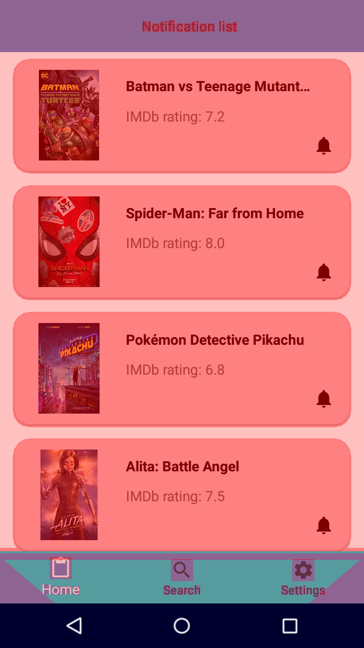 |
Blue color - redraws once. Good.
Color green - is redrawn twice. Optimization required.
Color light red - redraws three times. Very bad.
Red color - redraws more than 4 times. Something went wrong.
And if nothing is painted over, then the plot is not redrawn. Great job.
Why is everything red on the second screenshot? A white background was added to each Layout, RecyclerView, and CardView, which caused layers to overlap. In the design described above, this is not, the example only demonstrates the unsuccessful application of stylization.
In the first screenshot, only one background was used on LinearLayout for the Home fragment, the redrawing of which was canceled programmatically using the following method:
window.setBackgroundDrawable(null) Let's see how long it takes to render frames.
| For the first case | For the second case |
|---|---|
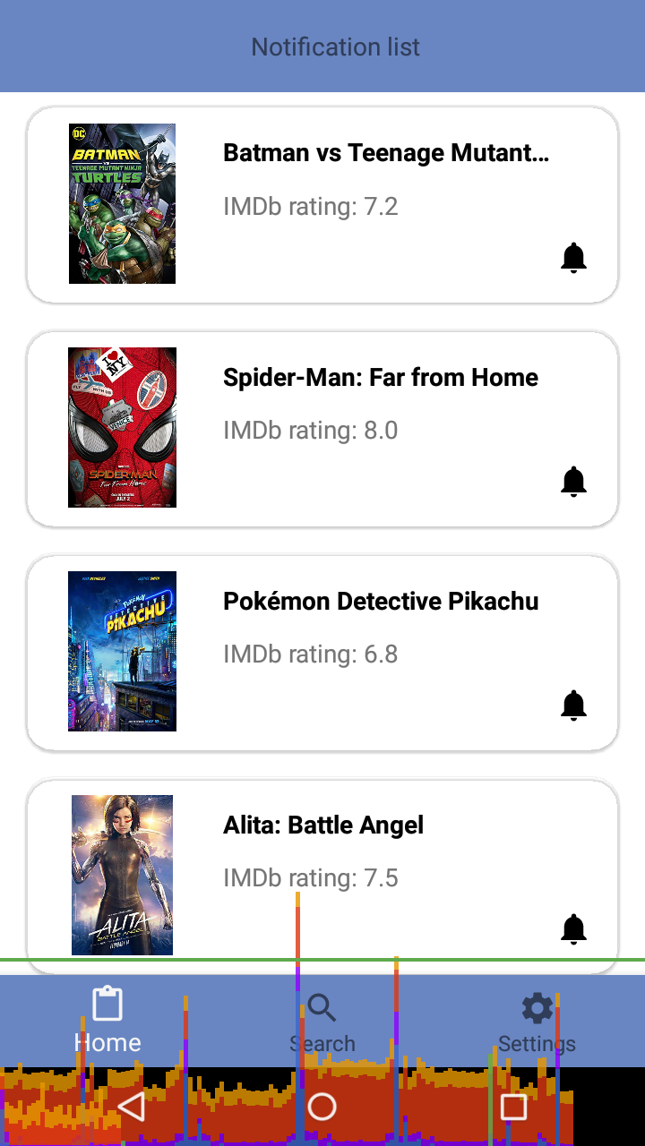 | 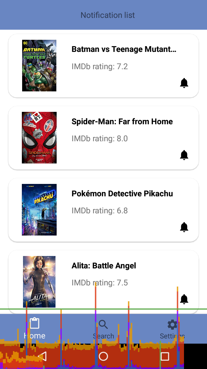 |
Cyan is responsible for the time used to create and update the View.
The purple part represents the time taken to transfer the rendering resources of the stream.
Red is the time to draw.
An orange color indicates how long the processor took to wait for the GPU to complete its work. It is a source of problems with large quantities. - Alexander Klimov
In our case, almost all tabs are drawn in less than 16ms, that is, below the green bar. If the bar is larger than this line, the program may slow down.
Conclusion
In the next article, we will consider working with the server, and while the author writes it, you can evaluate the current design in the survey below.
If any points remain unclear, ask questions in the comments.
If you think that design (XML) can be simplified or made better, please write about it.
Source: https://habr.com/ru/post/461249/
All Articles