Rounded or acute-angled?
Do I need to change the usual pointed buttons to rounded ones? Which ones are better for usability? How do we make such decisions?
It is precisely such issues that you will encounter when immersed in the UX associated with round buttons in applications. We already know that size, contrast, and the shadow cast by themselves can make the button noticeable, but finding the right balance for the elements of the main action and secondary is not always easy. The roundness in this case may come to the rescue.

Does rounding increase recognition?
Rounded elements are easier to read. It’s easier to count the number of cards in a row if their corners are not sharp.

This is because a better distinguishable roundness helps our eyes quickly distinguish between the cards themselves. On the contrary, cards with sharp corners look unified and uniform, which makes their recognition difficult.
In grid layout, rounding works even better.

For example, in a TurboTax dashboard, the eye clings to elements with rounded corners in the upper section better than the middle section, where the cards have sharp corners.

Do I need to use fully rounded buttons?
Fully rounded buttons look great in interfaces where there is an adequate amount of free space. An example of a very successful arrangement of such buttons is Spotify, where the call to action is well felt.

Generally speaking, in this particular example, since working with Spotify always comes down to playback (tracks, podcasts, playlists), the main action is uniquely defined. And the fully rounded play buttons are very distinguishable from UI albums and playlists, which in turn encourages the user to click on “Play”.

')
When do fully rounded buttons DO NOT work?
In some cases, roundness can impair usability, for example:
1. When rounded buttons look like tags
If distinguishing a button from a tag (filter) is not easy, it will lead people to bewilderment: “Do I click on a button or on a filter?”

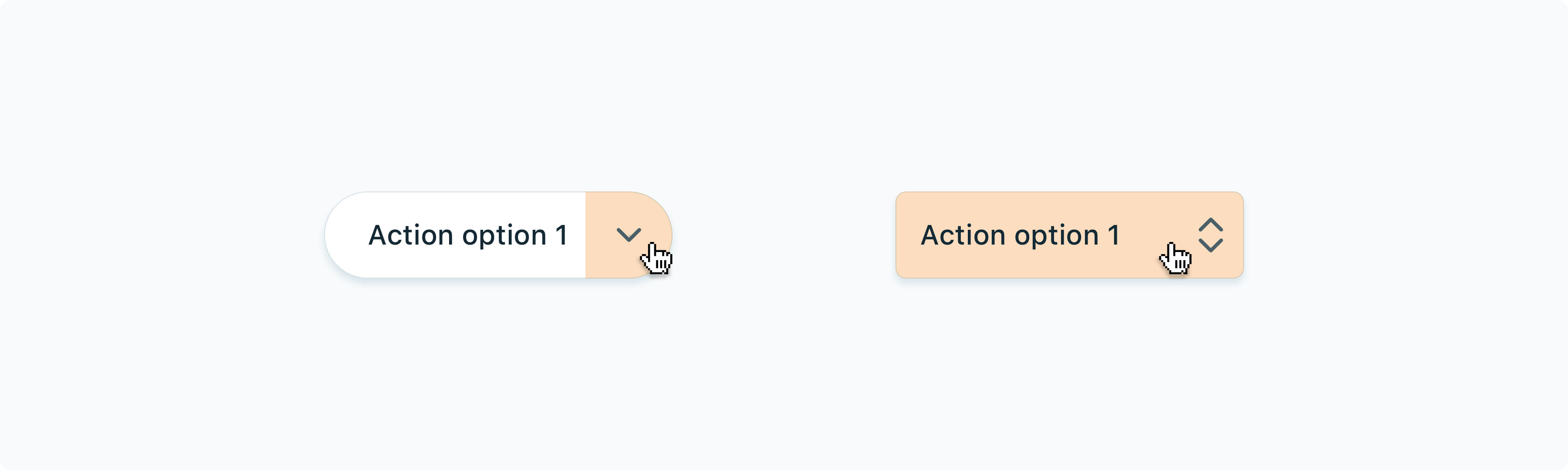
2. Rounded buttons are not able to show nested options
Fully rounded buttons usually use the “arrow” icon to indicate the presence of nested options. But the click area (or wheelbarrow) for displaying options is limited by the size of the icon (usually 16x16 or 24x24 px).

Will it be convenient to view the options in each case?

If we use only slightly rounded buttons, we can hide the arrow so that the button behaves like a pop-up button. This approach works better.

Apple does not recommend using rounded buttons for actions (see push buttons ). Fully rounded buttons are reserved for " Help " or for providing mutually exclusive options (see radio buttons ).

3. Fully rounded buttons are not suitable for stacks
When we place rounded buttons in rows in tables and cards, they look out of place. For example, for a table of 10 rows, we get a column of 10 buttons, each of which looks like a button for the main action.

Alternatively, you can try the “no borders” buttons, as is done in the new macOS notifications, or show the buttons only when you hover over. By minimizing the visibility of the buttons, we let the user focus on the main work area.

Aesthetics of rounded corners
The roundness looks modern. The application of full rounding began in mobile interfaces and migrated to the web. The lack of sharpness causes feelings of simplicity, optimism and accessibility. This is probably why many design systems have adopted rounded elements and are widely used for icons, buttons or even images.
In Chrome, after a recent update (six months have passed since the publication of the original article - approx. Transl.), The address bar has become rounded to better express the availability of simultaneous use for search. Users can see part of the search results right at the time of printing, even before going to the page.

In keeping with the new concept, the buttons on the toolbar began to be highlighted rounded on hover. It’s easy to find rounded elements in other Google apps like Calendar, Gmail, and Drive.
Summarizing
There is no definite answer which is better - roundness or sharpness. But rounded elements can help encourage the user to interact with the application without being distracted by a secondary UI.
List of resources for in-depth study of the issue:
Use round shapes in Material Designs
Characteristics of rounded corners
Why rounded corners are easier on the eyes
Source: https://habr.com/ru/post/461041/
All Articles