Measure seven times, once implement BI tool
Not so long ago, I was faced with the task of switching to a new BI system for our company. Since I had to dive rather deeply and thoroughly into this issue, I decided to share my thoughts on this with the reputable community.

On the Internet there are many articles on this topic, but, to my great surprise, they did not answer many of my questions about choosing the right tool and were somewhat superficial. Within 3 weeks of testing, we tested 4 tools: Tableau, Looker, Periscope / Sisense, Mode analytics . These tools will mainly be discussed in this article. I must say right away that the proposed article is the personal opinion of the author, reflecting the needs of a small but very rapidly growing IT company :)
Now, quite interesting changes are taking place in the BI market, consolidation is underway, major cloud technology players are trying to strengthen their positions by vertically integrating all aspects of working with data (data storage, processing, visualization). Over the past few months, there have been 5 major takeovers: Google bought Looker, Salesforce bought Tableau, Sisense bought Periscope Data, Logi Analytics bought Zoomdata, Alteryx bought ClearStory Data. We will not go further into the corporate world of mergers and acquisitions, it is worth noting that further changes in the pricing and protectionist policies of the new owners of BI tools can be expected (as the Alooma tool recently pleased us, shortly after their purchase by Google, they cease to support all data sources except Google BigQuery :)).
So, I wanted to start with a small theoretical part, because now where without theory. As Gartner tells us, a BI system is a term that combines software products, tools, infrastructure and best practices, which allows us to improve and optimize decisions [1]. This definition includes, in particular, data storage and ETL. In the framework of this article, I propose to focus on a narrower segment, namely, software products for data visualization and analysis.
')
In the pyramid of creating value for the company (I had the courage to propose another presentation of this obvious structure in Fig. 0), BI tools are located after the blocks for storing records and data preprocessing (ETL).
This is important to understand - the best practice in this case is the separation of ETL and BI tasks . In addition to a more transparent process of working with data, you will also not be tied to one software solution and will be able to choose the most suitable tool for each of the ETL and BI tasks. With a well-built ETL process and an optimal architecture of data tables, you can generally close 80% of all pressing business issues without using special software. This, of course, will require significant involvement of analysts and DS. Therefore, we come to the main question: what do we actually need first of all from a BI software product?
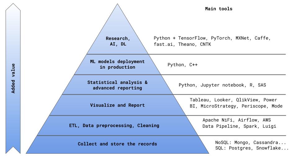
Fig. 0
Key criteria for choosing a BI software product
As we already understood, all key metrics and performance indicators of the company as a whole can be taken directly from the analytical tables in the database previously prepared as part of the ETL process (I’ll tell you in the next article how to optimally build an ETL process In the meantime, I’ll give a teaser about why this is so important: according to a Kaggle poll, the main difficulty that half of DS faces is dirty data [2]). The main problem in this case, obviously, will be the complexity and inefficiency of using analysts' time. Instead of creating a full-fledged product, analysts / DS will all the time prepare indicators, count metrics, check discrepancies in numbers, look for errors in the SQL code, and engage in other useless activities. Here I am convinced that the main thing that analysts / DS should do is to create a product that brings value to the company in the long run. This can be either a settlement / predictive service, the result of which is part of the company's main product (for example, an algorithm for calculating the cost / time of a trip) or, say, an algorithm for distributing orders among customers, or a full-fledged analytical report identifying the reasons for the outflow of users and lower MAU .
Therefore, the main criterion for choosing an analytical system should be the ability to unload analysts as much as possible from ad hoc problems and fluidity. How can this be achieved? In fact, there are two options: a) automate, b) delegate. By the second paragraph, I mean the now popular phrase Self Service - to give businesses the opportunity to delve into the data itself.
That is, analysts set up a software product once: create data cubes, configure automatic update of cubes (for example, every night), automatically send reports, prepare several dashboard wizards and teach users how to use the product. Further, the business provides its additional needs on its own, by calculating the indicators it needs in various data aggregation and filtering using a simple and understandable drag & drop option.
In addition to the simplicity of the reporting process , the speed of query execution is also important . No one will wait 15 minutes for the previous month to load data or metrics for another city. To address this issue, there are several generally accepted approaches. One of them is the creation of OLAP (online analytical processing) data cubes. In OLAP cubes, data types are divided into dimensions (dimensions) - these are fields by which aggregations can be done (for example, city, country, product, time intervals, type of payment ...), and measures are calculated metrics for measurements (e.g. number of trips, revenue, number of new users, average check, ...). Data cubes is a rather powerful tool that allows you to very quickly produce results using pre-aggregated data and calculated metrics. The flip side of OLAP cubes is the fact that all data is pre-collected and does not change until the next cube build. If you need data aggregation or a metric that was not originally calculated, or if you need more recent data, you need to recreate the data cube.
Another solution for increasing the speed of working with data is in-memory solutions . In Memory Database (IMDB) is designed to provide maximum performance when there is enough RAM to store data. While relational databases are designed to provide maximum performance when data is not completely placed in RAM, and slow disk I / O should be performed in real time. Many modern tools combine both of these solutions (for example, Sisense, Tableau, IBM Cognos, MicroStrategy, etc.).
Before that, we talked about the simplicity and convenience of using BI tools for business users. It is important to set up a convenient dashboard development and release process for analysts / DS. Here the situation is similar to any other IT product - you need a quick and convenient deployment process ( rapid deployment time ), as well as the thoughtful development process, testing, code review, release, version control, team collaboration. All this is combined by the concept of workflow.
Thus, we come to the key requirements for the BI software product . The same requirements formed the basis of the speed-map, on the basis of which we eventually chose the supplier of the product.
Table 1. BI tool selection criteria.
The final table of voting results within our team is as follows:
Table 2. Voting results for choosing a BI tool.
On the part of business users (they also participated in the selection of the product), the votes were divided approximately equally between Tableau and Looker. As a result, the choice was made in favor of Looker. Why Looker and what are the fundamental differences between the tools, we will now discuss.
So, let's start with the description of BI-tools.
The choice of a BI tool provider should be approached thoroughly, with the support of business users and determining the main criteria for choosing a tool (preferably in the form of a speed map). The criteria presented in this article are primarily aimed at improving the efficiency of working with data, simplifying the process of extracting information, improving the quality of data visualization and reducing the burden on analysts.
On the Internet there are many articles on this topic, but, to my great surprise, they did not answer many of my questions about choosing the right tool and were somewhat superficial. Within 3 weeks of testing, we tested 4 tools: Tableau, Looker, Periscope / Sisense, Mode analytics . These tools will mainly be discussed in this article. I must say right away that the proposed article is the personal opinion of the author, reflecting the needs of a small but very rapidly growing IT company :)
A few words about the market
Now, quite interesting changes are taking place in the BI market, consolidation is underway, major cloud technology players are trying to strengthen their positions by vertically integrating all aspects of working with data (data storage, processing, visualization). Over the past few months, there have been 5 major takeovers: Google bought Looker, Salesforce bought Tableau, Sisense bought Periscope Data, Logi Analytics bought Zoomdata, Alteryx bought ClearStory Data. We will not go further into the corporate world of mergers and acquisitions, it is worth noting that further changes in the pricing and protectionist policies of the new owners of BI tools can be expected (as the Alooma tool recently pleased us, shortly after their purchase by Google, they cease to support all data sources except Google BigQuery :)).
Bit of theory
So, I wanted to start with a small theoretical part, because now where without theory. As Gartner tells us, a BI system is a term that combines software products, tools, infrastructure and best practices, which allows us to improve and optimize decisions [1]. This definition includes, in particular, data storage and ETL. In the framework of this article, I propose to focus on a narrower segment, namely, software products for data visualization and analysis.
')
In the pyramid of creating value for the company (I had the courage to propose another presentation of this obvious structure in Fig. 0), BI tools are located after the blocks for storing records and data preprocessing (ETL).
This is important to understand - the best practice in this case is the separation of ETL and BI tasks . In addition to a more transparent process of working with data, you will also not be tied to one software solution and will be able to choose the most suitable tool for each of the ETL and BI tasks. With a well-built ETL process and an optimal architecture of data tables, you can generally close 80% of all pressing business issues without using special software. This, of course, will require significant involvement of analysts and DS. Therefore, we come to the main question: what do we actually need first of all from a BI software product?
Fig. 0
Key criteria for choosing a BI software product
As we already understood, all key metrics and performance indicators of the company as a whole can be taken directly from the analytical tables in the database previously prepared as part of the ETL process (I’ll tell you in the next article how to optimally build an ETL process In the meantime, I’ll give a teaser about why this is so important: according to a Kaggle poll, the main difficulty that half of DS faces is dirty data [2]). The main problem in this case, obviously, will be the complexity and inefficiency of using analysts' time. Instead of creating a full-fledged product, analysts / DS will all the time prepare indicators, count metrics, check discrepancies in numbers, look for errors in the SQL code, and engage in other useless activities. Here I am convinced that the main thing that analysts / DS should do is to create a product that brings value to the company in the long run. This can be either a settlement / predictive service, the result of which is part of the company's main product (for example, an algorithm for calculating the cost / time of a trip) or, say, an algorithm for distributing orders among customers, or a full-fledged analytical report identifying the reasons for the outflow of users and lower MAU .
Therefore, the main criterion for choosing an analytical system should be the ability to unload analysts as much as possible from ad hoc problems and fluidity. How can this be achieved? In fact, there are two options: a) automate, b) delegate. By the second paragraph, I mean the now popular phrase Self Service - to give businesses the opportunity to delve into the data itself.
That is, analysts set up a software product once: create data cubes, configure automatic update of cubes (for example, every night), automatically send reports, prepare several dashboard wizards and teach users how to use the product. Further, the business provides its additional needs on its own, by calculating the indicators it needs in various data aggregation and filtering using a simple and understandable drag & drop option.
In addition to the simplicity of the reporting process , the speed of query execution is also important . No one will wait 15 minutes for the previous month to load data or metrics for another city. To address this issue, there are several generally accepted approaches. One of them is the creation of OLAP (online analytical processing) data cubes. In OLAP cubes, data types are divided into dimensions (dimensions) - these are fields by which aggregations can be done (for example, city, country, product, time intervals, type of payment ...), and measures are calculated metrics for measurements (e.g. number of trips, revenue, number of new users, average check, ...). Data cubes is a rather powerful tool that allows you to very quickly produce results using pre-aggregated data and calculated metrics. The flip side of OLAP cubes is the fact that all data is pre-collected and does not change until the next cube build. If you need data aggregation or a metric that was not originally calculated, or if you need more recent data, you need to recreate the data cube.
Another solution for increasing the speed of working with data is in-memory solutions . In Memory Database (IMDB) is designed to provide maximum performance when there is enough RAM to store data. While relational databases are designed to provide maximum performance when data is not completely placed in RAM, and slow disk I / O should be performed in real time. Many modern tools combine both of these solutions (for example, Sisense, Tableau, IBM Cognos, MicroStrategy, etc.).
Before that, we talked about the simplicity and convenience of using BI tools for business users. It is important to set up a convenient dashboard development and release process for analysts / DS. Here the situation is similar to any other IT product - you need a quick and convenient deployment process ( rapid deployment time ), as well as the thoughtful development process, testing, code review, release, version control, team collaboration. All this is combined by the concept of workflow.
Thus, we come to the key requirements for the BI software product . The same requirements formed the basis of the speed-map, on the basis of which we eventually chose the supplier of the product.
Table 1. BI tool selection criteria.
| No. | Demand | Description | Significance (min = 1, max = 5) |
|---|---|---|---|
| one | UX + drag & drop | Requires a clear and accessible business user interface with drag & drop for reporting | five |
| 2 | Data handling | How data is stored and processed by the system. These are the very mechanics like OLAP and in-memory solutions that we talked about above. The faster and easier access to data is organized, the better. | five |
| 3 | Workflow | A fast and convenient deployment process is required. Also code review, version control, development & release. | five |
| four | Visualization | The set of data visualizations available. The more different options for presenting data - the better. | four |
| five | Support | Availability of support, SLA to respond to a request. | 3 |
| 6 | Statistics | The ability to use statistical methods, integration with Python. | 2 |
| 7 | Price | Everything is clear here, Lebowski :) | four |
The final table of voting results within our team is as follows:
Table 2. Voting results for choosing a BI tool.
| No. | Demand | Relevance | Tableau | Looker | Periscope | Mode |
|---|---|---|---|---|---|---|
| one | UX + drag & drop | five | 4.3 | 4.6 | 2.7 | 2.8 |
| 2 | Data handling | five | 4.4 | 3.5 | 3.6 | 2.3 |
| 3 | Workflow | five | 3.1 | 4.8 | 3.8 | 3.3 |
| four | Visualization | four | 3.8 | 3.7 | 3.4 | 2.1 |
| five | Support | 3 | 3.7 | 4.2 | 3.8 | 3.4 |
| 6 | Statistics | 2 | 2.3 | 2.2 | 2.5 | 2.8 |
| 7 | Price | four | four | 2 | four | 3 |
| Total | 3.77 | 3.79 | 3.43 | 2.79 |
On the part of business users (they also participated in the selection of the product), the votes were divided approximately equally between Tableau and Looker. As a result, the choice was made in favor of Looker. Why Looker and what are the fundamental differences between the tools, we will now discuss.
Detailed tool description
So, let's start with the description of BI-tools.
Tableau
(here we will focus on the extended service package: Tableau Online)- UX + drag & drop.
Tableau is a fairly old tool on the market since 2003, and there is a feeling that the interface has not changed much since then. You may be scared of pop-ups and drop-down options in the style of Windows XP (Fig. 1, Fig. 2). But pretty quickly you can get used to and master the basic functionality of the tool. Tableau reminds many of the advanced version of Excel, it has tabs (worksheets) and dashboards (Dashboards) - a combination of visualizations obtained on worksheets. The drag & drop option is quite easy to use, filters on the graphs are easily configured and change (Fig. 3, Fig. 4). Tableau has two versions of the service: Desktop and Desktop + Online. Desktop is more old-fashioned - it is, in fact, advanced Excel. The online version for the testing period was often thoughtful and sometimes ended in updating the page without saving your work.
Fig. one
Fig. 2
Fig. 3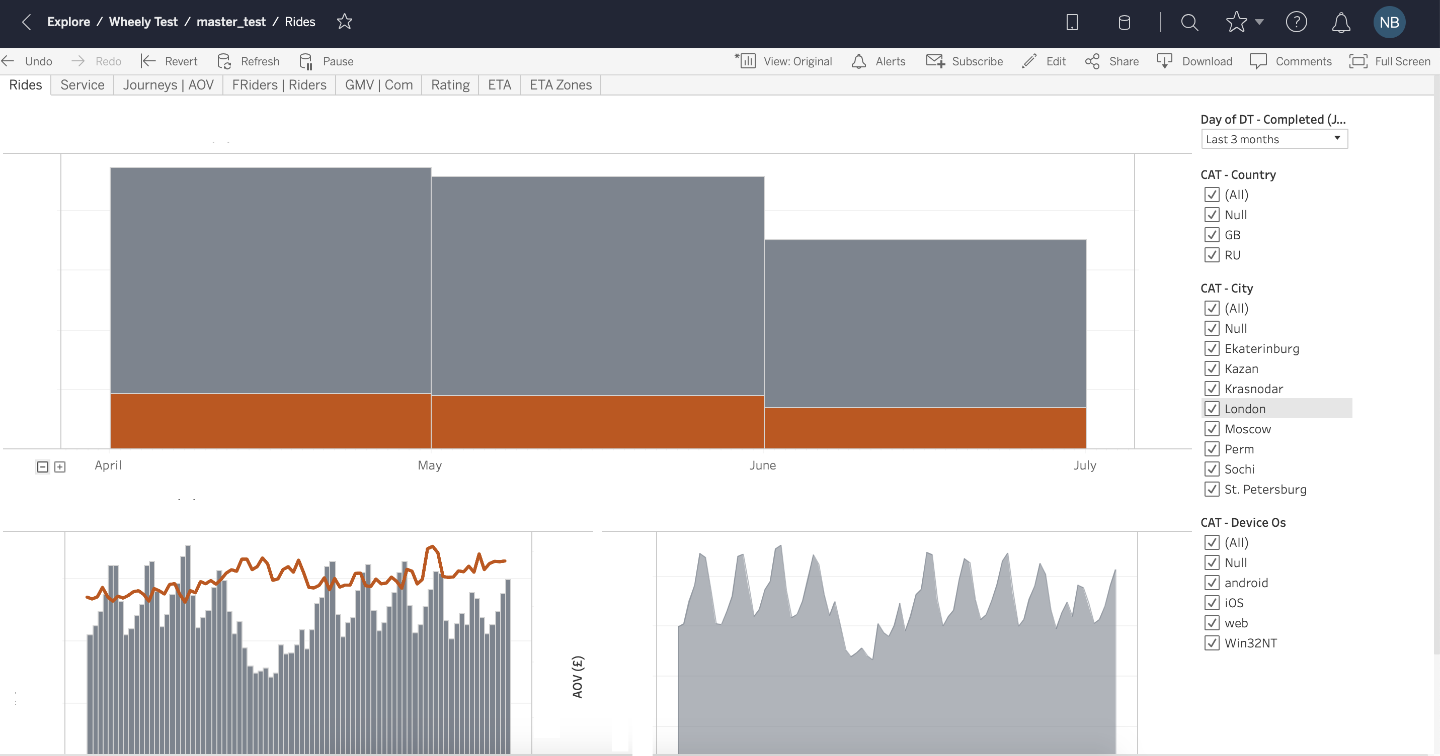
Fig. four - Data handling.
Tableau handles data very quickly, changing a temporary filter or aggregation occurs in a matter of seconds even on large volumes of data (more than 20 million records). As we have already said, for this, Tableau uses both OLAP data cubes and an in-memory data engine. Tableau claims that thanks to their internal in-memory solution Hyper, query execution speed has increased 5 times .
Data cubes can be configured on the local version of Tableau Desktop and downloaded or updated on a network server, in which case all dashboards built on the previous version of the cube assembly will be automatically updated. Update cubes can be configured automatically, for example, at night. All measurements and measures (dimensions and measures) are set in advance when assembling the cube and do not change until the next version of the assembly. Together with the use of data cubes in Tableau, it is possible to access the database directly, this is called Live connection, in which case the speed will be much lower, but the data will be more relevant. The process of assembling a data cube is quite simple, the main thing is to choose the correct fields for assembling several tables (joins) (Fig. 5).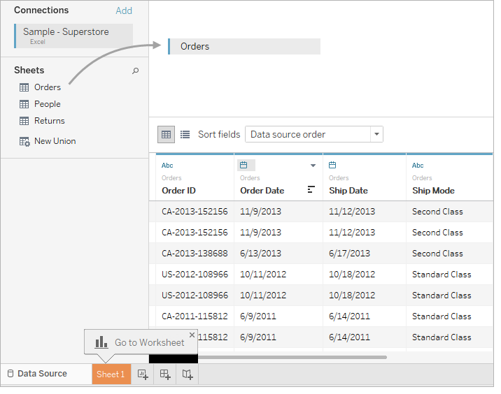
Fig. five - Workflow
It is because of this point that we did not choose Tableau in the future. By this parameter, Tableau lagged quite behind the industry and could not offer any tools to simplify the development and release of dashboards. Tableau does not provide version control, code review, team collaboration, nor is there a well-thought-out development and testing environment. It is precisely because of this that companies often abandon Tableau in favor of more advanced tools. Already with several employees involved in creating data cubes and dashboards, confusion can arise - where to find the latest version of the data, which metrics can be used and which cannot. There is a lack of data integrity, which leads to a distrust of the business in the metrics that it sees in the system. - Visualization
In terms of data visualization, Tableau is a very powerful tool. You can find charts and graphs for every taste and color (Fig. 6). Data visualization - page, as in Excel, you can switch between tabs.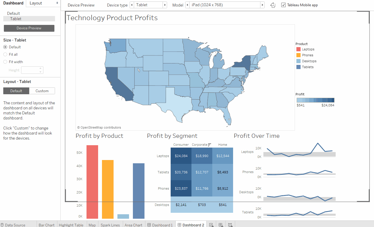
Fig. 6 - Support.
From the point of view of Tableau support, it seemed to me not very customer-oriented , I had to find the answer myself for most of the questions. Fortunately, Tableau has a rather large community where you can find answers to most questions. - Statistics
Tableau has the ability to integrate with Python, more details can be found. - Price
Prices are pretty standard for the market, can be found on the official website. The price depends on the user level (Developer, Explorer, Viewer), the description can be found there . When calculating 10 Developers, 25 Explorers and 100 Viewers, $ 39,000 / year comes out per year.
- UX + drag & drop.
Looker
- UX + drag & drop.
Looker is a relatively young company, founded in 2012. UX is natively clear and simple for the user, drag & drop is conveniently implemented (Fig. 7).
Fig. 7 - Data handling.
Working with data in Looker is noticeably slower than in Tableau . The main reason is that Looker makes queries directly to the database without creating OLAP cubes. As we discussed, this approach has its advantages - the fact that the data is always fresh and any data aggregation can be done. Looker also provides a tool for speeding up complex queries - Cached Queries , that is, the ability to cache queries. - Workflow
The main advantage of Looker compared to all the BI tools we tested is its well-thought out dashboard development and release process . Looker integrates version control using github . The development environment (Production mode ) and the productive environment (Fig. 8) are also well separated. Another advantage of Looker is that access to data modeling remains in the same hands - there is only one master version of the data model, which ensures integrity.
It makes sense here to also mention that Looker has its own analogue of the SQL language with additional features for data modeling - LookML. This is a fairly simple and flexible tool that allows you to customize the drag & drop functionality and adds many new options (Fig. 9).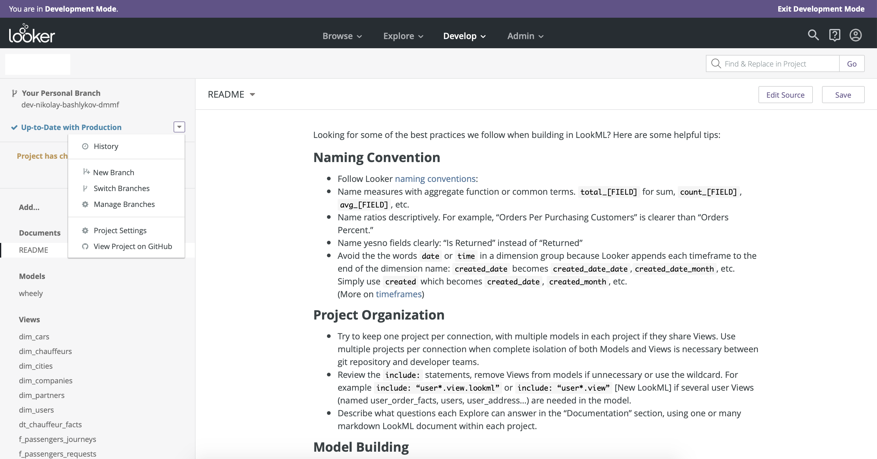
Fig. eight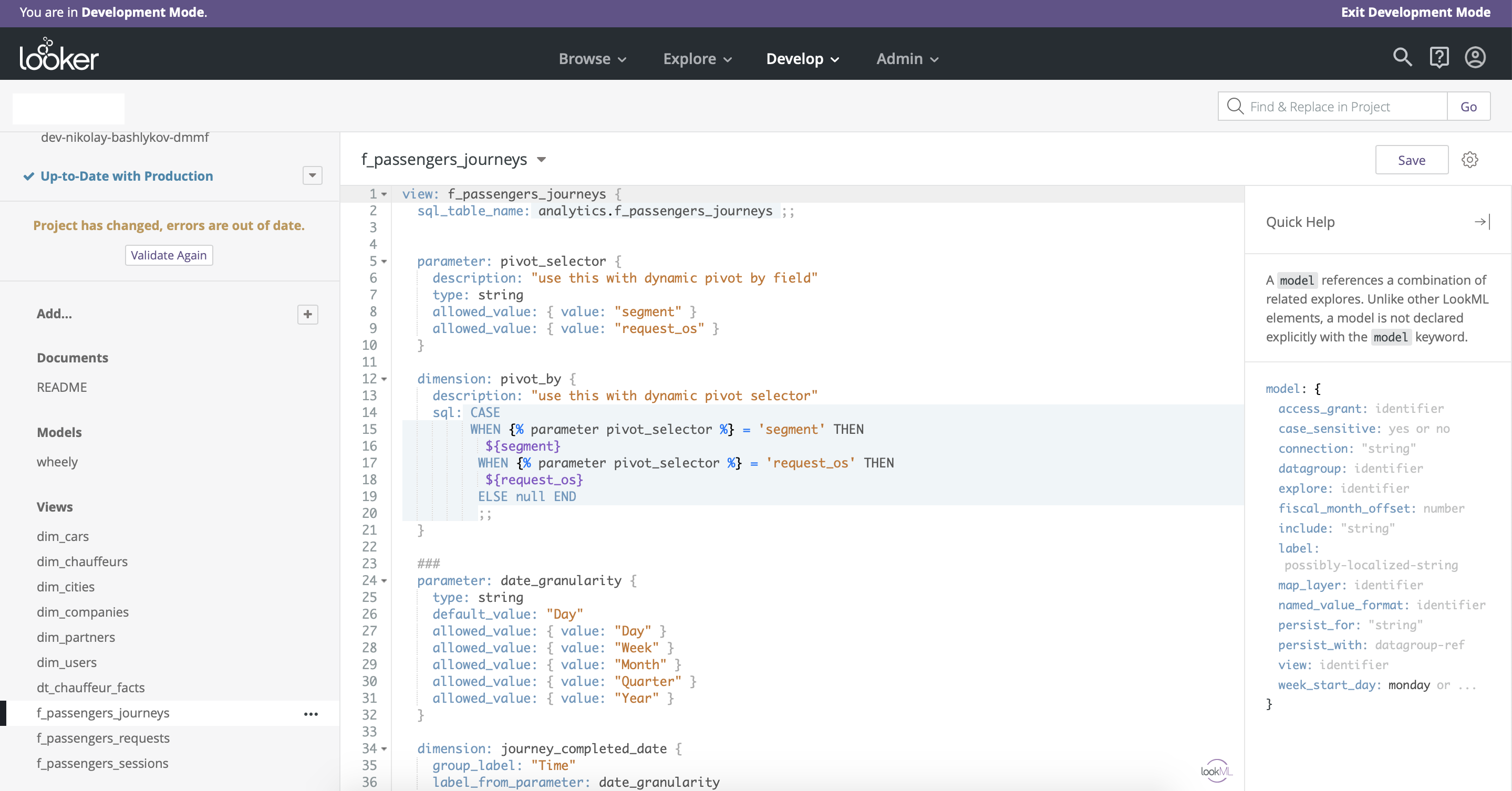
Fig. 9 - Visualization
From the point of view of visualization, Looker is not much inferior to Tableau, in it you can find any charts and charts to your taste. The organization of the charts is vertical, unlike Tableau, where the organization is paginated (Fig. 10, Fig. 11). One useful feature for business users is drill down - the ability to segment selected data in predefined dimensions.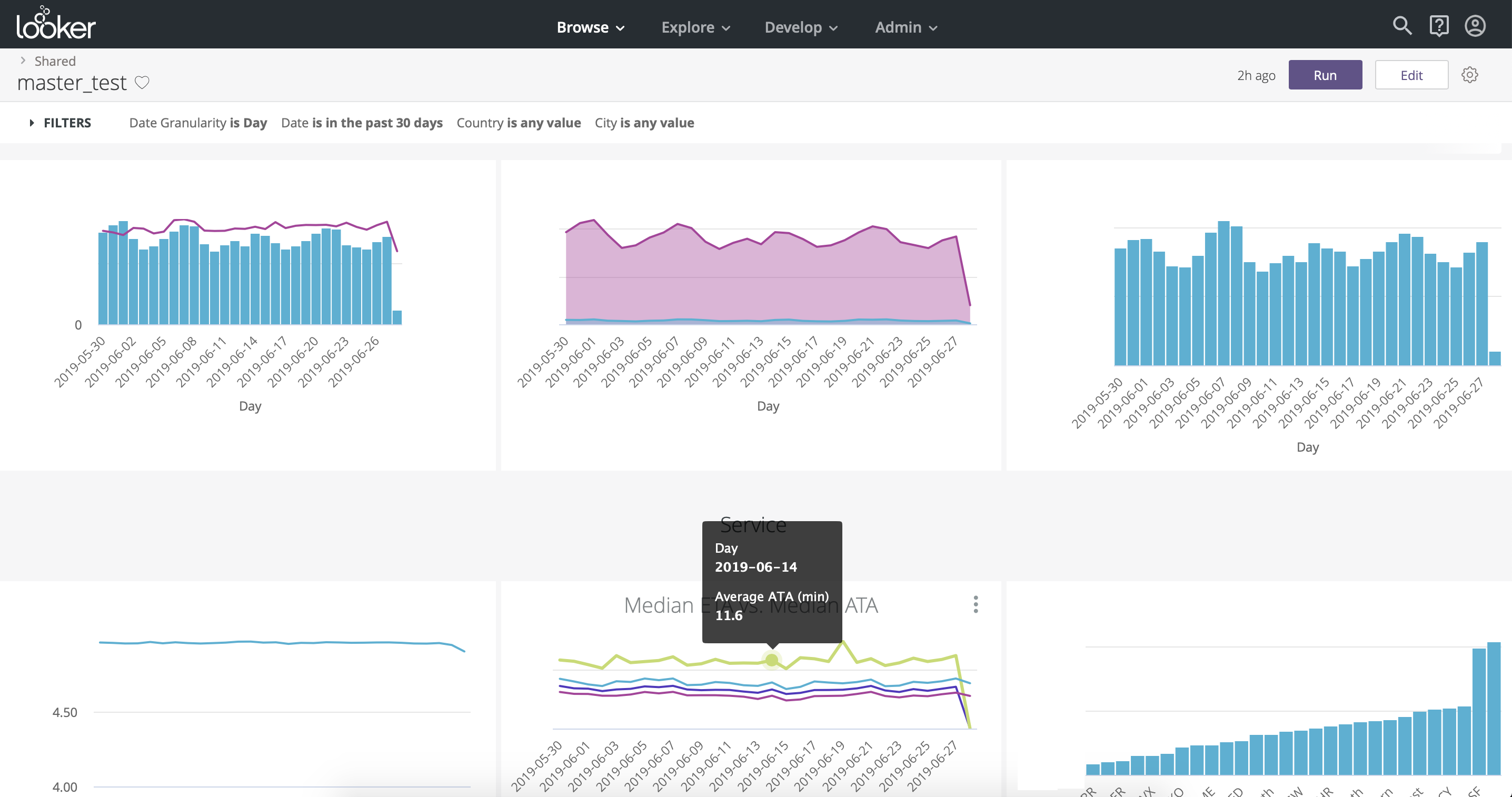
Fig. ten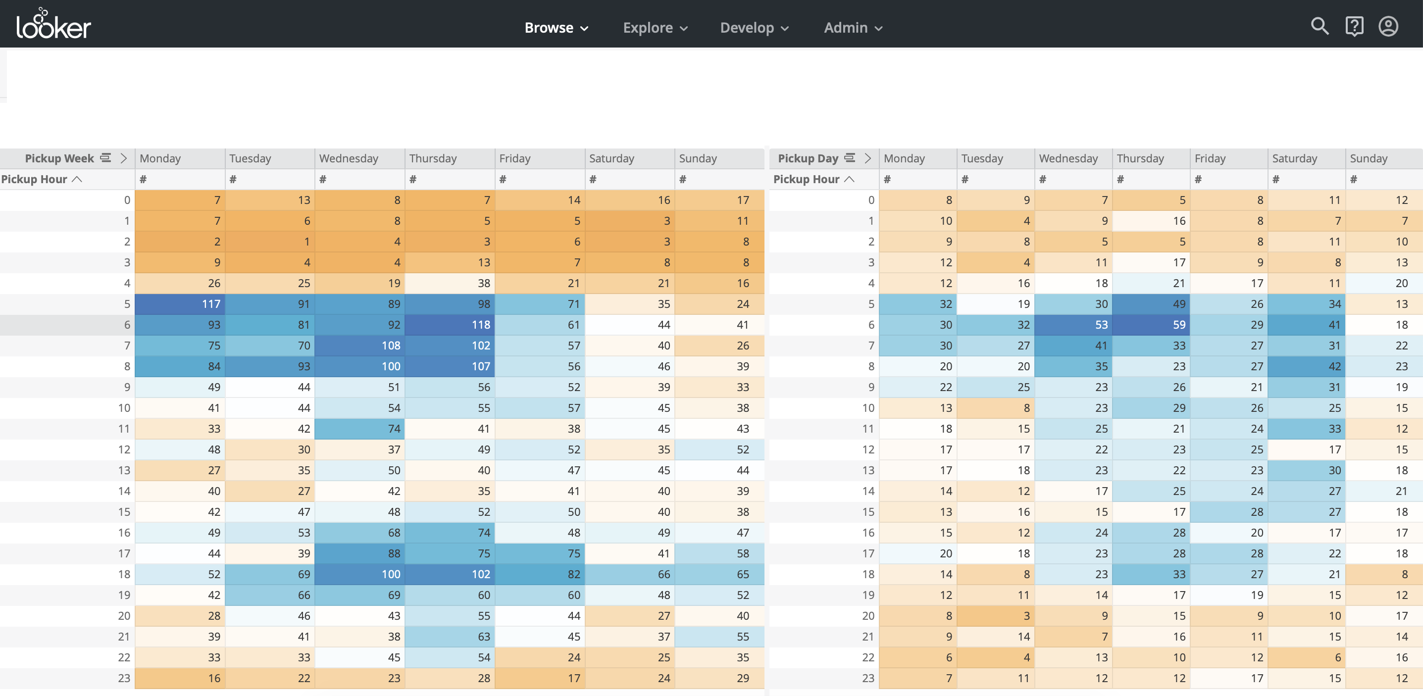
Fig. eleven - Support.
The support from business consultants and technical experts at Looker, I must say, was surprising - we could schedule a video call in half an hour on any issue and get a full answer. It seems that Looker really value their customers and try to simplify their lives. - Statistics
Looker has an API - Look API and SDK for Python, with their help you can connect to Looker from Python and download the necessary information, then perform the necessary transformations and statistical analysis in Python and load the results back into the database with subsequent output to the lookers on the dashboards. - Price
Looker costs significantly more than Tableau , for a similar set of users Looker came out almost 2 times more expensive than Tableau - about $ 60,000 / year.
- UX + drag & drop.
Periscope
- UX + drag & drop.
Periscope is a fairly easy-to-use tool with limited functionality . There is also a drag & drop function here, but filters for different charts will have to be created separately, which is inconvenient (Fig. 12). You can’t do without SQL to create slightly more complex queries.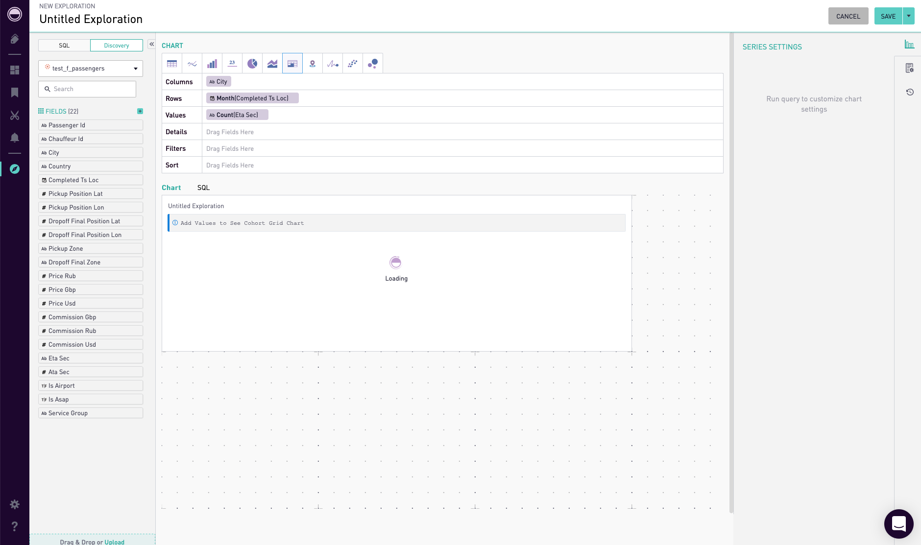
Fig. 12 - Data handling.
Periscope has a cross between OLAP cubes and query caching. In it, you can create Views and cache them. View is any SQL-query, for its caching it is necessary to click the 'materialize' button in the settings of this View (Fig. 13). You can also publish a 'publish' View so that you can use it for drag & drop.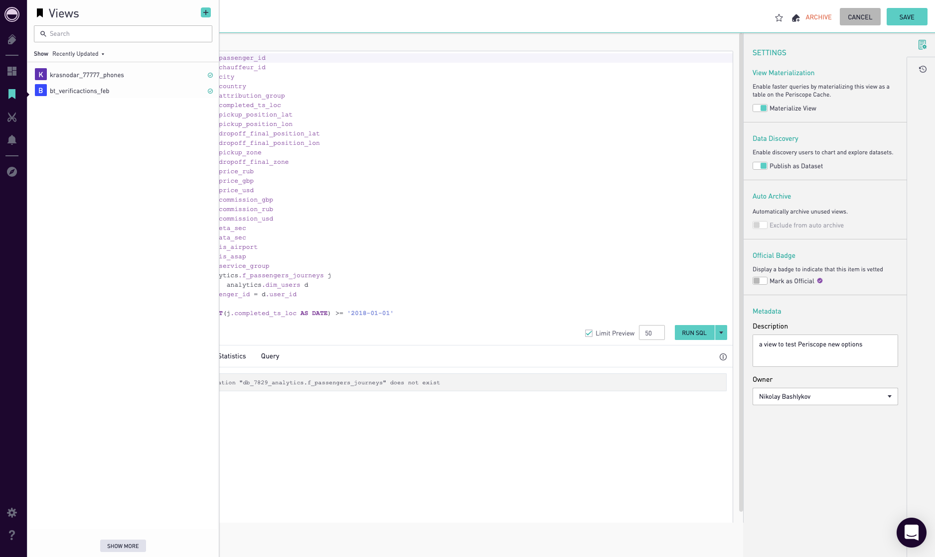
Fig. 13 - Workflow
Periscope Pro integrates version control using git. There is also the opportunity to see the history of changes to any dashboard and roll back to the previous version. - Visualization
The set of charts and charts is very limited; here you cannot find the variety as in Tableau or Looker. - Support.
Support is fairly operational, if you make the amendment that the support center operates at Pacific Standard Time. Within 24 hours, you will definitely receive a response. - Statistics
Periscope has integration with Python. More details can be found here . - Price
Periscope Pro will cost roughly like Tableau: $ 35,000.
- UX + drag & drop.
Mode analytics
- UX + drag & drop.
Mode is the simplest of these tools. Its key difference is its integration with Python and the ability to create analytic reports based on the Jupyter Notebook (Fig. 14). If you have not built up the process of creating analytical reports using the Jupyter Notebook, then this tool may be useful to you. Mode is rather an addition to a full-fledged BI-system, its functionality is very limited, for the purpose of creating dashboards, you can use tables of no more than 27 thousand lines, which greatly limits the capabilities of the tool (Fig. 15). Otherwise, you need to write separate SQL queries for each graph in order to aggregate the data and get a smaller table for visualization at the output (Fig. 16).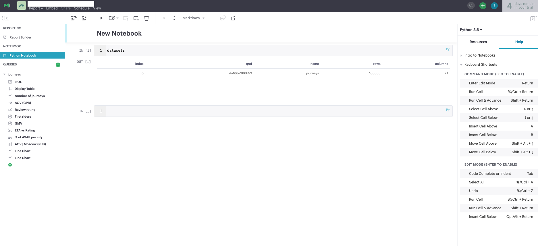
Fig. 14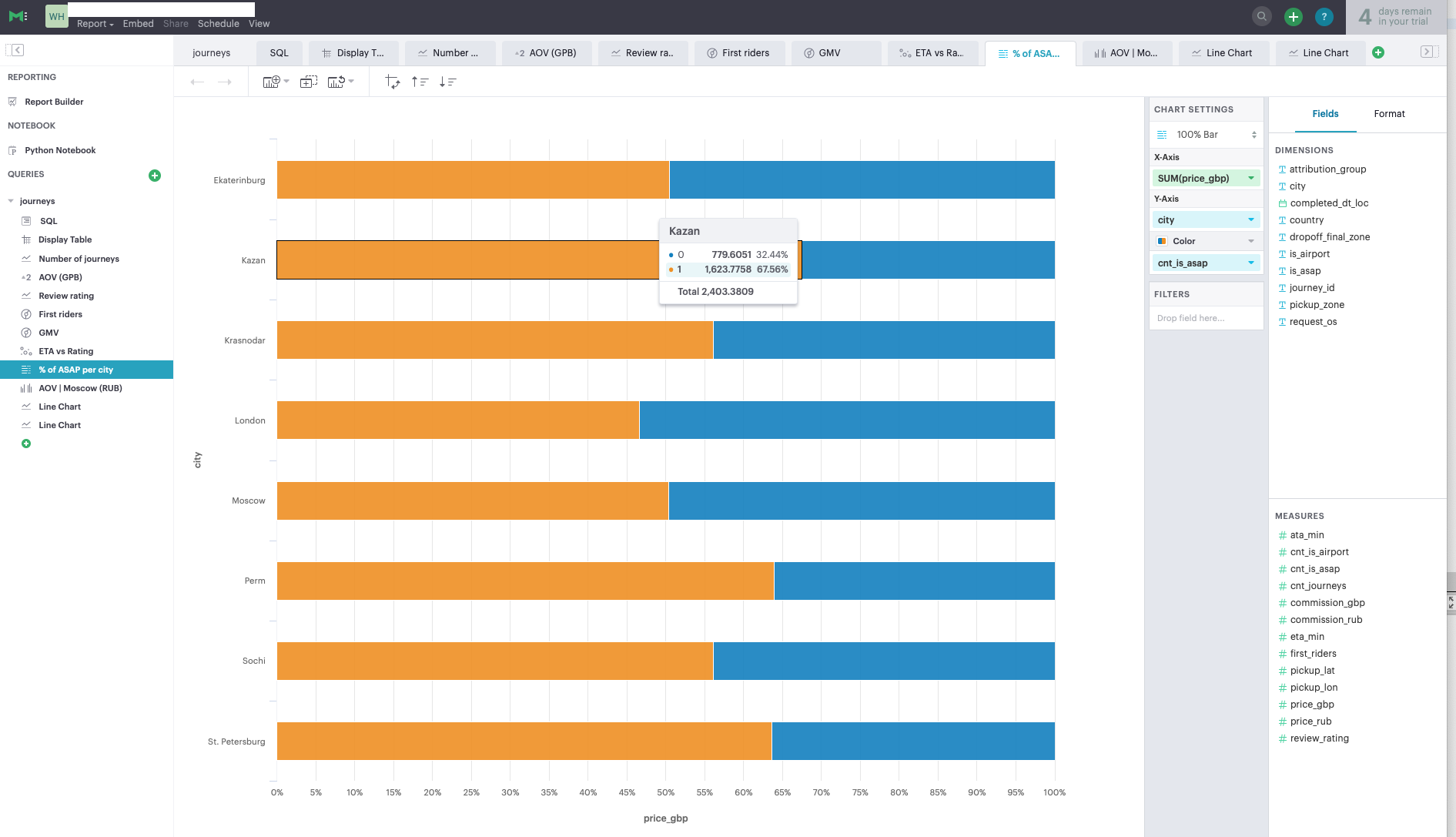
Fig. 15
Fig. sixteen - Data handling.
In Mode as such, data handling is missing. All queries are made directly to the database, there is no way to cache the main tables. - Workflow
Mode has integration with Github, more details can be found here . - Visualization
The set of data visualizations is very limited; there are 6-7 types of graphs. - Support.
During the test period, support was quite operational. - Statistics
As already mentioned, Mode is well integrated with Python, which allows you to create user-friendly analytic reports using the Jupyter Notebook. - Price
Mode, oddly enough, is quite expensive for its capabilities - about $ 50,000 / year.
- UX + drag & drop.
findings
The choice of a BI tool provider should be approached thoroughly, with the support of business users and determining the main criteria for choosing a tool (preferably in the form of a speed map). The criteria presented in this article are primarily aimed at improving the efficiency of working with data, simplifying the process of extracting information, improving the quality of data visualization and reducing the burden on analysts.
Sources
Source: https://habr.com/ru/post/460807/
All Articles