Designers vs developers: about the history of creating the application "My smart city"
Imagine a banking application. What do you see? Surely this is a few lines with the amount of money in your accounts and a bunch of nondescript menus that list ways to spend this money somehow. Plain picture. A banking application, as the center of payment activity, is capable of more. Why not make it a center of cultural activity? Transport activity? What prevents us from turning a banking application into a full-fledged assistant?
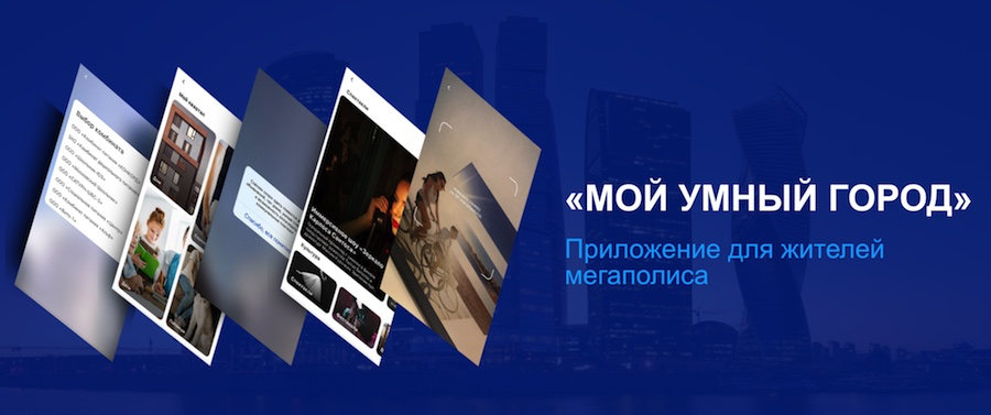
The answer is simple: we are hampered by the traditional view. At VTB, we, in conjunction with the Ampersand visual communication studio, decided to create a new type of banking application, which can no longer be called a banking application. In order for it to see the light exactly in the form in which we conceived, it was necessary to change the traditional development processes. Read more about how we did it.
The starting point for the whole process was set, as is usually the case, by the TK from the internal customer. More precisely, the fact that TK in the traditional sense did not exist . We received key input data, which were then supplemented and refined, sometimes right during the project: we need to tighten up such services, go here to this audience. "Well, then let's do it yourself!"
')
We started with the fact that we laid the main value of the new application - taking care of the user. Regardless of whether he is a client of VTB Bank. And here we are faced with contradictions.
In order for an application to claim such a role in the user's life, it must reach a new logical and visual level. We worked with the design studio for general introductory: combine Pinterest and a banking product , create large, vibrant forms, segment everything according to the natural scenarios of a person’s life. So there were large segments that should be filled with many different services: Culture, Transport, My quarter, Payments and transfers.

Payments and transfers are only one of the sections in our application. Everything that other banking applications offer in principle fits in it. But besides this, VTB has a huge number of partners - various city services that people constantly use. We wanted to make it so that using all these services was convenient through a single application. You find the event in the "Culture" section. Put it on the calendar. Receive a notice to buy a ticket. Postpone the purchase, and later receive another notice, so as not to miss the event. You buy a ticket, and the payment falls into a single convenient system, along with fines and Troika paid in the next section. If you didn’t pay the fine, you will see a red signal in the “Transportation” section. And so on. All for the care of the user.
We began to talk about our concept, our application at major conferences and thus attracted the first major partners - YouDo, Bury Zaryad, FitMost, restaurant booking services and other companies that are VTB clients. Our partners are the government of Moscow and the Active Citizen service. They pulled up local services smaller - for example, for walking dogs. All this we have combined in the section "My quarter".

Of course, faced with problems in integration.
At this stage, we connected the developers from the company Intervale . It has its own staff of designers, and the developers of Intervale are used to working with him, but the Ampersand agency team understood us as a business customer completely. As a result, we got a geographically distributed team. Ampersand as ideologists from the visualization of the project went to a better solution through many iterations - in the end, it was necessary to move from agit to the usual waterfall for VTB projects, otherwise the project would not be possible.
At the start of the project, Ampersand had its own technical specialist who helped with the initial validation of the design materials - it looked to see if they could be implemented technically at all. In the beginning, of course, there were many mutual questions. The regulation was: business requirements were stated by our business unit in close cooperation with Ampersand. Then technical coordination followed, developers received graphic materials, and implementation was going on. And here the most interesting began: the struggle of designers with developers, which was accompanied by the separation of stereotypical approaches to work and total mutual distrust at first .
Conveniently, when you can put everything like that in one basket. How, for example, payments. Designers came up with the logic in which all payments - planned and spontaneous - fall into a single basket of payments. Immediately made sketches of screens and handed over to developers.
We all are accustomed to see a single basket in online stores, focused on things. There are for this purpose long-established implementation practices. But in the bank application? It is necessary to collect both the ENP (single payment documents), and fines, as well as auto payments and even tickets to the play in one basket. Assemble so that with one button you can pay all at once or simply delete something with a simple swipe. For banking applications, this is a new approach.

Another time I came from designers to developers screen, where Maxim - our chat bot - answers questions like "do I have a fine or not?" Or "what is my payment status?". That is, conversational cues. Whereas usually in such scenarios in advance prepared list of questions is used. In order for the user to ask natural, more convenient questions, at this stage it is required to use a completely different approach to development as compared to that adopted in banking applications. At the moment we are still working on chat bot training.
Here is another “doubtful” screen from designers: at the top of the application screen is a search string that is designed to control the application. In the same way as the usual "burger" next. Why so? On the development side, this is a meaningless repetition of functionality.

The main screen of the application consists of tiles with sections. Among them there is one tile with a heart, “Favorites”. The user presses it and ... falls into the new tiles. Why two layers? And the thing is that the first layer of tiles always remains the same and represents the entire list of application functions. But the second layer of tiles is already dynamic, it is configured specifically for each user, depending on what and how often he uses. It may seem that the two screens will only confuse, but in reality this is not so - in the end, everything turns out quite intuitively.

All the interaction difficulties described above were not resolved in vain. We and design on the one hand, developers and analysts on the other - all eventually came to a single algorithm. First, we have business ideas and requirements. Then the designers look at how to embed this idea into a general concept, make general sketches. If it is clear that integration is necessary for the implementation of the idea - as is often the case with services - then, in parallel with the designers, analysts begin to work on an API or protocol.
Analysts add to the ideas of designers, based on the real situation. For example, parking fees. Initially, designers do not know what format the account number has, what additional information is needed - and consequently, how many fields it will need. Given this new information, designers are refining their ideas and then transmitting them to developers for implementation. In some cases, developers are ahead of the curve - and designers are already evaluating their input.

Of course, at least rarely, but contradictions occur - in this case we take the side of the designers, because, as we said, design first . In addition, our designers have a lot of experience, and often there is experience in controversial points on their side - the options they offer belong to best practice.
What are the advantages of our approach? As acknowledged by the developers, good design inspires them. In addition, from the point of view of functionality from designers, there is a big feedback about things that the developers don’t even think about. Yes, this can lead to an increase in development time, but experienced designers can justify why you need to make a custom button for two hours instead of sticking a default one in five minutes.

You can evaluate the result of our work in the App Store . While the application is just beginning to fill with services, there are already sections "Culture", "Transport", "Payments and transfers", "My quarter" and "Active citizen". Over time, it will be complemented by other features - a timetable of transport, a map of traffic jams, parking lots and car sharing vehicles. A “Sports” section will appear, where news from FC Dynamo, with which VTB cooperates, will be posted, and the module of augmented reality will be integrated. In addition, in the future, we will supplement the application with the section “For Moms” with information about restaurants with children's rooms and menus for the whole family, a poster for events, special offers from shops, etc. In the “Health” section, you can sign up for a doctor, see contacts medical institutions. Now we are working on launching the application not only in Moscow, but also in St. Petersburg, and with time in other million-plus cities.
If you are interested in our design-driven application development or anything else related to “My smart city”, we will be glad to hear your comments.
The answer is simple: we are hampered by the traditional view. At VTB, we, in conjunction with the Ampersand visual communication studio, decided to create a new type of banking application, which can no longer be called a banking application. In order for it to see the light exactly in the form in which we conceived, it was necessary to change the traditional development processes. Read more about how we did it.
The starting point for the whole process was set, as is usually the case, by the TK from the internal customer. More precisely, the fact that TK in the traditional sense did not exist . We received key input data, which were then supplemented and refined, sometimes right during the project: we need to tighten up such services, go here to this audience. "Well, then let's do it yourself!"
')
We started with the fact that we laid the main value of the new application - taking care of the user. Regardless of whether he is a client of VTB Bank. And here we are faced with contradictions.
Tully Kelme, CEO and Creative Director of Ampersand Visual Communications :
“The developers of banking applications put payment at the forefront and dance around it: so that notifications arrive on time, write offs are made, the help chat bot responded. We wanted our application to take care of the user because he knows everything about him: when he pays, where and how much. We were inspired by the film "She" , where the main character had a universal assistant, to whom he even felt like ".
In order for an application to claim such a role in the user's life, it must reach a new logical and visual level. We worked with the design studio for general introductory: combine Pinterest and a banking product , create large, vibrant forms, segment everything according to the natural scenarios of a person’s life. So there were large segments that should be filled with many different services: Culture, Transport, My quarter, Payments and transfers.
Payments and transfers are only one of the sections in our application. Everything that other banking applications offer in principle fits in it. But besides this, VTB has a huge number of partners - various city services that people constantly use. We wanted to make it so that using all these services was convenient through a single application. You find the event in the "Culture" section. Put it on the calendar. Receive a notice to buy a ticket. Postpone the purchase, and later receive another notice, so as not to miss the event. You buy a ticket, and the payment falls into a single convenient system, along with fines and Troika paid in the next section. If you didn’t pay the fine, you will see a red signal in the “Transportation” section. And so on. All for the care of the user.
We attract partners
We began to talk about our concept, our application at major conferences and thus attracted the first major partners - YouDo, Bury Zaryad, FitMost, restaurant booking services and other companies that are VTB clients. Our partners are the government of Moscow and the Active Citizen service. They pulled up local services smaller - for example, for walking dogs. All this we have combined in the section "My quarter".
Of course, faced with problems in integration.
Talley Kelmi:
“Many, especially large services are being developed by the developers of the“ old school ”who sometimes do not understand“ human ”cases. And without this it is difficult to explain why a normal API for integration is needed at all. Often we got to work only WebView, and only then the partners adjusted and offered a normal API. Here, as an example, everyone can cite the young team of YouDo programmers, who, despite their short experience, have already gained vast experience and are preaching a close approach to us. Of course, the larger the service, the greater, as a rule, problems with integration. ”
Design first
Polina Mikhailova, head of the project “My smart city” on the part of VTB:
“Even before the development began, it became clear: designers understand our“ absence of TK ”best of all , therefore they should play the main role. We had only one condition - to bring a maximum of payment connections of the bank in the new application - from paying school meals to tickets for FC Dynamo matches. ”
At this stage, we connected the developers from the company Intervale . It has its own staff of designers, and the developers of Intervale are used to working with him, but the Ampersand agency team understood us as a business customer completely. As a result, we got a geographically distributed team. Ampersand as ideologists from the visualization of the project went to a better solution through many iterations - in the end, it was necessary to move from agit to the usual waterfall for VTB projects, otherwise the project would not be possible.
At the start of the project, Ampersand had its own technical specialist who helped with the initial validation of the design materials - it looked to see if they could be implemented technically at all. In the beginning, of course, there were many mutual questions. The regulation was: business requirements were stated by our business unit in close cooperation with Ampersand. Then technical coordination followed, developers received graphic materials, and implementation was going on. And here the most interesting began: the struggle of designers with developers, which was accompanied by the separation of stereotypical approaches to work and total mutual distrust at first .
Template 1 gap: single basket ... for all-all payments
Conveniently, when you can put everything like that in one basket. How, for example, payments. Designers came up with the logic in which all payments - planned and spontaneous - fall into a single basket of payments. Immediately made sketches of screens and handed over to developers.
We all are accustomed to see a single basket in online stores, focused on things. There are for this purpose long-established implementation practices. But in the bank application? It is necessary to collect both the ENP (single payment documents), and fines, as well as auto payments and even tickets to the play in one basket. Assemble so that with one button you can pay all at once or simply delete something with a simple swipe. For banking applications, this is a new approach.
Template 2 gap: conversational chat-bot in ... “banking application”
Another time I came from designers to developers screen, where Maxim - our chat bot - answers questions like "do I have a fine or not?" Or "what is my payment status?". That is, conversational cues. Whereas usually in such scenarios in advance prepared list of questions is used. In order for the user to ask natural, more convenient questions, at this stage it is required to use a completely different approach to development as compared to that adopted in banking applications. At the moment we are still working on chat bot training.
Pattern 3 break: search bar ... to manage the application
Here is another “doubtful” screen from designers: at the top of the application screen is a search string that is designed to control the application. In the same way as the usual "burger" next. Why so? On the development side, this is a meaningless repetition of functionality.
Tully Kelmey:
“In fact, these management interfaces are focused on different types of users. There are "Old Believers", which is more convenient to click on the menu. And there are “intuits”, which are more convenient to enter into the search what they need, and get it from the application. Fast and elegant.
Pattern 4 is broken: there are only tiles around
The main screen of the application consists of tiles with sections. Among them there is one tile with a heart, “Favorites”. The user presses it and ... falls into the new tiles. Why two layers? And the thing is that the first layer of tiles always remains the same and represents the entire list of application functions. But the second layer of tiles is already dynamic, it is configured specifically for each user, depending on what and how often he uses. It may seem that the two screens will only confuse, but in reality this is not so - in the end, everything turns out quite intuitively.
New approaches to work
All the interaction difficulties described above were not resolved in vain. We and design on the one hand, developers and analysts on the other - all eventually came to a single algorithm. First, we have business ideas and requirements. Then the designers look at how to embed this idea into a general concept, make general sketches. If it is clear that integration is necessary for the implementation of the idea - as is often the case with services - then, in parallel with the designers, analysts begin to work on an API or protocol.
Analysts add to the ideas of designers, based on the real situation. For example, parking fees. Initially, designers do not know what format the account number has, what additional information is needed - and consequently, how many fields it will need. Given this new information, designers are refining their ideas and then transmitting them to developers for implementation. In some cases, developers are ahead of the curve - and designers are already evaluating their input.
Of course, at least rarely, but contradictions occur - in this case we take the side of the designers, because, as we said, design first . In addition, our designers have a lot of experience, and often there is experience in controversial points on their side - the options they offer belong to best practice.
What are the advantages of our approach? As acknowledged by the developers, good design inspires them. In addition, from the point of view of functionality from designers, there is a big feedback about things that the developers don’t even think about. Yes, this can lead to an increase in development time, but experienced designers can justify why you need to make a custom button for two hours instead of sticking a default one in five minutes.
What happens
You can evaluate the result of our work in the App Store . While the application is just beginning to fill with services, there are already sections "Culture", "Transport", "Payments and transfers", "My quarter" and "Active citizen". Over time, it will be complemented by other features - a timetable of transport, a map of traffic jams, parking lots and car sharing vehicles. A “Sports” section will appear, where news from FC Dynamo, with which VTB cooperates, will be posted, and the module of augmented reality will be integrated. In addition, in the future, we will supplement the application with the section “For Moms” with information about restaurants with children's rooms and menus for the whole family, a poster for events, special offers from shops, etc. In the “Health” section, you can sign up for a doctor, see contacts medical institutions. Now we are working on launching the application not only in Moscow, but also in St. Petersburg, and with time in other million-plus cities.
If you are interested in our design-driven application development or anything else related to “My smart city”, we will be glad to hear your comments.
Source: https://habr.com/ru/post/460443/
All Articles