Layout of rounded borders and sharp corners
The complexity of the interface elements increases with each new layout, which causes a lot of trouble for the layout makers. Developing technologies allow creating complex applications in the WEB (Google will not let me lie), so designers do not hold back and draw more and more sophisticated things. This usually results in a lot of graphics on the pages.
This article provides a couple of useful recipes for the author. You may already be familiar with them, and perhaps you will make something new for yourself, you decide.
Immediately explain what I mean:
')

It is necessary to impose this block so that it stretches in width and height. As a rule, the first thing that comes to mind is to create a 3x3 table. In the corner cells put 4 different images with the corners, put the content in the center, and hang up the rest of the cells according to the border. The way is cross-browser and quite simple. But first, to impose such blocks with tables not on feng shui, and second, you can opt out of four small images.
So, we will collect four corners in one image. In my example, I got the following result (32x26 px):

Now we have to position this image in the background in four different ways in blocks
size 16x13px, standing in the corners of the block. As a result, the author did this :
CSS:
HTML:
<div class = "roundborder">
<div class = "t">
<div class = "angles l"> </ div>
<div class = "angles r"> </ div>
</ div>
<div class = "content">
Content
</ div>
<div class = "b">
<div class = "angles l"> </ div>
<div class = "angles r"> </ div>
</ div>
</ div>
Initially, the corners were laid out through 4 DIVA scattered around the corners, and everything would be fine if it were not for one BUT - IE6. In it, this number is not climbed, I had to change everything in this way. So, the problem is solved: we got rid of the tables and reduced the number of HTTP connections by three, due to the collection of angles of one oval.
You see a layout with this block:
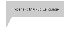
The first thing that comes to mind is: “Chooort, you have to cut this triangle and somehow hook it to the block.” It turns out not to. The reception was overlooked in the layout of hh.ru , for which the headhunter maker had a tremendous respect!
It turns out that the borders of the block divide the joint angles in equal shares, which will allow you to create any sharp angles. Illustration:
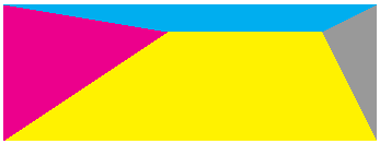
This is just one line of HTML / CSS code:
<div style = "border-top: 25px solid # 00aeef; border-left: 150px solid # ec008c; border-bottom: 100px solid # fff200; border-right: 50px solid # 999;"> </ div>
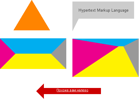
Here you will find a more fanciful application of this technique. Screenshot for those who are too lazy to look into the demo:
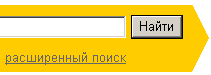
There is no need to go far for an example of usage. Everyone knows the face of Yandex:
Instead of the png-shki, which they use to create a corner, you can create such a corner from a single border:
<div style = "border-top: 34px solid #FFF; border-left: 17px solid # FFCC00; border-bottom: 34px solid #FFF;"> </ div>
And by the way, do not forget that an arbitrary polygon can be assembled from a finite number of triangles.
If someone wants to share their own ways of solving similar problems - I ask in the comments. Good luck in your struggle with the arbitrariness of design!
Crosspost Rounded borders and sharp corners from 2007.fastcoder.ru .
1) Comrade maxshopen correctly noticed that the border is also transparent, which allows us to impose without looking at the background of the page. And dmitrybaranovskiy added that the problem of using a transparent border in IE6 is solved by the IE-filter Chroma.
2) Comrades vasilioruzanni and dmitrybaranovskiy suggest that the idea with sharp corners is not new and is found here:
www.uselesspickles.com/triangles/demo.html
tantek.com/CSS/Examples/polygons.html
This article provides a couple of useful recipes for the author. You may already be familiar with them, and perhaps you will make something new for yourself, you decide.
1. Rounded borders
Immediately explain what I mean:
')
It is necessary to impose this block so that it stretches in width and height. As a rule, the first thing that comes to mind is to create a 3x3 table. In the corner cells put 4 different images with the corners, put the content in the center, and hang up the rest of the cells according to the border. The way is cross-browser and quite simple. But first, to impose such blocks with tables not on feng shui, and second, you can opt out of four small images.
So, we will collect four corners in one image. In my example, I got the following result (32x26 px):
Now we have to position this image in the background in four different ways in blocks
size 16x13px, standing in the corners of the block. As a result, the author did this :
CSS:
.roundborder {
border-top:1px solid #DBDBDB;
border-bottom:1px solid #DBDBDB;
}
.roundborder .content {
border-left:1px solid #DBDBDB;
border-right:1px solid #DBDBDB;

text-align:center;
color:#7A7A7A;
padding:10px 15px;
}
.roundborder .t, .roundborder .b {
position:relative;
height:12px;
}
.roundborder .t div, .roundborder .b div {
position:absolute;
width:16px; height:13px;
padding:0; margin:0;
}
.roundborder .t .l {
top:-1px; left:0;
background:#FFF no-repeat url(https://habrastorage.org/getpro/habr/post_images/10b/dea/8b5/10bdea8b5274eecd5da42b02b9d2cc9f.gif) top left;
}
.roundborder .t .r {
top:-1px; right:0;
background:#FFF no-repeat url(https://habrastorage.org/getpro/habr/post_images/10b/dea/8b5/10bdea8b5274eecd5da42b02b9d2cc9f.gif) top right;
}
.roundborder .b .l {
background:#FFF no-repeat url(https://habrastorage.org/getpro/habr/post_images/10b/dea/8b5/10bdea8b5274eecd5da42b02b9d2cc9f.gif) bottom left;
bottom:-1px; left:0;
}
.roundborder .b .r {
background:#FFF no-repeat url(https://habrastorage.org/getpro/habr/post_images/10b/dea/8b5/10bdea8b5274eecd5da42b02b9d2cc9f.gif) bottom right;
bottom:-1px; right:0;
}
HTML:
<div class = "roundborder">
<div class = "t">
<div class = "angles l"> </ div>
<div class = "angles r"> </ div>
</ div>
<div class = "content">
Content
</ div>
<div class = "b">
<div class = "angles l"> </ div>
<div class = "angles r"> </ div>
</ div>
</ div>
Initially, the corners were laid out through 4 DIVA scattered around the corners, and everything would be fine if it were not for one BUT - IE6. In it, this number is not climbed, I had to change everything in this way. So, the problem is solved: we got rid of the tables and reduced the number of HTTP connections by three, due to the collection of angles of one oval.
2. Angles less than 90 °
You see a layout with this block:
The first thing that comes to mind is: “Chooort, you have to cut this triangle and somehow hook it to the block.” It turns out not to. The reception was overlooked in the layout of hh.ru , for which the headhunter maker had a tremendous respect!
It turns out that the borders of the block divide the joint angles in equal shares, which will allow you to create any sharp angles. Illustration:
This is just one line of HTML / CSS code:
<div style = "border-top: 25px solid # 00aeef; border-left: 150px solid # ec008c; border-bottom: 100px solid # fff200; border-right: 50px solid # 999;"> </ div>
Here you will find a more fanciful application of this technique. Screenshot for those who are too lazy to look into the demo:
There is no need to go far for an example of usage. Everyone knows the face of Yandex:
Instead of the png-shki, which they use to create a corner, you can create such a corner from a single border:
<div style = "border-top: 34px solid #FFF; border-left: 17px solid # FFCC00; border-bottom: 34px solid #FFF;"> </ div>
And by the way, do not forget that an arbitrary polygon can be assembled from a finite number of triangles.
Conclusion
If someone wants to share their own ways of solving similar problems - I ask in the comments. Good luck in your struggle with the arbitrariness of design!
Crosspost Rounded borders and sharp corners from 2007.fastcoder.ru .
Additions
1) Comrade maxshopen correctly noticed that the border is also transparent, which allows us to impose without looking at the background of the page. And dmitrybaranovskiy added that the problem of using a transparent border in IE6 is solved by the IE-filter Chroma.
2) Comrades vasilioruzanni and dmitrybaranovskiy suggest that the idea with sharp corners is not new and is found here:
www.uselesspickles.com/triangles/demo.html
tantek.com/CSS/Examples/polygons.html
Source: https://habr.com/ru/post/46033/
All Articles