How a UX writer helps improve a product
Last September I completed my first big project with interface texts. I used to help colleagues-designers with formulations, but usually they were point changes: think up a term or phrase, shorten a sentence, explain something in simple language. Here I edited the texts on 100+ screens. I think this is a good reason for the article.
I'll warn you right away: I will not tell you what texts are needed in the headlines and on the buttons - on the Internet this is enough.
This article is about UX writing, work organization, and the challenges I encountered.
')
We have completely remade the user's personal account on the site of the Novosibirsk telecommunication company Electronic City. This is a major regional provider of digital services, which serves 93% of the city. The company has almost no competitors.
The electronic city connects the Internet, digital and cable TV, security with a panic button, video control, intercoms, peace of mind sensors, access to video cameras, control of wickets and barriers from a smartphone. The list is quite impressive.
You can connect these services in one section of your personal account, and configure them in another. And these are already different functions and interfaces. In the third section, you can manage your account: set up an auto payment, defer payments, order details, temporarily block an account.
There was a lot of work.
This is how the project looked like when I connected to it. It can be said to be introductory.

Personal account consists of six sections and 100+ screens. Everywhere there are lyrics
And here is the catalog of services. So far without my intervention.

In the catalog there are 34 screens with different states. In this section, you can only connect services. And manage - in another
I hope the scale of the work is clear.
The obvious answer is: to make the texts clearer, shorter and friendlier.
But there is an unobvious answer: the UX writer can use the texts to improve the product. Sometimes I managed to help designers reduce the number of screens, simplify user interaction and improve the design in other ways.
UX-writer in one sentence can improve the principle of the service.
Maybe he does it. The designer has to write something while working in order not to insert “fish” into the pictures. But the exact wording is not his task and, most likely, not his strong point. There is no point in wasting time on them: switching between the “write / draw” modes takes a lot of energy, and then you still have to rewrite.

This text was sent to us by the client. He is good, but does not answer basic questions. What if I install a video camera at home and get access to a stranger? For example, a company employee?
Depends on the complexity of the project. The correct answer to the question is no.
I was hooked up to the Electronic City project when all the screens were already drawn. But this is not an indicator - I know the products of the company well, because I had previously completely rewrote the Questions and Answers section on the site. The main scenarios of user behavior have not changed, so I did not need to help improve the design.
In other projects I was hooked up during design. And then the interface improved right before our eyes.

Two designers do not know how to formulate simple conditions. Try you.
This is how the situation was explained to me.
The service wants to collect more information about users and asks people to answer three questions for this. For the answer to one question, the user receives three bonus days, for the answer to the second question - another seven days, and for the third - ten more. You can earn 20 bonus days in total.
You can skip the first question, answer the second and third - 10 days will turn out. If you skip the second or third question, but answer the other two, it will still be 10 days.
It sounds very confusing. At first I tried to understand the logic.
If a person answers any two questions, he will receive ten days. And if he answers three questions, he will have twenty additional days. Not three plus seven plus ten, which must be counted in the mind, but twenty at once. This technique allows us not to explain how the days are summed up.
With the wording, everything was even easier. It is enough to change the "questions" to the answers, "and the picture will become clearer.

Sometimes it is necessary to connect a UX-writer at a time when it is difficult for the designer to formulate something, and this can spoil the interface.
But you can go another way: first write the text, and then design.
We usually discuss design in Miro . Comments and corrected texts I left there. But this turned out to be inconvenient for the customer, and his participation was required to clarify the information.

Therefore, I started writing texts in Google Docs, and the customer commented on them in the same place.
But if in Miro the designer sees which part of the text you have corrected, then in the text document - no. Therefore, for each page of the layout, I contributed all the texts, and not just the corrected part. This is important so that the designer understands how the final text should look.
For example, on the page three paragraphs of the text about the service. If the document contains only the rewritten third paragraph, the designer will have to read the text once more and think about what I have changed.

To make it clear which page the text belongs to, I copied a link to a specific page in the layout under the title. This is useful when there are several different pages or states in the subsection with the service.
For example, in the directory there is a subsection "Antivirus". It has six pages that are distinguished by fine details. Three of them in the project are called almost the same. In order not to force the designer to think for which page the text is, I gave a link.

It later turned out that it was inconvenient to recruit texts from images into a document. Therefore, the designer has unloaded all the layouts in Zeplin. There you can copy text directly from the layout.
So we worked using Sketch, Miro, Google Docs and Zeplin. Well, Telegram to quickly clarify something with the client.
Alas, there is no single tool in which you can design layouts, edit text and communicate with the customer.
UX writer does not work for speed. Sometimes you have to think over one phrase for a whole hour and rewrite it dozens of times. It is better to go through ten options and achieve the desired result than to produce a raw text in a hurry.
Remember, the interface will be used by thousands of people.

Riddle. The person living on the street Deputatskaya, there is Internet. He went to the service catalog, clicked "Connect Internet" and saw the text "The service will be added ...". What does this mean? Will he connect to the internet again? Will he have to change the tariff? Will they start taking money for a new service?
Try to guess and rewrite.
This formulation wounded me in the very heart and took away half an hour of life. I reworked it five times to make the text clear and at the same time brief.
We will carry an additional internet cable. You can change the tariff in "My Services".
This is a very simple formulation. But before that there were four difficult ones. Which I cut and rewrote.
Sometimes, to achieve a simple solution, you must first go through complex ones.
Another page from the same section took me an hour and a half.

The designer inserted a fish into the layout, and I needed to prepare a description. It would seem that here is difficult?
If I did not know the product, I would suggest leaving a paragraph about service offices and tariffs. Do not distract a person with unnecessary letters. Or I would insert a marketing text - about uninterrupted work, internal resources with free films and action routers.
But I knew the product.
Our provider can connect the Internet not only for yourself, but also for other people. For example, for parents. This is convenient - I ordered my mom a cable and you pay it yourself from your personal account in order to save her from the trouble. But, as you already know, you can connect a second cable to your home! Therefore, in one text I had to write about all three options and at the same time not confuse anyone and not hit the tautology.
Try to come up with a description.
I went over a dozen formulations, but each time it turned out clumsily and inelegantly. The penultimate decision was confused text.
You can connect the Internet to your apartment, to another apartment, but under your account or to take an additional cable to an already connected apartment.
Immediately you can not figure it out. Therefore, I broke the text into parts, and listed the conditions in the form of a list.
You can connect:
So there was a simple and clear solution. Before him, there were a dozen difficult ones that had to be abandoned.
There are two conclusions here.
Spending an hour on one sentence is normal. Because in the process you need to sort out dozens of inappropriate options.
A UX writer should think not only about individual formulations and phrases, but also about how the text will help the interface. Using letters, you can solve custom tasks that are difficult to handle by other means.
When you develop an interface, you can improve it in two ways.
The first way is to make the text shorter. The simple rule “best interface - no interface” applies to texts.
The second way is to make the text clearer. Alas, sometimes because of this, the text becomes longer. In the example above, I replaced "The service will be added" to "We will conduct an additional Internet cable." It was necessary, but inside it is still itching. After all, now in the interface the text will take two lines instead of one.
This happens. But it is better to write a clear title in two lines than incomprehensible in one.
Ideally, when you get and cut the text, and make it clearer.
If you are improving an existing interface rather than developing a new one, the customer may prohibit changing texts.
For example, you would like to simplify an ambiguous term.

The "Electronic City" has the service "Sensor of peace" - the company installs the equipment that monitors the apartment. If water leaks out or a thief gets in the window, the user will instantly receive a notification on the phone. Under the name "Sensor of Peace" it is not clear what kind of service it is. Maybe it is a wrist bracelet that tracks your condition? Or a device that checks the pulse of your elderly grandmother? We could come up with another name, but the subscribers of the provider already know it. There is no need to change and even harmful.
Sometimes it is impossible to change even individual phrases in interfaces.

I offered to write “Put on the account”, but the company uses “Deposit funds to the amount”. Can not be changed.
Another case is legal restrictions. Sometimes you cannot improve the text or get rid of difficult terms, because dissatisfied users can sue the company.

Concrete is always good. But the company cannot promise that the number of channels will not change. Because it risks violating the terms of the public offer.
The simplest example is the item about the storage of personal data. If the site has a form in which you ask for a name and telephone number, you must notify the user that you will store the entered data. And it is slightly alarming. You never know, zapamite later.
The wording about data storage is daunting, but try to explain it to lawyers.
Marketers create an image of the brand, so that it differs from competitors and is associated with the target audience with certain advantages. Texts are a part of interaction with consumers, and different companies have different styles of communication with people.
This also applies to interface texts, but here the UX-writer is responsible for the brand's voice. The tone of the microtexts depends on the impressions of the service visitor or application user.
Between "Yo, fly into the section" Discounts "" and "Good afternoon. We have collected the best offers for you in the “Promotions” section.
A UX writer should keep this in mind. And also to be able to speak with different “voices”.
When I wrote texts for the provider, I adhered to the tone of a polite assistant, who explains only the most necessary. He doesn’t give jokes, but he doesn’t behave emphatically officially. For example, when a person is required to perform some kind of action (this is always a microstress), he does not forget about “Please.”
It was.

It became.

Here we thank you for the payment, and not just report a successful transaction. Changed one word, and the robot turned into a man.
It was.

It became.

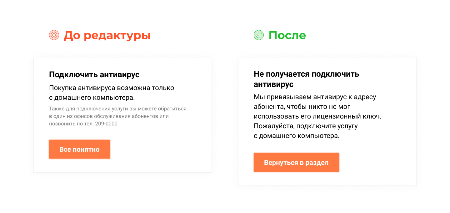
In the original layout, the text is slightly rude to the user. To avoid this, you need to explain why the company requires you to connect the antivirus only from your home computer.
Sometimes it is enough to change just one word so that the interface starts talking to the user in a friendly way. So, in the examples above, I did not propose radical changes. But the text still became more polite. The power of words lies in the nuances.
The main thing to remember is to try not to joke in the interface. Even if you think you can create a unique brand voice. Everyone's humor is different, and almost every joke can offend someone. Creative for the sake of creativity harms and distracts. And UX texts should help the user.
Any text can be reduced to a minimum. But not always brevity - the best solution.
Sometimes the interface has to “chat” with the user - to create the feeling that on the other side of the screen his friend is sitting and explaining complicated things in simple language. In this case, slang, neologisms and even parasitic words are appropriate. This informality makes the robot human.
Use the message “Oops! Something went wrong ”is possible not only on page 404.
Do not be afraid of a living language in the interface texts. So you create a brand voice, which will remember the company.
The larger the project, the more terms and repetitive phrases you will have. It is impossible to write “Put on the account” in one form, and “Deposit funds in the amount” in another. A person, of course, will understand what you want from him (you want money, you can see it immediately), but the consistency of the product is broken.
But if on different pages of the site you alternately use one or another term for the same actions or sections (“Enter the site” / “Authorization”, “Tariffs” / “Prices”, “Articles” / “Blog”), users will be cursed. Text is an interface element. And in parallel to use different terms - it's like using different buttons for the same action.
To prevent this from happening, get a dictionary. In the course of the project development you will replenish it with new type phrases. Designers collect all controls in a UI guide, and it would be useful for us to learn from this practice. If in the future the project is transferred to another company, your dictionary will help your colleagues - UX-writers.
We did not have such a dictionary. Therefore, when the customer began to change some of the wording, I had to manually search and correct these terms in other texts.
You write the texts, the customer comments on them or corrects them. Then you bring everything to a general view. Is it possible to transfer texts to the development? Not.
Even if both you and the customer are satisfied with the texts, they need to be shown to the editor and proofreader.
The editor will appreciate the texts with a fresh look, the proofreader will help with complex punctuation and typos. It is important that your work is checked. No matter how good you are. Everyone is inattentive.
After editing and proofreading texts can be transferred to production.
I'll warn you right away: I will not tell you what texts are needed in the headlines and on the buttons - on the Internet this is enough.
This article is about UX writing, work organization, and the challenges I encountered.
')
What was this project
We have completely remade the user's personal account on the site of the Novosibirsk telecommunication company Electronic City. This is a major regional provider of digital services, which serves 93% of the city. The company has almost no competitors.
The electronic city connects the Internet, digital and cable TV, security with a panic button, video control, intercoms, peace of mind sensors, access to video cameras, control of wickets and barriers from a smartphone. The list is quite impressive.
You can connect these services in one section of your personal account, and configure them in another. And these are already different functions and interfaces. In the third section, you can manage your account: set up an auto payment, defer payments, order details, temporarily block an account.
There was a lot of work.
This is how the project looked like when I connected to it. It can be said to be introductory.
Personal account consists of six sections and 100+ screens. Everywhere there are lyrics
And here is the catalog of services. So far without my intervention.
In the catalog there are 34 screens with different states. In this section, you can only connect services. And manage - in another
I hope the scale of the work is clear.
Why need a UX-writer. And why is it needed in principle?
The obvious answer is: to make the texts clearer, shorter and friendlier.
But there is an unobvious answer: the UX writer can use the texts to improve the product. Sometimes I managed to help designers reduce the number of screens, simplify user interaction and improve the design in other ways.
UX-writer in one sentence can improve the principle of the service.
Can a designer write texts himself
Maybe he does it. The designer has to write something while working in order not to insert “fish” into the pictures. But the exact wording is not his task and, most likely, not his strong point. There is no point in wasting time on them: switching between the “write / draw” modes takes a lot of energy, and then you still have to rewrite.
This text was sent to us by the client. He is good, but does not answer basic questions. What if I install a video camera at home and get access to a stranger? For example, a company employee?
When to connect to the project UX-writer
Depends on the complexity of the project. The correct answer to the question is no.
I was hooked up to the Electronic City project when all the screens were already drawn. But this is not an indicator - I know the products of the company well, because I had previously completely rewrote the Questions and Answers section on the site. The main scenarios of user behavior have not changed, so I did not need to help improve the design.
In other projects I was hooked up during design. And then the interface improved right before our eyes.
Task 1
Two designers do not know how to formulate simple conditions. Try you.
This is how the situation was explained to me.
The service wants to collect more information about users and asks people to answer three questions for this. For the answer to one question, the user receives three bonus days, for the answer to the second question - another seven days, and for the third - ten more. You can earn 20 bonus days in total.
You can skip the first question, answer the second and third - 10 days will turn out. If you skip the second or third question, but answer the other two, it will still be 10 days.
It sounds very confusing. At first I tried to understand the logic.
Decision
If a person answers any two questions, he will receive ten days. And if he answers three questions, he will have twenty additional days. Not three plus seven plus ten, which must be counted in the mind, but twenty at once. This technique allows us not to explain how the days are summed up.
With the wording, everything was even easier. It is enough to change the "questions" to the answers, "and the picture will become clearer.
Sometimes it is necessary to connect a UX-writer at a time when it is difficult for the designer to formulate something, and this can spoil the interface.
But you can go another way: first write the text, and then design.
How we organized the process
We usually discuss design in Miro . Comments and corrected texts I left there. But this turned out to be inconvenient for the customer, and his participation was required to clarify the information.
Therefore, I started writing texts in Google Docs, and the customer commented on them in the same place.
But if in Miro the designer sees which part of the text you have corrected, then in the text document - no. Therefore, for each page of the layout, I contributed all the texts, and not just the corrected part. This is important so that the designer understands how the final text should look.
For example, on the page three paragraphs of the text about the service. If the document contains only the rewritten third paragraph, the designer will have to read the text once more and think about what I have changed.
To make it clear which page the text belongs to, I copied a link to a specific page in the layout under the title. This is useful when there are several different pages or states in the subsection with the service.
For example, in the directory there is a subsection "Antivirus". It has six pages that are distinguished by fine details. Three of them in the project are called almost the same. In order not to force the designer to think for which page the text is, I gave a link.
It later turned out that it was inconvenient to recruit texts from images into a document. Therefore, the designer has unloaded all the layouts in Zeplin. There you can copy text directly from the layout.
So we worked using Sketch, Miro, Google Docs and Zeplin. Well, Telegram to quickly clarify something with the client.
Alas, there is no single tool in which you can design layouts, edit text and communicate with the customer.
You can work on one phrase for an hour. And it's worth it
UX writer does not work for speed. Sometimes you have to think over one phrase for a whole hour and rewrite it dozens of times. It is better to go through ten options and achieve the desired result than to produce a raw text in a hurry.
Remember, the interface will be used by thousands of people.
Task 2
Riddle. The person living on the street Deputatskaya, there is Internet. He went to the service catalog, clicked "Connect Internet" and saw the text "The service will be added ...". What does this mean? Will he connect to the internet again? Will he have to change the tariff? Will they start taking money for a new service?
Try to guess and rewrite.
This formulation wounded me in the very heart and took away half an hour of life. I reworked it five times to make the text clear and at the same time brief.
But the solution
We will carry an additional internet cable. You can change the tariff in "My Services".
This is a very simple formulation. But before that there were four difficult ones. Which I cut and rewrote.
Sometimes, to achieve a simple solution, you must first go through complex ones.
Another page from the same section took me an hour and a half.
The designer inserted a fish into the layout, and I needed to prepare a description. It would seem that here is difficult?
If I did not know the product, I would suggest leaving a paragraph about service offices and tariffs. Do not distract a person with unnecessary letters. Or I would insert a marketing text - about uninterrupted work, internal resources with free films and action routers.
But I knew the product.
Task 3
Our provider can connect the Internet not only for yourself, but also for other people. For example, for parents. This is convenient - I ordered my mom a cable and you pay it yourself from your personal account in order to save her from the trouble. But, as you already know, you can connect a second cable to your home! Therefore, in one text I had to write about all three options and at the same time not confuse anyone and not hit the tautology.
Try to come up with a description.
Decision
I went over a dozen formulations, but each time it turned out clumsily and inelegantly. The penultimate decision was confused text.
You can connect the Internet to your apartment, to another apartment, but under your account or to take an additional cable to an already connected apartment.
Immediately you can not figure it out. Therefore, I broke the text into parts, and listed the conditions in the form of a list.
You can connect:
- Internet to your apartment;
- Internet to another apartment, but under its contract - for example, parents;
- additional internet cable to an already connected apartment.
So there was a simple and clear solution. Before him, there were a dozen difficult ones that had to be abandoned.
There are two conclusions here.
Spending an hour on one sentence is normal. Because in the process you need to sort out dozens of inappropriate options.
A UX writer should think not only about individual formulations and phrases, but also about how the text will help the interface. Using letters, you can solve custom tasks that are difficult to handle by other means.
In short / everything is clear
When you develop an interface, you can improve it in two ways.
The first way is to make the text shorter. The simple rule “best interface - no interface” applies to texts.
The second way is to make the text clearer. Alas, sometimes because of this, the text becomes longer. In the example above, I replaced "The service will be added" to "We will conduct an additional Internet cable." It was necessary, but inside it is still itching. After all, now in the interface the text will take two lines instead of one.
This happens. But it is better to write a clear title in two lines than incomprehensible in one.
Ideally, when you get and cut the text, and make it clearer.
Sometimes it is forbidden to improve
If you are improving an existing interface rather than developing a new one, the customer may prohibit changing texts.
For example, you would like to simplify an ambiguous term.
The "Electronic City" has the service "Sensor of peace" - the company installs the equipment that monitors the apartment. If water leaks out or a thief gets in the window, the user will instantly receive a notification on the phone. Under the name "Sensor of Peace" it is not clear what kind of service it is. Maybe it is a wrist bracelet that tracks your condition? Or a device that checks the pulse of your elderly grandmother? We could come up with another name, but the subscribers of the provider already know it. There is no need to change and even harmful.
Sometimes it is impossible to change even individual phrases in interfaces.
I offered to write “Put on the account”, but the company uses “Deposit funds to the amount”. Can not be changed.
Another case is legal restrictions. Sometimes you cannot improve the text or get rid of difficult terms, because dissatisfied users can sue the company.
Concrete is always good. But the company cannot promise that the number of channels will not change. Because it risks violating the terms of the public offer.
The simplest example is the item about the storage of personal data. If the site has a form in which you ask for a name and telephone number, you must notify the user that you will store the entered data. And it is slightly alarming. You never know, zapamite later.
The wording about data storage is daunting, but try to explain it to lawyers.
UX Writer - Brand Voice
Marketers create an image of the brand, so that it differs from competitors and is associated with the target audience with certain advantages. Texts are a part of interaction with consumers, and different companies have different styles of communication with people.
This also applies to interface texts, but here the UX-writer is responsible for the brand's voice. The tone of the microtexts depends on the impressions of the service visitor or application user.
Between "Yo, fly into the section" Discounts "" and "Good afternoon. We have collected the best offers for you in the “Promotions” section.
A UX writer should keep this in mind. And also to be able to speak with different “voices”.
When I wrote texts for the provider, I adhered to the tone of a polite assistant, who explains only the most necessary. He doesn’t give jokes, but he doesn’t behave emphatically officially. For example, when a person is required to perform some kind of action (this is always a microstress), he does not forget about “Please.”
It was.
It became.
Here we thank you for the payment, and not just report a successful transaction. Changed one word, and the robot turned into a man.
It was.
It became.
In the original layout, the text is slightly rude to the user. To avoid this, you need to explain why the company requires you to connect the antivirus only from your home computer.
Sometimes it is enough to change just one word so that the interface starts talking to the user in a friendly way. So, in the examples above, I did not propose radical changes. But the text still became more polite. The power of words lies in the nuances.
The main thing to remember is to try not to joke in the interface. Even if you think you can create a unique brand voice. Everyone's humor is different, and almost every joke can offend someone. Creative for the sake of creativity harms and distracts. And UX texts should help the user.
The balance between brevity and humanity
Any text can be reduced to a minimum. But not always brevity - the best solution.
Sometimes the interface has to “chat” with the user - to create the feeling that on the other side of the screen his friend is sitting and explaining complicated things in simple language. In this case, slang, neologisms and even parasitic words are appropriate. This informality makes the robot human.
Use the message “Oops! Something went wrong ”is possible not only on page 404.
Do not be afraid of a living language in the interface texts. So you create a brand voice, which will remember the company.
Get a project vocabulary
The larger the project, the more terms and repetitive phrases you will have. It is impossible to write “Put on the account” in one form, and “Deposit funds in the amount” in another. A person, of course, will understand what you want from him (you want money, you can see it immediately), but the consistency of the product is broken.
But if on different pages of the site you alternately use one or another term for the same actions or sections (“Enter the site” / “Authorization”, “Tariffs” / “Prices”, “Articles” / “Blog”), users will be cursed. Text is an interface element. And in parallel to use different terms - it's like using different buttons for the same action.
To prevent this from happening, get a dictionary. In the course of the project development you will replenish it with new type phrases. Designers collect all controls in a UI guide, and it would be useful for us to learn from this practice. If in the future the project is transferred to another company, your dictionary will help your colleagues - UX-writers.
We did not have such a dictionary. Therefore, when the customer began to change some of the wording, I had to manually search and correct these terms in other texts.
Editing and proofreading
You write the texts, the customer comments on them or corrects them. Then you bring everything to a general view. Is it possible to transfer texts to the development? Not.
Even if both you and the customer are satisfied with the texts, they need to be shown to the editor and proofreader.
The editor will appreciate the texts with a fresh look, the proofreader will help with complex punctuation and typos. It is important that your work is checked. No matter how good you are. Everyone is inattentive.
After editing and proofreading texts can be transferred to production.
Let's sum up?
- UX Writer simplifies designer’s work and helps make the product better.
- Texts for the interface can be written before the design begins, in parallel with it and at the final stage of work.
- A unified tool for collaboration of the UX-writer, designer and customer does not exist yet. Or we still do not know about him :)
- One phrase can be composed for an hour. And it is worth it.
- UX-writer does not just write texts, he improves the interface and helps the user.
- It is necessary to write clearly, but not shortly.
- The customer may refuse a good text for their own reasons.
- The UX writer is the voice of the brand, so it must be human.
- Get a project vocabulary to use common terms and formulations.
- Be sure to spend editing and proofreading, not to miss mistakes.
Source: https://habr.com/ru/post/460281/
All Articles