Design game interfaces. Brent Fox. What is this book about?
This article is a brief overview of the Game interface design book by Brent Fox. For me, this book was interesting from the point of view of a programmer engaged in the development of games as a hobby alone. Here I will describe how useful it was for me and my hobby.
This review will help you decide whether to spend your resources on it. In the comments, you may find references to other useful books on the topic of game interfaces from more competent and kind colleagues.
The book was published in 2004. Therefore, there are obviously outdated descriptions and recommendations. For example, the resolution of the PC 1024x768 is called “very high resolution”. Also, to create interactive interface layouts, the author suggests using Flash. Although Flash has already ceased to be a popular technology, perhaps, to quickly create layouts, this is still a good solution.
')

A Brief History of Adobe Flash [ 1 ]
The main ideas and advice in the book still look just as relevant and the materials can be considered useful. It was nice to meet the now unpopular scrupulous approach to minimizing graphic data so that the game would fit on a DVD (or even on a CD) disk, and not weigh under 60 GB.
Due to the range of years the book cannot be called Must Have. Nevertheless, it can be useful, for me it was.
The book is mainly focused on novice game designers - interface developers, working in a team with programmers, artists, management and customers / publishers. For experienced designers, probably will be of little use (including judging by the reviews in online stores). The main development platform deals with the console, and then the PC. Smartphones (and especially VR) are not considered, because before the start of their explosive popularity with the release of the iPhone, there were still 3 years.
For minimal indie teams, the tips will also be very interesting too. Written book is easy and fun. I read it in English and did not find any intricate inappropriate phrases - everything is simple and to the point. It took 16 hours to read and take notes. The last two chapters describe the basics of working in Photoshope and Macromedia Flash, but you can also skip them.
Now, when I read books, I write out brief extracts from the proposed instructions and tips separately. In total here for myself I selected 63 husks. Below are a few such potions.
14. If you have a super cool and creative idea on the game interface, then you should carefully consider it (this includes control methods in the game). Probably, they tried to realize it, but there were very good reasons to refuse it. And not the fact that now it will be possible to solve them (and in general, is it worth it?). New interface and management can be a feature of the game, but it can make it inconvenient and incomprehensible.
18. A close look. In order to take a fresh look at your work, you need to change the way it is “received.” For example: on another device; replace texts with rectangles; change scale; flip; move away from the table or away from the side.
21. Indents between figures visually differ from the present distances. Rectangular shapes require more distance than round ones, so that they look “equal” distance from each other.

Cognitive distortions in user interfaces. [ 2 ] This article covers the topic in more detail, although it is more focused on web designers.
The idea is that the real distances between the characters / figures may be the same, but the perceived distance may be noticeably distorted.
24. Effect of movement. Even static elements can convey a sense of movement. For example, diagonal lines, leaving with a perspective into the distance.

Vertical and horizontal lines on the contrary give stability and stability to the picture.
32. Intersection of objects. Objects must either abut against each other, or intersect noticeably.

With a small overlay, it looks as if the designer tried to align them end-to-end, but he did not succeed, but a curved overlay came out.
46. Animations in the interface should be fast, usually not more than a second. Moreover, it should be possible to skip it completely for an instantaneous transition to the next screen or control element. Cool animation is interesting only the first couple of times, and then it will become uninteresting. If it is too long, it will only annoy. If it turns out to be short, then it will simply become imperceptible, which is an advantage rather than a disadvantage for the interface.
49-51. About icons. Buttons and indicators in the form of icons are much faster perceived by the player than text and numbers. Therefore, it is recommended to select clear icons as often as possible.
Icons can be grouped by purpose. For example, the attack buttons to make red, the settings buttons (sound, resolution) blue, the construction buttons are silver ... This will allow the player to quickly find the desired button, instantly cutting off unnecessary groups from the search area.
Icons should support the principle of uniformity. For example, if in one place a red pentagon or circle is used for the Stop sign, then you should not use the black square of the audio players in another place. When color grouping, this principle should also be used. You should not change colors of identical icons in different windows of the menu.
As with any graphics, with icons you need to be afraid of problems with copyright. Therefore, it is safer to make your own version of the icons “following the example” of another game. But there may be problems with it.
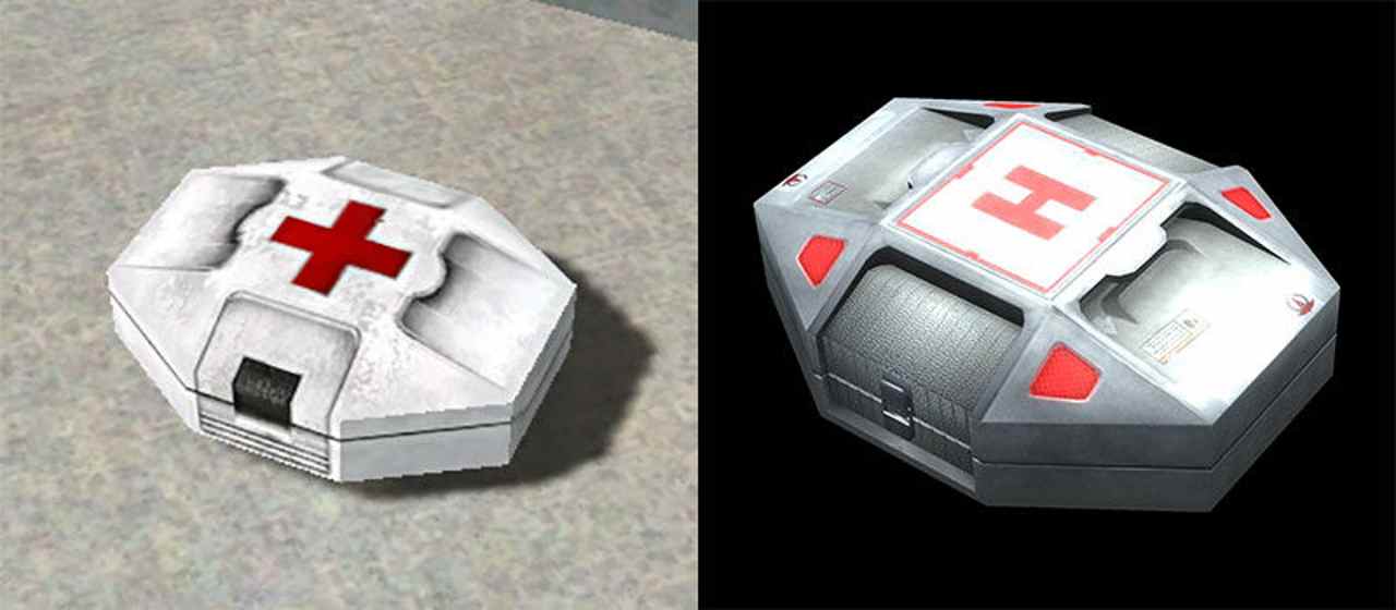
For example, the use of a red cross on a white background in first-aid kits (and other elements) is prohibited and you may well be “politely condemned”. The Red Cross organization does this periodically; for more details, see the article “Unexpected Reaction: The Red Cross requires you to remove your symbols from the Prison Architect game.” [ 3 ]
55. Dynamic elements in the HUD (in-game, "always" active interface). It is necessary to analyze the need to show all the information in the HUD - should it always be visible and accessible, can it only be in a certain state? For example, strategies often hide strips of health from completely healthy characters, and show them only if they are wounded.
In some cases, they can hide incomplete health bars and display them only for a couple of seconds immediately after it has been changed (treated or injured). Or show strips of lives only in combat mode, hiding them in the mode of wandering and searching for the trigger of the battle.
Brent Fox. At the time of this writing, he worked in the gaming industry for 7 years as a project manager and art director (then he was 34 years old). He worked / managed teams of up to 27 people, and also worked with very budget games. Developed games on a variety of consoles. Worked in studios: Bla-Dam Studios, Furious Games. [ 4 ]

Now the author of the book works as art director at Wahoo Studios [ 5 ]. Basically they are developing games on the console under a contract with Microsoft and Electronic Arts.
My opinion is that the book can be very useful. However, one should not forget about a significant number of negative reviews - the book is criticized for being too basic / simplified without narrow professional subtleties. Well, she had noticeably become outdated. It would be great if more experienced readers in the comments would recommend other books on this topic: better and / or more relevant.
1. A Brief History of Adobe Flash
2. Cognitive distortions in user interfaces
3. Unexpected reaction: “Red Cross” demands to remove its symbolism from the game Prison Architect
4. Game interface design - Brent Fox on Amazon
5. Wahoo Studios - Games
This review will help you decide whether to spend your resources on it. In the comments, you may find references to other useful books on the topic of game interfaces from more competent and kind colleagues.
Relevance
The book was published in 2004. Therefore, there are obviously outdated descriptions and recommendations. For example, the resolution of the PC 1024x768 is called “very high resolution”. Also, to create interactive interface layouts, the author suggests using Flash. Although Flash has already ceased to be a popular technology, perhaps, to quickly create layouts, this is still a good solution.
')
A Brief History of Adobe Flash [ 1 ]
The main ideas and advice in the book still look just as relevant and the materials can be considered useful. It was nice to meet the now unpopular scrupulous approach to minimizing graphic data so that the game would fit on a DVD (or even on a CD) disk, and not weigh under 60 GB.
Due to the range of years the book cannot be called Must Have. Nevertheless, it can be useful, for me it was.
The target audience
The book is mainly focused on novice game designers - interface developers, working in a team with programmers, artists, management and customers / publishers. For experienced designers, probably will be of little use (including judging by the reviews in online stores). The main development platform deals with the console, and then the PC. Smartphones (and especially VR) are not considered, because before the start of their explosive popularity with the release of the iPhone, there were still 3 years.
For minimal indie teams, the tips will also be very interesting too. Written book is easy and fun. I read it in English and did not find any intricate inappropriate phrases - everything is simple and to the point. It took 16 hours to read and take notes. The last two chapters describe the basics of working in Photoshope and Macromedia Flash, but you can also skip them.
Outlined ideas from the book
Now, when I read books, I write out brief extracts from the proposed instructions and tips separately. In total here for myself I selected 63 husks. Below are a few such potions.
14. If you have a super cool and creative idea on the game interface, then you should carefully consider it (this includes control methods in the game). Probably, they tried to realize it, but there were very good reasons to refuse it. And not the fact that now it will be possible to solve them (and in general, is it worth it?). New interface and management can be a feature of the game, but it can make it inconvenient and incomprehensible.
18. A close look. In order to take a fresh look at your work, you need to change the way it is “received.” For example: on another device; replace texts with rectangles; change scale; flip; move away from the table or away from the side.
21. Indents between figures visually differ from the present distances. Rectangular shapes require more distance than round ones, so that they look “equal” distance from each other.
Cognitive distortions in user interfaces. [ 2 ] This article covers the topic in more detail, although it is more focused on web designers.
The idea is that the real distances between the characters / figures may be the same, but the perceived distance may be noticeably distorted.
24. Effect of movement. Even static elements can convey a sense of movement. For example, diagonal lines, leaving with a perspective into the distance.
Vertical and horizontal lines on the contrary give stability and stability to the picture.
32. Intersection of objects. Objects must either abut against each other, or intersect noticeably.
With a small overlay, it looks as if the designer tried to align them end-to-end, but he did not succeed, but a curved overlay came out.
46. Animations in the interface should be fast, usually not more than a second. Moreover, it should be possible to skip it completely for an instantaneous transition to the next screen or control element. Cool animation is interesting only the first couple of times, and then it will become uninteresting. If it is too long, it will only annoy. If it turns out to be short, then it will simply become imperceptible, which is an advantage rather than a disadvantage for the interface.
49-51. About icons. Buttons and indicators in the form of icons are much faster perceived by the player than text and numbers. Therefore, it is recommended to select clear icons as often as possible.
Icons can be grouped by purpose. For example, the attack buttons to make red, the settings buttons (sound, resolution) blue, the construction buttons are silver ... This will allow the player to quickly find the desired button, instantly cutting off unnecessary groups from the search area.
Icons should support the principle of uniformity. For example, if in one place a red pentagon or circle is used for the Stop sign, then you should not use the black square of the audio players in another place. When color grouping, this principle should also be used. You should not change colors of identical icons in different windows of the menu.
As with any graphics, with icons you need to be afraid of problems with copyright. Therefore, it is safer to make your own version of the icons “following the example” of another game. But there may be problems with it.
For example, the use of a red cross on a white background in first-aid kits (and other elements) is prohibited and you may well be “politely condemned”. The Red Cross organization does this periodically; for more details, see the article “Unexpected Reaction: The Red Cross requires you to remove your symbols from the Prison Architect game.” [ 3 ]
55. Dynamic elements in the HUD (in-game, "always" active interface). It is necessary to analyze the need to show all the information in the HUD - should it always be visible and accessible, can it only be in a certain state? For example, strategies often hide strips of health from completely healthy characters, and show them only if they are wounded.
In some cases, they can hide incomplete health bars and display them only for a couple of seconds immediately after it has been changed (treated or injured). Or show strips of lives only in combat mode, hiding them in the mode of wandering and searching for the trigger of the battle.
about the author
Brent Fox. At the time of this writing, he worked in the gaming industry for 7 years as a project manager and art director (then he was 34 years old). He worked / managed teams of up to 27 people, and also worked with very budget games. Developed games on a variety of consoles. Worked in studios: Bla-Dam Studios, Furious Games. [ 4 ]
Now the author of the book works as art director at Wahoo Studios [ 5 ]. Basically they are developing games on the console under a contract with Microsoft and Electronic Arts.
Conclusion
My opinion is that the book can be very useful. However, one should not forget about a significant number of negative reviews - the book is criticized for being too basic / simplified without narrow professional subtleties. Well, she had noticeably become outdated. It would be great if more experienced readers in the comments would recommend other books on this topic: better and / or more relevant.
References to sources and additional literature
1. A Brief History of Adobe Flash
2. Cognitive distortions in user interfaces
3. Unexpected reaction: “Red Cross” demands to remove its symbolism from the game Prison Architect
4. Game interface design - Brent Fox on Amazon
5. Wahoo Studios - Games
Source: https://habr.com/ru/post/459708/
All Articles