How we made friends with SCSS with CSS Variables on the example of UI Kit temization

Hello everyone, my name is Vitalik, I am a senior Skyend front-end developer. Our team makes an online Vimbox platform for learning English. About a year ago, the designer and I completed a small UI kit, eradicating the chaos in the interface and codebase.
It turned out that we were not the only ones in the company who wanted the UI kit, and other teams began to come to us for advice “how to write our own”. We managed to dissuade them from this undertaking, promising to temizirovat their own - this saved the company hundreds of hours of development. Choosing a solution, we looked at Angular Material, customized assemblies and CSS Variables and eventually settled on the latter, despite their poor compatibility with SCSS, the basis of the existing UI kit. Under the cut - the details of what we have done.

Problem
The first UI kit consisted of fonts, a palette, a set of elements for creating forms (input, button, etc.), svg control system icons. Popup and tooltip based on Angular materials were also implemented. He was imprisoned for work only with the “classic” Vimbox : many things were deliberately tightly wired and did not allow changes from outside. And Skyeng began to appear new products on the same platform, for example, for children.
Developers of new directions, knowing that we have something, came for advice. And, to our surprise, they came already with the layouts of their UI kit: they were going to develop their solutions from scratch, since they needed a different look for the components. It was clear that something was going wrong, and we proposed to finalize our library, adding the possibility of its thematization.
The argument was simple: it took 200 hours of UX design and more than 500 hours of development to design our UI kit. This is the time required to create a system of fonts, colors and about 10 basic components. Accordingly, if you write a separate library for each product, the company will spend N * 500 hours of developer time. We thought that improving our UI kit would be cheaper, plus this action would not have to be repeated for each product.
Our arguments were accepted, related directions agreed to wait, and we set off to seek a technical solution.
Initial data
Our tools: Angular, SCSS.
We support only modern browsers and, with some limitations, IE11. What a great life simplifies.
All our UI kit components were permeated with common styles that we folded in UI kit.var.scss as SCSS constants:
@mixin fontSizeXl { @include fontSize(18px, 26px); } $colorSkillListening: #9679e0; $colorSkillListeningText: #7754d1; $colorSkillListeningBackground: mix($colorSkillListening, #ffffff, 16%); $colorSkillListeningBackgroundHover: mix($colorSkillListening, #ffffff, 8%); Task
- All new products are assembled from the already existing elements present in the “adult” Vimbox - study rooms, private rooms, etc.
- Designers should have a wide freedom to implement creative ideas, distinctive features and specific requirements of new products.
- At the same time, continuity is preserved, i.e. No matter how acidic and insane fonts the designer invented, the result of his work belongs to the Skyeng ecosystem.
- All this is added to the existing UI kit, while retaining all its advantages.
Go!
So, the result is expected from us yesterday, we need to quickly conduct a technical review and discuss options. At the first meetings, we identified a range of possible solutions:
Angular material
We do not like to write bikes, so first of all turned to Angular Material. In components, dynamic styles are rendered into a separate {component}-theme.scss file. These styles are bound to the global component selector.
| pros | minuses |
|---|---|
| no need to add new technologies to the project | need to make changes to each component |
| the largest amount of work | |
| have to sacrifice style encapsulation |
CSS variable
We have a great reason to try trendy CSS variables. The plan is to transfer custom UI kit parts to CSS Variables. The components use the same SCSS constants, but instead of specific values they contain CSS vars.
| pros | minuses |
|---|---|
| possesses scoup | will have to add a polyfill for IE |
| native browser technology (except for IE) | we will not be able to use SCSS functions |
| opens up the possibility of using CSS vars in other tasks |
Custom builds
We love simple solutions, why not try changing the build? Each team creates its own theme customization file. When building for all custom themes, separate bundles are created with their own theme.
| pros | minuses |
|---|---|
| no need to change library code | complication of library assembly configuration |
| complication of library deployment | |
| making changes, you need to rebuild artifacts for all projects | |
| There is no possibility of "dynamic" switching topics. It will be hard to add night mode |
Decision
Week we studied each option, discussed, postponed the decision and studied again.
We love new technologies and watch them, but we introduce them only if they give us real bonuses. We knew about CSS Variables, we wanted to try them, but the lack of SCSS functions caused great sadness. And yet the advantages of this option were obvious, we decided to figure out how and what functions we use SCSS, can we make friends with CSS vars.
Understanding CSS vs SCSS issues
After experimenting, we realized that the main problem is the lack of #hex support in CSS: in SCSS we write rgba(#ffffff, 0.4) , and in CSS the same requires a different set of parameters - rgba(255, 255, 255, 0.4) . Everything works for us with #hex, and we really, really don't want to change it. We have found solutions, I will tell in the order of admission.
Lighten & darken
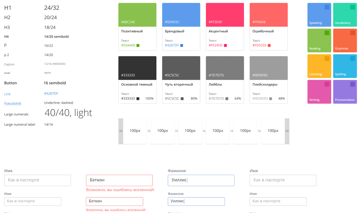
Our designer came up with a palette consisting of a small number of base colors, expanding with the SCSS functions lighten and darken :
// $color – base: $color, background: mix($color, #ffffff, 16%), backgroundHover: mix($color, #ffffff, 8%), hover: lighten($color, 5), focused: darken($color, 5), ...more transformations... We tried to find an analogue of lighten and darken in CSS, but found nothing. We thought for several days, until we realized that in order to customize, we need to get rid of these functions inside the library, bringing them out. After all, each team may want to come up with its own color change formula when the focus changes - for example, colleagues from Kids need more contrast.
It turned out a simple solution - to transfer our transformations to the side of the platform, which will initialize the theme. And for the platform we write a function that automatically creates the necessary values:
@function getMainColors($color, $colorText) { $colors: ( text: $colorText, base: $color, background: mix($color, #ffffff, 16%), backgroundHover: mix($color, #ffffff, 8%), lightenLess: lighten($color, 5), darkenLess: darken($color, 5), lightenMore: lighten($color, 20), ); @return $colors; } The platform uses it when initializing colors:
//platform $colorValues: ( brand: getMainColors(#5d9cec, #4287df), positive: getMainColors(#8cc152, #55a900), accent: getMainColors(#ff3d6f, #ff255d), wrong: getMainColors(#ff6666, #fe4f44), ) RGBA
In our UI kit we use the rgba function. With its help, we adjust the transparency of the base colors. But if in SCSS rgba works with the #hex format, then CSS cannot. I had to write a function that decomposes the #hex value in r / g / b:
// returns `r, g, b` from `#hex` for `rgba(var(--smth))` usage @function rgbValuesFromHex($hex) { @return red($hex), green($hex), blue($hex); } Well, since we do not want to generate RGB values by handles to the whole palette, we create a separate function that does this recursively for each color in the collection:
// adds `fieldRgb: r, g, b` fields to map for each `field: #hex` for `rgba(var(--smth-rgb))` usage @function withRgbValues($map) { $rgbValues: (); @each $name, $value in $map { $formattedValue: (); @if type-of($value) == 'map' { $rgbValues: map-merge($rgbValues, (#{$name}: withRgbValues($value))); } @else { // , rgb Rgb $rgbValues: map-merge($rgbValues, (#{$name}Rgb: rgbValuesFromHex($value))); } } @return map-merge($map, $rgbValues); } As a result, the initialization of the palette with the generated RGB values looks like this:
$colorValues: withRgbValues( ( text: ( base: #242d34, secondary: #50575c, label: #73797d, placeholder: #969b9e, inversed: #ffffff, inversedSecondary: #dadada, ), brand: getMainColors(#5d9cec, #4287df), positive: getMainColors(#8cc152, #55a900), accent: getMainColors(#ff3d6f, #ff255d), wrong: getMainColors(#ff6666, #fe4f44), //...etc At the output we get the SCSS color map, which can then be given to a method that turns it into CSS variables. In order to get the value from the RGB theme, we wrote a function:
@function getUiKitRgbVar($path...) { $path: set-nth($path, -1, #{nth($path, -1)}Rgb); // @return getFromMap($uiKitBaseVars, $path...); } // border-color: rgba(getUiKitRgbVar(color, brand, base), $opacity64); Turn SCSS const into CSS vars
The first step is to create a mirror structure (similar to SCSS), which stores the names of CSS Variables:
$colorCssVars: withRgbCssVars( ( text: ( base: getColorCssVar(text, base), secondary: getColorCssVar(text, secondary), label: getColorCssVar(text, label), placeholder: getColorCssVar(text, placeholder), inversed: getColorCssVar(text, inversed), // getColorCssVar is a method that prefixes variable names. Add the prefix --sky to avoid collisions with external libraries. And also we add to the --sky library prefix - UI kit to avoid collisions with internal libraries. It turned out - --sky- UI kit :
@function getColorCssVar($parts...) { @return getUiKitCssVar(color, $parts...); } @function getUiKitCssVar($parts...) { $uiKitCssVarPrefix: '--sky- UI kit'; $cssVar: $uiKitCssVarPrefix; @each $part in $parts { $cssVar: $cssVar + '-' + $part; } @return $cssVar; } For example, for getColorCssVar(text, base) at the output we get - --sky- UI kit-color-text-base .
The final stroke is a recursive mixin that initializes values from the SCSS structure to variables with names from the CSS Var structure:
// :root { @include uiKitThemeCssVars($uiKitDefaultTheme); //uiKitDefaultTheme – SCSS } @mixin uiKitThemeCssVars($theme) { $cssVarsList: createVarsList($theme, $uiKitBaseCssVars); //18+, Map List, $uiKitBaseCssVars css @each $cssVar, $value in $cssVarsList { #{$cssVar}: $value; } } An example of using a theme on a platform:
.popup { font-family: getUiKitVar(font, family); background-color: getUiKitVar(color, background, base); ... } What is the result
We were able to use CSS Variables, retaining the ability to use SCSS functions. Created the ability to customize the appearance of the components. We wrote a couple of recursive methods to automate the expansion of the topic. Well and the main thing - have spent 30 hours of development instead of N * 500.
Profit!
')
Source: https://habr.com/ru/post/459194/
All Articles