Product Design Digest June 2019
The digest collects fresh articles on interface design, as well as tools, patterns, cases, trends and historical stories since 2009. I carefully filter a large stream of subscriptions so that you can upgrade your professional skills and better solve work tasks. Previous issues: April 2010-May 2019 .

Suzanne Scacca writes about a strange trend when chat bots replace the usual feedback forms on mobile sites. In most cases, they are useless and only complicate contact with the company.

')
Overview of crazy interface patterns that go into the Reddit-community Programmer Humor since 2016.

Page Laubheimer from Nielsen / Norman Group talks about the law of taxiing Accot-Zhai for interface elements that require a long pointer movement (for example, a mouse cursor). It helps to make the accessible zone (tunnel) wide enough so that the interaction with the drop-down list, slider, video chronology and other similar element is comfortable.

Tips on literate presentation of promotional codes on Kim Flaherty online stores from Nielsen / Norman Group.
Aaron Pearlman offers tips on how to optimize keyboard navigation for users with disabilities.
Another catalog of interface patterns.
Memo Raluca Budiu from the Nielsen / Norman Group on the selection of mandatory fields in the forms. Basic, but good review.
Kara Pernice and Patty Caya from the Nielsen / Norman Group describe trends in the design of intranet sites.
The annual conference of WWDC brings fresh iOS and some unexpected ones for interface designers making fancy apps. This time came from the side of the tablet.

Since there is no reason to wait for a reasonable approach with a single OS for Apple’s computers and tablets, the creeping migration of tablets towards usefulness continues (with the rejection of many Post-PC mantras). This year, iOS has been allocated to a separate branch of the iPadOS. What interesting happened to the interface :
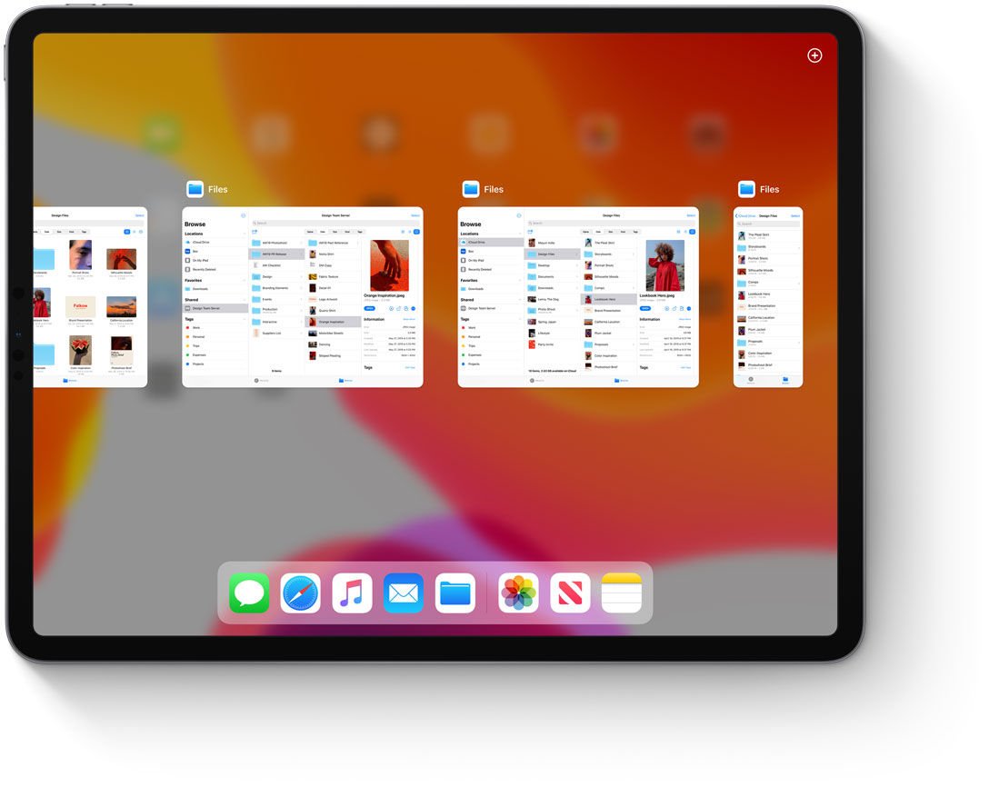
More serious work with the file system after all those tales of the uselessness of this “outdated concept”. There are even their own flash drives - an SD card can be connected via an adapter.
Applications can be run several times (they will be in tabs).
The start screen is now with widgets, and the grid of application icons is denser.
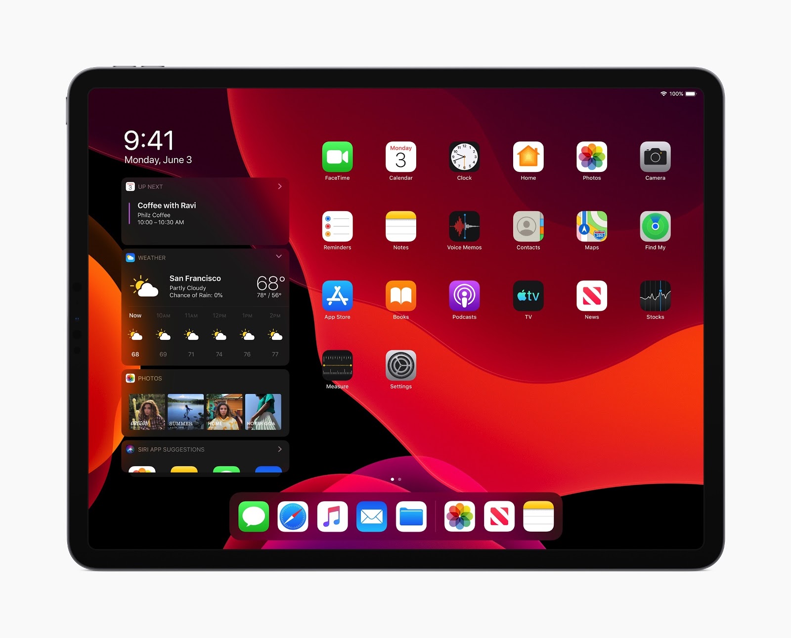
Better switching between applications.
Simple gestures for copying and pasting, as well as cancellation when editing documents.
You can put fonts (judging by the description, through the AppStore).

Gradually they are working on a browser that was very far from modern features on the desktop. They already boast of Google Docs, so most likely, Figma and the upcoming Sketch for the browser will be able to.
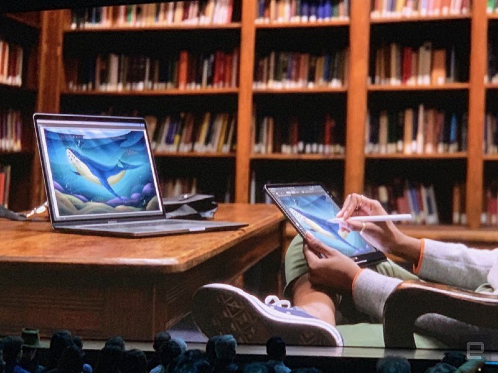
iPad can be the second screen for a laptop or computer . You can also control the computer from the tablet.
Project Catalyst (previously announced as Marzipan), which allows porting iPad applications to Macs, is already available to developers. For example, Twitter quickly flashed the application.
A beta version is already available (review). Overview of updates for developers and designers .
There are no special updates to the interface (again focus on speeding up and reducing the size of applications), but:
The dark theme of design , as in any teapot in 2019. Guidelines .
New filter pattern in photos and advanced editor in the inbox.

Authorization in third-party services through an Apple account . Allows you to enter through fingerprint or face recognition, well, it will help to hide mail from spammers.


Speed dialing on the keyboard via swipe is only about ten years behind Android.
Voice control for users with disabilities now seems to cover all possible usage scenarios.
Restrictions on advertising and tracking behavior in applications for children .
If you bring the phone to HomePod, the music will continue to play on the smart speaker.
Siri's more humane voice .
A beta version is already available ( review ). Overview of updates for developers and designers . And there were also the font New York and a library of icons with varying thick lines :

Another useful tool is the SwiftUI framework for any Apple OS, which greatly simplifies the interface assembly. So that designers can do this - you can sketch elements on the screen and then adjust the code. Step - by -step lessons come to him, and the omnipresent Meng To will launch the course in the fall.
Well, the traditional awarding of the best design applications .
Hours develop as a tool for health monitoring. Now they have their own app store that does not require a phone.
Gene Shopnon from Shopify reflects on the main findings from two years of experience working on their Polaris design system. Many interesting details and practical problems of development of a large-scale platform.

Adobe is developing its Spectrum design system. They have more than a hundred products, so the task is monstrous and the return will not be fast. But they described a good universal approach that could potentially help make different applications homogeneous. The team recently answered questions from Designer News . A couple more articles on the topic from them: 1 , 2 and 3 .
Vox Media's Michele Cynowicz talks about how interactive prototypes are built around their design systems. They make a branch in the components, which, if successful, merges into the main code and is accessible to everyone.
A brief interview with Brad Frost about his current projects and the nuances of the introduction of design systems.
A useful reminder of Rhiannon Jones from Deliveroo for choosing the right key for interface texts. It should be associated with the brand and work in ordinary and problematic situations.
Chrid Cid proposes to call design-system variables "ions" for those who adhere to the atomic design methodology. True, the "tokens" is already a more well-established and accustomed word.
Susan Gray Blue from Facebook describes the company's approach to the tonality of texts in the interface. They do not try to guess the mood of the user, because this is impossible, but they try to be adequate to the specific situation.
The service helps to store design system tokens and distribute them to a bunch of platforms and frameworks. Well, collect them initially from the design tools.
Kate Moran and Kim Flaherty describe a compromise between convenience and fears for modern devices and services that require you to sacrifice some privacy.
Andrei Gargul writes about the importance of taking user expectations into account when planning and launching MVP.
Jared Spool writes about an iterative improvement in the understanding of users and their scenarios in the course of work on the product.
IDEO launched a service for the exchange of mindboards, notes and other developments within the team.

Announced version for teams. Sketch Cloud shared space, versioning, centralized distribution of plug-ins and symbol libraries, viewing screen specifications in a browser without Zeplin. As in Figma, you only pay for the editors, and not everyone with a single view of one screen. The beta version will appear in July.
And in version 56, the most ancient and stupid pain will be solved - the characters themselves change size as content changes. Do not have to change the width of the hands of the buttons? Plus a component panel will appear next to the layers (as in the Figure). And the change in distance in the group of objects (also in the Fig).
The service allows you to quickly assemble a learning tour for the user. The authors have targeted sellers and customer support, i.e. use to help a particular person.
Search Muzli collections well complements Pinterest to collect the mindboards.
Announced plugins. They promise reliable and trouble-free operation when add-ons do not break when the tool is updated. A beta version for developers is already available. This was one of the main functional claims shifting from Sketch.
Bonus: Memo to create a typographic system . More basic theory of building a font scale, but there are examples of patterns directly in Figma.

This is reminiscent of a tipping point in the race of Android and iOS - at some point they so strongly broke away from competing platforms like Windows Phone, Tizen, Sailfish, WebOS, and others that all attempts to catch up with their heads lost meaning (with all the money from Adobe and InVision) . This year, Sketch and Figma will do about the same, so I don’t even know whether to continue talking about the rest.
Designer mobile sites for Instagram, you can do them right on the phone.
The third version of the designer promo sites from DesignModo.
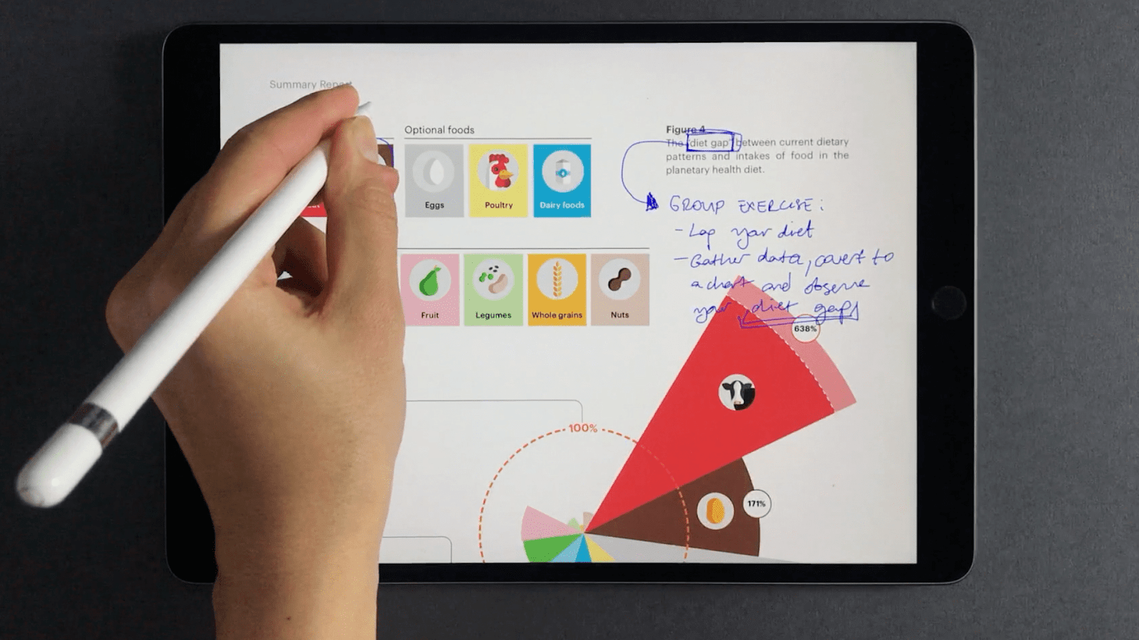
Experimental tablet app for visual notes and sketches. Interesting techniques of interaction with interfaces, which are discussed in detail in the article.
Vector editor for Mac.
Generator briefs on different design work.
The simplest prototype designer promo sites, helping marketers and interface writers to work out the content and the flow of information in general.

Another service designer of illustrations from finished elements.
And one more designer of illustrations.
New version out of beta . Of the most interesting changes - the animation of vector shapes.
The site is written about the termination of development .
Course on the Framer Playground by Meng To .
Out of beta . The interface has been updated, import from Sketch has appeared, the possibilities of visual design are being expanded.

Constructor chat in the chat, which gives the output iMessage screenshot on the phone. Interview with the author .
Now he can make mental maps .
Out of beta . The organization of projects in the cloud and versioning appeared, and the interface itself is greatly improved.
We launched global guidelines that can describe several projects at once. Colors, fonts, and components can be inherited, for example, between the web, Android, and iOS.
Alyssa X talks about his new animation tool. There is nothing working yet, but there is an overview of the main ideas.
Matt Duignan from Microsoft manages the HITS user insights database. It shows the principles of its operation and how food teams benefit from it. His podcast is on this topic .

Babette Schilte, a user research team on Facebook, talks about collecting small insights from user research that can and should be used for other tasks.
Jeff Sauro deals with the ability to predict the user's actions through his attitude towards the company or product. He walked through early research (including the reasons for the emergence of the norm “you do not need to ask the user what he needs”). Attitudes can be divided into three components (beliefs, feelings, and intentions), and the likelihood confirms the probability of predicting subsequent actions.

Facebook's Beth Lingard shows its approach to describing the findings from user research, which is convenient for product teams.
Jeff Sauro reviewed his attempts to reproduce famous metrics and user research methods. Some were confirmed, some - no.
Maria Rosala of Nielsen / Norman Group describes typical problems in planning and conducting interviews with users.
Cailean Cooke Goold from Facebook provides tips on conducting exploratory user research.
Overview of the development of interface technologies for users with disabilities from Be Birchall.
Andy Clarke continues a series of experiments with an interesting magazine layout on the web.
Jeff Sauro compares the HEART framework with earlier counterparts and tries to understand how its use benefits the product teams. He connects metrics of behavior and attitudes towards the company.

Jeff Sauro reproduced another part of the NPS study to understand the distribution of recommendations for specific assessments.
Henry Wu from HubSpot writes about how a designer can competently communicate in the language of business and appeal to the correct metrics for the current situation in the product.
Atlassian's Alastair Simpson led many design teams at the company. He created a smart memo for a new design manager in a team - how to sort out the situation and bring benefits, and not a new layer of micro-management.
Deliveroo's Sana Rao talks about the reorganization of the design team. They came to the matrix structure instead of division into functional departments.

Denise Lee Yohn gives advice on the organization of the internal culture of the company, which contributes to the focus on users. Much time is spent on the availability of knowledge about the user and competent hiring of employees.
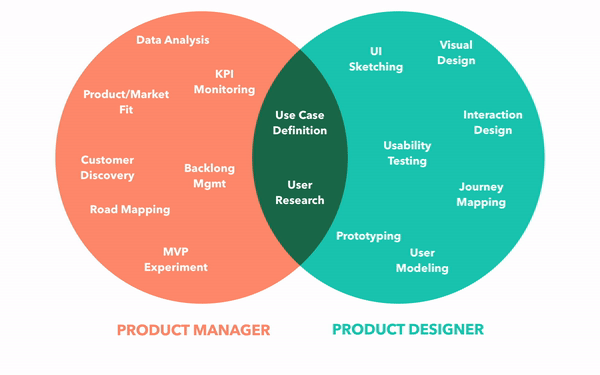
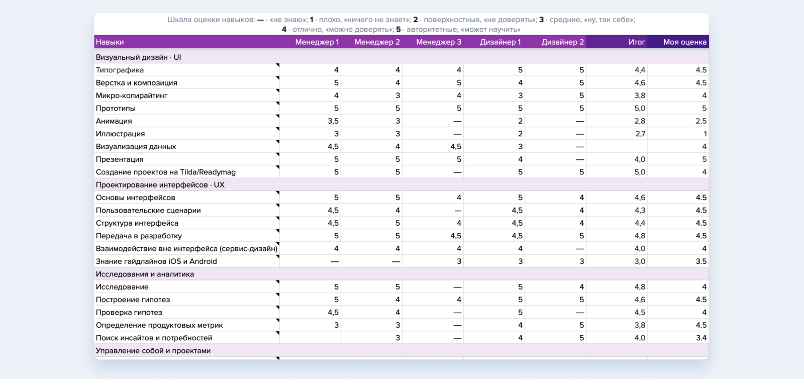
Ivan Solovyov from DocDoc talks about the competence map of designers in a team.
Eunice from IBM briefly talks about the competency map for designers in the company (there are already 2,000 of them). Allison Biesboer tells how she was born (a bit too much water, but there are basic details of the creation process).
Slack Behzod Sirjani talks about his experience in building an internship program for user research, as well as a vision for working properly with product teams.
Ayesha Saleem has done a little UX research in startups. She identified three categories, depending on when they started using good interface design practices, and tried to relate them to success in the market.
Peter Merholz reflects on the optimal process for finding design leaders. The main tasks and features of the selection.
Dan Brown describes a universal approach to conducting useful design meetings. These are 4 stages - the formulation of a problem, the extraction of ideas, a combination of ideas, reflection.

A great article by Oleg Yakubenkov, where he shows an error in using the term Customer Development, which is now popular in the domestic professional community. In the original concept of Steve Blank, this was a holistic methodology for grocery work, and by this we mean only one of the pieces - user research (or rather, part of it - in-depth interviews).

Sid Yadav has moved from design to product management and gives 10 tips on key focus points in this transformation. All with references to efficient books.
Canvas design thinking, helping to lead the design process.
Strong concept of a fictional operating system from Jason Yuan. It is designed for meta-scenarios (for example, to plan a trip) in which the user interacts with atomized parts of applications (for example, a specific correspondence from the messenger).

A striking example of the fiasco at product launch. Accenture did a restart of the Hertz website for many millions of dollars. They thwarted all the time limits, the solution did not meet the TOR in terms of modern requirements (correct adaptability, a normal design system on components in the code with a live guide, the possibility of the theming for sub-brands). And for bringing him to the contractor asks for millions for finishing work.
The annual review of trends in logos from LogoLounge.
Mary Meeker released an annual report on Internet trends. vc.ru identified the main points .
Niteesh Yadav describes the features of perception of texts in virtual and augmented reality. How to achieve good readability.
Redesign CarPlay . Splitting the screen for two applications, so you don’t have to switch from maps to music, plus context-sensitive application hints.

Medium launched their own design magazine on Medium with articles from other authors.
The Kim Flaherty of the Nielsen / Norman Group gives its definition of the difference between User Experience and Customer Experience. She considers three levels of human interaction with the company - specific interactions, holistic scenarios and a general history of relationships.
Jon Kolko reflects on the problems of modern education for designers. How to make graduates not only know the methods, but think better about the problem being solved.
Jony Ive leaves Apple. Together with Mark Newson, they will open a design studio that will work including with Apple. Five years ago, he said that he would leave only if the company ran out of innovation.

Patterns and best practices
Should Chatbots Replace Forms On Mobile?
Suzanne Scacca writes about a strange trend when chat bots replace the usual feedback forms on mobile sites. In most cases, they are useless and only complicate contact with the company.
')
Bad UI - on Reddit for three years competing in creating the worst interfaces for adjusting the sound, entering the number and password
Overview of crazy interface patterns that go into the Reddit-community Programmer Humor since 2016.
Accot-Zhai Steering Law - Implications for UI Design
Page Laubheimer from Nielsen / Norman Group talks about the law of taxiing Accot-Zhai for interface elements that require a long pointer movement (for example, a mouse cursor). It helps to make the accessible zone (tunnel) wide enough so that the interaction with the drop-down list, slider, video chronology and other similar element is comfortable.
Applying Discounts and Promotions on Ecommerce Websites
Tips on literate presentation of promotional codes on Kim Flaherty online stores from Nielsen / Norman Group.
UX Optimizations For Keyboard-Only And Assistive Technology Users
Aaron Pearlman offers tips on how to optimize keyboard navigation for users with disabilities.
Webframe - Beautiful web app screenshots
Another catalog of interface patterns.
Marking Required Fields in Forms
Memo Raluca Budiu from the Nielsen / Norman Group on the selection of mandatory fields in the forms. Basic, but good review.
4 Noteworthy Intranet Design Trends in 2019
Kara Pernice and Patty Caya from the Nielsen / Norman Group describe trends in the design of intranet sites.
Design systems and guidelines
iOS 13 and iPadOS
The annual conference of WWDC brings fresh iOS and some unexpected ones for interface designers making fancy apps. This time came from the side of the tablet.
iPadOS
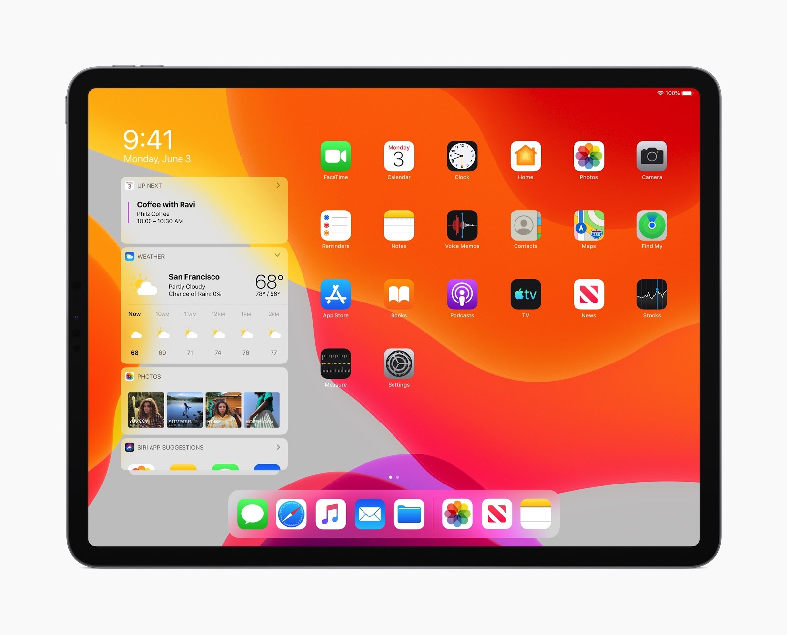
Since there is no reason to wait for a reasonable approach with a single OS for Apple’s computers and tablets, the creeping migration of tablets towards usefulness continues (with the rejection of many Post-PC mantras). This year, iOS has been allocated to a separate branch of the iPadOS. What interesting happened to the interface :
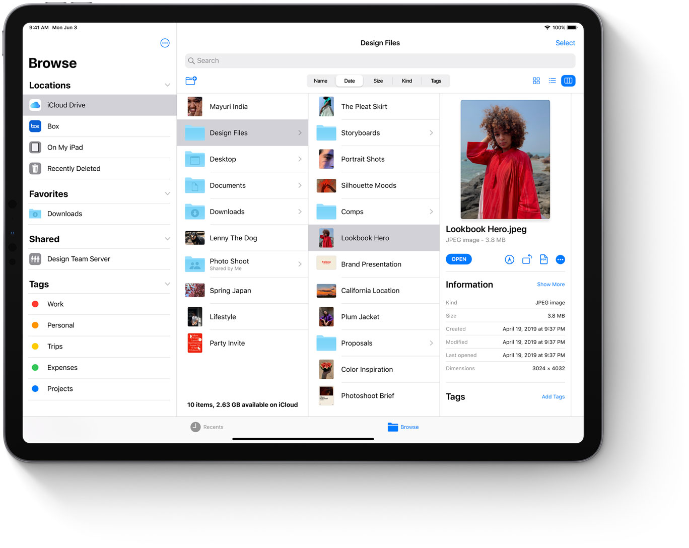
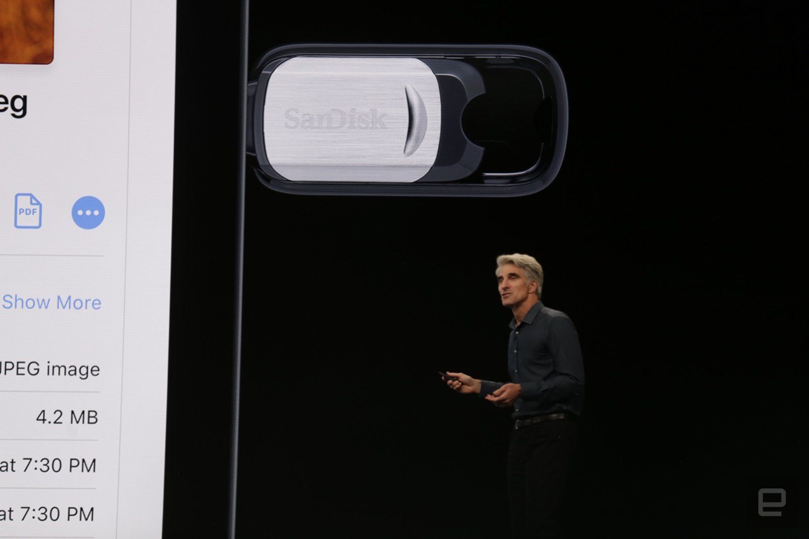
More serious work with the file system after all those tales of the uselessness of this “outdated concept”. There are even their own flash drives - an SD card can be connected via an adapter.
Applications can be run several times (they will be in tabs).
The start screen is now with widgets, and the grid of application icons is denser.
Better switching between applications.
Simple gestures for copying and pasting, as well as cancellation when editing documents.
You can put fonts (judging by the description, through the AppStore).
Gradually they are working on a browser that was very far from modern features on the desktop. They already boast of Google Docs, so most likely, Figma and the upcoming Sketch for the browser will be able to.
iPad can be the second screen for a laptop or computer . You can also control the computer from the tablet.
Project Catalyst (previously announced as Marzipan), which allows porting iPad applications to Macs, is already available to developers. For example, Twitter quickly flashed the application.
A beta version is already available (review). Overview of updates for developers and designers .
iOS 13
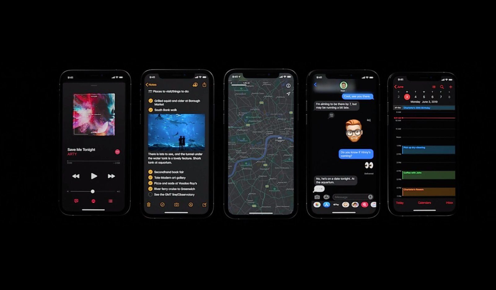
There are no special updates to the interface (again focus on speeding up and reducing the size of applications), but:
The dark theme of design , as in any teapot in 2019. Guidelines .
New filter pattern in photos and advanced editor in the inbox.
Authorization in third-party services through an Apple account . Allows you to enter through fingerprint or face recognition, well, it will help to hide mail from spammers.
Speed dialing on the keyboard via swipe is only about ten years behind Android.
Voice control for users with disabilities now seems to cover all possible usage scenarios.
Restrictions on advertising and tracking behavior in applications for children .
If you bring the phone to HomePod, the music will continue to play on the smart speaker.
Siri's more humane voice .
A beta version is already available ( review ). Overview of updates for developers and designers . And there were also the font New York and a library of icons with varying thick lines :
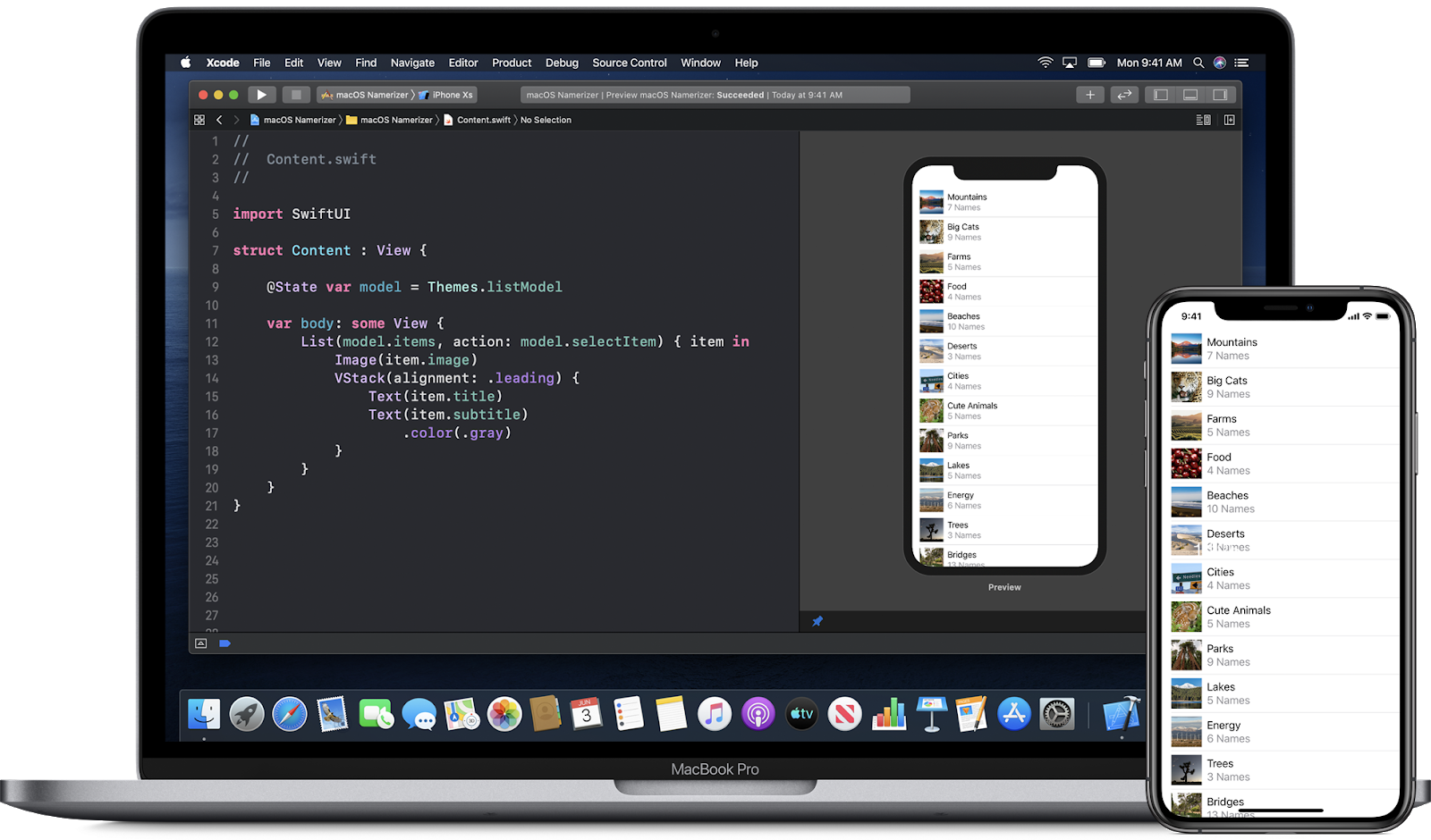
Another useful tool is the SwiftUI framework for any Apple OS, which greatly simplifies the interface assembly. So that designers can do this - you can sketch elements on the screen and then adjust the code. Step - by -step lessons come to him, and the omnipresent Meng To will launch the course in the fall.
Well, the traditional awarding of the best design applications .
watchOS 6
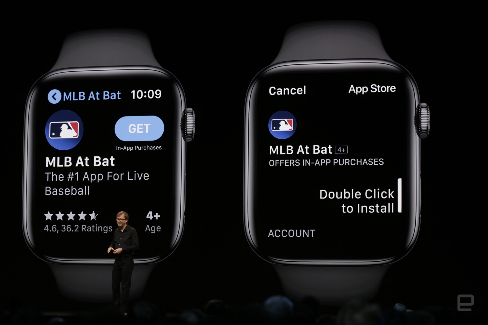
Hours develop as a tool for health monitoring. Now they have their own app store that does not require a phone.
Tracking polaris
Gene Shopnon from Shopify reflects on the main findings from two years of experience working on their Polaris design system. Many interesting details and practical problems of development of a large-scale platform.
Introducing Spectrum - How Is Adobe Building A Scale
Adobe is developing its Spectrum design system. They have more than a hundred products, so the task is monstrous and the return will not be fast. But they described a good universal approach that could potentially help make different applications homogeneous. The team recently answered questions from Designer News . A couple more articles on the topic from them: 1 , 2 and 3 .
Prototypes for usability testing with VueJS
Vox Media's Michele Cynowicz talks about how interactive prototypes are built around their design systems. They make a branch in the components, which, if successful, merges into the main code and is accessible to everyone.
When Do We Need A Design System? An Interview With Brad Frost
A brief interview with Brad Frost about his current projects and the nuances of the introduction of design systems.
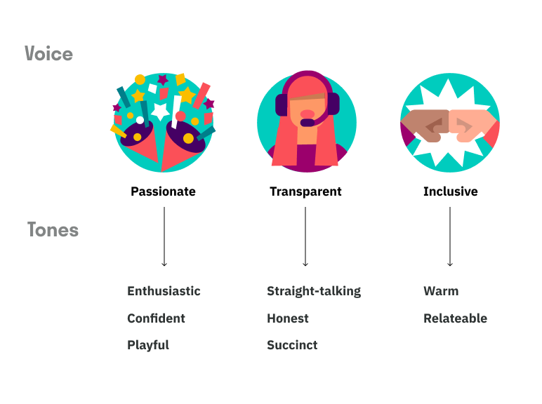
How to use voice and tone in UX writing
A useful reminder of Rhiannon Jones from Deliveroo for choosing the right key for interface texts. It should be associated with the brand and work in ordinary and problematic situations.
Introducing "Ions", an extension to the Atomic Design
Chrid Cid proposes to call design-system variables "ions" for those who adhere to the atomic design methodology. True, the "tokens" is already a more well-established and accustomed word.
Material design
- The Google design team briefly talks about creating a dark theme for photo apps, calendars, news, and Android Auto .
A Content Strategist's Guide to Using Tone in Products
Susan Gray Blue from Facebook describes the company's approach to the tonality of texts in the interface. They do not try to guess the mood of the user, because this is impossible, but they try to be adequate to the specific situation.
Diez
The service helps to store design system tokens and distribute them to a bunch of platforms and frameworks. Well, collect them initially from the design tools.
Storybook
- Version 5.1 will help check components for accessibility right in the live guide . A separate tab lists the problems and shows the specific elements of the component that need to be fixed.
Understanding the user
Creepiness – Convenience Tradeoff
Kate Moran and Kim Flaherty describe a compromise between convenience and fears for modern devices and services that require you to sacrifice some privacy.
That's thing that's missing from your MVP
Andrei Gargul writes about the importance of taking user expectations into account when planning and launching MVP.
An Iterative Approach to Scenarios and Personas
Jared Spool writes about an iterative improvement in the understanding of users and their scenarios in the course of work on the product.
Information architecture, conceptual design, content strategy
Shape
IDEO launched a service for the exchange of mindboards, notes and other developments within the team.
New interface design tools
Sketch for teams
Announced version for teams. Sketch Cloud shared space, versioning, centralized distribution of plug-ins and symbol libraries, viewing screen specifications in a browser without Zeplin. As in Figma, you only pay for the editors, and not everyone with a single view of one screen. The beta version will appear in July.
And in version 56, the most ancient and stupid pain will be solved - the characters themselves change size as content changes. Do not have to change the width of the hands of the buttons? Plus a component panel will appear next to the layers (as in the Figure). And the change in distance in the group of objects (also in the Fig).
Plugins
- Sparkle : The plugin turns a tool into a promo site builder - you can build it and get ready-made code.
- xLayers : The application allows you to assemble a finished site from the layout. And you can get both static and component version on React and Angular.
- Dmitry Kovalenko from Readle made three hundred data sets . Names, mail addresses, devices, countries, airports, etc.
Presto
The service allows you to quickly assemble a learning tour for the user. The authors have targeted sellers and customer support, i.e. use to help a particular person.
Muzli Search
Search Muzli collections well complements Pinterest to collect the mindboards.
Plugins for Figma
Announced plugins. They promise reliable and trouble-free operation when add-ons do not break when the tool is updated. A beta version for developers is already available. This was one of the main functional claims shifting from Sketch.
Bonus: Memo to create a typographic system . More basic theory of building a font scale, but there are examples of patterns directly in Figma.
This is reminiscent of a tipping point in the race of Android and iOS - at some point they so strongly broke away from competing platforms like Windows Phone, Tizen, Sailfish, WebOS, and others that all attempts to catch up with their heads lost meaning (with all the money from Adobe and InVision) . This year, Sketch and Figma will do about the same, so I don’t even know whether to continue talking about the rest.
Milkshake App
Designer mobile sites for Instagram, you can do them right on the phone.
Startup
The third version of the designer promo sites from DesignModo.
Muse
Experimental tablet app for visual notes and sketches. Interesting techniques of interaction with interfaces, which are discussed in detail in the article.
Amadine
Vector editor for Mac.
Good brief
Generator briefs on different design work.
Langingpagr
The simplest prototype designer promo sites, helping marketers and interface writers to work out the content and the flow of information in general.
Struct
Another service designer of illustrations from finished elements.
Stubborn
And one more designer of illustrations.
Tumult hype 4
New version out of beta . Of the most interesting changes - the animation of vector shapes.
Subform
The site is written about the termination of development .
Framer x
Course on the Framer Playground by Meng To .
Axure RP 9
Out of beta . The interface has been updated, import from Sketch has appeared, the possibilities of visual design are being expanded.
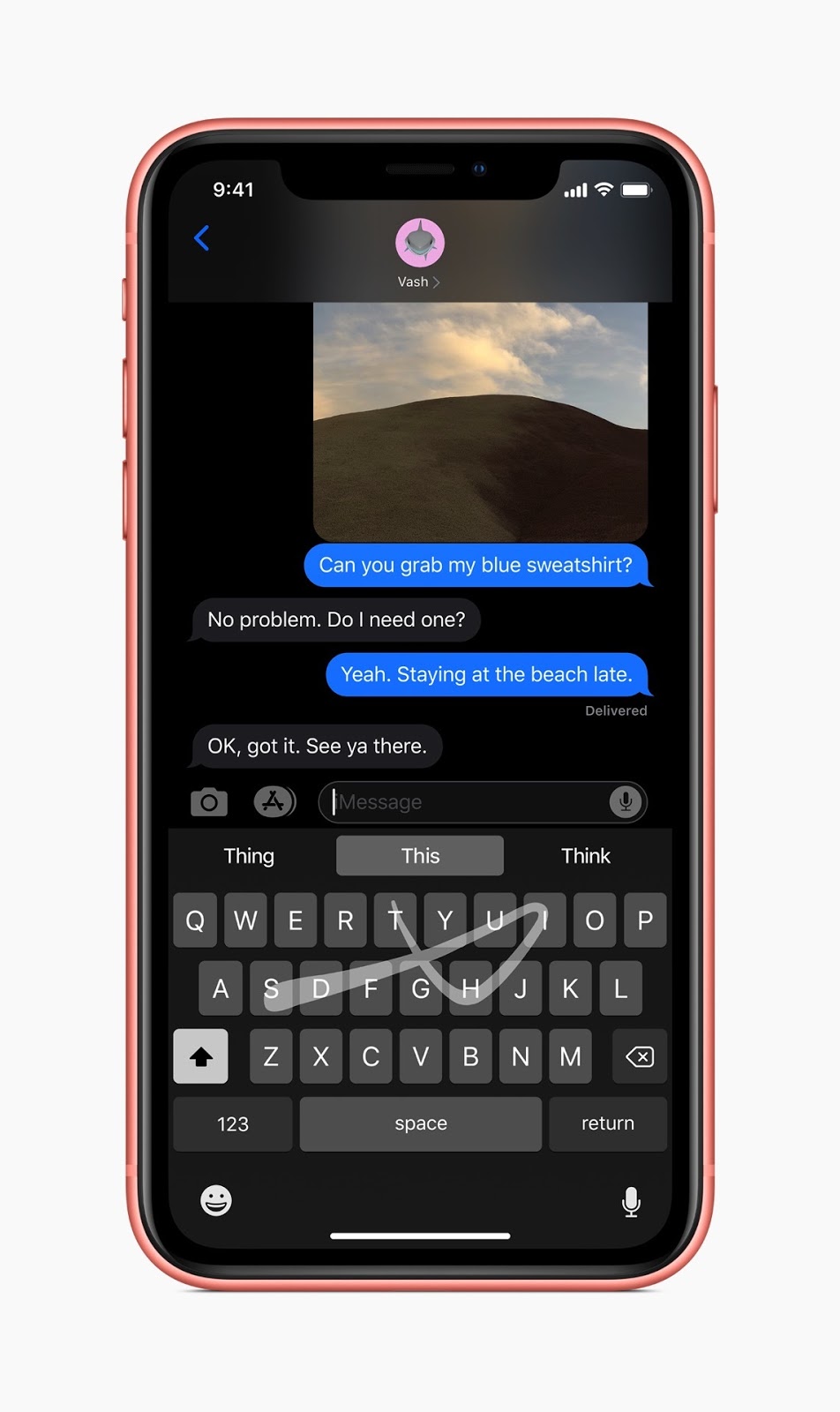
ScreenChat
Constructor chat in the chat, which gives the output iMessage screenshot on the phone. Interview with the author .
Whimsical
Now he can make mental maps .
Overflow
Out of beta . The organization of projects in the cloud and versioning appeared, and the interface itself is greatly improved.
Zeplin
We launched global guidelines that can describe several projects at once. Colors, fonts, and components can be inherited, for example, between the web, Android, and iOS.
Building a Web-Based Motion Graphics Editor
Alyssa X talks about his new animation tool. There is nothing working yet, but there is an overview of the main ideas.
User research and analytics
Microsoft's Human Insights Library Creates a Living Body of Knowledge
Matt Duignan from Microsoft manages the HITS user insights database. It shows the principles of its operation and how food teams benefit from it. His podcast is on this topic .
Insights on demand
Babette Schilte, a user research team on Facebook, talks about collecting small insights from user research that can and should be used for other tasks.
Do Attitudes Predict Behavior?
Jeff Sauro deals with the ability to predict the user's actions through his attitude towards the company or product. He walked through early research (including the reasons for the emergence of the norm “you do not need to ask the user what he needs”). Attitudes can be divided into three components (beliefs, feelings, and intentions), and the likelihood confirms the probability of predicting subsequent actions.
Stronger Findings the 'Mad Libs' Way
Facebook's Beth Lingard shows its approach to describing the findings from user research, which is convenient for product teams.
The Importance of Replicating Research Findings
Jeff Sauro reviewed his attempts to reproduce famous metrics and user research methods. Some were confirmed, some - no.
Why User Interviews Fail
Maria Rosala of Nielsen / Norman Group describes typical problems in planning and conducting interviews with users.
Getting Started With Foundational UX
Cailean Cooke Goold from Facebook provides tips on conducting exploratory user research.
Visual programming and browser design
Web Accessibility In Context
Overview of the development of interface technologies for users with disabilities from Be Birchall.
Inspired Design Decisions: Avaunt Magazine
Andy Clarke continues a series of experiments with an interesting magazine layout on the web.
New scripts
- The generator of non-existent planets with a spectacular appearance .
- Zdog : JavaScript framework allows you to make pseudo-3D graphics.
Web typography
- Ethan Marcotte describes the history of the inclusion of the initial letter in the Vox Media design system . It is interesting how they collected real-world usage scenarios and then proposed a solution for the editorial staff.
- Memo Matej Latin on the registration of users with disabilities .
- Several approaches to the implementation of adaptive typography, which uses screen space on the case .
Metrics and ROI
Should You Love the HEART Framework?
Jeff Sauro compares the HEART framework with earlier counterparts and tries to understand how its use benefits the product teams. He connects metrics of behavior and attitudes towards the company.
Do Promoters Actually Recommend More? A longitudinal analysis
Jeff Sauro reproduced another part of the NPS study to understand the distribution of recommendations for specific assessments.
Designers Should Forget About Coding. Learn Product Management Instead
Henry Wu from HubSpot writes about how a designer can competently communicate in the language of business and appeal to the correct metrics for the current situation in the product.
Design Management and DesignOps
New to a design team? These 4 pillars to set it up for success
Atlassian's Alastair Simpson led many design teams at the company. He created a smart memo for a new design manager in a team - how to sort out the situation and bring benefits, and not a new layer of micro-management.
Redesigning the content, research & design org
Deliveroo's Sana Rao talks about the reorganization of the design team. They came to the matrix structure instead of division into functional departments.
6 Ways to Build a Customer-Centric Culture
Denise Lee Yohn gives advice on the organization of the internal culture of the company, which contributes to the focus on users. Much time is spent on the availability of knowledge about the user and competent hiring of employees.
Growing up: how do we assess team skills
Ivan Solovyov from DocDoc talks about the competence map of designers in a team.
Fortifying the design career path at IBM
Eunice from IBM briefly talks about the competency map for designers in the company (there are already 2,000 of them). Allison Biesboer tells how she was born (a bit too much water, but there are basic details of the creation process).
#UXRConf Preview: Meet Behzod Sirjani
Slack Behzod Sirjani talks about his experience in building an internship program for user research, as well as a vision for working properly with product teams.
Startups and UX - Reliable Success to Good UX Practices
Ayesha Saleem has done a little UX research in startups. She identified three categories, depending on when they started using good interface design practices, and tried to relate them to success in the market.
Thoughts on Hiring a Design Leader (director-level and above)
Peter Merholz reflects on the optimal process for finding design leaders. The main tasks and features of the selection.
Team interaction
Getting Unstuck in Design Conversations
Dan Brown describes a universal approach to conducting useful design meetings. These are 4 stages - the formulation of a problem, the extraction of ideas, a combination of ideas, reflection.
Product management and analytics
Customer Development and Custdev. What is it and what is the difference?
A great article by Oleg Yakubenkov, where he shows an error in using the term Customer Development, which is now popular in the domestic professional community. In the original concept of Steve Blank, this was a holistic methodology for grocery work, and by this we mean only one of the pieces - user research (or rather, part of it - in-depth interviews).
10 obvious lessons
Sid Yadav has moved from design to product management and gives 10 tips on key focus points in this transformation. All with references to efficient books.
Methodologies, procedures, standards
Design Thinking Canvas
Canvas design thinking, helping to lead the design process.
Cases
Introducing Mercury OS
Strong concept of a fictional operating system from Jason Yuan. It is designed for meta-scenarios (for example, to plan a trip) in which the user interacts with atomized parts of applications (for example, a specific correspondence from the messenger).
Accenture sued over website redesign so bad it: Car hire biz $ 32m + for 'defective' cyber-revamp
A striking example of the fiasco at product launch. Accenture did a restart of the Hertz website for many millions of dollars. They thwarted all the time limits, the solution did not meet the TOR in terms of modern requirements (correct adaptability, a normal design system on components in the code with a live guide, the possibility of the theming for sub-brands). And for bringing him to the contractor asks for millions for finishing work.
Trends
2019 Logo Trend Report
The annual review of trends in logos from LogoLounge.
Mary Meeker Internet Trends Report 2019
Mary Meeker released an annual report on Internet trends. vc.ru identified the main points .
Factors that influence the reading experience in AR
Niteesh Yadav describes the features of perception of texts in virtual and augmented reality. How to achieve good readability.
Car Interfaces
Redesign CarPlay . Splitting the screen for two applications, so you don’t have to switch from maps to music, plus context-sensitive application hints.
For general and professional development
Modus
Medium launched their own design magazine on Medium with articles from other authors.
User Experience vs. Customer Experience: What's the difference?
The Kim Flaherty of the Nielsen / Norman Group gives its definition of the difference between User Experience and Customer Experience. She considers three levels of human interaction with the company - specific interactions, holistic scenarios and a general history of relationships.
Teach Slower to Teach Better
Jon Kolko reflects on the problems of modern education for designers. How to make graduates not only know the methods, but think better about the problem being solved.
People and companies in the industry
Apple as a client
Jony Ive leaves Apple. Together with Mark Newson, they will open a design studio that will work including with Apple. Five years ago, he said that he would leave only if the company ran out of innovation.
Subscribe to a digest on Facebook , VKontakte , Telegram or by mail - there fresh links appear every week. Thanks to everyone who shares the links in the group, especially Gennady Dragun, Pavel Skripkin, Dmitry Podluzhny, Anton Artyomov, Denis Efremov, Alexey Kopylov, Taras Brizitsky, Yevgeny Sokolov and Anton Oleynik. Special thanks to the Grid team for the editor and Alexander Orlov for the visual style.
Source: https://habr.com/ru/post/459146/
All Articles