Heat map of clicks - how users behave on the site
Today we have a lot of tools, research and articles on ux / ui and how the site will be read and identified.
But the main question remains open.
Do you know exactly where the users of your (or yours) site are poking?

Today let's talk about the buttons
Everybody, probably, at least once heard that the buttons have a minimum allowable size, there are some kind of protective fields, and that the buttons should look like buttons.
But is it really?
Let's look at an example
For him, I took my site - 2 buttons and a list of links. (~ 600 users, ~ 2 500 clicks, time coverage - 1 year). And analyzed it using a heat map from Yandex.metrics.
Items:
1. Hamburger
2. List of links
3. Tips
4. Appearing button
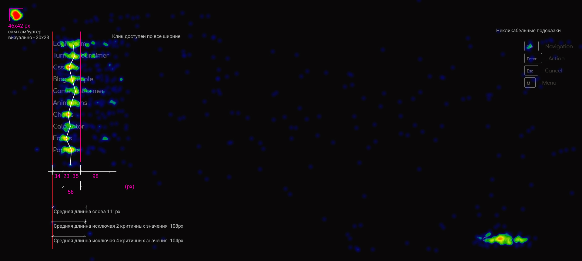
Hamburger
Visually, the hamburger has a size of 32x26 pixels. Together with protective fields, the click area is 40x33 pixels. The user basically clicks on the area of 46x42 pixels.
And this means that it is not enough for approximately 4px around the perimeter in my case.
And by 8px in general.

Conclusion: for the main buttons of the type: "hamburger", "back", "home" click area should be increased by at least 8px from each side. And strive for size 48x48px.
List of links

Next is just a list of links. It is clickable across the width and visually it is shown when you hover.
Horizontally
As can be seen from the heat map, the main density of clicks falls in the middle of the average word length. ~ 55px (62%) from the left edge.
Upright
If we take into account the standard line height (normal), the “miss” is approximately from 2px to 5px.
Mobile phone
An arrow appears in the list (just like on the desktop). And the users on the mobile device click on it with the following action.

Closing
The close button appears when we selected a list item. And the nature of clicks on it does not differ from the list itself.
Conclusion: For text links lists, the click area should be increased by 4px from the top and bottom.

Tips
The block with hints is located in the upper right corner, made poorly visible, and does not respond to guidance. But visually a bit like a button.
Activity
The number of people who clicked on this "pseudo button" is noticeably less than the total number.
And those who clicked and realized that nothing was happening, just left. (it is noticeable that the activity ends only on the first button)
Conclusion: If you want the button to be pressed, you need to change its state when you hover, change the cursor, or perform an action when pressed.
Appearing button
The button has a size of 200 + px x 48px and as you can see almost 100% of the clicks are inside, which confirms point 1 .
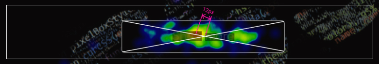
The main part of the clicks is in the center of the button with a slight offset to the center of the screen (~ 12px)
Conclusion: A button of sufficient size close to the center of the screen is a profit.
Epilogue
So what am I doing all this for? You can read a lot of articles about ux / ui, study the patterns of content scanning by the user and watch videos on YouTube.
But better than 1 time see learn metrics than listen to stories.
Connect metrics and share your results :)
')
Source: https://habr.com/ru/post/459054/
All Articles