User Inyerface - how not to torment the user

Studio Bagaar collected the worst elements of the sites in one online form and offered to fill it. Can you pass this test?
Link to the online form .
Every aspect and click of the wrong mouse is intended to “enrage”, there are incorrectly labeled buttons, complex password rules, pop-up windows that are almost impossible to close from the first, second, and in general, multifaceted captcha and even a sea of other annoying elements that are either otherwise present on many sites of real companies.
')
According to The Verge , this online form-game makes it terrifying not even the concept of a set of bad interfaces and user treatment, but how close it is with its elements to reality.
Of course, there are not so bad sites on the Internet, but there are those that “are selected very close to User Inyerface, and this is true horror ,” consider The Verge.
In fact, the link is better to go from a tablet or smartphone - use more where and how to click where in the page to get things going!

From the laptop screen, then everything is clear, and already many “tricks” of the developers just cause a smile and you can find some more new, previously unnoticed on a small screen, chips and “jokes” -tasks like a list of months.
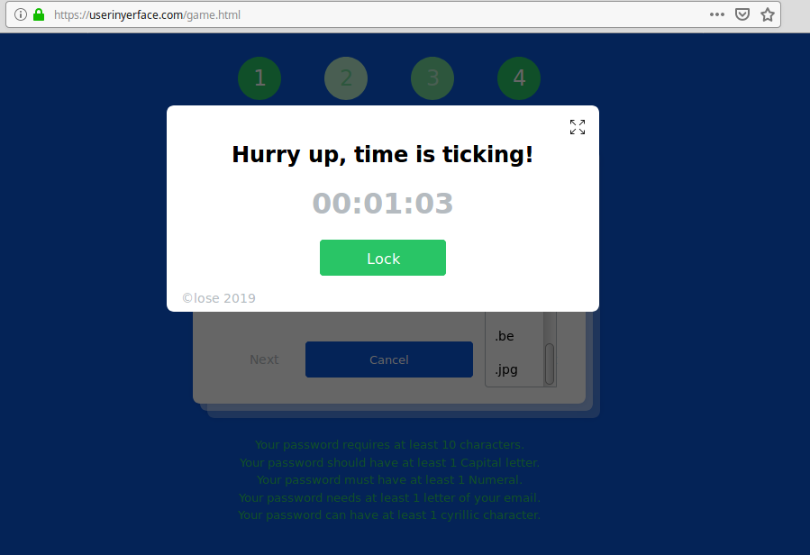
By the way, you can spend the greatest time ... on filling out the first form. For there so much is crammed and pops up immediately after a while, including anguish with reading “Terms & Conditions”.

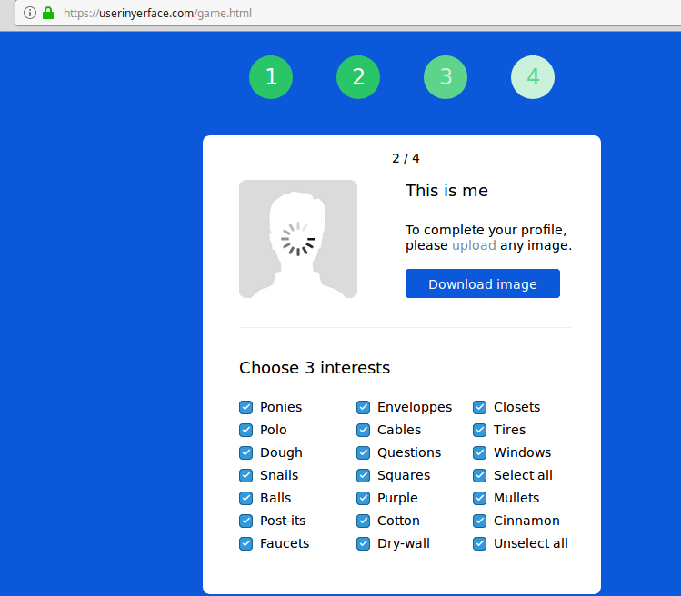
When a tick is not for a tick:

And here the user is just puzzled:
Choosing a country is just lovely:
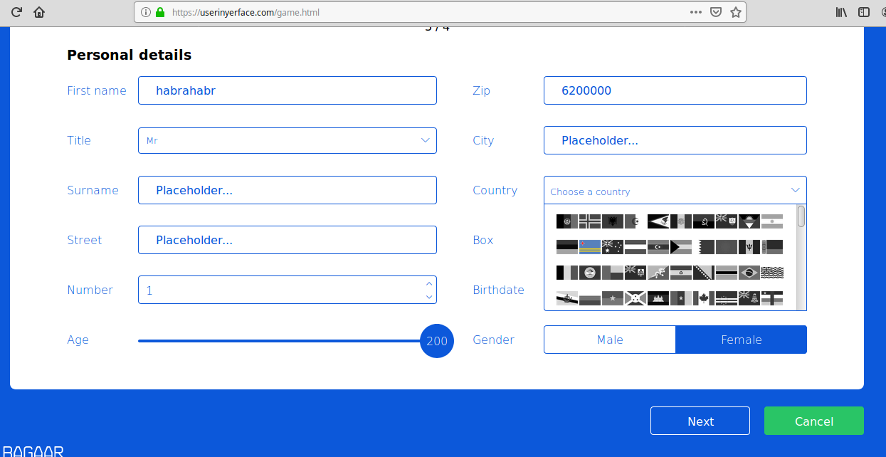
Like dates of birth:

We will live and survive:
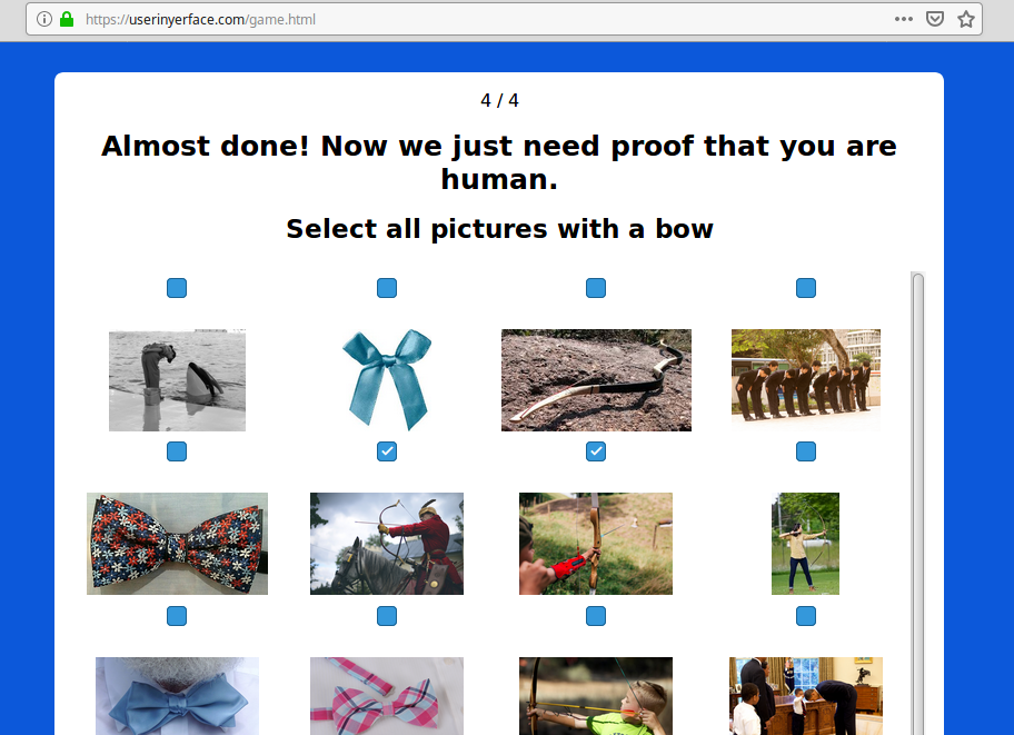
A separate topic - check that you are a person.
Try to simply review and go through ALL the kinds of questions that are asked to you and answer options.
This is very funny and really the brain begins to suspect something:
Other options


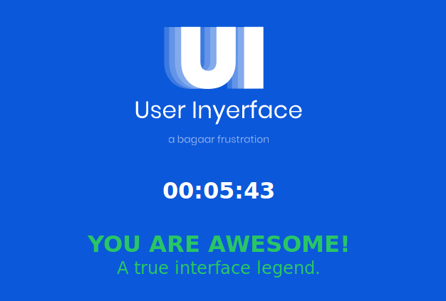
And at the end of all stages of the torment of a happy user, greetings and dance await.
Well, that's not all, because after quickly passing through all forms, I want to go through this design test once again, but by clicking on everything and everyone on each page of the form, to see more new and interesting attempts to bring the user to stress, and can understand that and so it was incorrect to do in their projects.
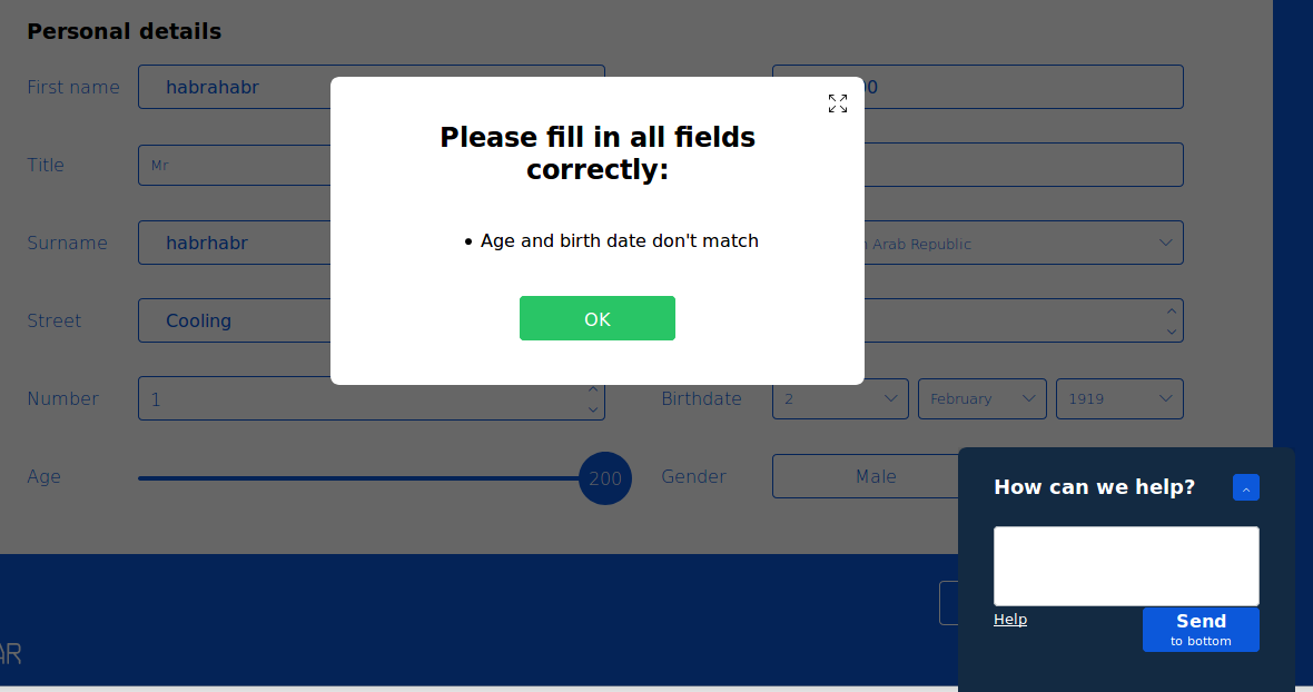
For example, the counter in the help menu adds one user each time you click Help in the form:

Source: https://habr.com/ru/post/458996/
All Articles