MotionLayout: better animations, less code
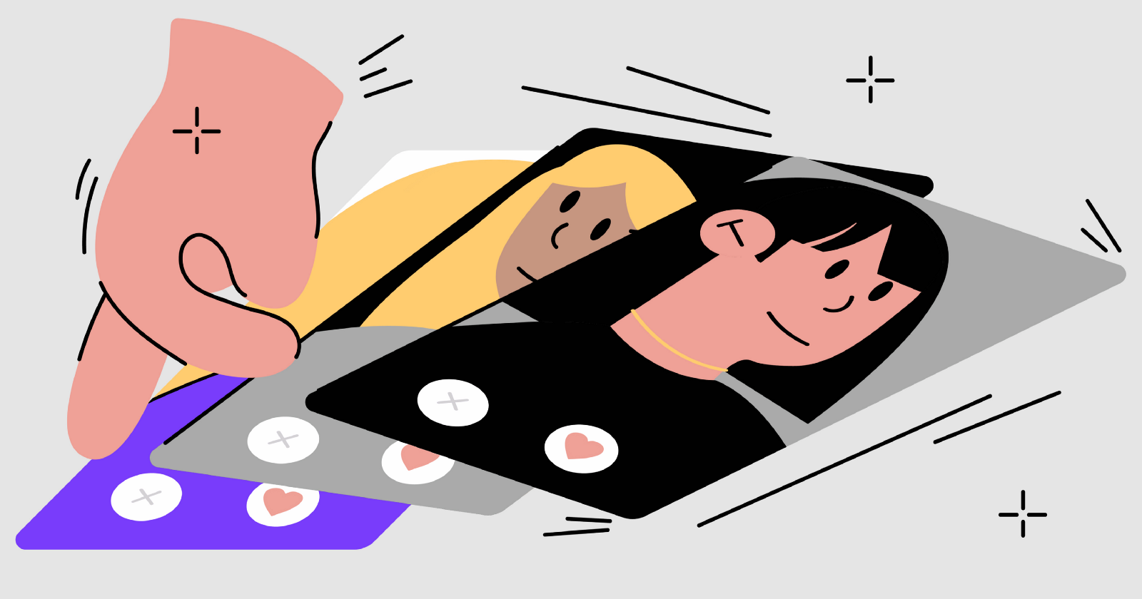
Google continues to improve our lives by releasing new handy libraries and APIs. Among which was the new MotionLayout. Considering the abundance of animations in our applications, my colleague Cedric Holtz immediately implemented the most important animation of our application - voting in dating - using the new API, while saving a huge amount of code. I share the translation of his article.
The Google I / O 2019 conference recently ended, at which they announced updates and the most recent improvements to our beloved SDK. Personally, I was particularly interested in the presentation by Nicholas Roard and John Hofford on the future functionality of ConstraintLayout. Or rather, its expansion in the form of MotionLayout.
After the release of the beta version, I wanted to implement a dating animation based on this library.
')
First, we define the terms:
"MotionLayout is a ConstraintLayout that allows you to animate layouts between different states." - Documentation
If you have not read a series of articles by Nicholas Roard, which explains the key ideas of MotionLayout, I highly recommend reading.
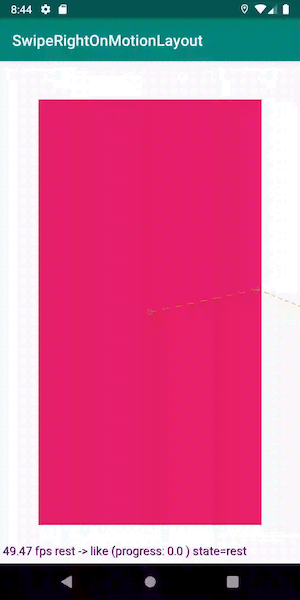
So, with the introduction finished, now let's see what we want to get:
Stack of cards
Show the shifted map
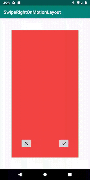
First of all, add MotionLayout to the layout directory, which so far contains only one top map:
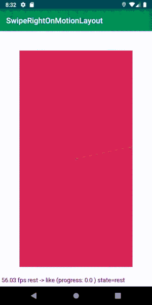
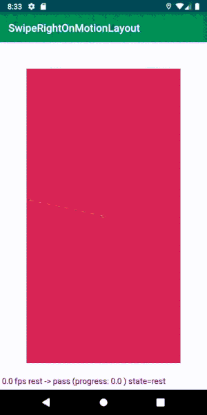
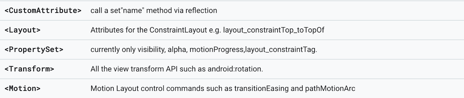
<androidx.constraintlayout.motion.widget.MotionLayout android:id="@+id/motionLayout" xmlns:android="http://schemas.android.com/apk/res/android" xmlns:app="http://schemas.android.com/apk/res-auto" android:layout_width="match_parent" android:layout_height="match_parent" app:layoutDescription="@xml/scene_swipe" app:motionDebug="SHOW_ALL"> <FrameLayout android:id="@+id/topCard" android:layout_width="0dp" android:layout_height="0dp" /> </androidx.constraintlayout.motion.widget.MotionLayout> Pay attention to this line: app: motionDebug = "SHOW_ALL". It allows us to display debugging information on the screen, the trajectory of the movement of objects, the state with the beginning and end of the animation, as well as the current progress. The line helps a lot when debugging, but do not forget to remove it before sending it to the prod: there is no reminder for that.
As you can see, we have not set any restrictions for views here. They will be taken from the scene (MotionScene), which we will now define.
To begin with, we define the initial state: one map lies in the center of the screen, with indents around.
<MotionScene xmlns:android="http://schemas.android.com/apk/res/android" xmlns:app="http://schemas.android.com/apk/res-auto"> <ConstraintSet android:id="@+id/rest"> <Constraint android:id="@id/topCard" android:layout_width="match_parent" android:layout_height="match_parent" android:layout_marginBottom="50dp" android:layout_marginEnd="50dp" android:layout_marginStart="50dp" android:layout_marginTop="50dp" app:layout_constraintEnd_toEndOf="parent" app:layout_constraintStart_toStartOf="parent"> </ConstraintSet> </MotionScene> Add sets of restrictions (ConstraintSet) pass and like. They will reflect the state of the top card when it is fully shifted left or right. We want the map to stop before it disappears from the screen in order to show a beautiful animation confirming our decision.
<ConstraintSet android:id="@+id/pass" app:deriveConstraintsFrom="@+id/rest"> <Constraint android:id="@id/topCard" android:layout_width="0dp" android:layout_height="match_parent" android:layout_marginBottom="80dp" android:layout_marginEnd="200dp" android:layout_marginStart="50dp" android:layout_marginTop="20dp" app:layout_constraintEnd_toEndOf="parent" app:layout_constraintWidth_percent="0.7" /> </ConstraintSet> <ConstraintSet android:id="@+id/like" app:deriveConstraintsFrom="@id/rest"> <Constraint android:id="@id/topCard" android:layout_width="0dp" android:layout_height="match_parent" android:layout_marginBottom="80dp" android:layout_marginEnd="50dp" android:layout_marginStart="200dp" android:layout_marginTop="20dp" app:layout_constraintStart_toStartOf="parent" app:layout_constraintWidth_percent="0.7" /> </ConstraintSet> Add to the previous scene both sets of constraints. They are almost the same, only mirrored on both sides of the screen.
Now we have three sets of constraints - start, like and pass. Let's define transitions between these states.
To do this, add to the scene one transition for the swipe to the left, another for the swipe to the right.
<Transition app:constraintSetEnd="@+id/pass" app:constraintSetStart="@+id/rest" app:duration="300"> <OnSwipe app:dragDirection="dragLeft" app:onTouchUp="autoComplete" app:touchAnchorId="@id/topCard" app:touchAnchorSide="left" app:touchRegionId="@id/topCard" /> </Transition> <Transition app:constraintSetEnd="@+id/like" app:constraintSetStart="@+id/rest" app:duration="300"> <OnSwipe app:dragDirection="dragRight" app:onTouchUp="autoComplete" app:touchAnchorId="@+id/topCard" app:touchAnchorSide="right" app:touchRegionId="@id/topCard" /> </Transition> So, for the top map, we set the svayp animation to the left and the same - flipped to the svayp to the right.
These properties will help improve the interaction with our scene:
- touchRegionId: since we added indents around the map, we need to make sure that the touch is recognized only in the area of the map itself, and not the entire MotionLayout. This can be done using touchRegionId.
- onTouchUp: what will happen to the animation after we release the map? It must either move on or return to the initial state, so autoComplete is applicable.
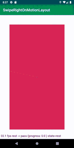
Let's see what happened:
The map automatically goes off the screen.
Now let's work on the animation that will run when the map goes beyond the screen.
Add two more sets of ConstraintSet for each final state of our animations: the map goes off the screen to the left and to the right.
In the following examples, I will show how to make a like state, and the pass state will repeat it in a mirror. The working example can be fully seen in the repository .
<ConstraintSet android:id="@+id/offScreenLike"> <Constraint android:id="@id/topCard" android:layout_width="0dp" android:layout_height="match_parent" android:layout_marginBottom="80dp" android:layout_marginEnd="50dp" android:layout_marginTop="20dp" app:layout_constraintStart_toEndOf="parent" app:layout_constraintWidth_percent="0.7" /> </ConstraintSet> Now, as in the previous example, it is necessary to determine the transition from the state of the swipe to the final state. The transition should automatically trigger immediately after the completion of the swipe animation. You can do this with autoTransition:
<Transition app:autoTransition="animateToEnd" app:constraintSetEnd="@+id/offScreenLike" app:constraintSetStart="@+id/like" app:duration="150" /> Now we have a swap map that can be swiped from the screen!
Bottom card animation
Now we will make the bottom card to create the illusion of infinity of the deck.
Add another map to the layout, similar to the first one:
<FrameLayout android:id="@+id/bottomCard" android:layout_width="0dp" android:layout_height="0dp" android:background="@color/colorAccent" /> Modify the XML to set the restrictions that apply to this map at each stage of the animation:
<ConstraintSet android:id="@id/rest"> <!-- ... --> <Constraint android:id="@id/bottomCard"> <Layout android:layout_width="match_parent" android:layout_height="match_parent" android:layout_marginBottom="50dp" android:layout_marginEnd="50dp" android:layout_marginStart="50dp" android:layout_marginTop="50dp" /> <Transform android:scaleX="0.90" android:scaleY="0.90" /> </Constraint> </ConstraintSet> <ConstraintSet android:id="@+id/offScreenLike" app:deriveConstraintsFrom="@id/like"> <!-- ... --> <Constraint android:id="@id/bottomCard"> <Transform android:scaleX="1" android:scaleY="1" /> </Constraint> </ConstraintSet> To do this, we can use the convenient property ConstraintSet.
By default, each new set takes attributes from the parent MotionLayout. But with the help of the deriveConstraintsFrom flag you can set for our set of the other parent. It should be borne in mind that if we set constraints using the constraint tag, we thereby override all constraints from the parent set. To avoid this, you can set specific attributes in the tags so that only they are replaced.
In our case, this means that in the pass set we do not define the Layout tag, but copy from the parent. However, we redefine the Transform, so we replace all the attributes specified in the Transform tag with our own, in this case, a change of scale.
So it is so easy to add a new element using MotionLayout and seamlessly integrate it with the animations of our scene.

Making the animation endless
After the completion of the animation, the top card can no longer be brushed away, because now it has become the bottom card. To get an endless animation, you need to swap maps.
At first, I wanted to do this with a new transition:
<Transition app:autoTransition="jumpToEnd" app:constraintSetEnd="@+id/rest" app:constraintSetStart="@+id/offScreenLike" app:duration="0" /> 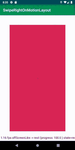
The whole animation is played as it should. Now we have a stack of cards that can be endlessly swapped!
Having wriggled a bit, I noticed something. The transition animation to the end of the deck stops when you touch the card. Even though the duration of the animation is zero, it still stops, and this is bad.
I managed to win only one way - programmatically changing the active transition in MotionLayout.
To do this, we will set a callback to complete the animation. As soon as offScreenLike and offScreenPass are completed, we simply reset the transition back to the rest state and reset the progress.
motionLayout.setTransitionListener(object : TransitionAdapter() { override fun onTransitionCompleted(motionLayout: MotionLayout, currentId: Int) { when (currentId) { R.id.offScreenPass, R.id.offScreenLike -> { motionLayout.progress = 0f motionLayout.setTransition(R.id.rest, R.id.like) } } } }) It doesn't matter what transition we set, pass or like, when we swipe, we switch to the desired one.

It looks the same, but the animation does not stop! Go ahead!
Binding (binding) data
Create test data for display on maps. For now, let's limit ourselves to changing the background color of each card.
We create a ViewModel with a swipe method that only substitutes new data. Bind it in Activity in this way:
val viewModel = ViewModelProviders .of(this) .get(SwipeRightViewModel::class.java) viewModel .modelStream .observe(this, Observer { bindCard(it) }) motionLayout.setTransitionListener(object : TransitionAdapter() { override fun onTransitionCompleted(motionLayout: MotionLayout, currentId: Int) { when (currentId) { R.id.offScreenPass, R.id.offScreenLike -> { motionLayout.progress = 0f motionLayout.setTransition(R.id.rest, R.id.like) viewModel.swipe() } } } }) It remains to inform ViewModel about the completion of the swipe animation, and it will update the data that is currently displayed.
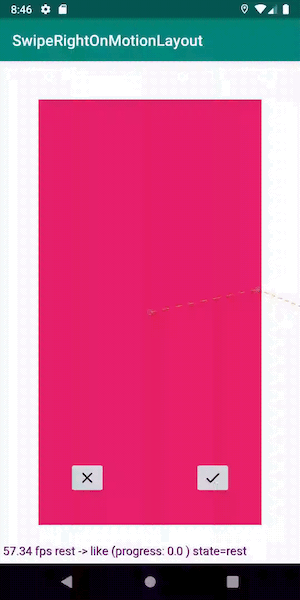
Pop up icons
Add two views that appear on one of the sides of the screen when you swipe (only one is shown below, the second is mirrored).
<ImageView android:id="@+id/likeIndicator" android:layout_width="0dp" android:layout_height="0dp" /> Now for the maps you need to set the state of the animation with this view.
<ConstraintSet android:id="@id/rest"> <!-- ... --> <Constraint android:id="@+id/like"> <Layout android:layout_width="40dp" android:layout_height="40dp" app:layout_constraintBottom_toBottomOf="parent" app:layout_constraintStart_toEndOf="parent" app:layout_constraintTop_toTopOf="parent" /> <Transform android:scaleX="0.5" android:scaleY="0.5" /> <PropertySet android:alpha="0" /> </Constraint> </ConstraintSet> <ConstraintSet android:id="@+id/like" app:deriveConstraintsFrom="@id/rest"> <!-- ... --> <Constraint android:id="@+id/like"> <Layout android:layout_width="100dp" android:layout_height="100dp" app:layout_constraintBottom_toBottomOf="@id/topCard" app:layout_constraintEnd_toEndOf="@id/topCard" app:layout_constraintStart_toStartOf="@id/topCard" app:layout_constraintTop_toTopOf="@id/topCard" /> <Transform android:scaleX="1" android:scaleY="1" /> <PropertySet android:alpha="1" /> </Constraint> </ConstraintSet> There is no need to set limits in animations that go beyond the screen, as they are inherited from the parents. And in our case, this is the state of svayp.
That's all we need to do. Now you can add components to animation chains very easily.
Run the animation programmatically
We can make two buttons on the maps, so that the user can not only snap, but also control them with the help of buttons.
Each button launches the same animation as the swipe.
As usual, we subscribe to button clicks and run the animation right on the MotionLayout object:
likeButton.setOnClickListener { motionLayout.transitionToState(R.id.like) } passButton.setOnClickListener { motionLayout.transitionToState(R.id.pass) } We need to add buttons to both the top and bottom cards so that the animation plays continuously. However, for the lower card, subscription to clicks is not necessary, because it is either not visible, or the upper card is animated, and we do not want to interrupt it.
Another great example of how MotionLayout handles state changes for us. Let's slow down the animation a bit:

Look at the transition that MotionLayout performs when the pass changes like. Magic!
Swipe map by curve
Suppose we like it if the map moves not in a straight line, but along a curve (to be honest, I just wanted to try to do this).
Then you need to determine KeyPosition for movement in both directions, so that the trajectory of movement is arched by an arc.
Add this to the motion scene:
<Transition app:constraintSetEnd="@+id/like" app:constraintSetStart="@+id/rest" app:duration="300"> <!-- ... --> <KeyFrameSet> <KeyPosition app:drawPath="path" app:framePosition="50" app:keyPositionType="pathRelative" app:motionTarget="@id/topCard" app:percentX="0.5" app:percentY="-0.1" /> </KeyFrameSet> </Transition> 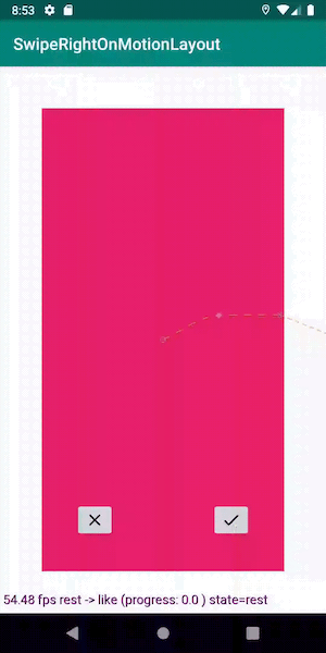
Now the map moves along a non-banal curved path. Magically!
Conclusion
When you compare the amount of code I’ve gotten when creating these animations, with our current implementation of similar animations in production, the result is staggering.
MotionLayout discreetly handles the abolition of transitions (for example, when you touch), the creation of chains of animations, changes in properties during transitions and much more. This tool radically changes everything, greatly simplifying the UI logic.
There are still some things to work on (mostly disabling animations and bi-directional scrolling in RecyclerView), but I am sure that this can be solved.
Remember that the library is still in beta status, but it already opens up many exciting opportunities for us. We look forward to the release of MotionLayout, which, I am sure, will come in handy for us in the future. You can view the fully working application from this article in the repository .
PS: and since I, as a translator, have been given the floor, there is a developer’s place in our Android team. Thanks for attention.
Source: https://habr.com/ru/post/458854/
All Articles