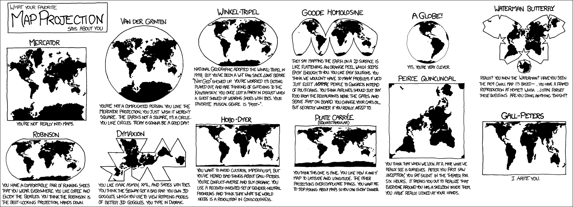
Map projections: what is xkcd really joking about
Xkcd is one of the most iconic web comics, and the minimalistic style of sketches as if from a mechanic textbook has become his calling card . The author of the comic book, Randall Munro, admitted that he was diligently seeking inspiration for new releases: he tries new programs and games, works on mathematical problems, and follows the news of science and technology. If he didn’t do this, the comic book would tell how the artist sits at home at the computer.
Sometimes the release of the xkcd comic is a surface joke in a narrow area of expertise. Such a humor can be understood by a specialist or at least poorly familiar with the affected area, and the rest will only be perplexed. An example of such a release is 2011 xkcd.com/977 Map Projections. For a complete understanding of the issue, it is only necessary to roughly present the history and function of various projections of world maps, otherwise the comic will remain in black and white.
')
Even outwardly simple questions have several solutions. The shape of the Earth is a geoid-like ball, but for the convenience of perception it is better to deploy it on a flat map. This can be done in several ways. Each of them will be executed with different trade-offs, since distortions of form, angles or lengths are inevitable. Some projections give more distortion, others are easier to perceive, for some we are just used.
Not all of us are looking at a map for navigation in the open sea. Often the choice of the method of transforming the shape of the Earth is not a matter of life and death, it is an artistic illustration. In these cases, the projection is chosen from the well-established tastes and preferences - just like choosing clothes or a car. You can joke about the fashion for expensive sneakers among the directors of large Silicon Valley companies or about the popularity of lowered cars. Likewise, cartographic projections are amenable to jokes, as was done in Map Projections.
We divide the comic into several parts and consider them in a convenient order.
Yes, you are very smart.
The Earth is a complex body with a relief. Even if we take it for a ball, an ellipsoid of rotation or a geoid , the Earth will still not be able to “flatten” without distortion. The lengths of rivers and roads, the area and shape of countries and continents, the corners for navigation are distorted. Any projection is a compromise between which distortions are undesirable.
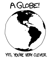
Therefore, any attempt to present the Earth on a plane without distortion is doomed to failure, as this response option resembles. Why try to do the impossible? The easiest way to a question about your favorite cartographic projection is to smugly shout out “Globe!”
It is clear that this is not a projection, but only an attempt to be clever. Munro points to this in the signature.
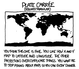
It seems to you that this one will do. You like the way X and Y are converted to latitude and longitude. Other projections complicate things. You want me to leave behind you and give me a quiet dinner.
This is one of the oldest projections of the world map - probably, it was invented by Ptolemy before our era. The geoid is converted into a cylinder and unfolds onto a sheet of paper. Distances remain along the equator and all meridians, but the angles and area are distorted. Such a projection is convenient to use in computer geo-information systems: the linear coordinates on the projection are easily converted into latitude and longitude.
Equivalent projection distorts corners and areas. Pole points on this projection stretch into lines. Due to distortion, the equidistant projection is not used in navigation.
In the view of Munro, such a projection may appeal to a busy person who is not interested in the projections and associated wisdom.
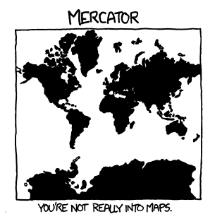
Cards are of little interest to you.
In the 1569 edition of the Atlas of the Flemish cartographer Gerard Mercator, on eighteen sheets with a total size of 202 by 124 centimeters, was represented by an equilateral cylindrical projection. Its name has its characteristics: at every point the angles are transmitted without distortion, and the parallels and meridians preserve parallelism.
For this, we had to pay with scale distortions: the farther the object moves from the equator to the pole, the larger it is. The poles themselves are transformed from points to infinitely large objects. Therefore, the map does not extend to the poles, a cutoff is used for latitudes of ± 80 ° —85 °.
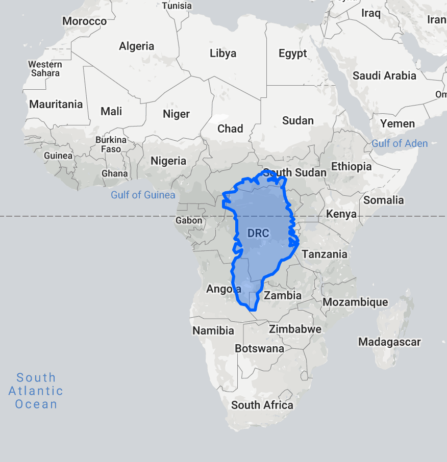
Because of this, not the largest Antarctica acquires enormous dimensions in the Mercator projection, and Africa and the countries of South and Southeast Asia seem smaller than they really are. On the Mercator projection, Greenland looks the size of the entire African continent, although in reality its area is smaller than that of the Democratic Republic of the Congo.
The True Size Of website demonstrates how strongly the Mercator projection distorts squares.
But the Mercator projection was useful for navigating navigators and, subsequently, air traffic. If the compass needle retains its position, then the trajectory of the ship in the Mercator projection will be represented by a straight line. The intersection of two roads will keep its angle in this projection. The Mercator projection is widely used in navigation to this day.
Moreover, the Mercator projection well preserves the general outlines of objects. A variant of such a projection is used by all the major map services: Google Maps, Bing Maps, OpenStreetMap, and so on. The difference of the “web Mercator” is that it is cut off at latitudes of ± 85.0511 ° to make the map perfectly square.
The task of cartographic projection is solved, but not completely. Yes, it is very convenient to walk on the sea along the Mercator, but you cannot draw two small sections around the poles. Squares and lengths are distorted. Such a projection can only please someone who cares about the problems of cartography, hints the signature.
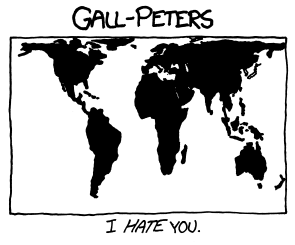
L hate you.
The man in the street is accustomed to the Mercator projection, which blatantly distorts the real size of countries near the equator. Europe is almost bigger than South America, although in fact it is almost twice as small. Greenland is actually 14 times smaller than Africa, although at the Mercator they look about the same. The states of Europe and North America look bigger than the near-equatorial countries, which diminishes the importance of the latter. At least that’s what a politically motivated criticism of the Mercator projection sounds like.
In 1855, the Scottish priest James Gall described the projection, which was called the “orthographic projection of Gall”. In this projection, the areas of objects are correctly displayed due to the distortion of their forms. At that time, the projection had no political overtones, it was a by-product of astronomical observations.
In 1967, the German Arno Peters created an identical projection, and in 1973, during the political climate of the search for social justice, presented it as a new invention. The Peters projection was demonstrated as a method of fighting imperialism and Eurocentrism. On the Mercator projection, Europe is large and central, the author pointed out, and on the “new” projection Africa and countries close to the equator turn out to be of the right size.
The very name “ Gall-Peters projection ” first appeared in Arthur Robinson’s 1986 publication. The projection is mentioned, for example, in the television series Western Wing , which tells about the work of the fictional administration of the US President. The plot implies that the cartographers suggested changing the maps in schools to “more socially just.”
The problem of the Gall-Peters projection is the initial assumption that the Mercator projection puts its - main or secondary - goal to raise the importance of European states due to their integration on the world map. In fact, the Mercator projection is only convenient for marine navigation, nor does it distort the local forms of objects.
The projection of Gall - Peters saves the area due to the distortion of angles, distances and shapes of objects. The distortions are significant, although Peters denied this. Despite statements to the contrary , the Peters projection does not represent the world in the form in which it actually looks.
The funny thing is that this map, on the contrary, depicts poor countries at the equator with distortion. The fact is that in this projection at 45 degrees north and south latitude the shape of objects does not change relative to real ones. The farther from these two lines, the greater the shape distortion. One of the two lines without distortion comes to Europe - that is, that part of the world from whose influence the Gall-Peters projection is so eager to save us. Thus, Africa is distorted most strongly by Peters, although the rich "imperialist countries" (Europe, the USA, Japan, Australia) hardly change the real form.
For comparison: at the Berman projection, the line passes without distortion at 30 degrees, at the equal-sized cylindrical projection of Lambert - at the equator.
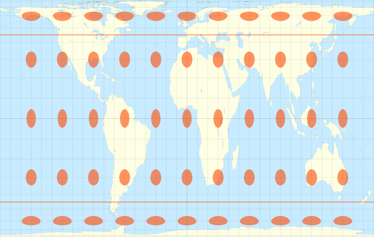
Distortion Ellipses on the Gall - Peters Projection
The map in the Gall - Peters projection is rectangular, which is a bit strange for a projection in the 20th century. Prior to the Peters projection, projections with the preservation of scale already existed, although the map was presented as something unseen before. Finally, if we assume that the larger the country, the more powerful it is perceived, then Antarctica will be the most important in the Mercator projection.
To summarize, the Gaul-Peters projection finds a problem that does not exist, cannot solve it, but allows for many new distortions. However, she has supporters who sincerely believe that the Mercator projection should be a thing of the past. For example, this projection is used by UNESCO, some British schools and part of the schools of Massachusetts.
Munro is not limited to a brief remark that he hates those who have this favorite projection. Also in the alt-text of the comic, he hid a message with a joke in the style of Horatio Kane : “What? You think I do not like the Peters map, because my cultural disquiet makes me uncomfortable to challenge? Don't you think that you don’t :: put on glasses :: project? ”
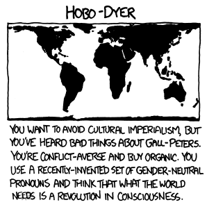
You want to avoid cultural imperialism, but you heard bad about Gall-Peters. You are non-conflict and buy organic products. You use the newly invented set of gender-neutral pronouns and think that the world needs a revolution in self-awareness.
In the name of the Hobo-Dyer projection , three names are coded at once: Howard Bronstein and Bob Abramas, the managers of the ordering company of the ODT Maps, and the cartographer Mick Dyer, who fulfilled the order. It was created in 2002 as a more palatable version of Gall - Peters.
The map still distorts the shapes of the countries. At 37.5 ° north and south latitude there is no distortion.

Distortion ellipses on Hobo-Dyer projection
Munroe plays with the story of the projection, pointing out that her lover may be a less radical and more non-conflicting supporter of social justice and concern for the environment. Such a person buys organic products, that is, grown with minimal use of synthetic fertilizers, pesticides and herbicides. He uses gender-neutral pronouns to offend no one.

Inverted World Map in Hobo-Dyer Projection
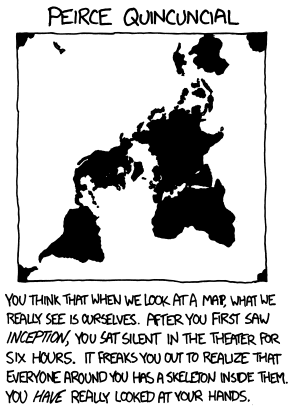
Do you think that when we look at the map, we actually see ourselves. After the first viewing of the film “The Beginning,” you sat silently at the cinema for six hours. What scares you is that inside each of the others is a skeleton. Once you really looked into your hands.
The planet in the Pierce projection is unfolded so that an endless pattern can be made from the projection. It correctly conveys angles in many places with the exception of areas where the equator and meridians suddenly change directions. The equator in the Pierce projection looks like a square, although the real equator has no sharp corners. Pierce himself argued that the distorted areas on the map take up less space than the Mercator.

Pattern of the Earth in the projection of the Pier
Maps in the Pierce projection have no significant practical applications. But the projection algorithm itself came in handy for representing 360-degree images on the plane - Pierce successfully unfolded the sphere into a rectangle consisting of two squares.

Distortion Ellipses on Pierce's Projection
The plot of the film “The Beginning” uses a complex nested structure, so the viewer may take several views to fully understand the motion picture. With the right mood of the psyche it may seem strange presence in the body of the skeleton or the complexity of the brush of a human hand. Probably, Munro hints that the endless pattern of the projections of the Earth and the squareness of the equator are liked by people who are inclined to fix themselves on small details.
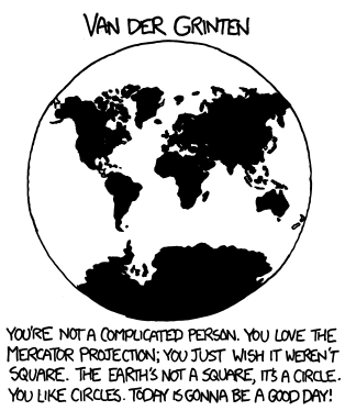
You are a simple man. You like the Mercator projection; you just want it not to be square. The earth is not square, it is round. You like circles. Today will be a great day!
In 1922, the US National Cartographic Society adopted the Van der Grintin projection as the standard map of the world. In this status, it existed until 1988.
This projection is neither equal or conformal. It projects the surface of the Earth into an arbitrary shape - a circle. It retains the outlines of continents and countries familiar from the Mercator projection, slightly removing the distortions. At the same time, the distortion at the poles is enormous - Antarctica seems to be larger than the rest of the land.
Van der Grinten projection distortion ellipses
Munro represents a fan of such a projection in the form of a frankly stupid and naive person. The sphere and the circle have little in common, but for the amateur Van der Greenten this is one and the same. In fact, this man is not far removed from the projection of the Mercator, Munro hints.
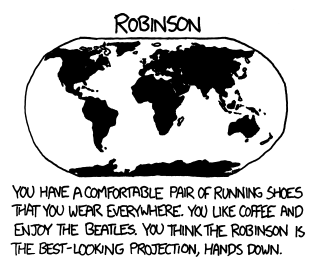
You have a comfortable pair of running sneakers that you wear everywhere. You like coffee and the Beatles. You think that the Robinson projection is the best without question.
The creation of Robinson replaced Van der Greenten as the projection of the standard map of the world by the National Cartographic Society of the USA in 1988. A decade later, in 1998, the projection was changed. It is possible that the author of the comic book itself (Munro was born in 1984) taught geography with a map of such a projection.
The projection of Robinson is also neither equiangular, nor equal projection, but a compromise. The meridians gently bend, and the poles are drawn in strings. Therefore, at the poles, the distortions are huge, but already with a slight departure towards the equator, the errors are not so significant. This is largely an artistic picture of the world: the projection is given by a table of values in increments of 5 degrees, and not by a formula. The remaining values are approximations.
Ellipses distortion of the projection of Robinson.
Munro hints that this projection is familiar and pleasant: he associates her fan with soft and comfortable things. The musical tastes of people are recorded in adolescence . Perhaps Munro points out that such a person grew up in the era of popularity of the Beatles, that is, it is a man who loves a quiet life for fifty to sixty.
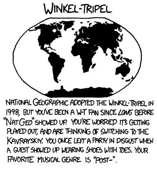
The National Cartographic Society adopted a triple projection of Winckel in 1998, but you adored it long before this recognition. You are worried that this is the end, and you are thinking of switching to Kavraisky. Once you left the party in disgust when a guest came in shoes with fingers. The name of your favorite music genre begins with “post-“.
The Winkel triple projection was published in 1921, and in 1998 the National Cartographic Society adopted it as the standard. This is the arithmetic average between the equidistant projection and the projection of Aytof - so the cartographer Oswald Winkel, in his compromise projection, tried to reduce all three types of distortion.
The popular comic stereotype states that if a certain product becomes popular, hipsters immediately refuse to use it. Munro points out that the fan of Winkel's triple projection belongs to this subculture. Such a person would abandon it in favor of the unused in the West projection of the Soviet geodesist and cartographer Kavraysky , who in general resembles the triple projection of Winkel.
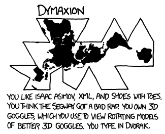
You like Isaac Asimov, XML and shoes with fingers. You think the Segways have just a bad reputation. You have 3D glasses in which you look at rotating models of 3D glasses better. Your layout is Dvorak.
Why be sure to suffer with the ball? Our planet can be approximately represented as a polyhedron, and its development can be made a cartographic projection. This idea Buckminster Fuller published in the journal Life in 1943.
This sweep has several advantages. The distortion of the size and shape of objects is less than in the Mercator or Gall-Peters projection. On such a map it is convenient to illustrate the scientific theory of human migration.
Dimaxion distortion ellipses
However, you need to get used to several new concepts. There is no “top” or “bottom” on the map. Fuller argued that the universe "north" and "south" are absent - there is only "inside" and "outside." In the Dimaxion projection it is difficult to find the coordinates of objects and indicate the directions of the world. Difficult to find ways to travel, they look unpredictable.
No matter how minimal the distortions may be, but Earth maps are needed for traveling around the world. Despite the originality and beauty of the idea, Fuller's projection did not receive any practical application.
In the signature, Munro collected similar cases where seemingly interesting inventions in practice did not have significant distribution, while remaining something niche. The list is not the most popular markup language XML, unusual shoes with fingers, expensive and therefore unpopular mobile scooters from Segway. For 3D glasses (that is, early virtual reality helmets) Munro hints at the lack of content and applications - this is true for the early 2010s. The layout of Dvorak is designed to speed up typing with respect to typewritten QWERTY, but requires complete retraining and does not demonstrate such significant advantages in practice.
Seriously? Do you know Waterman? And what about the 1909 Cahill map on which it is based ... do you have a reproduction in a frame of a house ?! Wow ... listen, forget about these questions. What are your plans for the evening ?!
Waterman's projection is similar to Dimaxion: a geoid is approximately like a polyhedron, in this case an octahedron. Then the polyhedron is unrolled onto a plane. As in the previous cases, the shape of objects and their true size are not distorted so much. But on such a map is difficult to specify the direction of the world and build a path.
Waterman published his “butterfly” in 1996. As recalled by Munro, she was based on the work of Cahill in 1909. Architect Cahill also crumbled Antarctica into slices, but he did it physically: he created and patented a folding rubber globe, and then flattened it.

As in the case of Dimaxion, this projection has not received significant practical application. Only a big fan of cartography can know about it. Munroe jokes that he has something to chat with a man who calls Waterman's Butterfly his favorite projection.
They say that transferring the Earth to a two-dimensional plane is like crushing an orange skin, which sounds easy to you. You like simple solutions. Do you think that we would have fewer problems, we choose normal people in Congress instead of politicians. Do you think that the airlines would simply need to buy food from restaurants near the terminals and serve it on board. You change the oil in your car, but secretly wonder whether you need it.
In 1923, John Good developed his pseudocylindrical equal replacement of the Mercator projection. Good's projection was designed to correctly convey the area of objects. The projection has several breaks in the oceans and Antarctica, which are made to reduce distortion.
On some variants of the Good's projection, the objects are repeated. You can make this projection with an emphasis on the ocean.
The main disadvantage of the Good's projection is the huge gaps in the oceans, which do not allow to visually estimate the distance between the continents. The Good's projection is designed to preserve space and does this for the continents. But the oceans in it look more than it actually is.
Indeed, a comparison with the orange peel was attached to this projection. Munro considers the desire to turn the globe into the skin as an overly simple and ignorant approach to the difficult problem of cartography. He cites parliamentary elections as an example: “normal” people would hardly have been able to break into the strictly expressed ruling class of the United States. And in the end it would hardly have solved the problems of the country. Besides, who defines the “normality” of a person?
The perception of taste is highly dependent on the composition of air and pressure, and an ordinary restaurant cannot at the same time prepare the quantities of food necessary for 100-300 people. Also, food must be packaged in a special way. If you force a restaurant to take into account all these requirements and change its technology, it will turn into a supplier of food for passengers on airplanes.
The car manufacturer indicates when to change the oil. Our lover of the Good's projection sometimes wonders if there is any collusion between automakers and car oil sellers.
All these are traps that can be reached if you underestimate the problem being solved. Munro points out that turning a geoid onto a plane is not as simple as it seems to a fan of Good's projection.
Based on Brilliant Maps , discussions on Reddit and Explain xkcd .
Sometimes the release of the xkcd comic is a surface joke in a narrow area of expertise. Such a humor can be understood by a specialist or at least poorly familiar with the affected area, and the rest will only be perplexed. An example of such a release is 2011 xkcd.com/977 Map Projections. For a complete understanding of the issue, it is only necessary to roughly present the history and function of various projections of world maps, otherwise the comic will remain in black and white.
')
Even outwardly simple questions have several solutions. The shape of the Earth is a geoid-like ball, but for the convenience of perception it is better to deploy it on a flat map. This can be done in several ways. Each of them will be executed with different trade-offs, since distortions of form, angles or lengths are inevitable. Some projections give more distortion, others are easier to perceive, for some we are just used.
Not all of us are looking at a map for navigation in the open sea. Often the choice of the method of transforming the shape of the Earth is not a matter of life and death, it is an artistic illustration. In these cases, the projection is chosen from the well-established tastes and preferences - just like choosing clothes or a car. You can joke about the fashion for expensive sneakers among the directors of large Silicon Valley companies or about the popularity of lowered cars. Likewise, cartographic projections are amenable to jokes, as was done in Map Projections.
We divide the comic into several parts and consider them in a convenient order.
Globe!
Yes, you are very smart.
The Earth is a complex body with a relief. Even if we take it for a ball, an ellipsoid of rotation or a geoid , the Earth will still not be able to “flatten” without distortion. The lengths of rivers and roads, the area and shape of countries and continents, the corners for navigation are distorted. Any projection is a compromise between which distortions are undesirable.
Therefore, any attempt to present the Earth on a plane without distortion is doomed to failure, as this response option resembles. Why try to do the impossible? The easiest way to a question about your favorite cartographic projection is to smugly shout out “Globe!”
It is clear that this is not a projection, but only an attempt to be clever. Munro points to this in the signature.
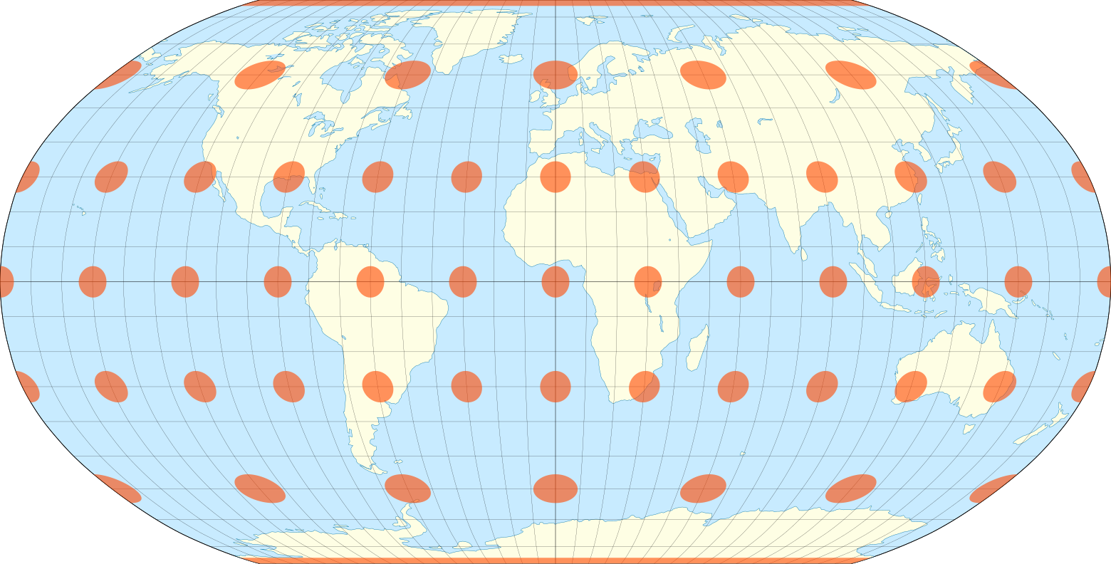
Equal Intermediate Projection (Plate-Carre)
It seems to you that this one will do. You like the way X and Y are converted to latitude and longitude. Other projections complicate things. You want me to leave behind you and give me a quiet dinner.
This is one of the oldest projections of the world map - probably, it was invented by Ptolemy before our era. The geoid is converted into a cylinder and unfolds onto a sheet of paper. Distances remain along the equator and all meridians, but the angles and area are distorted. Such a projection is convenient to use in computer geo-information systems: the linear coordinates on the projection are easily converted into latitude and longitude.
Equivalent projection distorts corners and areas. Pole points on this projection stretch into lines. Due to distortion, the equidistant projection is not used in navigation.
In the view of Munro, such a projection may appeal to a busy person who is not interested in the projections and associated wisdom.
Mercator
Cards are of little interest to you.
In the 1569 edition of the Atlas of the Flemish cartographer Gerard Mercator, on eighteen sheets with a total size of 202 by 124 centimeters, was represented by an equilateral cylindrical projection. Its name has its characteristics: at every point the angles are transmitted without distortion, and the parallels and meridians preserve parallelism.
For this, we had to pay with scale distortions: the farther the object moves from the equator to the pole, the larger it is. The poles themselves are transformed from points to infinitely large objects. Therefore, the map does not extend to the poles, a cutoff is used for latitudes of ± 80 ° —85 °.
Because of this, not the largest Antarctica acquires enormous dimensions in the Mercator projection, and Africa and the countries of South and Southeast Asia seem smaller than they really are. On the Mercator projection, Greenland looks the size of the entire African continent, although in reality its area is smaller than that of the Democratic Republic of the Congo.
The True Size Of website demonstrates how strongly the Mercator projection distorts squares.
But the Mercator projection was useful for navigating navigators and, subsequently, air traffic. If the compass needle retains its position, then the trajectory of the ship in the Mercator projection will be represented by a straight line. The intersection of two roads will keep its angle in this projection. The Mercator projection is widely used in navigation to this day.
Moreover, the Mercator projection well preserves the general outlines of objects. A variant of such a projection is used by all the major map services: Google Maps, Bing Maps, OpenStreetMap, and so on. The difference of the “web Mercator” is that it is cut off at latitudes of ± 85.0511 ° to make the map perfectly square.
The task of cartographic projection is solved, but not completely. Yes, it is very convenient to walk on the sea along the Mercator, but you cannot draw two small sections around the poles. Squares and lengths are distorted. Such a projection can only please someone who cares about the problems of cartography, hints the signature.
Gall - Peters Projection
L hate you.
The man in the street is accustomed to the Mercator projection, which blatantly distorts the real size of countries near the equator. Europe is almost bigger than South America, although in fact it is almost twice as small. Greenland is actually 14 times smaller than Africa, although at the Mercator they look about the same. The states of Europe and North America look bigger than the near-equatorial countries, which diminishes the importance of the latter. At least that’s what a politically motivated criticism of the Mercator projection sounds like.
In 1855, the Scottish priest James Gall described the projection, which was called the “orthographic projection of Gall”. In this projection, the areas of objects are correctly displayed due to the distortion of their forms. At that time, the projection had no political overtones, it was a by-product of astronomical observations.
In 1967, the German Arno Peters created an identical projection, and in 1973, during the political climate of the search for social justice, presented it as a new invention. The Peters projection was demonstrated as a method of fighting imperialism and Eurocentrism. On the Mercator projection, Europe is large and central, the author pointed out, and on the “new” projection Africa and countries close to the equator turn out to be of the right size.
The very name “ Gall-Peters projection ” first appeared in Arthur Robinson’s 1986 publication. The projection is mentioned, for example, in the television series Western Wing , which tells about the work of the fictional administration of the US President. The plot implies that the cartographers suggested changing the maps in schools to “more socially just.”
The problem of the Gall-Peters projection is the initial assumption that the Mercator projection puts its - main or secondary - goal to raise the importance of European states due to their integration on the world map. In fact, the Mercator projection is only convenient for marine navigation, nor does it distort the local forms of objects.
The projection of Gall - Peters saves the area due to the distortion of angles, distances and shapes of objects. The distortions are significant, although Peters denied this. Despite statements to the contrary , the Peters projection does not represent the world in the form in which it actually looks.
The funny thing is that this map, on the contrary, depicts poor countries at the equator with distortion. The fact is that in this projection at 45 degrees north and south latitude the shape of objects does not change relative to real ones. The farther from these two lines, the greater the shape distortion. One of the two lines without distortion comes to Europe - that is, that part of the world from whose influence the Gall-Peters projection is so eager to save us. Thus, Africa is distorted most strongly by Peters, although the rich "imperialist countries" (Europe, the USA, Japan, Australia) hardly change the real form.
For comparison: at the Berman projection, the line passes without distortion at 30 degrees, at the equal-sized cylindrical projection of Lambert - at the equator.
Distortion Ellipses on the Gall - Peters Projection
The map in the Gall - Peters projection is rectangular, which is a bit strange for a projection in the 20th century. Prior to the Peters projection, projections with the preservation of scale already existed, although the map was presented as something unseen before. Finally, if we assume that the larger the country, the more powerful it is perceived, then Antarctica will be the most important in the Mercator projection.
To summarize, the Gaul-Peters projection finds a problem that does not exist, cannot solve it, but allows for many new distortions. However, she has supporters who sincerely believe that the Mercator projection should be a thing of the past. For example, this projection is used by UNESCO, some British schools and part of the schools of Massachusetts.
Munro is not limited to a brief remark that he hates those who have this favorite projection. Also in the alt-text of the comic, he hid a message with a joke in the style of Horatio Kane : “What? You think I do not like the Peters map, because my cultural disquiet makes me uncomfortable to challenge? Don't you think that you don’t :: put on glasses :: project? ”
Hobo-Dyer Projection
You want to avoid cultural imperialism, but you heard bad about Gall-Peters. You are non-conflict and buy organic products. You use the newly invented set of gender-neutral pronouns and think that the world needs a revolution in self-awareness.
In the name of the Hobo-Dyer projection , three names are coded at once: Howard Bronstein and Bob Abramas, the managers of the ordering company of the ODT Maps, and the cartographer Mick Dyer, who fulfilled the order. It was created in 2002 as a more palatable version of Gall - Peters.
The map still distorts the shapes of the countries. At 37.5 ° north and south latitude there is no distortion.
Distortion ellipses on Hobo-Dyer projection
Munroe plays with the story of the projection, pointing out that her lover may be a less radical and more non-conflicting supporter of social justice and concern for the environment. Such a person buys organic products, that is, grown with minimal use of synthetic fertilizers, pesticides and herbicides. He uses gender-neutral pronouns to offend no one.
Inverted World Map in Hobo-Dyer Projection
Pierce Projection
Do you think that when we look at the map, we actually see ourselves. After the first viewing of the film “The Beginning,” you sat silently at the cinema for six hours. What scares you is that inside each of the others is a skeleton. Once you really looked into your hands.
The planet in the Pierce projection is unfolded so that an endless pattern can be made from the projection. It correctly conveys angles in many places with the exception of areas where the equator and meridians suddenly change directions. The equator in the Pierce projection looks like a square, although the real equator has no sharp corners. Pierce himself argued that the distorted areas on the map take up less space than the Mercator.
Pattern of the Earth in the projection of the Pier
Maps in the Pierce projection have no significant practical applications. But the projection algorithm itself came in handy for representing 360-degree images on the plane - Pierce successfully unfolded the sphere into a rectangle consisting of two squares.
Distortion Ellipses on Pierce's Projection
The plot of the film “The Beginning” uses a complex nested structure, so the viewer may take several views to fully understand the motion picture. With the right mood of the psyche it may seem strange presence in the body of the skeleton or the complexity of the brush of a human hand. Probably, Munro hints that the endless pattern of the projections of the Earth and the squareness of the equator are liked by people who are inclined to fix themselves on small details.
Van der Greenten projection
You are a simple man. You like the Mercator projection; you just want it not to be square. The earth is not square, it is round. You like circles. Today will be a great day!
In 1922, the US National Cartographic Society adopted the Van der Grintin projection as the standard map of the world. In this status, it existed until 1988.
This projection is neither equal or conformal. It projects the surface of the Earth into an arbitrary shape - a circle. It retains the outlines of continents and countries familiar from the Mercator projection, slightly removing the distortions. At the same time, the distortion at the poles is enormous - Antarctica seems to be larger than the rest of the land.
Van der Grinten projection distortion ellipses
Munro represents a fan of such a projection in the form of a frankly stupid and naive person. The sphere and the circle have little in common, but for the amateur Van der Greenten this is one and the same. In fact, this man is not far removed from the projection of the Mercator, Munro hints.
Robinson projection
You have a comfortable pair of running sneakers that you wear everywhere. You like coffee and the Beatles. You think that the Robinson projection is the best without question.
The creation of Robinson replaced Van der Greenten as the projection of the standard map of the world by the National Cartographic Society of the USA in 1988. A decade later, in 1998, the projection was changed. It is possible that the author of the comic book itself (Munro was born in 1984) taught geography with a map of such a projection.
The projection of Robinson is also neither equiangular, nor equal projection, but a compromise. The meridians gently bend, and the poles are drawn in strings. Therefore, at the poles, the distortions are huge, but already with a slight departure towards the equator, the errors are not so significant. This is largely an artistic picture of the world: the projection is given by a table of values in increments of 5 degrees, and not by a formula. The remaining values are approximations.
Ellipses distortion of the projection of Robinson.
Munro hints that this projection is familiar and pleasant: he associates her fan with soft and comfortable things. The musical tastes of people are recorded in adolescence . Perhaps Munro points out that such a person grew up in the era of popularity of the Beatles, that is, it is a man who loves a quiet life for fifty to sixty.
Winkel Triple Projection
The National Cartographic Society adopted a triple projection of Winckel in 1998, but you adored it long before this recognition. You are worried that this is the end, and you are thinking of switching to Kavraisky. Once you left the party in disgust when a guest came in shoes with fingers. The name of your favorite music genre begins with “post-“.
The Winkel triple projection was published in 1921, and in 1998 the National Cartographic Society adopted it as the standard. This is the arithmetic average between the equidistant projection and the projection of Aytof - so the cartographer Oswald Winkel, in his compromise projection, tried to reduce all three types of distortion.
The popular comic stereotype states that if a certain product becomes popular, hipsters immediately refuse to use it. Munro points out that the fan of Winkel's triple projection belongs to this subculture. Such a person would abandon it in favor of the unused in the West projection of the Soviet geodesist and cartographer Kavraysky , who in general resembles the triple projection of Winkel.
Dimaxion
You like Isaac Asimov, XML and shoes with fingers. You think the Segways have just a bad reputation. You have 3D glasses in which you look at rotating models of 3D glasses better. Your layout is Dvorak.
Why be sure to suffer with the ball? Our planet can be approximately represented as a polyhedron, and its development can be made a cartographic projection. This idea Buckminster Fuller published in the journal Life in 1943.
This sweep has several advantages. The distortion of the size and shape of objects is less than in the Mercator or Gall-Peters projection. On such a map it is convenient to illustrate the scientific theory of human migration.
Dimaxion distortion ellipses
However, you need to get used to several new concepts. There is no “top” or “bottom” on the map. Fuller argued that the universe "north" and "south" are absent - there is only "inside" and "outside." In the Dimaxion projection it is difficult to find the coordinates of objects and indicate the directions of the world. Difficult to find ways to travel, they look unpredictable.
No matter how minimal the distortions may be, but Earth maps are needed for traveling around the world. Despite the originality and beauty of the idea, Fuller's projection did not receive any practical application.
In the signature, Munro collected similar cases where seemingly interesting inventions in practice did not have significant distribution, while remaining something niche. The list is not the most popular markup language XML, unusual shoes with fingers, expensive and therefore unpopular mobile scooters from Segway. For 3D glasses (that is, early virtual reality helmets) Munro hints at the lack of content and applications - this is true for the early 2010s. The layout of Dvorak is designed to speed up typing with respect to typewritten QWERTY, but requires complete retraining and does not demonstrate such significant advantages in practice.
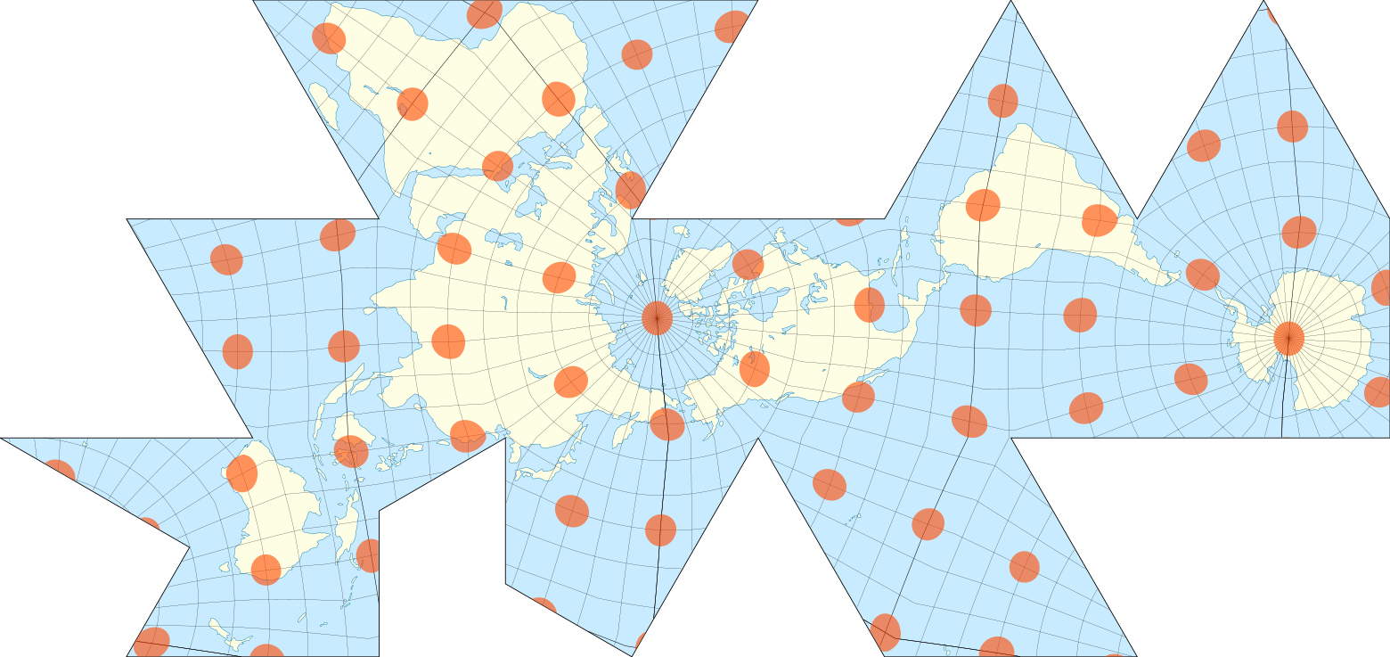
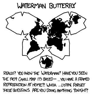
"Waterman's Butterfly"
Seriously? Do you know Waterman? And what about the 1909 Cahill map on which it is based ... do you have a reproduction in a frame of a house ?! Wow ... listen, forget about these questions. What are your plans for the evening ?!
Waterman's projection is similar to Dimaxion: a geoid is approximately like a polyhedron, in this case an octahedron. Then the polyhedron is unrolled onto a plane. As in the previous cases, the shape of objects and their true size are not distorted so much. But on such a map is difficult to specify the direction of the world and build a path.
Waterman published his “butterfly” in 1996. As recalled by Munro, she was based on the work of Cahill in 1909. Architect Cahill also crumbled Antarctica into slices, but he did it physically: he created and patented a folding rubber globe, and then flattened it.
As in the case of Dimaxion, this projection has not received significant practical application. Only a big fan of cartography can know about it. Munroe jokes that he has something to chat with a man who calls Waterman's Butterfly his favorite projection.
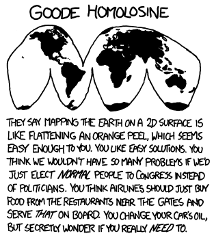
Projection Good
They say that transferring the Earth to a two-dimensional plane is like crushing an orange skin, which sounds easy to you. You like simple solutions. Do you think that we would have fewer problems, we choose normal people in Congress instead of politicians. Do you think that the airlines would simply need to buy food from restaurants near the terminals and serve it on board. You change the oil in your car, but secretly wonder whether you need it.
In 1923, John Good developed his pseudocylindrical equal replacement of the Mercator projection. Good's projection was designed to correctly convey the area of objects. The projection has several breaks in the oceans and Antarctica, which are made to reduce distortion.
On some variants of the Good's projection, the objects are repeated. You can make this projection with an emphasis on the ocean.
The main disadvantage of the Good's projection is the huge gaps in the oceans, which do not allow to visually estimate the distance between the continents. The Good's projection is designed to preserve space and does this for the continents. But the oceans in it look more than it actually is.
Indeed, a comparison with the orange peel was attached to this projection. Munro considers the desire to turn the globe into the skin as an overly simple and ignorant approach to the difficult problem of cartography. He cites parliamentary elections as an example: “normal” people would hardly have been able to break into the strictly expressed ruling class of the United States. And in the end it would hardly have solved the problems of the country. Besides, who defines the “normality” of a person?
The perception of taste is highly dependent on the composition of air and pressure, and an ordinary restaurant cannot at the same time prepare the quantities of food necessary for 100-300 people. Also, food must be packaged in a special way. If you force a restaurant to take into account all these requirements and change its technology, it will turn into a supplier of food for passengers on airplanes.
The car manufacturer indicates when to change the oil. Our lover of the Good's projection sometimes wonders if there is any collusion between automakers and car oil sellers.
All these are traps that can be reached if you underestimate the problem being solved. Munro points out that turning a geoid onto a plane is not as simple as it seems to a fan of Good's projection.
Based on Brilliant Maps , discussions on Reddit and Explain xkcd .
Source: https://habr.com/ru/post/458426/
All Articles