Texturing, or what you need to know to become an artist on surfaces. Part 1. Pixel
What is this series of lessons about?
In this series of articles that I am going to write, I will try to maximize the theory of creating textures for the gaming industry, starting from the very concept of “pixel” and ending with the construction of complex materials (shaders) in the game engine using the example of Unreal Engine 4.
The second part is here .
I will try to cover such programs as Windows Paint, Photoshop, Substance Painter, Substance Designer and, perhaps, Quixel (I don’t really see the point in this program, because after reading all the articles, readers should have a complete understanding of how to work with textures, and Quixel will be intuitive).
')
I will try to make out as detailed as possible such a thing as PBR, masks and various types of textures.
And all this will be considered from the lowest and most basic levels for first-graders and those who have never done so before, so that after reading these articles, the reader has no questions left, there is a maximum understanding of how this all works and he can Start confidently working with textures and shaders in any software, since the basis (base, essence) is the same for all.
I am not perfect. I do not think that I know this topic inside and out. I started writing this article to help my friends get involved in this wonderful world of texturing without my help - so that they can open articles at any time, read them and understand how to work with it and what to do. And I will be grateful to all of you if you help me with filling out this tutorial, so that we all can give the right people a link to these articles, and they can quickly get involved in this direction. I really ask everyone who is not indifferent to this topic and the topic of teaching this area to help me in the comments - to make my own edits or wishes, if suddenly I miss something or make a mistake in something.
I really ask everyone who can come up with other examples for a better understanding of a certain block, unsubscribe in the comments so that I can add these examples to the article. Suddenly, my examples will not be enough to fully understand the basics?
So, guys, let's go =)
Part 1. Pixel
And what is a pixel?
The concept of "pixel" is used in the definition of the physical element of the display matrix, as well as the smallest color point in the image, from the heap of which the image is formed.
The concept of “pixel” is equally used here and there for the simple reason that, in general, the working principle of this element is the same in monitors and in images with slight differences. Therefore, to begin with, let's look at the principle of the pixel on the monitor.
Pixel and monitors
(The description of the operation of the pixels below is abstract and does not describe the real physical phenomena of the operation of LCD monitors).
In monitors, a pixel is a physical element consisting of 3 luminous elements of 3 colors - Red, Green and Blue. The intensity of each element (luminous intensity) determines the color of a pixel. That is, if the green and blue elements cease to glow completely, and the red element remains on, then it will already be a red dot (red pixel) on the screen, and if you physically get close to the monitor as much as possible, you can see how this red dot to its right has black space - two extinct elements.
Intensity Range and Pixel Color
Once again. The color of the pixel is determined by 3 light elements - red, green and blue. Depending on their glow settings, the color itself is obtained. It is important.
Now let’s imagine this in the form of the intensity scale of each element, where the green color represents the current intensity, and in the square to the right is the color that is approximately obtained from the combination of the intensity of the elements:
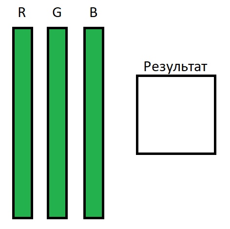
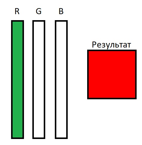
Imagine that the figure shows the maximum intensity of the glow of all elements of a pixel, which ultimately gives us a white pixel on the monitor. Accordingly, if we reduce the intensity of the Green and Blue elements to 0, then we get an exceptionally bright red color:
And also we come to a very important point - the range of intensity.
The intensity range (let's call it that) is the range of the state of the element from its minimum state (the absence of luminescence completely) to its maximum state (maximum brightness of the luminescence).
This can be expressed in many formats, for example:
- - From 0% to 100%. That is, the element can glow in the floor of force, in other words, 50%.
- - From 0 to 6000 candles. That is, the maximum element brightness (100%) is 6000 candles, and the power by 75% will be equal to 4500 candles respectively.
- - From 0 to 255. That is, 30% in this range will be equal to 76.5.
- - From 0 to 1. Same as 100%, only use 1 instead of 100. This is convenient for calculations, which we will definitely look at later.
In our lessons we will use the last version of the range, as it is convenient for calculations, as we will see later.
Now let's add intensity ranges to our scale and get the following image:

Now we see that the intensity is R = 1, the intensity is G = 0.55-0.60, and B = 0. As a result, we get approximately orange color, which is given to us on the monitors by pixels. You can physically get as close as possible to the monitor and try to look at the pixels in the square of the result — you will not see the blue element in these pixels, since it is completely off (its intensity is 0).
It is important to understand that each monitor, depending on the matrix manufacturer, assembly, and some additional parameters, the brightness level itself can be completely different.
For example, the brightness range of the pixel matrix monitors:
- - Samsung may be 6000 candles.
- - LG = 5800 candles.
- - HP = 12,000 candles.
These abstract figures, which have no relation to reality, are necessary in order to have an understanding that each monitor has a maximum intensity intensity, but the intensity range is always the same - from 0 to 1. That is, when you unscrew to 1 the intensity of the red element, then you it starts to glow as bright as possible, because 1 = maximum.
Now we have the maximum idea of how the color is built on the monitor - a million pixels adjust the intensity of their elements so that the desired color is obtained in total. If you read this text in black letters on a white background, you should already understand that the letters themselves are displayed by pixels that completely turned off their glow, and the white background consists of pixels that turned on the intensity of all their elements to the maximum.
If you go very deep into this ocean, then you can find that a pixel has 2 ranges of luminous intensity - this is the intensity range of each element, and the total intensity range, which determines the overall brightness of the entire monitor (for example, monitor brightness is reduced in darkness and added, when it is very light).
Screen resolution and pixel dimensions
And so, having understood how color is built in pixels, we understand how the image is formed on the monitor. And what is the pixel size? And why is size important?
The smaller the pixel in size, the more you can shove them into the monitor. However, the number of pixels is always limited by the screen resolution.
For example, a screen with a resolution of 1920x1080 contains 2,073,600 pixels. That is, the screen width consists of 1920 pixels, and height = 1080 pixels. Multiplying these two values, we get the area (number) of pixels.
Thus, depending on the monitor diagonal and the screen resolution, the pixel on the screen has its dimensions. So, with a monitor diagonal of 19 inches and a resolution of 1920x1080, the pixel size will be smaller than that of a 24-inch monitor and the same resolution. Accordingly, if we take a 24-inch monitor with a resolution of 2560x1440, then its pixel size will be smaller than the previous example.
Total
We have an idea how the color of the pixels on the monitor is formed.
We have an idea of the size of the pixels, and that they can vary depending on the monitor itself.
We have an idea that at a resolution of 1920x1080 on the monitors of the phone, the pictures will look more detailed and clearer, since the pixels are smaller.
And in general, we have an understanding of how the image is formed on the monitor.
Pixel in images
Again. The concept of "pixel" is used in the definition of the physical element of the display matrix, as well as the smallest color point in the image, from the heap of which the image itself is formed.
Color formation
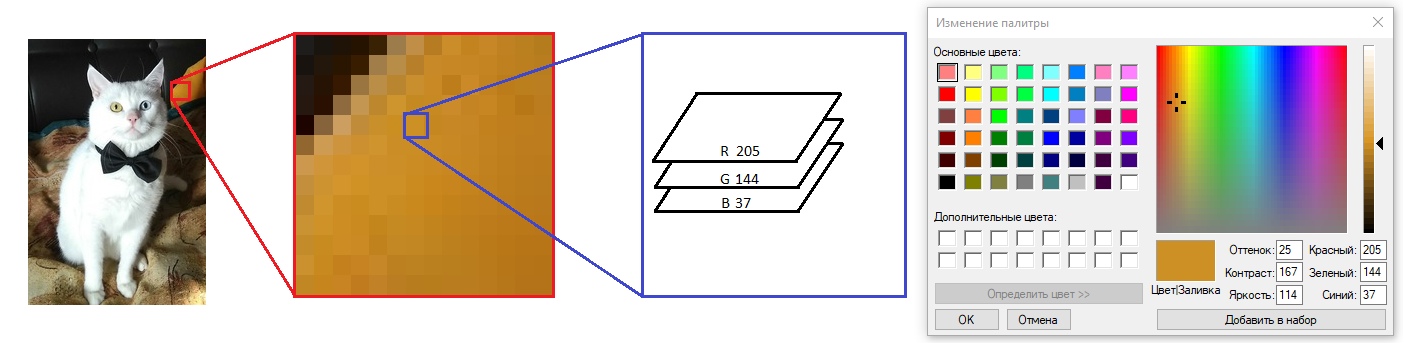
Let's look at the image, some image. For example, my cat:

This picture has a resolution of 178x266 pixels. That is, the picture consists of 47.348 pixels and occupies only 2.2 percent of the space on the screen. Is it true? Does this picture really take up 47.348 physical pixels on your monitor? And if the scale of the image to reduce? When the picture is reduced and enlarged, the number of pixels from which it consists does not change, which means that the pixels in the picture clearly imply something different than the pixels in the monitor. Yes and no.
A pixel in an image is the smallest color point from which a bunch is made up. The number of pixels in the picture is not tied to the monitor and depends on who created this picture (or what created it). In this example, the number of pixels depended on my curves hands - I cut the photo randomly and got a picture with so many pixels.

To make it easier to understand what a “pixel” in an image is, you should refer to the software implementation of this object.
The pixel in the image for the computer is a set of numbers. Relatively speaking, this block (brick, square) - one white square on the cat's ear takes 32 bits. When the computer wants to display my cat on your monitor, it reads every pixel of the image (all 47,348 pixels in turn), and displays them on the monitor. When the image scale is 1 to 1 (1 image pixel is 1 monitor pixel or, in other words, the scale is 100%), the image size takes up exactly the same number of monitor pixels as it has.
Each such pixel consists of 4 values (channels) of 8 bits = 32 bits.
3 values are assigned to the intensity distribution of the colors Red, Green and Blue (remembering how the pixel works in the monitor, it becomes immediately clear how these values affect the color).
1 value is given to transparency (more on that later).
(In these lessons we will consider only 32-bit images and 8-bit channels. Everything else is already particular and other standards that work by analogy).
Each value (channel) can be in the range from 0 to 255 integers, or else 256 values, which is equal to 8 bits.
In other words:
If the channels responsible for green and blue will be equal to 0, and the red will be equal to 255 - then the image pixel will be as red as possible.
If the green value is raised to 128 (which is equal to the middle or 0.5), then the pixel will be orange, as in the example with pixels from the monitor above.
Or another example:
In this image, the Hue, Contrast, and Brightness settings do not actually affect the formation of color. These are derivatives, which are calculated automatically from the current values of the channels, and not stored in them, so you do not need to be afraid of such a number of digits.
That is, the image pixel has three channels (three values), which have their own intensity range from 0 to 255. By adjusting the intensity of the channel, you can get different shades of colors.
From now on, we will start using Adobe Photoshop, because it has a great way to visualize color composition from 3 channels (and even more, but more on that later).
So it was got that began to use shades of white color for visual display of a range of intensity.
Blackest color = 0.
The whitest color = 1 (or 255, if we consider the scale from 0 to 255).
And it looks like this:

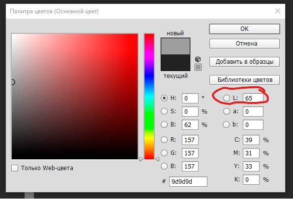
By the way, setting the intensity in Photoshop corresponds to the Level parameter (the used designation of the range is 0 - 100). Where 65 can be regarded as 65% of the intensity or 0.65:
Remember how in the screenshot of the color settings in Paint I asked not to pay attention to other parameters? In fact, in Photoshop you can ignore the other parameters. Everything is controlled by 3 channels - RGB. The remaining values here are calculated based on the values of RGB. But they can be used, for example, by specifying the intensity in the Level parameter from 0 to 100, and then Photoshop will calculate the necessary values for RGB for us.
In Photoshop, you can switch to each channel separately and see how the intensity of each channel is indicated in the range from 0 to 1 in white:
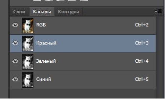
Red channel:

Green channel:

Blue channel:

Well, once again, how it all looks like:
Now, understanding how the color of a pixel is summed up from the sum of the channels, how the intensity of each channel is visualized, one can understand which colors approximately the objects have, if you watch each channel separately. For example, the orange cover on the right on top of the red channel is bright white (intensity from 0.8 and above), on the green channel the average intensity (about 0.5), and on the blue channel it is almost black (intensity about 0). Taken together, turned orange.
Total
Pixel in the image forms a color about the same as the pixel on the monitor. In fact, when the picture is 1 to 1, the image pixel scale tells the pixel of the monitor how to shine. But the zooming already causes the software in which this occurs to process the image differently.
(Further, a paragraph with a subjective view of the work processes) As far as I understand, when you zoom in on a picture, the software simply paints a handful of pixels (for example, 4 by 4) in the same color (as if it is one pixel), forming a sense of approaching the picture and its pixelation. . But when the image is scaled down, when 1 real pixel of the monitor begins to have 2 or more pixels of the image, the software begins to average the color of several pixels of the image that are fighting for 1 pixel of the monitor. Both with increasing and decreasing image scale, the software somehow uses its own image processing algorithms.
Additionally:
The above is a system for building images without any compression. In general, there are variations of image compression methods, at which values are either cut down, or averages are taken from those nearby, and so on — we are not interested in it now, and compression methods are already ways of cutting back on computer memory, which are repelled by this idea. pixel work.
Images and Masks
And now gradually we are getting closer to the most interesting - masks .
The first mask that we have already encountered, but have not voiced this - is a transparency mask.
We remind you that a pixel has 4 channels of 8 bits each. Of these, 3 channels are responsible for the formation of color, and the 4th is responsible for transparency.
The transparency mask is the 4th channel in the image pixel, which indicates that this pixel should be displayed in full, have transparency or not be displayed in full.
That is, this channel also has a size of 8 bits and can have values from 0 to 255. Where 0 is as transparent as possible and 255 as non- transparent as possible.
If you do not have a transparency channel in the image, it is easy to add it by clicking on the channel adding:

And you will immediately have an alpha channel.
Now, all the values in this channel are 0, and it is visually completely black.
Next, I marked the zone with 100% visibility - selected my cat, tracing the cat's silhouette in the alpha channel:

Now, if you turn on the display of all 3 channels + Alpha channel, you can see the following:

Photoshop marked with red areas that are completely transparent, so that I understand that when a transparent image is unloaded, the pixels in the red zone will be recorded, they will have a value in all 4 channels, but as in the 4th channel, they have a value of 0, they will not be displayed and, therefore, will hang a load for the image file.
This is what the exported image in PNG format with a transparency layer looks like (in fact, it was Tiff, but it doesn’t play any role):

Now it should be noted that when I painted the transparency mask, there were smooth transitions on it (that is, not roughly 1 and 0, but 1 in the center, and along the edges there are soft drops from 1 to 0). This made it possible to create translucent pixels, which in this image show how smoothly the picture passes around the cat into transparency.
So we smoothly approached the next extensive topic, which I will try to cover in the near future - to the masks and the first texturing lesson.
Thank you for your attention, I am waiting for your wishes and adjustments =)
Source: https://habr.com/ru/post/458342/
All Articles