How to visualize data in a compelling story
James Round - London's famous graphic designer and illustrator will share his secrets on conveying complex ideas in a visually appealing way. Find out how James tells stories through data using real-life examples of his infographics!
Tell about yourself and how you got into the sphere of design
I am a graphic designer and illustrator from London. For the last ten years I have been working in various creative agencies, and last year I switched to freelancing. One of the factors that influenced this decision was the ability to focus on the work that is most important and interesting for me.
Besides graphic design and illustrations, I have always loved infographics and data visualization. On my own initiative, I created several free data visualization projects. They were included in the Information is Beautiful Awards, and soon after that I began to receive requests from customers. Since then I have worked with BBC, WIRED and Norwegian Airlines.

Skyscrapers - BBC

UK Tech: The Network Effect - Wired
You have done some personal data-related projects. What inspired you when choosing ideas?
One of my favorite things in design is the ability to take something complicated and talk about it clearly, attractively and beautifully. Therefore, when it comes to my personal projects, the starting point is interesting topics and tasks that I want to better understand and present in an accessible and fascinating form.
For example, my visualization of extinction data started and developed with the simple question "why do animals die out?". I am interested in science, especially I like the topics of space and ecology, and the visualization of data gives me a reason and an opportunity to study them in more detail.

How do you build a data visualization project development process?
First, I figure out how many variables there are for visualization, which of them are most important, which story should I show with data? Then I, within a few minutes, make sketches of drafts until I find several options. From there, I immediately turn to Adobe Illustrator and begin to make two or three electronic sketches.
The customer is always pleased to see different ways of presenting their content, and for me it is useful to study the data, notice interesting things that I could miss. As soon as I decide on the concept, I enter all the data and process it for final work. My favorite part of the process begins after the structure has been defined - that is, the most difficult part is finished, and only a couple of strokes are left to make it look amazing!
What are some tips for visualizing large data sets?
The most important thing is to make sure that the data set is in order. A dirty table will cause endless problems in the future. Before proceeding directly to visualization, make sure that you and your client completely agree with the proposed structure. If in the future the opinion about the structure changes, consider that you need to start all the work from the beginning. Finally, the order in the working environment is mandatory for such types of projects: call your layers by speaking names, select different elements into separate ones, never delete what you may need later, and use the grid, since your life depends on it!
As for deciding which type of visualization to use, as soon as I feel that I understand the data and started sketching out layouts, I go for inspiration on Pinterest or the Data Viz project . Often you will be confronted with ideas similar to your drafts, or, if you're lucky, stumble upon a new structure that will help you get the most out of your data.

The International Space Station: The First 50 Expeditions.
What problems do you encounter when working with data?
I recently worked in a magazine that was extremely difficult, but taught me some useful lessons. The data was too cumbersome and our goal was to simplify their perception. The data did not constantly fit into the structure we chose; there was simply too much of it. Every time I had to go back and start again with a changed data set. And every time I discovered that I could not put all the data in the DPS (note I could not find what DPS is) .
We had almost abandoned the project and I suddenly thought of another way of presenting content, which fortunately worked and looked great. I was so happy when it was all over. This was an excellent part of the portfolio and caused a good response on the Internet, which proved the successful completion of the project.
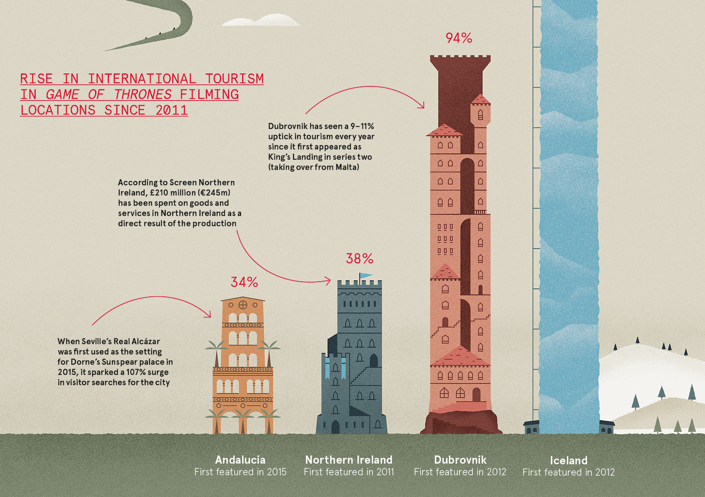
Rise in international tourism in Game of Thrones filming locations since 2011.
What resources would you recommend to people who want to improve their skills?
As for resources, the Data Viz Project is great for exploring various ways of presenting data, and The Information is Beautiful Awards has a wonderful section that brings together the best work in this direction.
To search for work and experiment data, try the following:
- The website of the UK government contains a lot of significant data (and I believe that other countries offer similar resources)
- The United Nations has a wealth of interesting data at FAOSTAT
- Our world is in data
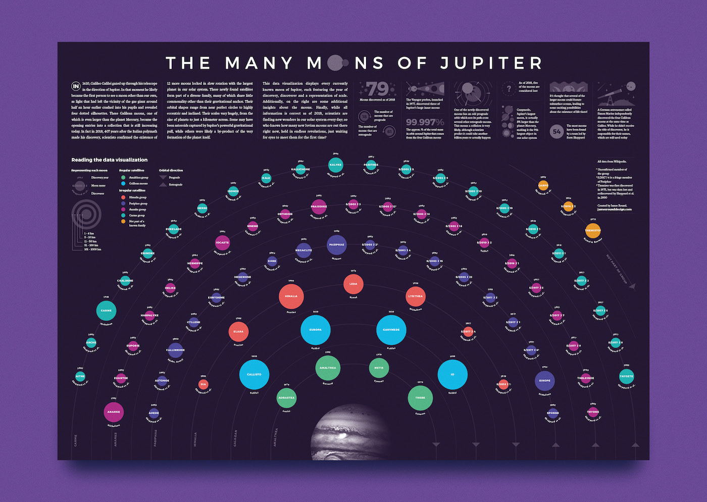
But my favorite place to search for data (for my personal projects, of course) is Wikipedia. I always find another source to double check the data, but the wiki is never wrong. For my previous visualizations, I used it to map Jupiter’s satellites , present each member of the ISS crew, and create a schedule of all past US presidents . For those who want to work with the data - look at Wikipedia, you never know what you can find!
Find James at Dribbble and jamesrounddesign.com .
')
Source: https://habr.com/ru/post/457608/
All Articles