ASO check list: how not to miss anything
Recently, our employees listened to a series of webinars dedicated to search engine optimization of mobile applications. During the discussion of the information received, we concluded that, despite the extensive experience in the field of development and ASO, simple measures to optimize the issue, which sometimes seem not so significant, can help to achieve a good result.
Therefore, we decided to systematize our knowledge base and experience and write about this small series of articles that would reveal the range of basic compulsory practices for each mobile application developer.
')
In this cycle, we will touch on various topics - from visual optimization of applications to current mobile analytical metrics used in evaluating an application for ASO.
All the most delicious under the cut. Go!
To begin, let's try to understand what is ASO?
ASO (App Store optimization) is a set of measures to optimize a mobile application, used in order to maximize the output of your application in search.
It is no secret that it is organic traffic that is the most valuable: thanks to it, you get the most involved and motivated to purchase users.
Constantly improving every parameter that affects the conversion of showing into viewing and viewing into installation is the sacred duty of whoever is responsible in your company for ASO - developer, content manager or marketer (underline the appropriate).
In order to accomplish this task, it is necessary to analyze the application on several parameters at once and to identify what exactly is in it that does not meet the expectations of users and spoils the whole picture.
We suggest you use a kind of check-list, which lists what requires the most close attention:

Screen from ASOdesk presentation
If you consider all these points and optimize them, they are able to provide you with good and stable installations and a solvent audience.
When you do a product for a long time, the eye becomes wet. In this situation, a regular analysis of each listed parameter will be simply irreplaceable: it will help you look at your project from a new angle. We have begun to apply this simple technique and already notice positive changes. For example, the first conversion in a number of applications increased by 10% from the previous result, and the second by 15%.
In today's article we will detail the nuances associated with visual design and work with promotional materials of the application.
But before proceeding to the detailed consideration, we will give a little advice that applies to absolutely all of the above areas: before you improve something, understand those for whom your product was created. To do this, make a portrait of the target audience of your application, taking into account gender, age and status of people, and also think about their expectations. Consider cultural and class differences: what works in Europe (for example, white for a wedding application) may not appeal to audiences in China and Japan, where white is the color of mourning.
This set of actions, as it is easy to guess, is aimed at bringing the visual component of the application page in line with user requests.
What presents the visual side of the application on the market and what you should pay attention to:
First, briefly go over the general points that are equally valid for the above.
All promotional items must be combined and deliver a consistent, consistent image of your application. This means that in the creation of promotional materials you need to adhere to the general concept, color palette and position the elements in such a way that they are not in composition contradicting each other.
Also, when working with the design of your product, you should take into account the features of various markets, since the same promotional materials on the AppStore and Google Play will work with varying degrees of effectiveness. Therefore, when placing an application on several markets, it is necessary to “customize” the design for the target audience. Users of AppStore and Google Play have a different mentality and solvency. An illustrative example: for Google Play, the design of the icon is more important, since screenshots in the search are not displayed and the user decides to go to the application page based on what he sees on the icon and in the title. Therefore, the GP Market provides the ability to download different icons for different countries. On the AppStore, on the contrary, the first screenshots attract all the attention - the user takes a 90% decision on downloading, looking at them, the first screenshot is especially important: either it catches the attention and the user visits the application page or not, and you lose your potential user.
We now turn to a more detailed coverage of each promotional element separately:
This element is able to increase the conversion of the application by 10-25% of the current value (that is, if your initial conversion was 50%, then it can reach 55-62%), and drop it to the bottom.
What needs to be remembered when creating an icon that works for success?
The icon should clearly display the “meaning” of the application.
Images that meet the expectations of the target audience, increase interest in the application.
For example, according to statistics, the children's application will swing better if there is a dolphin, dinosaur or unicorn on the icon or screen.
Use the icon to display local and global events (from holidays to discounts). Making an icon for an event can raise the conversion quite strongly. Even large developers of recognizable applications do not neglect this method.
The stylistics of the icon and the dynamics / statics of the elements on it should correspond to the genre and content of the application.
All the details of the image should be clearly visible - on the device the icon will look quite small, and the design solutions that are laid down may not be appreciated because they simply cannot be viewed.
When choosing a color solution, it is necessary to build on the color semantics existing on the market for mobile applications: neutral blue shades are often used in instant messengers, it is good to enter the global market with them; green tones are associated with money or nature; pink, purple, purple are constantly used in applications for women or games for girls and so on.
Sometimes even a small change in the hue or gradient of the icon can lead to a significant increase in conversion, so do not be afraid to experiment with different color solutions.
Relying on trends can and should be, but it is also important not to lose individuality, because the “instinctive” clicking on your application to the target audience of a popular utility from which you “borrowed” the idea will someday end ... and can incidentally provoke negative reviews. Just check that the same cunning on the market is not the majority, and this is fraught with this result:

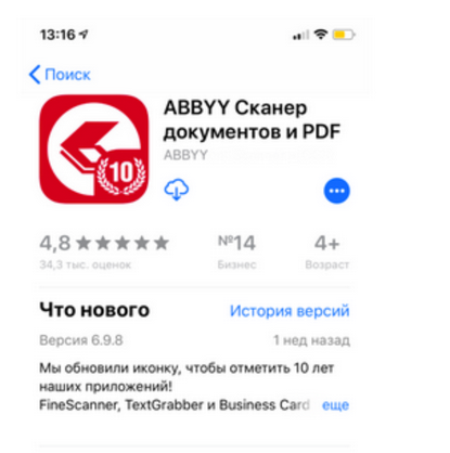
For applications that have stable good installs and often fall into feature and tops, you can try to give the user this information through the icon. Similarly, you can act when there is some kind of information channel: for example, an application is 5 or 10 years old.
You can use the "little tricks" to attract attention - a good conversion to pressing before imitating the icon of an unread message displayed on the icon (by the way, this can be used, if appropriate, for targeted actions within the application. Now, the market is unlikely to miss this icon, but it was a trend.
The application icon should be “embedded” in the overall style of the page design - that is, it should be well combined not only with promoscreens, but also with video previews.
In order for the user to understand what is waiting for him and, what is important, he could be interested in your product, the screenshots are very well suited without downloading the application - a graphic display of the functional advantages of the application and its visual appeal. Working with screenshots can increase the conversion to 20% of the original value.
Now let's get to what you need to pay attention to when working with screenshots:
On the page, the first visible screenshots are the most important, they need to be hooked on the user, and then they need to take him through all the promotions so that he does not lose interest. To do this, you can place images in such a way that they "flow" from one screenshot to another.
You can also experiment with targeting screenshots for different countries.
An example is Nike apps in the USA and China. Pay attention to the first promoskrin.

This was done not by chance: the AppStore screenshots are displayed not only on the application page, but also on the search card, so in order to increase the settings, it is necessary to work especially carefully with the first screenshot.
It is very important that the text on the screenshots is readable, contrasted with the substrate and has a distinct size and font. It is especially important that the card in search results has a small size and the coolest typography will be simply incomprehensible and will cause bewilderment rather than interest the user.
If we talk about games, then if you have good quality graphics, you can not place promotional phrases at all on the screenshots, paying attention to the post-processing of the image.
Any suitable positive information guide should be displayed on screenshots: this could include getting into the media, getting a reward or achieving a high rating and settings of your application. All these cases can be used in the framework of "social proof".
According to statistics, applications that are supported on different devices, often fall into the collections on the market - if your application is one of these, then this can also be clearly shown on the promo.
From a historical perspective, a person has always been more attracted to simple and understandable ways to get information - therefore, film lovers are much more than fans of literary works. Competent video preview can increase the conversion to + 16% to the previous value.
Therefore, a video preview is your chance to interest those users who do not want and do not like to peer into the texts (and such people are the majority). Therefore, take a close look at the video of your application and check that the following nuances are observed in it:
The duration of the video should not exceed 15-20 seconds. Laconic promo videos work better, so if you have a lot of content, make a few videos for 15 seconds than one for 45 seconds.
From the first moments (within the first second) it is necessary to capture the user's attention - and from the second to the third seconds you can provide information about the functionality, so the user will have time to focus and not miss anything important.
Do not forget about the differences in the markets - the same video can raise the conversion on the AppStore and drop it on Google Play, so you need to segment the target audience and take statistical measurements.
The video should be clear and attractive even without sound and in windowed mode - on the AppStore, the promo is played automatically in the output and therefore you need to make the video as “adaptive” as possible to different viewing conditions.
Video orientation (landscape or portrait) affects the video display on the page - horizontal video with vertical screenshots will be automatically transferred to a separate “detailed view” field. That is why it is better to combine horizontal video with horizontal screenshots, and vertical video with vertical ones.
An interesting feature is the preview, which simulates screenshots on the preview, and only after launching the user understands that this video. The idea itself is very interesting, but it should be borne in mind that the market does not always positively relate to the image of devices within the video sequence.
Today we have described some simple, but not less important moments when working with graphic promotional material of your application in the ASO environment.
But no less important than the preparation and optimization of the product itself is an adequate assessment of the results of the actions taken and a quick response to the consequences - be they positive or negative.
Here is a small list of rules, adhering to which you can conduct ASO most successfully:
We hope that you will be able to apply all the practices described in this article in your projects - and next time we will tell you about working with the textual component and reveal the nuances associated with it.
Therefore, we decided to systematize our knowledge base and experience and write about this small series of articles that would reveal the range of basic compulsory practices for each mobile application developer.
')
In this cycle, we will touch on various topics - from visual optimization of applications to current mobile analytical metrics used in evaluating an application for ASO.
All the most delicious under the cut. Go!
To begin, let's try to understand what is ASO?
ASO (App Store optimization) is a set of measures to optimize a mobile application, used in order to maximize the output of your application in search.
It is no secret that it is organic traffic that is the most valuable: thanks to it, you get the most involved and motivated to purchase users.
Constantly improving every parameter that affects the conversion of showing into viewing and viewing into installation is the sacred duty of whoever is responsible in your company for ASO - developer, content manager or marketer (underline the appropriate).
In order to accomplish this task, it is necessary to analyze the application on several parameters at once and to identify what exactly is in it that does not meet the expectations of users and spoils the whole picture.
We suggest you use a kind of check-list, which lists what requires the most close attention:
- Visual design;
- Description of the application;
- Keywords;
- Application Name
Screen from ASOdesk presentation
If you consider all these points and optimize them, they are able to provide you with good and stable installations and a solvent audience.
When you do a product for a long time, the eye becomes wet. In this situation, a regular analysis of each listed parameter will be simply irreplaceable: it will help you look at your project from a new angle. We have begun to apply this simple technique and already notice positive changes. For example, the first conversion in a number of applications increased by 10% from the previous result, and the second by 15%.
In today's article we will detail the nuances associated with visual design and work with promotional materials of the application.
But before proceeding to the detailed consideration, we will give a little advice that applies to absolutely all of the above areas: before you improve something, understand those for whom your product was created. To do this, make a portrait of the target audience of your application, taking into account gender, age and status of people, and also think about their expectations. Consider cultural and class differences: what works in Europe (for example, white for a wedding application) may not appeal to audiences in China and Japan, where white is the color of mourning.
Visual optimization
This set of actions, as it is easy to guess, is aimed at bringing the visual component of the application page in line with user requests.
What presents the visual side of the application on the market and what you should pay attention to:
- Icon
- Screenshots
- Video preview
First, briefly go over the general points that are equally valid for the above.
All promotional items must be combined and deliver a consistent, consistent image of your application. This means that in the creation of promotional materials you need to adhere to the general concept, color palette and position the elements in such a way that they are not in composition contradicting each other.
Also, when working with the design of your product, you should take into account the features of various markets, since the same promotional materials on the AppStore and Google Play will work with varying degrees of effectiveness. Therefore, when placing an application on several markets, it is necessary to “customize” the design for the target audience. Users of AppStore and Google Play have a different mentality and solvency. An illustrative example: for Google Play, the design of the icon is more important, since screenshots in the search are not displayed and the user decides to go to the application page based on what he sees on the icon and in the title. Therefore, the GP Market provides the ability to download different icons for different countries. On the AppStore, on the contrary, the first screenshots attract all the attention - the user takes a 90% decision on downloading, looking at them, the first screenshot is especially important: either it catches the attention and the user visits the application page or not, and you lose your potential user.
We now turn to a more detailed coverage of each promotional element separately:
Icon
This element is able to increase the conversion of the application by 10-25% of the current value (that is, if your initial conversion was 50%, then it can reach 55-62%), and drop it to the bottom.
What needs to be remembered when creating an icon that works for success?
The icon should clearly display the “meaning” of the application.
Images that meet the expectations of the target audience, increase interest in the application.
For example, according to statistics, the children's application will swing better if there is a dolphin, dinosaur or unicorn on the icon or screen.
Use the icon to display local and global events (from holidays to discounts). Making an icon for an event can raise the conversion quite strongly. Even large developers of recognizable applications do not neglect this method.
The stylistics of the icon and the dynamics / statics of the elements on it should correspond to the genre and content of the application.
All the details of the image should be clearly visible - on the device the icon will look quite small, and the design solutions that are laid down may not be appreciated because they simply cannot be viewed.
When choosing a color solution, it is necessary to build on the color semantics existing on the market for mobile applications: neutral blue shades are often used in instant messengers, it is good to enter the global market with them; green tones are associated with money or nature; pink, purple, purple are constantly used in applications for women or games for girls and so on.
Sometimes even a small change in the hue or gradient of the icon can lead to a significant increase in conversion, so do not be afraid to experiment with different color solutions.
Relying on trends can and should be, but it is also important not to lose individuality, because the “instinctive” clicking on your application to the target audience of a popular utility from which you “borrowed” the idea will someday end ... and can incidentally provoke negative reviews. Just check that the same cunning on the market is not the majority, and this is fraught with this result:
For applications that have stable good installs and often fall into feature and tops, you can try to give the user this information through the icon. Similarly, you can act when there is some kind of information channel: for example, an application is 5 or 10 years old.
You can use the "little tricks" to attract attention - a good conversion to pressing before imitating the icon of an unread message displayed on the icon (by the way, this can be used, if appropriate, for targeted actions within the application. Now, the market is unlikely to miss this icon, but it was a trend.
The application icon should be “embedded” in the overall style of the page design - that is, it should be well combined not only with promoscreens, but also with video previews.
Screenshots
In order for the user to understand what is waiting for him and, what is important, he could be interested in your product, the screenshots are very well suited without downloading the application - a graphic display of the functional advantages of the application and its visual appeal. Working with screenshots can increase the conversion to 20% of the original value.
Now let's get to what you need to pay attention to when working with screenshots:
On the page, the first visible screenshots are the most important, they need to be hooked on the user, and then they need to take him through all the promotions so that he does not lose interest. To do this, you can place images in such a way that they "flow" from one screenshot to another.
You can also experiment with targeting screenshots for different countries.
An example is Nike apps in the USA and China. Pay attention to the first promoskrin.
This was done not by chance: the AppStore screenshots are displayed not only on the application page, but also on the search card, so in order to increase the settings, it is necessary to work especially carefully with the first screenshot.
It is very important that the text on the screenshots is readable, contrasted with the substrate and has a distinct size and font. It is especially important that the card in search results has a small size and the coolest typography will be simply incomprehensible and will cause bewilderment rather than interest the user.
If we talk about games, then if you have good quality graphics, you can not place promotional phrases at all on the screenshots, paying attention to the post-processing of the image.
Any suitable positive information guide should be displayed on screenshots: this could include getting into the media, getting a reward or achieving a high rating and settings of your application. All these cases can be used in the framework of "social proof".
According to statistics, applications that are supported on different devices, often fall into the collections on the market - if your application is one of these, then this can also be clearly shown on the promo.
Video
From a historical perspective, a person has always been more attracted to simple and understandable ways to get information - therefore, film lovers are much more than fans of literary works. Competent video preview can increase the conversion to + 16% to the previous value.
Therefore, a video preview is your chance to interest those users who do not want and do not like to peer into the texts (and such people are the majority). Therefore, take a close look at the video of your application and check that the following nuances are observed in it:
The duration of the video should not exceed 15-20 seconds. Laconic promo videos work better, so if you have a lot of content, make a few videos for 15 seconds than one for 45 seconds.
From the first moments (within the first second) it is necessary to capture the user's attention - and from the second to the third seconds you can provide information about the functionality, so the user will have time to focus and not miss anything important.
Do not forget about the differences in the markets - the same video can raise the conversion on the AppStore and drop it on Google Play, so you need to segment the target audience and take statistical measurements.
The video should be clear and attractive even without sound and in windowed mode - on the AppStore, the promo is played automatically in the output and therefore you need to make the video as “adaptive” as possible to different viewing conditions.
Video orientation (landscape or portrait) affects the video display on the page - horizontal video with vertical screenshots will be automatically transferred to a separate “detailed view” field. That is why it is better to combine horizontal video with horizontal screenshots, and vertical video with vertical ones.
An interesting feature is the preview, which simulates screenshots on the preview, and only after launching the user understands that this video. The idea itself is very interesting, but it should be borne in mind that the market does not always positively relate to the image of devices within the video sequence.
Success or error?
Today we have described some simple, but not less important moments when working with graphic promotional material of your application in the ASO environment.
But no less important than the preparation and optimization of the product itself is an adequate assessment of the results of the actions taken and a quick response to the consequences - be they positive or negative.
Here is a small list of rules, adhering to which you can conduct ASO most successfully:
- When making any changes or AB tests, you should break everything up by iterations and perform one action at a time and take at least a week for a trial period, which you will then need to analyze.
- The sharp decline in indicators and the unequivocally negative dynamics of the application in the framework of the experiment need to respond quickly - in this case, you can not wait a week.
- When conducting analytics, one should take into account the peaks of installations on the markets - it is interesting that the utilities are downloaded more on Mondays, while games have a peak on the installments during the weekend.
- In order to consider the optimization results valid, the difference in performance before and after the ASO should be at least 3% - smaller indicators can be considered as an error.
- It is necessary to use A / B testing to more accurately determine the response of users in comparison.
- It should be noted here that Google Play provides A / B functional testing, but it is not on the AppStore. But there is an alternative - to measure the effectiveness of actions using Search Ads, and in this service it is possible to customize the delivery of screenshots depending on the user's request (note that this is a paid service and users perceive Search Ads not as an organic issue, but rather as an advertisement that will affect on the purity of the experiment).
We hope that you will be able to apply all the practices described in this article in your projects - and next time we will tell you about working with the textual component and reveal the nuances associated with it.
Source: https://habr.com/ru/post/456886/
All Articles