From UI-kit to design system
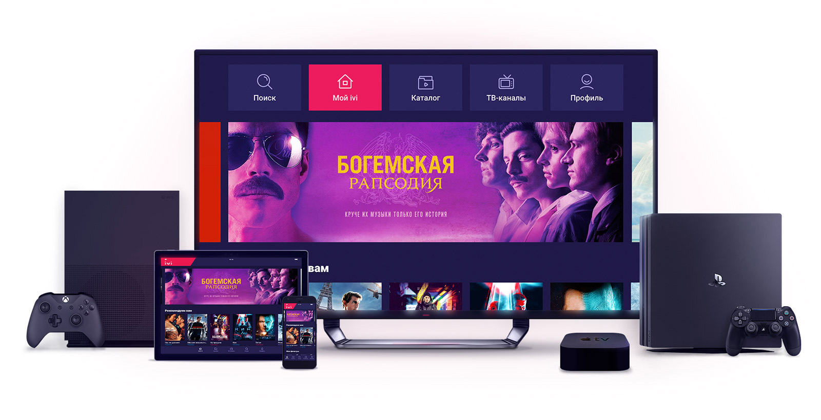
Experience Ivy's online cinema
When at the beginning of 2017 we first thought about creating our own system for delivering design to code, many people already spoke about this and even did something. However, to this day, little is known about the experience of building cross-platform design systems, and there are no clear and proven recipes describing technologies and methods for such a transformation of the implementation of a design into an already working product. Yes, and under the "components in the code" often understand very different things.
Meanwhile, the company doubled its staff from year to year - it was necessary to scale the design department and optimize the processes of creating and transferring layouts to development. We multiply all this by the “zoo” of platforms that need to be maintained, and we get a semblance of the Babylonian crowd, which is simply not capable of “normally doing” and generating income. The development of platforms often went in parallel, and the same functionality could go out on different platforms with a lag of several months.

Separate layouts for each platform
')
Traditionally, we started with problems that the design system would help solve and formulated the requirements for its design. In addition to creating a single visual language, increasing the speed of prototyping and development, improving the quality of the product as a whole, it was vital to maximally unify the design. This is necessary so that the development of functionality becomes possible immediately on all our platforms simultaneously: Web, iOS, Android, Smart TV, tvOS, Android TV, Windows 10, xBox One, PS4, Roku - without working on each of them separately . And we did it!
When the basic agreements of the product and development departments were reached, we sat down to select the technological stack and study the details of the whole process - from the layout to the release. In order to fully automate the process of transferring design to development, we investigated the option with a parser of component parameters directly from Sketch-files with mock-ups. It turned out that finding the pieces of code we need and extracting the parameters we need is a difficult and dangerous undertaking. Firstly, designers will have to be extremely careful in naming all layers of the source code, secondly, it works only for the simplest components, and thirdly, dependence on someone else’s technology and code structure of the original Sketch layout threatens the future of the entire project. We decided to abandon automation at this site. So, the first person appeared in the design-system team, at the entrance to which design layouts were submitted, and at the output - data describing all the parameters of the components and hierarchically ordered by the atomic design methodology.
The matter remained for small: where and how to store data, how to transfer to development and how to interpret in development on all platforms supported by us. The evening ceased to be languid ... The outcome of the regular meetings of the working group, consisting of designers and team leaders from each platform, was the following.
Manually parse the visual into atom elements: fonts, colors, transparency, indents, rounding, icons, images, and durations for animations. And we collect buttons, inputs, checkboxes, bank card widgets, etc. from this. For styles of any level, except icons, we assign non-semantic names, such as city names, nymphs, pokemon names, car brands ... There’s one condition - the list should not be exhausted before what the end of the styles is - Must go! You should not get involved in semantics, so you don’t have to add a middle button between “small” and “medium”, for example.
The developers left to think about how to store and transfer data so that it fits all platforms, and the design had to design interface elements that could look equally good and work efficiently on the entire fleet of supported devices.
Previously, we had already “run in” most of the design elements in the Windows 10 application, which at that time was a new platform for us, that is, we needed to draw and design from scratch. By drawing it, we were able to prepare and test most of the components and understand which of them should have entered the future Ivy design system. Without such a “sandbox”, such experience could only be obtained by a large number of iterations on the platforms already working, and this would take more than a year.
Re-use of the same components on different platforms reduces the number of layouts and the dataset of the design system by several times, so the design had to solve another task not previously described in the practices of product design and development - like, for example, a button for phones and tablets to reuse on TVs? And how, in principle, to be with the sizes of fonts and elements on such different platforms?
Obviously, it was required to design a cross-platform modular grid, which will set the required text and element sizes for each specific platform. For the point of reference for the grid, we chose the size and number of movie posters that we want to see on this or that screen and, based on this, formulated the rule for constructing the grid columns, provided that the width of one column is equal to the poster width.
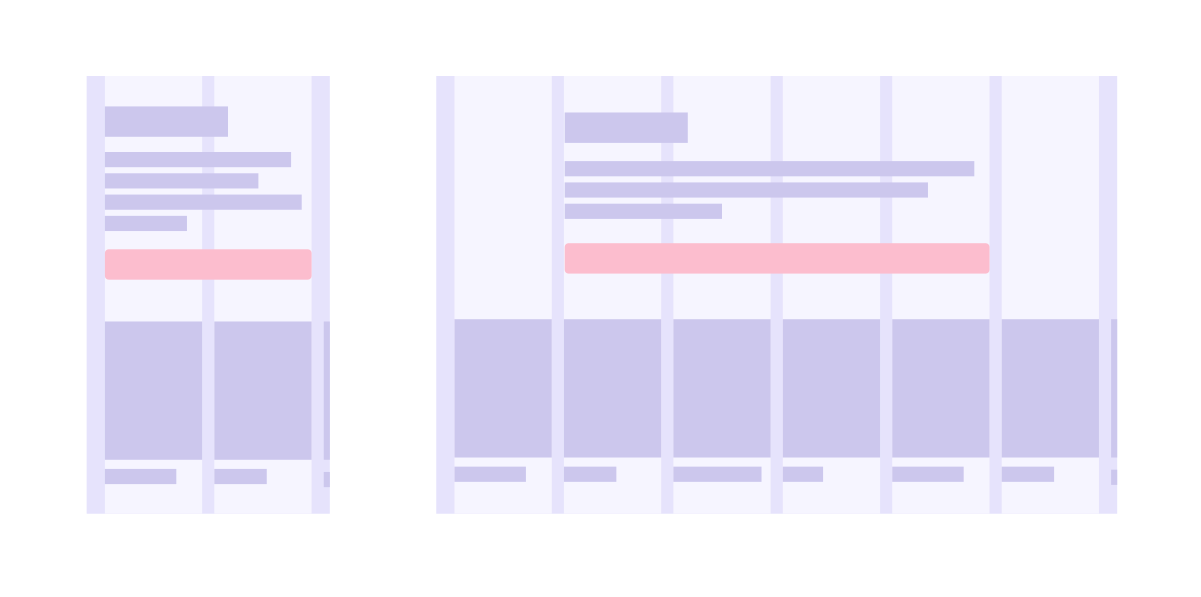
Now you need to bring to the same size of the layout all the big screens and fit them into a common grid. Apple TV and Roku are developed in size 1920x1080, Android TV - 960x540, Smart TV, depending on the vendor, are the same, and there are 1280x720. When the application is rendered and displayed on Full HD screens, 960 is multiplied by 2, 1280 by 1.33, and 1920 is displayed as it is.
Omitting boring details, we came to the conclusion that in general all screens, including television screens in terms of elements and their sizes, are covered by a single design layout, and all television screens are a special case of a common cross-platform grid, and consist of five or six columns, like an average tablet or desktop. Who are interested in the details, in the comments.

Unified UI for all platforms
Now, to draw a new feature, we do not need to draw layouts for each of the platforms, plus the adaptability options for each of them. It is enough to show one layout and its adaptability for all platforms and devices of any width: telephones - 320–599, all the rest - 600–1280.
Of course, no matter how much we want to come to an absolutely unified design, each platform has its own unique features. Despite the fact that both the web and Smart TV use the ReactJS + TypeScript stack, the Smart TV application runs on outdated WebKit and Presto clients and therefore cannot use common styles with the web. And email-mailings and at all are compelled to work with tabular layout. At the same time, none of the non-html-platforms does not use and does not plan to use React Native or some of its counterparts, fearing a deterioration in performance, since we have too many custom layouts, collections with complex updating logic, images and videos. Therefore, the common scheme for us is not to supply ready-made CSS styles or React components. Therefore, we decided to transfer data in JSON format, describing the values in an abstract declarative form.
The declarative nature of the description also assumes that if the platform is technically unable to use any property or its value, it can ignore it. From the point of view of terminology, we made some kind of Esperanto language: we took something from Android, something from SVG, something from CSS.
If it is necessary to display elements on a particular platform in some other way, we realized the possibility of transferring the corresponding data generation as a separate JSON file. For example, the state of “in focus” for Smart TV dictates a change in the position of the text under the poster, which means for this platform this component, in the value of the “indent” property, will contain the 8 indent points it needs. Although this complicates the infrastructure of the design system, it does provide an additional degree of freedom, leaving us the opportunity to manage the visual “dissimilarity” of the platforms ourselves, and not be hostages of the architecture we have created.

Iconography in a digital product is always a voluminous and not the easiest subproject, often having a separate designer. There are always a lot of glyphs, each of them has several sizes and colors, besides the platforms they are needed, usually in different formats. In general, there was no reason not to have it all in the design system.

Glyphs are loaded in SVG vector format, and color values are automatically replaced by variables. Client applications can get them ready for use - in any format and color.
On top of JSON with the data, we wrote a tool for previewing components - a JS application that skips JSON data on the fly through its markup and style generators, and displays various variations of each component in the browser. In fact, the preview is exactly the same client as the platform applications, and works with the same data.
To understand how a particular component works is easiest by interacting with it. Therefore, we did not use tools like the Storybook, but did an interactive preview - you can touch, ponder, click ... When adding a new component to the design system, it appears in the preview so that the platforms have something to navigate when implementing it.
Based on the data that is delivered in the form of JSON to the platforms, the documentation on the components is automatically generated. A list of properties and possible types of values in each of them is described. After autogeneration information can be specified manually, add a text description. Preview and documentation are provided with cross-references to each other at the level of each component, and all the information that goes into the documentation is available to developers as additional JSON-files.
Another need was the ability over time to replace and update existing components. The design system has learned to tell developers which properties or even whole components cannot be used and can be deleted as soon as they are no longer used on all platforms. So far in this process there is still a lot of “manual” labor, but we are not standing still.
Undoubtedly, the most ambitious stage in terms of complexity was the interpretation of the design system data in the code of all the platforms we supported. If, for example, modular grids on the web are not something new, then the developers of native mobile applications for iOS and Android pretty sweat before they figured out how to live with it.
For the layout of the screens of an iOS application, we use two basic mechanisms that iviUIKit provides: free layout of elements and layout of collections of elements. We use VIPER, and all interaction with iviUIKit is concentrated in View, and most of the interaction with Apple UIKit is concentrated in iviUIKit. The size and location of elements is given in terms of columns and syntax constructions that work on top of the iOS SDK native frameworks, making them more practical. This has especially simplified our life when working with a UICollectionView. We have written several customizable wrappers for layouts, including quite complex ones. The client code turned out to be a minimum and it became declarative.
To generate styles in the Android project, we use Gradle, turning the design system data into XML styles. At the same time, we have several generators of various levels:
After the designers have drawn a new component or reworked an existing one, these changes fall into the design system. The developers of each platform are finalizing their code-generation, providing support for changes. After that it can be used in the implementation of the new functionality, where this component is necessary. Thus, interaction with the design system does not occur in real time, but only at the time of the assembly of new releases. This approach also allows for better control of the data transfer process and ensures that the code works in client development projects.
Soon the year as a design system became part of the infrastructure serving the development of the Ivy online cinema, and some conclusions can already be made:
Preview of the components of the Ivy design system - design.ivi.ru
When at the beginning of 2017 we first thought about creating our own system for delivering design to code, many people already spoke about this and even did something. However, to this day, little is known about the experience of building cross-platform design systems, and there are no clear and proven recipes describing technologies and methods for such a transformation of the implementation of a design into an already working product. Yes, and under the "components in the code" often understand very different things.
Meanwhile, the company doubled its staff from year to year - it was necessary to scale the design department and optimize the processes of creating and transferring layouts to development. We multiply all this by the “zoo” of platforms that need to be maintained, and we get a semblance of the Babylonian crowd, which is simply not capable of “normally doing” and generating income. The development of platforms often went in parallel, and the same functionality could go out on different platforms with a lag of several months.
Separate layouts for each platform
')
Traditionally, we started with problems that the design system would help solve and formulated the requirements for its design. In addition to creating a single visual language, increasing the speed of prototyping and development, improving the quality of the product as a whole, it was vital to maximally unify the design. This is necessary so that the development of functionality becomes possible immediately on all our platforms simultaneously: Web, iOS, Android, Smart TV, tvOS, Android TV, Windows 10, xBox One, PS4, Roku - without working on each of them separately . And we did it!
Design → data
When the basic agreements of the product and development departments were reached, we sat down to select the technological stack and study the details of the whole process - from the layout to the release. In order to fully automate the process of transferring design to development, we investigated the option with a parser of component parameters directly from Sketch-files with mock-ups. It turned out that finding the pieces of code we need and extracting the parameters we need is a difficult and dangerous undertaking. Firstly, designers will have to be extremely careful in naming all layers of the source code, secondly, it works only for the simplest components, and thirdly, dependence on someone else’s technology and code structure of the original Sketch layout threatens the future of the entire project. We decided to abandon automation at this site. So, the first person appeared in the design-system team, at the entrance to which design layouts were submitted, and at the output - data describing all the parameters of the components and hierarchically ordered by the atomic design methodology.
The matter remained for small: where and how to store data, how to transfer to development and how to interpret in development on all platforms supported by us. The evening ceased to be languid ... The outcome of the regular meetings of the working group, consisting of designers and team leaders from each platform, was the following.
Manually parse the visual into atom elements: fonts, colors, transparency, indents, rounding, icons, images, and durations for animations. And we collect buttons, inputs, checkboxes, bank card widgets, etc. from this. For styles of any level, except icons, we assign non-semantic names, such as city names, nymphs, pokemon names, car brands ... There’s one condition - the list should not be exhausted before what the end of the styles is - Must go! You should not get involved in semantics, so you don’t have to add a middle button between “small” and “medium”, for example.
Visual language
The developers left to think about how to store and transfer data so that it fits all platforms, and the design had to design interface elements that could look equally good and work efficiently on the entire fleet of supported devices.
Previously, we had already “run in” most of the design elements in the Windows 10 application, which at that time was a new platform for us, that is, we needed to draw and design from scratch. By drawing it, we were able to prepare and test most of the components and understand which of them should have entered the future Ivy design system. Without such a “sandbox”, such experience could only be obtained by a large number of iterations on the platforms already working, and this would take more than a year.
Re-use of the same components on different platforms reduces the number of layouts and the dataset of the design system by several times, so the design had to solve another task not previously described in the practices of product design and development - like, for example, a button for phones and tablets to reuse on TVs? And how, in principle, to be with the sizes of fonts and elements on such different platforms?
Obviously, it was required to design a cross-platform modular grid, which will set the required text and element sizes for each specific platform. For the point of reference for the grid, we chose the size and number of movie posters that we want to see on this or that screen and, based on this, formulated the rule for constructing the grid columns, provided that the width of one column is equal to the poster width.
Now you need to bring to the same size of the layout all the big screens and fit them into a common grid. Apple TV and Roku are developed in size 1920x1080, Android TV - 960x540, Smart TV, depending on the vendor, are the same, and there are 1280x720. When the application is rendered and displayed on Full HD screens, 960 is multiplied by 2, 1280 by 1.33, and 1920 is displayed as it is.
Omitting boring details, we came to the conclusion that in general all screens, including television screens in terms of elements and their sizes, are covered by a single design layout, and all television screens are a special case of a common cross-platform grid, and consist of five or six columns, like an average tablet or desktop. Who are interested in the details, in the comments.
Unified UI for all platforms
Now, to draw a new feature, we do not need to draw layouts for each of the platforms, plus the adaptability options for each of them. It is enough to show one layout and its adaptability for all platforms and devices of any width: telephones - 320–599, all the rest - 600–1280.
Data → development
Of course, no matter how much we want to come to an absolutely unified design, each platform has its own unique features. Despite the fact that both the web and Smart TV use the ReactJS + TypeScript stack, the Smart TV application runs on outdated WebKit and Presto clients and therefore cannot use common styles with the web. And email-mailings and at all are compelled to work with tabular layout. At the same time, none of the non-html-platforms does not use and does not plan to use React Native or some of its counterparts, fearing a deterioration in performance, since we have too many custom layouts, collections with complex updating logic, images and videos. Therefore, the common scheme for us is not to supply ready-made CSS styles or React components. Therefore, we decided to transfer data in JSON format, describing the values in an abstract declarative form.
So propertyrounding: 8Windows 10 application converts toCornerRadius="8", web -border-radius: 8px, Android -android:radius="8dp", iOS -self.layer.cornerRadius = 8.0.
The offsetTopoffsetTop: 12can be interpreted by the same web client astop,margin-top,padding-toportransformin different cases.
The declarative nature of the description also assumes that if the platform is technically unable to use any property or its value, it can ignore it. From the point of view of terminology, we made some kind of Esperanto language: we took something from Android, something from SVG, something from CSS.
If it is necessary to display elements on a particular platform in some other way, we realized the possibility of transferring the corresponding data generation as a separate JSON file. For example, the state of “in focus” for Smart TV dictates a change in the position of the text under the poster, which means for this platform this component, in the value of the “indent” property, will contain the 8 indent points it needs. Although this complicates the infrastructure of the design system, it does provide an additional degree of freedom, leaving us the opportunity to manage the visual “dissimilarity” of the platforms ourselves, and not be hostages of the architecture we have created.
Pictograms
Iconography in a digital product is always a voluminous and not the easiest subproject, often having a separate designer. There are always a lot of glyphs, each of them has several sizes and colors, besides the platforms they are needed, usually in different formats. In general, there was no reason not to have it all in the design system.
Glyphs are loaded in SVG vector format, and color values are automatically replaced by variables. Client applications can get them ready for use - in any format and color.
Preview
On top of JSON with the data, we wrote a tool for previewing components - a JS application that skips JSON data on the fly through its markup and style generators, and displays various variations of each component in the browser. In fact, the preview is exactly the same client as the platform applications, and works with the same data.
To understand how a particular component works is easiest by interacting with it. Therefore, we did not use tools like the Storybook, but did an interactive preview - you can touch, ponder, click ... When adding a new component to the design system, it appears in the preview so that the platforms have something to navigate when implementing it.
Documentation
Based on the data that is delivered in the form of JSON to the platforms, the documentation on the components is automatically generated. A list of properties and possible types of values in each of them is described. After autogeneration information can be specified manually, add a text description. Preview and documentation are provided with cross-references to each other at the level of each component, and all the information that goes into the documentation is available to developers as additional JSON-files.
Deprecator
Another need was the ability over time to replace and update existing components. The design system has learned to tell developers which properties or even whole components cannot be used and can be deleted as soon as they are no longer used on all platforms. So far in this process there is still a lot of “manual” labor, but we are not standing still.
Customer Development
Undoubtedly, the most ambitious stage in terms of complexity was the interpretation of the design system data in the code of all the platforms we supported. If, for example, modular grids on the web are not something new, then the developers of native mobile applications for iOS and Android pretty sweat before they figured out how to live with it.
For the layout of the screens of an iOS application, we use two basic mechanisms that iviUIKit provides: free layout of elements and layout of collections of elements. We use VIPER, and all interaction with iviUIKit is concentrated in View, and most of the interaction with Apple UIKit is concentrated in iviUIKit. The size and location of elements is given in terms of columns and syntax constructions that work on top of the iOS SDK native frameworks, making them more practical. This has especially simplified our life when working with a UICollectionView. We have written several customizable wrappers for layouts, including quite complex ones. The client code turned out to be a minimum and it became declarative.
To generate styles in the Android project, we use Gradle, turning the design system data into XML styles. At the same time, we have several generators of various levels:
- Basic . Parse these primitives for higher level generators.
- Resource . Download pictures, icons, and other graphics.
- Component . They are written for each component, where properties are described and how to translate them into styles.
Application Releases
After the designers have drawn a new component or reworked an existing one, these changes fall into the design system. The developers of each platform are finalizing their code-generation, providing support for changes. After that it can be used in the implementation of the new functionality, where this component is necessary. Thus, interaction with the design system does not occur in real time, but only at the time of the assembly of new releases. This approach also allows for better control of the data transfer process and ensures that the code works in client development projects.
Results
Soon the year as a design system became part of the infrastructure serving the development of the Ivy online cinema, and some conclusions can already be made:
- This is a large and complex project in implementation that requires permanent allocated resources.
- This allowed us to create our own unique cross-platform visual language that meets the tasks of the online video service.
- We no longer have visually and functionally lagging platforms.
Preview of the components of the Ivy design system - design.ivi.ru
Source: https://habr.com/ru/post/456854/
All Articles