Why do we prefer CSS (- variable) to SASS ($ variable)?
Since the release of the CodyHouse Framework a couple of months ago, many users asked us why we chose CSS variables instead of SASS variables, although we use SASS in this environment. In this article, I will discuss the benefits of using custom properties and why they became decisive in our workflow.
In this article, I assume that you are familiar with the basics of custom CSS and SASS properties (or any other CSS preprocessor). If not, let's start with a basic example:
In SCSS:
')
In CSS:
Custom properties allow you to define variables without having to use extensions for CSS (i.e., you don't need to use SASS).
They are the same? Not really! Unlike SASS variables, user properties 1) are limited to the element on which they are declared, 2) cascade, 3) they can be controlled in JavaScript. These three features open up a whole new world of possibilities. Let me show you some practical examples!
Here is an example of how you could create two (simplified) color themes using SASS variables:
In the example above, we have a “default” and “dark” theme, where we invert the colors for the background and the text. Note that in the dark theme, we need to go through each property that uses variable colors and update them with a new variable.
As long as we adhere to simplified (unrealistic) examples, no problems arise. But what if we have a component with a lot of elements? We would have to rewrite all properties where variables are used for color, and replace variables with new ones. And if you change the main component, you have to double check all modifiers. Yes ... not so convenient!
When creating our framework, we came up with a different approach based on CSS variables. First of all, let's define the variables for the color:
Note: in the example above, we use data- * attributes to apply a color theme, but this has nothing to do with CSS variables and SASS variables. In addition, we defined a scale of neutral values using a nomenclature based on the "contrast level"
The important point is that we do not need to create new color variables for our second, third, fourth ... (dark) theme. Unlike SASS, we can override the value of existing custom properties.
Here's how to apply variable colors to a component:
What about the dark version of the component? We don't need extra CSS. Since we redefine and do not replace variables, we need to apply the correct variables for the color only when we first create the component. No matter how complicated the component becomes, after you have set the color themes in the _colors.scss file and apply the color variables to the elements of your components.
You can apply color themes in a very simple way:
In the example above, we applied the “dark” color theme to the section and the default color theme to the “.child” element. That's right, you can nest colored themes!
This is made possible through the use of CSS properties. What allowed in the shortest possible time to do such interesting things as this.

Here are a few links in case you want to learn more about managing colors using the CodyHouse framework:
A modular scale is a set of harmonious (dimensional) values that are applied to typographical elements. Here is how you can set the font scale in SCSS using SASS variables:
The standard approach would be to create a scale of fonts using a third-party tool (or performing mathematical operations), and then import the values into your style, as in the example above.
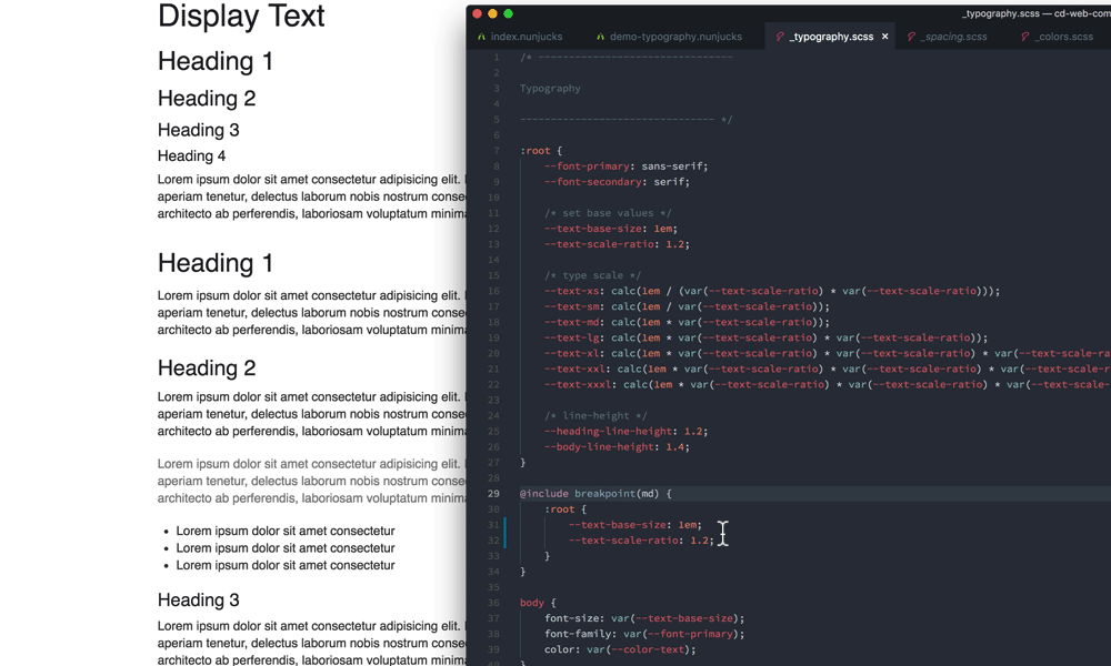
When creating the framework, we decided to include the entire scale formula in the _typography.scss file . Here is how we set the font scale using CSS variables:
What is the advantage of this approach? This makes it possible to control the entire printing system, editing only two variables: - text-base-size (size of the base font) and - text-scale-ratio (scale factor).
“Can't you do the same thing using sass variables?” No, if you want to change the typography at certain points during media queries:
This fragment is the cornerstone of our flexibility. Since we use relative Ems units, when changing - text-base-size (base font size) this affects both typography and spacing. As a result, you get a system that resizes all of your components with little or no need to specify media queries at the component level.
Here are some useful related links:
The interval scale is equivalent to a type scale, but applies to spatial values. Once again, the inclusion of a scale formula in the structure allowed us to control the system of intervals and make it responsive:
This approach becomes especially powerful in combination with the typography method discussed above. With just a few lines of CSS you will get responsive components:
Another thing I like about using Ems modules with this spacing system is that if the spacing and typography sizes look right at a particular media query point, they almost certainly look right at all media query points, regardless of that you update the value of --space-unit. Therefore, I can design without the need to resize the browser windows (except when I want to change the behavior of the component).
More related links:
Unlike the SASS variable, we can override the value of CSS variables. One way to use this property is to add custom properties to other custom properties, thereby creating “controls” that can be edited at the component level.
Here is an example, when you set the vertical spacing for a text component, you probably want to specify the line-height and margin-bottom for your elements:
However, this pace varies depending on where the text is used. For example, if you want your text to be more concise, you need to create a component variant (modifier) in which you apply different interval values:
... and so every time, if you want to update the "vertical rhythm".
Here is an alternative approach based on CSS variables:
--line-height-multiplier and --text-vspace-multiplier are two text component control variables. When we create a modifier of the .text-component class, to edit the vertical interval, we only need to override these two variables:
In case you want to try it yourself and take note:
The ability to override the value of a component can be used in different ways. In general, at any time when you can abstract the behavior of a component in one or more variables, you make your life easier when this component requires editing (or you need to create a variant of the component).
An example is our Auto Sized Grid component, where we use a CSS grid to create a layout, where gallery elements automatically fill available space based on the minimum width specified in CSS, then we abstract the min-width value of the elements, storing it in a variable.
The minimum width is the only thing that needs to be changed when creating a version of the Auto Size grid component.
In a nutshell: browser support ... You can use CSS variables in all the ways described in this article using the PostCss plugin. There are a number of limitations for older browsers (<IE11). Otherwise, it is free to use. See our documentation for more information on the limitations of using CSS variables today.
Yes! As long as SASS (or any other preprocessor) allows you to do what you can't do in CSS, and you need it, why not use it? SASS is not a library that users should download when accessing your site. This is a tool in your workflow. We use SASS, for example, to define color functions that work with CSS variables.
In this article, we looked at a few examples that demonstrate the advantage of using CSS variables over SASS variables. We focused on how they allow you to create “controls” that speed up the process of changing components or setting rules that affect typography and spacing. We have reviewed a lot, and I hope that you can learn something from this post and use it in your work.
Variable definition
In this article, I assume that you are familiar with the basics of custom CSS and SASS properties (or any other CSS preprocessor). If not, let's start with a basic example:
In SCSS:
')
$color-primary: hsl(220, 90%, 56%); .link { color: $color-primary; } In CSS:
:root { --color-primary: hsl(220, 90%, 56%); } .link { color: var(--color-primary); } Custom properties allow you to define variables without having to use extensions for CSS (i.e., you don't need to use SASS).
They are the same? Not really! Unlike SASS variables, user properties 1) are limited to the element on which they are declared, 2) cascade, 3) they can be controlled in JavaScript. These three features open up a whole new world of possibilities. Let me show you some practical examples!
Creating and applying color themes
Here is an example of how you could create two (simplified) color themes using SASS variables:
$color-primary: blue; $color-text: black; $color-bg: white; /* */ $color-primary-invert: red; $color-text-invert: white; $color-bg-invert: black; .component { color: $color-text; background-color: $color-bg; a { color: $color-primary; } } .component--dark { color: $color-text-invert; background-color: $color-bg-invert; a { color: $color-primary-invert; } } In the example above, we have a “default” and “dark” theme, where we invert the colors for the background and the text. Note that in the dark theme, we need to go through each property that uses variable colors and update them with a new variable.
As long as we adhere to simplified (unrealistic) examples, no problems arise. But what if we have a component with a lot of elements? We would have to rewrite all properties where variables are used for color, and replace variables with new ones. And if you change the main component, you have to double check all modifiers. Yes ... not so convenient!
When creating our framework, we came up with a different approach based on CSS variables. First of all, let's define the variables for the color:
:root, [data-theme="default"] { --color-primary: blue; /* */ --color-bg: white; --color-contrast-lower: hsl(0, 0%, 95%); --color-contrast-low: hsl(240, 1%, 83%); --color-contrast-medium: hsl(240, 1%, 48%); --color-contrast-high: hsl(240, 4%, 20%); --color-contrast-higher: black; } [data-theme] { background-color: var(--color-bg); color: var(--color-contrast-high); } [data-theme="dark"] { --color-primary: red; /* */ --color-bg: black; --color-contrast-lower: hsl(240, 6%, 15%); --color-contrast-low: hsl(252, 4%, 25%); --color-contrast-medium: hsl(240, 1%, 57%); --color-contrast-high: hsl(0, 0%, 89%); --color-contrast-higher: white; } Note: in the example above, we use data- * attributes to apply a color theme, but this has nothing to do with CSS variables and SASS variables. In addition, we defined a scale of neutral values using a nomenclature based on the "contrast level"
The important point is that we do not need to create new color variables for our second, third, fourth ... (dark) theme. Unlike SASS, we can override the value of existing custom properties.
Here's how to apply variable colors to a component:
.component { color: var(--color-contrast-higher); background-color: var(--color-bg); border-bottom: 1px solid var(--color-contrast-low); a { color: var(--color-primary); } } What about the dark version of the component? We don't need extra CSS. Since we redefine and do not replace variables, we need to apply the correct variables for the color only when we first create the component. No matter how complicated the component becomes, after you have set the color themes in the _colors.scss file and apply the color variables to the elements of your components.
You can apply color themes in a very simple way:
<section data-theme="dark"> <div class="component"> <div class="child" data-theme="default"></div> </div> </section> In the example above, we applied the “dark” color theme to the section and the default color theme to the “.child” element. That's right, you can nest colored themes!
This is made possible through the use of CSS properties. What allowed in the shortest possible time to do such interesting things as this.
Here are a few links in case you want to learn more about managing colors using the CodyHouse framework:
Font Scale Management
A modular scale is a set of harmonious (dimensional) values that are applied to typographical elements. Here is how you can set the font scale in SCSS using SASS variables:
$text-xs: 0.694em; $text-sm: 0.833em; $text-base-size: 1em; $text-md: 1.2em; $text-lg: 1.44em; $text-xl: 1.728em; The standard approach would be to create a scale of fonts using a third-party tool (or performing mathematical operations), and then import the values into your style, as in the example above.
When creating the framework, we decided to include the entire scale formula in the _typography.scss file . Here is how we set the font scale using CSS variables:
:root { // --text-base-size: 1em; // --text-scale-ratio: 1.2; --text-xs: calc((1em / var(--text-scale-ratio)) / var(--text-scale-ratio)); --text-sm: calc(var(--text-xs) * var(--text-scale-ratio)); --text-md: calc(var(--text-sm) * var(--text-scale-ratio) * var(--text-scale-ratio)); --text-lg: calc(var(--text-md) * var(--text-scale-ratio)); --text-xl: calc(var(--text-lg) * var(--text-scale-ratio)); --text-xxl: calc(var(--text-xl) * var(--text-scale-ratio)); --text-xxxl: calc(var(--text-xxl) * var(--text-scale-ratio)); } What is the advantage of this approach? This makes it possible to control the entire printing system, editing only two variables: - text-base-size (size of the base font) and - text-scale-ratio (scale factor).
“Can't you do the same thing using sass variables?” No, if you want to change the typography at certain points during media queries:
:root { @include breakpoint(md) { --text-base-size: 1.25em; --text-scale-ratio: 1.25; } } This fragment is the cornerstone of our flexibility. Since we use relative Ems units, when changing - text-base-size (base font size) this affects both typography and spacing. As a result, you get a system that resizes all of your components with little or no need to specify media queries at the component level.
Here are some useful related links:
Distance scale control
The interval scale is equivalent to a type scale, but applies to spatial values. Once again, the inclusion of a scale formula in the structure allowed us to control the system of intervals and make it responsive:
:root { --space-unit: 1em; --space-xxxxs: calc(0.125 * var(--space-unit)); --space-xxxs: calc(0.25 * var(--space-unit)); --space-xxs: calc(0.375 * var(--space-unit)); --space-xs: calc(0.5 * var(--space-unit)); --space-sm: calc(0.75 * var(--space-unit)); --space-md: calc(1.25 * var(--space-unit)); --space-lg: calc(2 * var(--space-unit)); --space-xl: calc(3.25 * var(--space-unit)); --space-xxl: calc(5.25 * var(--space-unit)); --space-xxxl: calc(8.5 * var(--space-unit)); --space-xxxxl: calc(13.75 * var(--space-unit)); } @supports(--css: variables) { :root { @include breakpoint(md) { --space-unit: 1.25em; } } } This approach becomes especially powerful in combination with the typography method discussed above. With just a few lines of CSS you will get responsive components:
Another thing I like about using Ems modules with this spacing system is that if the spacing and typography sizes look right at a particular media query point, they almost certainly look right at all media query points, regardless of that you update the value of --space-unit. Therefore, I can design without the need to resize the browser windows (except when I want to change the behavior of the component).
More related links:
Editing "vertical rhythm" at the component level
Unlike the SASS variable, we can override the value of CSS variables. One way to use this property is to add custom properties to other custom properties, thereby creating “controls” that can be edited at the component level.
Here is an example, when you set the vertical spacing for a text component, you probably want to specify the line-height and margin-bottom for your elements:
.article { h1, h2, h3, h4 { line-height: 1.2; margin-bottom: $space-xs; } ul, ol, p, blockquote { line-height: 1.5; margin-bottom: $space-md; } } However, this pace varies depending on where the text is used. For example, if you want your text to be more concise, you need to create a component variant (modifier) in which you apply different interval values:
.article--sm { h1, h2, h3, h4 { line-height: 1.1; margin-bottom: $space-xxxs; } ul, ol, p, blockquote { line-height: 1.4; margin-bottom: $space-sm; } } ... and so every time, if you want to update the "vertical rhythm".
Here is an alternative approach based on CSS variables:
.text-component { --component-body-line-height: calc(var(--body-line-height) * var(--line-height-multiplier, 1)); --component-heading-line-height: calc(var(--heading-line-height) * var(--line-height-multiplier, 1)); --line-height-multiplier: 1; --text-vspace-multiplier: 1; h1, h2, h3, h4 { line-height: var(--component-heading-line-height); margin-bottom: calc(var(--space-xxxs) * var(--text-vspace-multiplier)); } h2, h3, h4 { margin-top: calc(var(--space-sm) * var(--text-vspace-multiplier)); } p, blockquote, ul li, ol li { line-height: var(--component-body-line-height); } ul, ol, p, blockquote, .text-component__block, .text-component__img { margin-bottom: calc(var(--space-sm) * var(--text-vspace-multiplier)); } } --line-height-multiplier and --text-vspace-multiplier are two text component control variables. When we create a modifier of the .text-component class, to edit the vertical interval, we only need to override these two variables:
.article.text-component { // --line-height-multiplier: 1.13; // --text-vspace-multiplier: 1.2; // } In case you want to try it yourself and take note:
Abstraction of behavior components
The ability to override the value of a component can be used in different ways. In general, at any time when you can abstract the behavior of a component in one or more variables, you make your life easier when this component requires editing (or you need to create a variant of the component).
An example is our Auto Sized Grid component, where we use a CSS grid to create a layout, where gallery elements automatically fill available space based on the minimum width specified in CSS, then we abstract the min-width value of the elements, storing it in a variable.
The minimum width is the only thing that needs to be changed when creating a version of the Auto Size grid component.
What's the catch?
In a nutshell: browser support ... You can use CSS variables in all the ways described in this article using the PostCss plugin. There are a number of limitations for older browsers (<IE11). Otherwise, it is free to use. See our documentation for more information on the limitations of using CSS variables today.
Can I use CSS variables with a preprocessor?
Yes! As long as SASS (or any other preprocessor) allows you to do what you can't do in CSS, and you need it, why not use it? SASS is not a library that users should download when accessing your site. This is a tool in your workflow. We use SASS, for example, to define color functions that work with CSS variables.
Conclusion
In this article, we looked at a few examples that demonstrate the advantage of using CSS variables over SASS variables. We focused on how they allow you to create “controls” that speed up the process of changing components or setting rules that affect typography and spacing. We have reviewed a lot, and I hope that you can learn something from this post and use it in your work.
Source: https://habr.com/ru/post/456302/
All Articles