Multidimensional graphics in Python - from three-dimensional to six-dimensional
Introduction
Visualization is an important part of data analysis, and the ability to look at several dimensions at the same time makes this task easier. In the tutorial we will draw graphs up to 6 dimensions.
Plotly is an open source Python library for a variety of visualizations that offers much more options than the well-known matplotlib and seaborn . The module is installed as usual - pip install plotly . We will use it for drawing graphs.
Let's prepare the data
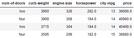
For visualization, we use simple data about cars from the UCI , which represent 26 characteristics for 205 cars (26 columns for 205 lines). To visualize the six dimensions, we take these six parameters.
Download data from CSV using pandas .
import pandas as pd data = pd.read_csv("cars.csv") Now, having prepared, let's start with two dimensions.
2D scatterplot
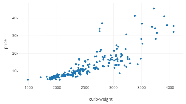
A scatterplot is a very simple and common graph. Of the 6 parameters, price and curb-weight are used below as Y and X, respectively.
# import plotly import plotly.graph_objs as go # figure fig1 = go.Scatter(x=data['curb-weight'], y=data['price'], mode='markers') # layout mylayout = go.Layout(xaxis=dict(title="curb-weight"), yaxis=dict( title="price")) # HTML plotly.offline.plot({"data": [fig1], "layout": mylayout}, auto_open=True) The plotly process is slightly different from the same in Matplotlib. We have to create the layout and figure , passing them to the function offline.plot , after which the result will be saved to an HTML file in the current working directory. Here is a screenshot of what happens. At the end of the article there will be a link to the GitHub repository with ready-made interactive HTML graphics.
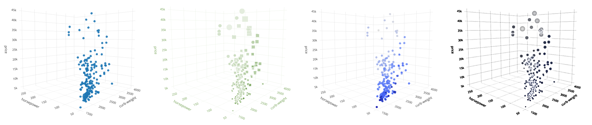
3D scatterplot
We can add the third parameter horsepower (horsepower) to the Z axis. Plotly provides the Scatter3D feature for building interactive 3D graphics.

Instead of inserting the code here every time, I added it to the repository.
(The most convenient way is to look at the relevant code in the adjacent tab in parallel with reading - approx. Transl.)
Adding a fourth dimension
We know that it’s impossible to use more than three dimensions directly, but there is a workaround: we can emulate depth to visualize higher dimensions using color, size or shape.
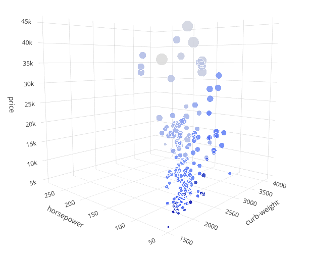
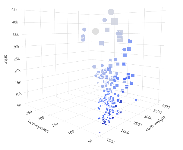
Here, along with the three previous characteristics, we will use urban mileage - city-mpg as the fourth dimension, for which the markercolor parameter of the Scatter3D function will be responsible. A lighter shade of the marker will mean less mileage.
Immediately it is striking that the higher the price, the number of horses and weight, the less will be the mileage.

Adding the fifth dimension
Marker size can be used to visualize the 5th dimension. We use the engine-size characteristic for the markersize parameter of the Scatter3D function.
Observations: engine size is related to some of the previous parameters. The higher the price, the bigger the engine. It is the same as: lower mileage - more engine.
Adding the sixth dimension
The shape of the marker is great for visualizing categories. Plotly gives you a choice of 10 different shapes for 3D graphics (asterisk, circle, square, etc.). Thus, up to 10 different values can be shown as a form.
We have the num-of-doors feature, which contains integers - the number of doors (2 or 4). Let's transform these values into figures: a square for 4 doors, a circle for 2 doors. The markersymbol parameter of the Scatter3D function is used .
Observations: the feeling that all the cheapest cars have 4 doors (circles). Continuing to study the schedule, it will be possible to make more assumptions and conclusions.
Can we add more dimensions?
Of course we can! Markers have more properties, such as opacity and gradients that can be used. But the more dimensions we add, the harder it is to keep them all in my head.
Source
Python code and interactive graphics for all shapes are available on GitHub here.
')
Source: https://habr.com/ru/post/456282/
All Articles