Themes and styles in Android without magic. And how to cook them with SwitchCompat

In the previous article, we looked at how to use themes and styles at the code level, using the custom view as an example. In this article, let's look at several ways of styling a standard ui element, and in particular SwitchCompat.
Content
Introduction
New style for switchStyle
Style in layout
Style in the subject. The topic is assigned via Manifest.
Style in the subject. The topic is assigned programmatically.
Other View
Introduction
The default design of the standard UI element does not always suit the designer. Let's take a look at how to change the appearance of an element using the example of SwitchCompat.
')
To solve the problem we need:
- Create your own style for SwitchCompat.
- Somehow set this style to SwitchCompat.
You can assign a SwitchCompat style in several ways, for example:
- Specify for each view in the layout of screens through the style attribute.
- Create a theme with the switchStyle attribute overridden and assign this theme in the manifest for the entire application or a specific activation. This will change the appearance of the view for the entire application / activity.
- The theme can also be installed programmatically, in the activation code. If necessary, it can be changed "on the fly."
New style for SwitchCompat
In the resources, we will create a new style MySwitchStyle, inherit the design from Widget.AppCompat.CompoundButton.Switch by specifying parent. It is possible and not to inherit, but then you have to specify all the values, even which we do not plan to change.
<style name="MySwitchStyle" parent = "Widget.AppCompat.CompoundButton.Switch"> </style> To change something, you need to redefine the required attributes. Attributes can be viewed in the documentation.
In the documentation we see several attributes. They are listed as if we were accessing them in code (for example, like this R.styleable.SwitchCompat_android_thumb). I will decipher only a part of them so that there is no doubt. The purpose of the rest is easy to understand from the documentation.
| In code | In xml |
| SwitchCompat_android_thumb | android: thumb |
| SwitchCompat_thumbTint | thumbTint |
| SwitchCompat_track | track |
| SwitchCompat_trackTint | trackTint |
- android: thumb - a resource for the movable part of SwitchCompat
- track - resource for the fixed part of SwitchCompat
- thumbTint - allows you to paint the moving part in the desired color depending on the state of SwitchCompat
- trackTint - allows you to paint a fixed part in the desired color depending on the state of SwitchCompat
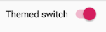
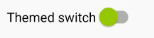
As an example, change the color of the thumb (circle) - even if it is on, it will be orange, if it is off, it will be green. Ugly, but clearly.
We will need a selector in the color folder of our resources. File selector_switch_thumb.xml
<selector xmlns:android="http://schemas.android.com/apk/res/android"> <item android:state_checked="true" android:color = "@android:color/holo_orange_dark"/> <item android:color="@android:color/holo_green_light"/> </selector> Now let's set the thumbTint attribute in our style.
<style name="MySwitchStyle" parent = "Widget.AppCompat.CompoundButton.Switch"> <item name="thumbTint">@color/selector_switch_thumb</item> </style> Now all SwitchCompat that have somehow gotten the MySwitchStyle style will look different.
Style in layout
The most trivial and inflexible way.
- The style is applied when inflate resource layout.
- We cannot programmatically affect it.
- Specifying each time in the layout is inconvenient. And we can forget.
<androidx.appcompat.widget.SwitchCompat android:text="Themed switch" style="@style/MySwitchStyle" android:layout_width="wrap_content" android:layout_height="wrap_content"/> Style in the subject. The topic is assigned via Manifest
Create an AppTheme theme and set the value of the switchStyle attribute. The value is our MySwitchStyle style.
<resources> <style name="CustomTheme" parent="Theme.AppCompat.Light.DarkActionBar"> <item name="colorPrimary">@color/colorPrimary</item> <item name="colorPrimaryDark">@color/colorPrimaryDark</item> <item name="colorAccent">@color/colorAccent</item> <!-- switchStyle --> <item name="switchStyle">@style/MySwitchStyle</item> </style> </resources> The subject can be specified in the manifest for the entire application.
<application android:allowBackup="true" android:icon="@mipmap/ic_launcher" android:label="@string/app_name" android:roundIcon="@mipmap/ic_launcher_round" android:supportsRtl="true" android:theme="@style/CustomTheme"><!-- --> </application> Or for a specific activation
<activity android:name=".MainActivity" android:theme="@style/CustomTheme"><!-- --> </activity> Now all SwitchCompat will have a new look. No change in layout.
- Pros - We can change the appearance for the entire application at once.
- Cons - on the fly change will not work.
Style in the subject. The topic is assigned programmatically.
In order to set a theme for activating programmatically, you need to call the activation method setTheme (themeResId).
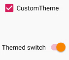
Let's change the topic of activation depending on the state of the Switch.
class MainActivity : AppCompatActivity() { private const val KEY_CUSTOM_THEME_CHECKED = "KEY_CUSTOM_THEME_CHECKED" class MainActivity : AppCompatActivity() { private val preference by lazy { PreferenceManager.getDefaultSharedPreferences(this) } override fun onCreate(savedInstanceState: Bundle?) { val isCustomThemeChecked = preference.getBoolean( KEY_CUSTOM_THEME_CHECKED, true ) if (isCustomThemeChecked) { setTheme(R.style.CustomTheme) } else { setTheme(R.style.StandardTheme) } super.onCreate(savedInstanceState) setContentView(R.layout.activity_main) customThemeCheckbox.isChecked = isCustomThemeChecked customThemeCheckbox.setOnCheckedChangeListener { _, isChecked -> preference.edit() .putBoolean(KEY_CUSTOM_THEME_CHECKED, isChecked) .apply() recreate() } } } - Set the theme programmatically by calling setTheme. The method must be called before super.onCreate (savedInstanceState). In onCreate, we have the initialization of fragments (when they are).
- Set the initial state of the Switch depending on the topic.
- Set the listener, which, when the Switch changes, changes the theme in the settings and restarts activations via the activate method recreate ().
Result
The rest of the code
<resources> <style name="CustomTheme" parent="Theme.AppCompat.Light.DarkActionBar"> <item name="colorPrimary">@color/colorPrimary</item> <item name="colorPrimaryDark">@color/colorPrimaryDark</item> <item name="colorAccent">@color/colorAccent</item> <item name="switchStyle">@style/MySwitchStyle</item> </style> <style name="StandardTheme" parent="Theme.AppCompat.Light.DarkActionBar"> <item name="colorPrimary">@color/colorPrimary</item> <item name="colorPrimaryDark">@color/colorPrimaryDark</item> <item name="colorAccent">@color/colorAccent</item> </style> <style name="MySwitchStyle" parent="Widget.AppCompat.CompoundButton.Switch"> <item name="thumbTint">@color/selector_switch_thumb</item> </style> </resources> <LinearLayout xmlns:android="http://schemas.android.com/apk/res/android" android:layout_width="match_parent" android:layout_height="match_parent" android:padding="10dp" android:orientation="vertical"> <CheckBox android:text="CustomTheme" android:layout_width="match_parent" android:layout_height="wrap_content" android:saveEnabled="false" android:id="@+id/customThemeCheckbox"/> <androidx.appcompat.widget.SwitchCompat android:text="Themed switch" android:layout_marginTop="56dp" android:layout_width="wrap_content" android:layout_height="wrap_content" android:id="@+id/themedSwitch"/> </LinearLayout> Other View
In order to override the style for SwithView for the entire application, we redefined the value of the switchStyle attribute, we can guess that there are such attributes for other View.
For example:
- editTextStyle
- checkboxStyle
- radioButtonStyle
How to find them? I just watch the source through Android Studio.
Go to the topic, hold down ctrl, click on the parent of our topic. We look at how the guys from Google describe the topic. We look at which attribute is determined and from which style you can inherit. We use.
A piece of the Base.V7.Theme.AppCompat.Light theme.
<item name="editTextStyle">@style/Widget.AppCompat.EditText</item> <item name="checkboxStyle">@style/Widget.AppCompat.CompoundButton.CheckBox</item> <item name="radioButtonStyle"> @style/Widget.AppCompat.CompoundButton.RadioButton </item> <item name="buttonStyle">@style/Widget.AppCompat.Button</item> Resources
developer.android.com/guide/topics/ui/look-and-feel/themes
developer.android.com/reference/android/support/v7/widget/SwitchCompat.html#xml-attributes
PS
The article does not claim to be a complete reference. Code intentionally abbreviated. I set the task to give a general understanding - how it works and why it is needed. Then everything is easily searched in the documentation and in standard resources.
Source: https://habr.com/ru/post/456178/
All Articles