Core UX Features & MVP when creating a product
I have been creating various web services and mobile applications for 12 years already. And a million times I advised people to do MVP. But I feel that you need to be very careful with this advice, you need to allow a lot of reservations when you give this advice and explain what is "M" and "V" in this abbreviation.
MVP is a good concept if you want to test a hypothesis, look at the reaction of the audience, be flexible, and not spend a lot of effort and money.
But many people even after the launch do not let go of this idea. Thinking that now is their credo for the rest of their lives.

Users do not like "minimally viable"
Would you like to own a "minimally viable" car? Or when buying an apartment or house, would you like the “Minimally Viable” option?
Just admit to yourself that you dislike “minimally viable” things, including web services and mobile apps. And all other users do not like them either.
Yes, people love SIMPLE things, but between "simple" and "minimally viable" infinity.
To make an application simple you need a lot of work. Make an application, remove all unnecessary. See the reaction of users, understand that you did not remove what you need and did not add what is needed. And so a few iterations.
Pascal once wrote: "This letter came out long only because I had no time to write it shorter."
To compile a short and informative and logical text you need to spend much more time than for a simple statement of all the thoughts that come to mind. Similarly with applications.
Core UX Features
In any product, the main thing is only one thing - "Core UX Features".
By this I mean the following:
You and I have shoes. Already about a few thousand years. And it is being upgraded. New materials have appeared, the shoes have become more beautiful and comfortable.
And if suddenly you want to make a pair of sneakers right now, you will not be able to make “minimally viable sneakers” out of burlap with cardboard soles. This is what many people consider MVP.
Three things are important in sneakers:
- How do they look (in the application is UI) and how comfortable they are (UX)
- How and what they are made of (Technical part)
- Price of sneakers (Attached is BA / BI)
Many people think that people do not buy their "minimally viable" sneakers just because they do not have competitive advantages (features). And they decide to add to the powerbank sneakers, flash drive or flashlight.
Something like this analogy can be made of what is happening in the market of mobile applications.
It seems to be obvious to everyone, but not to the creators of mobile applications. Now you can easily find the "minimally viable" application to a huge bunch of features. And I'm not saying that features are not needed at all. Features are needed, but they should be as consistent as possible with the main task that the application performs.
For example, you and I have cars. And the most important thing in the car is also "Core UX Features". These are various power steering, automatic transmission, ABS, various automatics which themselves slow down, stick to the band or lower the headlights. And other various things that help us in the most important thing - in driving.
But the car has other features that are not essential: music, air conditioning. But you need to understand that these features are very consistent. Inconsistent features for the car would be built-in dishwasher.
When "Features" is more important than "UX"
And note that large corporations do not think in such categories. Look at Apple, Google, Yandex. They all have their cards. And none of the corporations is trying to stand out features. They all understand what they are doing.
But small companies in most cases will think exactly the features.
Here's what you can think of if you argue in this paradigm:
- Let me add a social network to the cards. This is great. I can be friends with people in maps. I will post about where I walk on maps and my favorite routes.
- And I’ll add the ability to correspond there, I’ll add an instant messenger there. Naturally with stickers and masks, because they are everywhere now, people love masks. There is no such thing in Google Maps or Yandex Maps.
- It would be cool if I marked my favorite places on the map, and those people who also marked these same places would show me. And we would be friends with people places. There is no such thing anywhere. Very cool.
- We can also add coins directly to the map. People will walk and collect them. Who has more coins at that higher level. And for the levels you will be able to buy a new frame for your avatar. Gamification People love that.
- It would also be cool to add a game to the cards. Imagine, I'm walking through the city, and I suddenly became bored. I want to be distracted somehow. And I open the game straight from the cards. For example, a snake. Push the button and the game begins. You collect the balls with a snake. Users love the game, we did research, the young audience will be ours.
Here, look, on the move, I came up with five new and cool features and I stood out sharply among the competitors.

Why do people think in such a paradigm? First of all, people think that copying is bad, as if you steal, if you adopt something from a competitor. Secondly, people do not want to do the same thing because they think that if they make cards like Google’s, they will not be able to stand out in any way.
Therefore, most applications are just such criteria and reason. Zarilizit more features.
And very few companies think about Core UX Features, not about new features.
And then they made an application and this application looks exactly the same. And normally, Yandex is not concerned that they are copying something.
In principle, copy normally. But only if you simply copy, you will always be secondary, and if you copy and improve Core UX Features, your application will be used.
Telegram
For example, came to the market Telegram. In the same market where there is whatsapp. And Telegram, as you understand, did not think about competitive advantages. He did the same, only he did everything better.
And Telegram just took a huge chunk of 15% of users from WhatsApp. Every aspect, every detail in the Telegram is made much better than whatsapp.
Why does Telegram not add new features or add them very carefully? Therefore, adding each new feature destroys the UX.
AMAZON
There was a dude named Ben Kamens. And in 2013 he wrote an incredible article. You can read it in the original here .
And the point of the article is that Amazon is not thinking about new features, but about “Core UX Features”.
Amazon sells quite a lot of products and, accordingly, it has a multi-level menu.
And when you move the cursor on this menu, it opens instantly. And this is very cool. Because you do not have this insane delay.
When as if you go to almost any other online store you will see this nasty delay. You can check it yourself, for example, by going to the online shops of DNS or Citylink. You will see that when you move through the menu items, the list opens in about a second. And it is annoying.

I think you understand why you need this delay. So you can move the mouse diagonally. It is needed, because otherwise when you start moving the mouse from the main list to the secondary submenu, it will immediately disappear if you fall into an empty space, or move to another menu.
And Amazon solved this problem. And decided very elegant.
And now we can move our mouse diagonally, while the menu will be displayed instantly.

After this decision, I am ready to applaud Amazon. I read this article in 2013 and it still does not go out of my head. This is the work with "Core UX Features".
And I am convinced that companies that pay so much attention to "Core UX Features" are becoming market leaders.
Adding every new feature destroys the UX
This rule almost always works. With very few exceptions. This expression I heard from the founder of the company Slack.
Features which do not destroy the UX or destroy it is not very very rare, for example, voice control in the Yandex navigator. This is a cool feature and this feature does not break the UX.
But in most cases, adding a new feature means adding a new button, menu item, gesture, control, or other action. That's it, at this moment we are destroying the UX a bit.
Slack
Slack, by the way, is now worth $ 17B. In fact, Slack is a fairly simple messenger. This is IRC, which is already a billion years old, just with a very beautiful UI and a very, very, very thoughtful UX.
And the network has a letter from the founder of Slack to his team. And you know what he writes. What do you think he writes.
Two options:
Guys, let's think up some more cool features. And we will make a cool messenger with where will be the maximum number of competitive advantages?
Guys, let us take and lick our "Core UX Features".
Here is the answer:
Therefore, it’s not worth it. It is the sum of the exercise of all our crafts. It is a sign that it is not a question of any kind.
Tinder
There are other examples. For example, applications for dating. We have Tinder, who is the market leader. Compared to all other applications, it has an incredibly meager functionality.
You can only svaypat and correspond.
At the same time, MATCH GROUP has a Market Cap $ 20B. The competitors there were not even lying around. Although competitors have many times more features.

Here, for example, a great example of what features can repel an application. One of the dating apps has made a huge amount of features straight. Here you and some kind of "Photoline" which the tyder does not have, and naturally this is a competitive advantage. And live stream, which also does not have a tynder, the second competitive advantage. Only here the application has forgotten about the most important thing that I indicated during registration that I was interested in girls, but for some reason the application shows me not only girls. And it’s so strange to me that removing this application is the most rational that a user can do.
At least they can repel complex interface. I can go into the application and say NO THANKS, I will not deal with this.
Other acquaintance applications also have competitive advantages. Here is an example:
There is a vote for the winners. Clear advantage over tinder. And a photo contest. And even the news. Well, the great thing is that there is a flash-game from 2002. Apparently, the creator of this product used to make flash games and decided that they should not disappear. Most likely, this company does not know that PUBG, Heartstone, FIFA, Clash of Clans and Brawl Stars have been on my phone for a long time.
Do you know how to think in these companies? They look at the statistics. See, for example, how many people click on the game. And it turns out, for example, that 5% of users clicked on games. And the company believes that since there is a game, then it must be left, because people use it.
Using this logic, you can simply add a button that does nothing at all. And see how many percent of people click on it. Someone will obviously click.
Total. Applications have won a tyder by the number of features. A tinder won them all by the amount of money earned.
Science, BITCH!
Well, okay, let's look at some research.
Aesthetic-usability effect
There is such an effect, which is called the "Aesthetic-usability effect". And the effect suggests that attractive in terms of design things seem easier to use and more comfortable than those that are less beautiful.
If a person sees two objects in front of him beautiful and ugly, then the person believes that beautiful is more convenient. This applies to everything. For example, there are two chairs. And on a large sample in the blind, most choose one chair. And not another blind.
Absolutely the same thing happens with the interface. If the interface of your application is beautiful, then users subconsciously will consider your application cool. Every tiny detail in your application is very important.
And I myself see that the effect works. Here there is a telegram and vatsap. And telegrams seem to me a billion times more convenient. And I mostly use it only. In my opinion it is more beautiful and more comfortable.
Aesthetics greatly influence our attitude to the product. People love beautiful things. Beautiful things form people's positive attitude to the product and make people tolerant of product problems that may arise.
Kurosu, M., & Kashimura, K. (1995). Apparent Usability vs. Inherent Usability. Conference companion on Human factors in computing systems - CHI '95.
Forming impressions of personality (Asch, SE)
Flexibility-usability tradeoff
And this effect suggests that as the system becomes more flexible, its practicality, that is, usability, decreases.
The more features you add to your application, the less convenient it becomes for the user. Flexible products can perform more functions than specialized ones, but less efficiently.
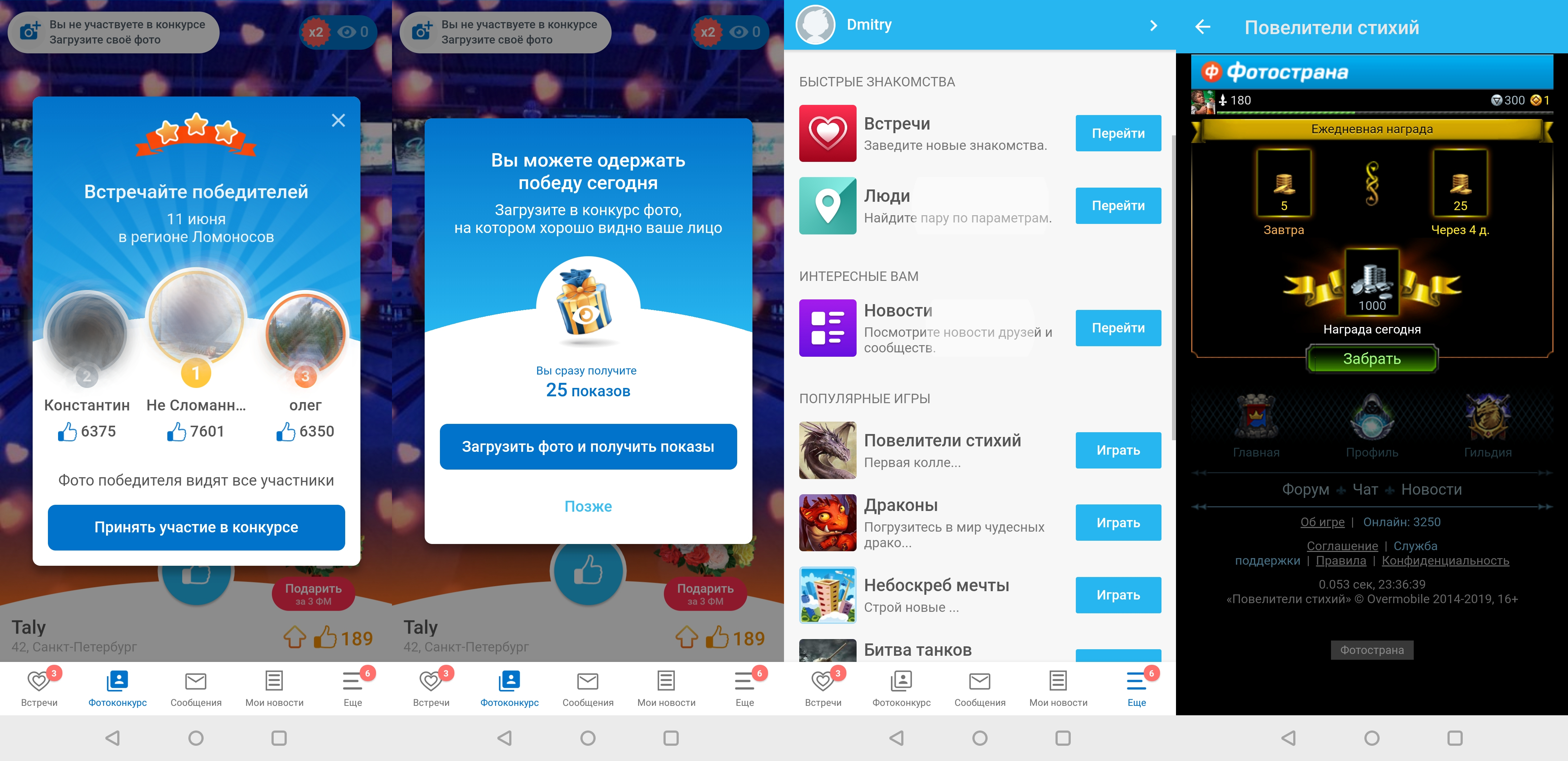
Photostrana wants to be flexible and offer the user and dating and games and news and contests. But it has complicated its interface and users are now confused about it. The project code is bloated and harder to maintain. Its harder to test. And the most important thing is that a photo-country loses to a tinder in dating questions, and loses to PUBG in matters of gameplay. And it will always be that way until the guys concentrate on Core UX Features.
Look at Facebook, a couple of years ago, he brought out his instant messenger. What for? What do you think?
Why does Google make separate projects? Why is there a separate gmail and a separate google drive. Why didn't they make one big monster?
Donald A. Norman ( The invisible Computer , MIT Press)
Andrew Odlyzko ( The concept of information appliances )
Form follows function
Form follows function.
Look at any really beautiful applications. In these applications, there is nothing superfluous. There is only what you need. There you will see the information for which you have opened this application. If you open the telegram you will see messages from your friends. If you open the instagram, then immediately see the photos. And in a photo country you will immediately see Alexei, who won in some kind of competition. (I do not know why I need this information).
Beauty in truly beautiful applications follows function. I really love the concept of minimalism. Minimalistic can be considered the application from which there is nothing to remove so that it does not collapse.
Beauty is the absence of redundant elements, including the absence of decorative elements.
Hick's law
And this is another interesting law that tells us that the time that we need to make a decision increases with an increase in the number of options.
If you are designing an application, then you need to understand which CTA to expect from the user and which one to push. And to more effectively push the user, reduce the number of options as much as possible.
This law applies to the design of any interface. Both mobile applications, car dashboard, newspaper layout. In short, anything.
Designers can greatly increase the effectiveness of design, if they learn how to properly use Hick's law. It is used in the development of software menus, indicators.
WE Hick On The Rate Of Gain Of Information
Horror vacui
And this is my favorite effect, in Russian the most true translation will be "Fear of the Void".
It is the desire to fill empty spaces with any objects or any information, instead of just leaving them empty.
In art, it is the opposite of minimalism. This term is used in art, design, for a description of a style where empty spaces are completely filled.
For example, look at the paintings of Adolf Wölfli (he spent 35 years in a lunatic asylum), Jean Dubuffet, David Carson, Vaughan Oliver, Clay Wilson, Robert Crumb.
For the first time this term appeared when people began to study the Victorian era, and here in it artists sought to fill in everything.
Studies show that horror vacue is inversely proportional to perceived value. People, for example, researched clothing stores that displayed windows in their stores, and it turned out that the degree of filling of shop windows with mannequins, clothes, price tags, and stocks turned out to be inversely proportional to the average price of goods and the prestige of the store.


Shops from the mass market tried their best to fill the showcase to the maximum. Using all the space, a lot of clothes, mannequins, everything must be glued with stocks and price tags. And prestigious chat boutiques use one dummy, without hanging clothes, without price tags. If a person wants to know the price, then perhaps the thing he can not afford.
This result is fully consistent with life experience, although it is somewhat unusual, since abundance is traditionally considered a sign of prosperity and luxury.
This principle works. And in design you need to take it into account in the design of banners, advertising, websites, mobile applications.
To evoke associations with high quality, you need to use minimalism to attract rich and educated people. Or if you want a mass market, then use the fear of emptiness to attract the poor and less educated.
Dimitri Mortelmans. Visualizing Emptiness, Visual Anthropology .
Ernst Gombrich. Order in A Psychology of Decorative Art .
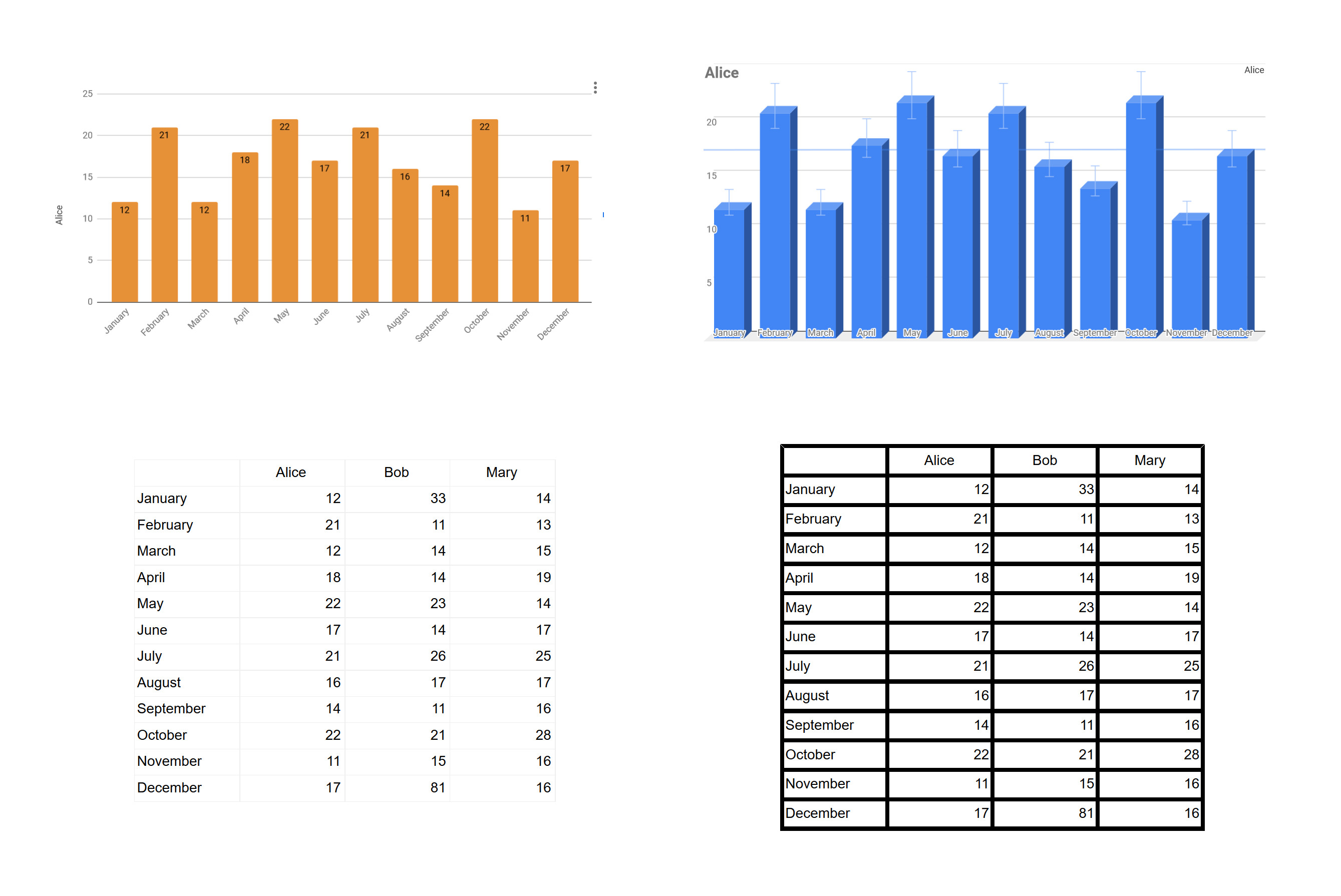
Signal-to-noise ratio
The ratio of relevant information to irrelevant information displayed on the screen. If you want your application to be used more efficiently, then you should strive to increase the signal-to-noise ratio.
In the applications that we create with you, we somehow transmit information to the user. And at this stage we have it collapses. And extraneous and unnecessary information is added. The destruction of information reduces the quality of useful information by changing its shape.
Noise reduces transmission clarity by diluting useful information with unnecessary information. And your goal is to make it so as to maximize the signal and minimize noise. To get a high signal-to-noise ratio.
Increase the signal-to-noise ratio in two ways.
Amplify signal:
- Any text in your application should be as accurate and clear as possible.
- Charts that do not fit the text.
- Ambiguous icons.
- Incomprehensible gestures or lack of gestures by default.
Minimize noise:
- Remove all that is possible to remove the required elements should be minimized, as far as possible, without prejudice to their function.
- For example, grid lines or table lines should always be made as thin and lighter as possible. And if you can, then delete it altogether.
Take a look at the examples and immediately understand the difference.
Wilson P. Tanner Jr. and John A. Swets. A Decision-Making Theory of Visual Detection .
Visual of Quantitative Information .
Conclusion
Please look at your application and think about what you can cut out of it.
')
Source: https://habr.com/ru/post/456154/
All Articles