What does your text look like?
Friends, great Friday everyone. We want to share with you the translation of an article prepared specifically for students of the course “Android Developer. Advanced course . Enjoy your reading.

How to declaratively stylize text on Android.
')
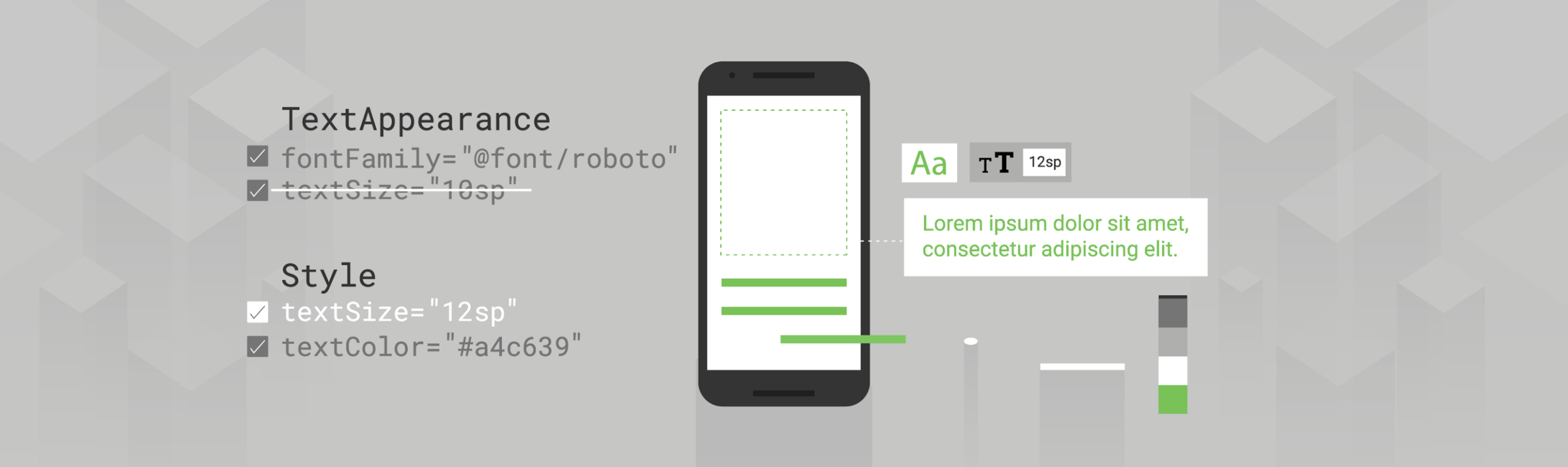
Illustration of Virginia Poltrek
What and when to use?
This article describes various approaches to declarative text styling (that is, when you define styles in an XML file), discusses the areas of application and the priority of each method.
You should read the entire post, but here’s a summary.
Remember the order of priority of various styling methods - if you try to stylize some text and do not see the expected results, then, most likely, your changes are overridden by something with a higher priority in this hierarchy:

The hierarchy of text styling methods
I would suggest the following procedure for styling:
You can directly set
What happens under the hood when you style the view? If you ever wrote your custom view, you probably saw the call context.obtainStyledAttributes (AttributeSet, int [], int, int) . Thus, the view-system in Android transfers to the view the attributes specified in the layout. The
View → Style
Attributes defined directly in the view always “prevail” and override attributes defined in the style. Note that the combination of the style and view attributes is used; defining an attribute in a view, which is also specified in the style, does not cancel the entire style. It should also be noted that in your view there is no real way to determine where the stylization comes from; this is decided by the view system for you once with a similar call. You cannot get both options and choose.
Although styles are extremely useful, they have their limitations. One of them is that you can apply only one style to the view (as opposed to something like CSS, where you can apply several classes).
So what is going on here? In fact,
View → Style → TextAppearance
Since the appearance of the text (text appearance) is checked first, any attributes defined either directly in the view or in the style will override it.
With
We considered the
Styling Attributes Supported by
Here are some
Therefore,
When we looked at how the Android view-system resolves attributes (
When determining the final value of a particular attribute, four input parameters come into play:
The order of priorities for styling from the Theme documentation
We’ll go back to the topics, but first look at the default styles. What is this default style? To answer this question, I think it would be useful to make a small exit from the

Standard Button
Why? If you look at the
It's all! Here is the whole class (no comments). You can check it out here . I'll wait. So where does the background, capital letters, ripple, etc. come from? You may have missed, but this will all be defined in the constructor with 2 arguments; one that is called when the layout is taken from XML. This is the last parameter that defines the
Back in
The best approach may be to specify your own default style for all
With this in mind, our priority rule takes the form:
View → Style → Default Style → TextAppearance
As part of the resolution of the attributes of the view-system, this slot is filled after the styles (so everything in the style is defaulted by the applied style or view attributes), but it will still override the text appearance. Default styles can be very comfortable. If you ever decide to write your own custom view, they can be a powerful way to implement default behavior, making it easy to customize.
If you inherit a widget and do not specify your own default style, then be sure to use the default style of parent classes in constructors (do not just pass 0). For example, if you inherit from
As mentioned earlier, there is another (last, I promise) way to provide information about styling. Another place
One example would be when you are trying to change the font in the entire application. You can use one of the methods described above, but manual setting of text styles / appearance everywhere will be monotonous and unsafe, and the default styles will work only at the level of the widget; subclasses can override this behavior, for example, buttons define their own
Now, any view that supports this attribute will pick it up if it is not overridden by something with a higher priority:
View → Style → Default Style → Theme → TextAppearance
Again, since this is part of the view styling system, it will override everything that is provided in text form, but will be overridden by any more specific attributes.
Remember this priority. In our example with the font for the entire application, you can expect the
This entire article was devoted to the declarative design of the text at the view level, that is, how to style the entire
→ Spantastic text styling with Spans
→ Underspanding spans
I’ll mention this for completeness, to keep in mind that software styling and spans will be at the top of the order of priority:
Span → Setters → View → Style → Default Style → Theme → TextAppearance
Although there are several ways of styling text, understanding the differences between methods and their limitations helps you find the right tool for a particular task or understand why one method takes precedence over another.
Successful text styling!
We invite everyone to a free webinar in which we will get acquainted with the DI Dagger 2 framework: learn how Dagger2 generates code, deal with JSR 330 annotations and Dagger2 designs, learn how to use Dagger2 in a multi-module application and consider the Dagger Android Injector.
How to declaratively stylize text on Android.
')
Illustration of Virginia Poltrek
TextView in Android applications provides several attributes for styling text and various ways to apply them. You can set these attributes directly in layout, apply a style to the view or a theme to the layout, or, if you want, set textAppearance. But what of this should be used? And what happens if you combine them? What and when to use?
This article describes various approaches to declarative text styling (that is, when you define styles in an XML file), discusses the areas of application and the priority of each method.
tl; dr;
You should read the entire post, but here’s a summary.
Remember the order of priority of various styling methods - if you try to stylize some text and do not see the expected results, then, most likely, your changes are overridden by something with a higher priority in this hierarchy:
The hierarchy of text styling methods
I would suggest the following procedure for styling:
- Set any application style to
textViewStyleas the default style for your theme. - Install the (small)
TextAppearanceset that your application will use (or use / inherit from MaterialComponent styles ), and link to them directly from your view - Create a
styleby setting attributes that are not supported byTextAppearance(which themselves will determine one of yourTextAppearance). - Perform any unique styling right in the layout.
Show some style
You can directly set
TextView attributes to the layout, but this approach can be more tedious and insecure. Imagine that you are trying to update the color of all TextViews in an application in this way. As with all other views, you can (and should!) Use styles instead to ensure consistency, reuse, and ease of updates. To this end, I recommend creating styles for text whenever you probably want to apply the same style to multiple views. It is extremely simple and largely supported by the Android view system.What happens under the hood when you style the view? If you ever wrote your custom view, you probably saw the call context.obtainStyledAttributes (AttributeSet, int [], int, int) . Thus, the view-system in Android transfers to the view the attributes specified in the layout. The
AttributeSet parameter, in fact, can be viewed as a map of the XML parameters that you specify in your layout. If AttributeSet sets the style, the style is read first , and then the attributes specified directly in the view are applied to it. Thus, we come to the first priority rule.View → Style
Attributes defined directly in the view always “prevail” and override attributes defined in the style. Note that the combination of the style and view attributes is used; defining an attribute in a view, which is also specified in the style, does not cancel the entire style. It should also be noted that in your view there is no real way to determine where the stylization comes from; this is decided by the view system for you once with a similar call. You cannot get both options and choose.
Although styles are extremely useful, they have their limitations. One of them is that you can apply only one style to the view (as opposed to something like CSS, where you can apply several classes).
TextView , however, has a trick, it provides the TextAppearance attribute, which works similarly to style . If you TextAppearance text with TextAppearance , then leave the style attribute free for other styles that looks practical. Let's take a closer look at what TextAppearance and how it works.TextAppearance
TextAppearance is nothing magical (for example, a secret mode for applying several styles, which you shouldn’t know about !!!!), TextView saves you from some extra work. Let's take a look at the TextView constructor to see what's going on. TypedArray a = theme.obtainStyledAttributes(attrs, com.android.internal.R.styleable.TextViewAppearance, defStyleAttr, defStyleRes); TypedArray appearance = null; int ap = a.getResourceId(com.android.internal.R.styleable.TextViewAppearance_textAppearance, -1); a.recycle(); if (ap != -1) { appearance = theme.obtainStyledAttributes(ap, com.android.internal.R.styleable.TextAppearance); } if (appearance != null) { readTextAppearance(context, appearance, attributes, false); appearance.recycle(); } // a little later a = theme.obtainStyledAttributes(attrs, com.android.internal.R.styleable.TextView, defStyleAttr, defStyleRes); readTextAppearance(context, a, attributes, true); So what is going on here? In fact,
TextView first looks to see if you’ve indicated android:textAppearance , if so, it loads this style and applies all the properties specified there. Later he loads all the attributes from the view (which he remembers, including the style) and applies them. So we come to the second priority rule:View → Style → TextAppearance
Since the appearance of the text (text appearance) is checked first, any attributes defined either directly in the view or in the style will override it.
With
TextAppearance , another caution should be remembered: it supports a subset of the style attributes that TextView offers. To better understand what I mean, let's go back to this line:obtainStyledAttributes(ap, android.R.styleable.TextAppearance);We considered the
receiveStyledAttributes version with 4 arguments, this 2-argument version is a little different. It looks at the given style (as determined by the first id parameter) and filters it only by style attributes that appear in the second parameter, the attrs array. Thus, styleable android.R.styleable.TextAppearance defines the scope of the TextAppearance . Looking at this definition, we see that TextAppearance supports many, but not all, of the attributes that TextView supports . <attr name="textColor" /> <attr name="textSize" /> <attr name="textStyle" /> <attr name="typeface" /> <attr name="fontFamily" /> <attr name="textColorHighlight" /> <attr name="textColorHint" /> <attr name="textColorLink" /> <attr name="textAllCaps" format="boolean" /> <attr name="shadowColor" format="color" /> <attr name="shadowDx" format="float" /> <attr name="shadowDy" format="float" /> <attr name="shadowRadius" format="float" /> <attr name="elegantTextHeight" format="boolean" /> <attr name="letterSpacing" format="float" /> <attr name="fontFeatureSettings" format="string" /> Styling Attributes Supported by
TextAppearanceHere are some
TextView attributes that are not included in the TextAppearance : lineHeight[Multiplier|Extra] , lines , breakStrategy and hyphenationFrequency . TextAppearance works at the level of characters, not paragraphs, so attributes that affect the entire layout are not supported.Therefore,
TextAppearance very useful, it allows us to define a style oriented to the attributes of text styling, and leaves the style in view free for other purposes. However, it has a limited scope and is located at the bottom of the priority chain, so do not forget about restrictions.Reasonable defaults
When we looked at how the Android view-system resolves attributes (
context.obtainStyledAttributes ), we actually simplified it a bit. It calls theme.obtainStyledAttributes (using the current Theme Context 'a). When checking the link , the priority order is shown, which we considered earlier, and indicates 2 more places that it searches for attribute resolution: the default style for the view and the theme.When determining the final value of a particular attribute, four input parameters come into play:
- Any attribute values in this AttributeSet.
- The style resource specified in the AttributeSet (named "style").
- The default style specified in defStyleAttr and defstyleres
- Basic values in this topic.
The order of priorities for styling from the Theme documentation
We’ll go back to the topics, but first look at the default styles. What is this default style? To answer this question, I think it would be useful to make a small exit from the
TextView theme and take a look at a simple Button . When you insert a < Button >Standard Button
Why? If you look at the
Button source code, you will see that it is rather meager: public class Button extends TextView { public Button(Context context) { this(context, null); } public Button(Context context, AttributeSet attrs) { this(context, attrs, com.android.internal.R.attr.buttonStyle); } public Button(Context context, AttributeSet attrs, int defStyleAttr) { this(context, attrs, defStyleAttr, 0); } public Button(Context context, AttributeSet attrs, int defStyleAttr, int defStyleRes) { super(context, attrs, defStyleAttr, defStyleRes); } @Override public CharSequence getAccessibilityClassName() { return Button.class.getName(); } @Override public PointerIcon onResolvePointerIcon(MotionEvent event, int pointerIndex) { if (getPointerIcon() == null && isClickable() && isEnabled()) { return PointerIcon.getSystemIcon(getContext(), PointerIcon.TYPE_HAND); } return super.onResolvePointerIcon(event, pointerIndex); } } It's all! Here is the whole class (no comments). You can check it out here . I'll wait. So where does the background, capital letters, ripple, etc. come from? You may have missed, but this will all be defined in the constructor with 2 arguments; one that is called when the layout is taken from XML. This is the last parameter that defines the
defaultStyleAttr in com.android.internal.R.attr.buttonStyle . This is the default style, in effect, being an indirect conversion point, allowing you to specify the style to be used by default. It does not point directly to the style, but allows you to point to one of those listed in your topic, which it will check when attributes are resolved. And this is exactly what all the themes from which you usually inherit do, to ensure the appearance and perception of standard widgets. For example, if you look at the Material topic, it defines @style/Widget.Material.Light.Button , and it is this style that provides all the attributes that theme.obtainStyledAttributes will theme.obtainStyledAttributes if you have not specified anything else.Back in
TextView , it also suggests a default style: textViewStyle . This can be very convenient if you want to apply some styles to each TextView in your application. Suppose you want to set the default line spacing to 1.2. You can do this with style/TextAppearance and try to apply during code review (or maybe even with an elegant user rule in Lint), but you need to be vigilant and make sure that you recruit new team members. , be careful with refactoring, etc.The best approach may be to specify your own default style for all
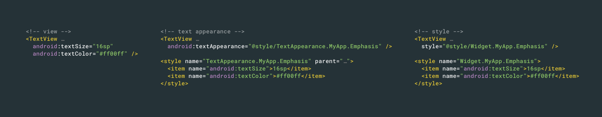
TextView in the application that defines the desired behavior. You can do this by setting your own style for textViewStyle , which is inherited from the platform or from MaterialComponents/AppCompat by default. <style name="Theme.MyApp" parent="@style/Theme.MaterialComponents.Light"> ... <item name="android:textViewStyle">@style/Widget.MyApp.TextView</item></style> <style name="Widget.MyApp.TextView" parent="@android:style/Widget.Material.TextView"> <item name="android:textAppearance">@style/TextAppearance.MyApp.Body</item> <item name="android:lineSpacingMultiplier">@dimen/text_line_spacing</item> </style> With this in mind, our priority rule takes the form:
View → Style → Default Style → TextAppearance
As part of the resolution of the attributes of the view-system, this slot is filled after the styles (so everything in the style is defaulted by the applied style or view attributes), but it will still override the text appearance. Default styles can be very comfortable. If you ever decide to write your own custom view, they can be a powerful way to implement default behavior, making it easy to customize.
If you inherit a widget and do not specify your own default style, then be sure to use the default style of parent classes in constructors (do not just pass 0). For example, if you inherit from
AppCompatTextView and write your own constructor with 2 arguments, be sure to pass android.R.attr.textViewStyle defaultStyleAttr ( as here ), otherwise you will lose the behavior of the parent class.Topics
As mentioned earlier, there is another (last, I promise) way to provide information about styling. Another place
theme.obtainStyledAttributes will look directly into the theme itself. That is, if you add a style attribute to your theme, for example, android:textColor , the view system will select it as a last resort. As a rule, it is a bad idea to mix theme attributes and style attributes, that is, what you apply directly to the view should, as a rule, never be set for the theme (and vice versa), but there are a couple of rare exceptions.One example would be when you are trying to change the font in the entire application. You can use one of the methods described above, but manual setting of text styles / appearance everywhere will be monotonous and unsafe, and the default styles will work only at the level of the widget; subclasses can override this behavior, for example, buttons define their own
android:buttonStyle that your android:textViewStyle does not catch. Instead, you can specify the font in your theme: <style name="Theme.MyApp" parent="@style/Theme.MaterialComponents.Light"> ... <item name="android:fontFamily">@font/space_mono</item> </style> Now, any view that supports this attribute will pick it up if it is not overridden by something with a higher priority:
View → Style → Default Style → Theme → TextAppearance
Again, since this is part of the view styling system, it will override everything that is provided in text form, but will be overridden by any more specific attributes.
Remember this priority. In our example with the font for the entire application, you can expect the
Toolbar pick up this font, since it contains a title that is a TextView . The Toolbar class itself, however, defines a default style that contains a titleTextAppearance , which defines android:fontFamily , and directly sets it in the TextView header, overriding the theme level value. Topic-level styles can be useful, but they are easy to override, so make sure they apply properly.Bonus: Unsolved Issues
This entire article was devoted to the declarative design of the text at the view level, that is, how to style the entire
TextView while filling. Any style applied after filling (for example, textView.setTextColor(…) ) will override the declarative styling. TextView also supports smaller styles via Span . I will not go into this topic, since it is described in detail in the articles by Florina Muntenescu .→ Spantastic text styling with Spans
→ Underspanding spans
I’ll mention this for completeness, to keep in mind that software styling and spans will be at the top of the order of priority:
Span → Setters → View → Style → Default Style → Theme → TextAppearance
Choose your style
Although there are several ways of styling text, understanding the differences between methods and their limitations helps you find the right tool for a particular task or understand why one method takes precedence over another.
Successful text styling!
We invite everyone to a free webinar in which we will get acquainted with the DI Dagger 2 framework: learn how Dagger2 generates code, deal with JSR 330 annotations and Dagger2 designs, learn how to use Dagger2 in a multi-module application and consider the Dagger Android Injector.
Source: https://habr.com/ru/post/456110/
All Articles