Flutter: we pump over AppBar & SliverAppBar
In Flutter, the well-known AppBar is used to create the toolbar, but when we need a dynamic toolbar that will show the content on the swipe, we use the excellent SliverAppBar widget.
Both widgets allow you to make the application a little more beautiful, which in Flutter is, without a doubt, very simple.
I saw a lot of questions on StackOverflow and in Facebook groups about how you can modify AppBar and SliverAppBar in terms of behavior or design.
Let's look at two tasks.
Task 1
We want to create, not screwed to the top of the AppBar screen, but not in the usual way. We want to add a Drawer (sidebar), to the opening of which AppBar will respond. That's it: our own AppBar with the size we need.
The problem is that, as we know, AppBar has a default size, and we cannot change it. Looking at the source code, we see the appBar parameter in Scaffold , we see that it accepts a widget of the type PreferredSizeWidget , now we look through the source code of the AppBar and find out that this is only StatefulWidget , which implements PreferredSizeWidget .

Things are easy: just create our own widget that implements PreferredSizeWidget .
That's what we want

How to make it so that when you press the menu of our AppBar, the side menu opens.
We can do this in two ways:
Using `AppBar`
This is how AppBar will be able to control the opening of the side menu inside Scaffold .
class Sample1 extends StatelessWidget { @override Widget build(BuildContext context) { return SafeArea( child: Scaffold( drawer: Drawer(), appBar: MyCustomAppBar( height: 150, ), body: Center( child: FlutterLogo( size: MediaQuery.of(context).size.width / 2, ), ), ), ); } } class MyCustomAppBar extends StatelessWidget implements PreferredSizeWidget { final double height; const MyCustomAppBar({ Key key, @required this.height, }) : super(key: key); @override Widget build(BuildContext context) { return Column( children: [ Container( color: Colors.grey[300], child: Padding( padding: EdgeInsets.all(30), child: AppBar( title: Container( color: Colors.white, child: TextField( decoration: InputDecoration( hintText: "Search", contentPadding: EdgeInsets.all(10), ), ), ), actions: [ IconButton( icon: Icon(Icons.verified_user), onPressed: () => null, ), ], ) , ), ), ], ); } @override Size get preferredSize => Size.fromHeight(height); } Using a custom widget
Here we have more flexibility and we can use a GlobalKey type of ScaffoldState or InheritedWidget from Scaffold , thus gaining access to the state methods for opening the Drawer .
import 'package:flutter/material.dart'; class Sample1 extends StatelessWidget { @override Widget build(BuildContext context) { return SafeArea( child: Scaffold( drawer: Drawer(), appBar: MyCustomAppBar( height: 150, ), body: Center( child: FlutterLogo( size: MediaQuery.of(context).size.width / 2, ), ), ), ); } } class MyCustomAppBar extends StatelessWidget implements PreferredSizeWidget { final double height; const MyCustomAppBar({ Key key, @required this.height, }) : super(key: key); @override Widget build(BuildContext context) { return Column( children: [ Container( color: Colors.grey[300], child: Padding( padding: EdgeInsets.all(30), child: Container( color: Colors.red, padding: EdgeInsets.all(5), child: Row(children: [ IconButton( icon: Icon(Icons.menu), onPressed: () { Scaffold.of(context).openDrawer(); }, ), Expanded( child: Container( color: Colors.white, child: TextField( decoration: InputDecoration( hintText: "Search", contentPadding: EdgeInsets.all(10), ), ), ), ), IconButton( icon: Icon(Icons.verified_user), onPressed: () => null, ), ]), ), ), ), ], ); } @override Size get preferredSize => Size.fromHeight(height); } Result

Simple, isn't it? Let's look at the second task for SliverAppBar .
Task 2
As we know, SliverAppBar works as follows:
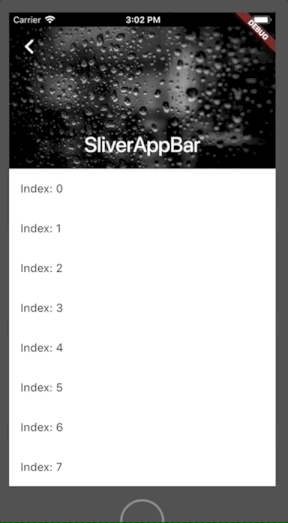
What we want is to place the Card embedded in our SliverAppBar , as shown in the following figure.
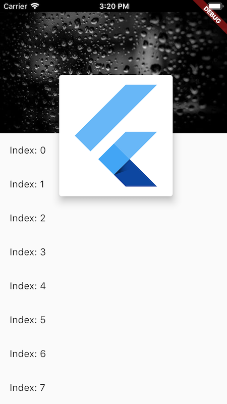
Wait, but the content inside the SliverAppBar is clipped, so it can’t go beyond what to do?

Without a panic, let's see the source code of SliverAppBar and, oh, surprise, this is a StatefulWidget that uses SliverPersistentHeader inside, that's the whole secret.
We will create our own SliverPersistentHeaderDelegate to use SliverPersistentHeader .
class Sample2 extends StatelessWidget { @override Widget build(BuildContext context) { return SafeArea( child: Material( child: CustomScrollView( slivers: [ SliverPersistentHeader( delegate: MySliverAppBar(expandedHeight: 200), pinned: true, ), SliverList( delegate: SliverChildBuilderDelegate( (_, index) => ListTile( title: Text("Index: $index"), ), ), ) ], ), ), ); } } class MySliverAppBar extends SliverPersistentHeaderDelegate { final double expandedHeight; MySliverAppBar({@required this.expandedHeight}); @override Widget build( BuildContext context, double shrinkOffset, bool overlapsContent) { return Stack( fit: StackFit.expand, overflow: Overflow.visible, children: [ Image.network( "https://images.pexels.com/photos/396547/pexels-photo-396547.jpeg?auto=compress&cs=tinysrgb&dpr=1&w=500", fit: BoxFit.cover, ), Center( child: Opacity( opacity: shrinkOffset / expandedHeight, child: Text( "MySliverAppBar", style: TextStyle( color: Colors.white, fontWeight: FontWeight.w700, fontSize: 23, ), ), ), ), Positioned( top: expandedHeight / 2 - shrinkOffset, left: MediaQuery.of(context).size.width / 4, child: Opacity( opacity: (1 - shrinkOffset / expandedHeight), child: Card( elevation: 10, child: SizedBox( height: expandedHeight, width: MediaQuery.of(context).size.width / 2, child: FlutterLogo(), ), ), ), ), ], ); } @override double get maxExtent => expandedHeight; @override double get minExtent => kToolbarHeight; @override bool shouldRebuild(SliverPersistentHeaderDelegate oldDelegate) => true; } Result

Done, both problems solved.
Examples lie in this repository .
Conclusion
Often we despair when we don’t find any properties of the widget, but we only need to look at its source code to understand how it is implemented in Flutter, thus discovering options for implementing its own widgets.
')
Source: https://habr.com/ru/post/456054/
All Articles