We create the most inaccessible website with the perfect Lighthouse rating.
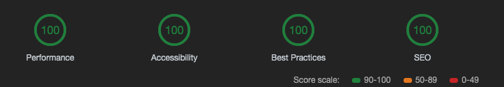
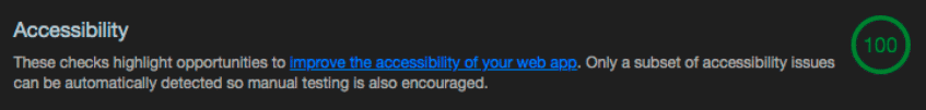
Google Lighthouse’s built-in testing tool rates accessibility of sites on a scale from 0 to 100. It is commendable to strive for maximum readability of content, but a rating of 100 does not mean that the site is perfectly accessible. To prove this, I did a little experiment.
It's always nice to see people brag on Twitter for their Lighthouse ratings: that means they care about quality.
')
Lighthouse rewards the best sites with a green circle with the number 100, which you proudly show clients and friends.
Evaluation of the quality of the code is important, but it is even more important to correctly interpret it. If the automatic tool says that the site is 100% accessible, this is not necessarily the case. It only means that we laid the foundation for manual testing. For tests, Lighthouse uses the ax-core library with its own set of rules . She brings out some bad practices, but not all. Other practices are not bad in themselves, but can be harmful if abused.
You won't get good quality with automated testing alone. To prove this, I created a maximally inaccessible website with a perfect Lighthouse rating.
Zach Leterman recently tweeted:
And the answer Vadim Makeeva inspired me to work.
I thought it was a great idea: not only to confuse the maximum number of site visitors, but also to get the ideal Lighthouse rating from above.
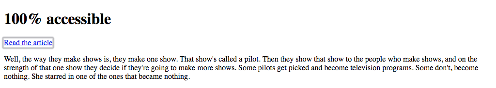
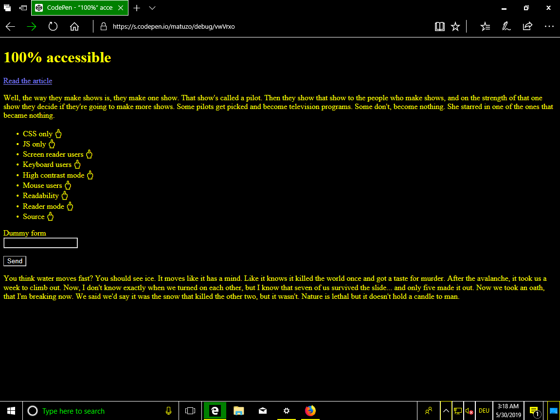
Take this simple, well accessible page as a basis.
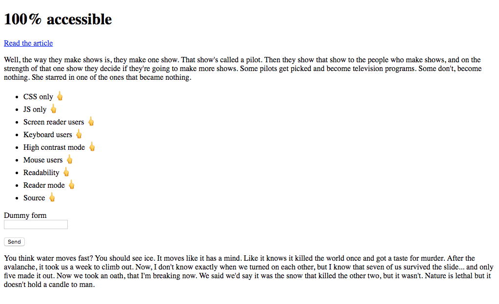
CodePen: 100% availability, step 0
Let's start with the simple. I want to make sure my perfect website doesn't work without CSS. To do this, add the

Perfect clean page
We are back to what was before, but now CSS should be loaded.
CodePen: 100% availability, step 1
Add another dependency. I now add the class for displaying content not in HTML, but through JS.
Great! The site still has not changed, but in order to display at least some content, CSS and JS files must be loaded and work correctly.
CodePen: 100% availability, step 2
It seems the time has come for the first test of the Lighthouse. Cross your fingers!
The perfect result on the site with CSS and JS. It's great, but we can do better.
There are many ways to prevent screen readers from working. The easiest and most effective is to use the
Now people with screen readers will experience one of those “rare” moments when they encounter an inaccessible site .
CodePen: 100% availability, step 3
Keyboard users can move around the page by pressing the Tab key to move from one interactive element to another. The browser shows the outline around the elements in focus.
Let's get rid of it.
With just three lines of CSS, we cut off a whole group of people from the site. Technically, they can still interact with the page: by pressing Tab, there is still a transition between interactive elements, just the focus indicator is no longer shown. Since in our experiment it is required to completely limit the capabilities of people, let's turn off the keyboard altogether.
Our application now removes the default functionality of all keys.
CodePen: 100% availability, step 4
Time for the next test.
Still perfect.
Okay, it's time for dirty tricks.
In Windows, people with low vision can improve contrast by turning on the so-called high contrast mode .
Then the entire operating system begins to use a contrasting scheme for all applications, including browsers.
We can target the
These rules apply only if high contrast mode is enabled in Windows. Unfortunately, we do not know what colors the theme uses: light or dark. Setting the color
Oh my God. This is so mean. Now I’m getting job offers from Facebook and Uber.
CodePen: 100% availability, step 5
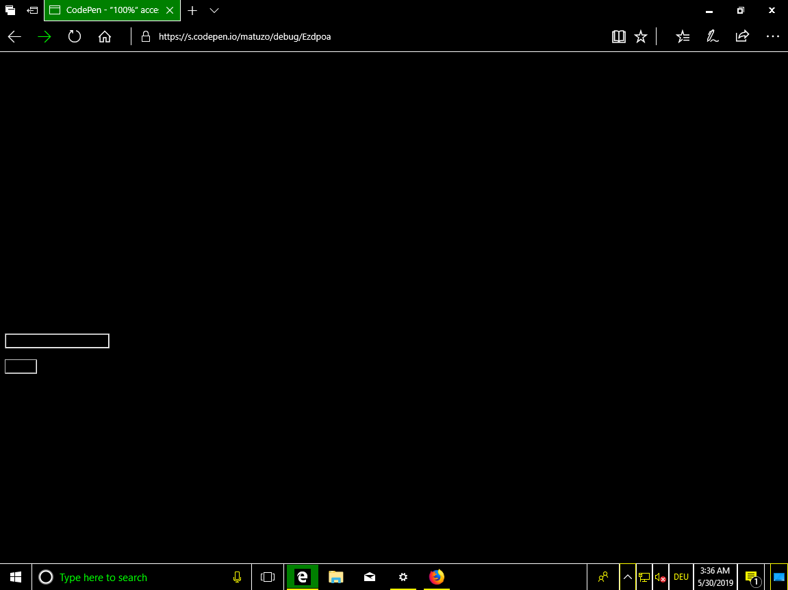
It's very easy here: just remove the cursor from the screen.
For a user with a mouse, the
Well, another thing. After specifying
This backup script runs and removes click events from all elements if the browser does not support the
CodePen: 100% availability, step 6
Great! The site is still perfectly available!
We can no longer use the mouse or keyboard, but still see the text on the page. Disorder.
Content remained on the page, but almost invisible. Awesome!
CodePen: 100% availability, step 7
Testing the site in different browsers, I noticed that it is still available in Safari in read mode.
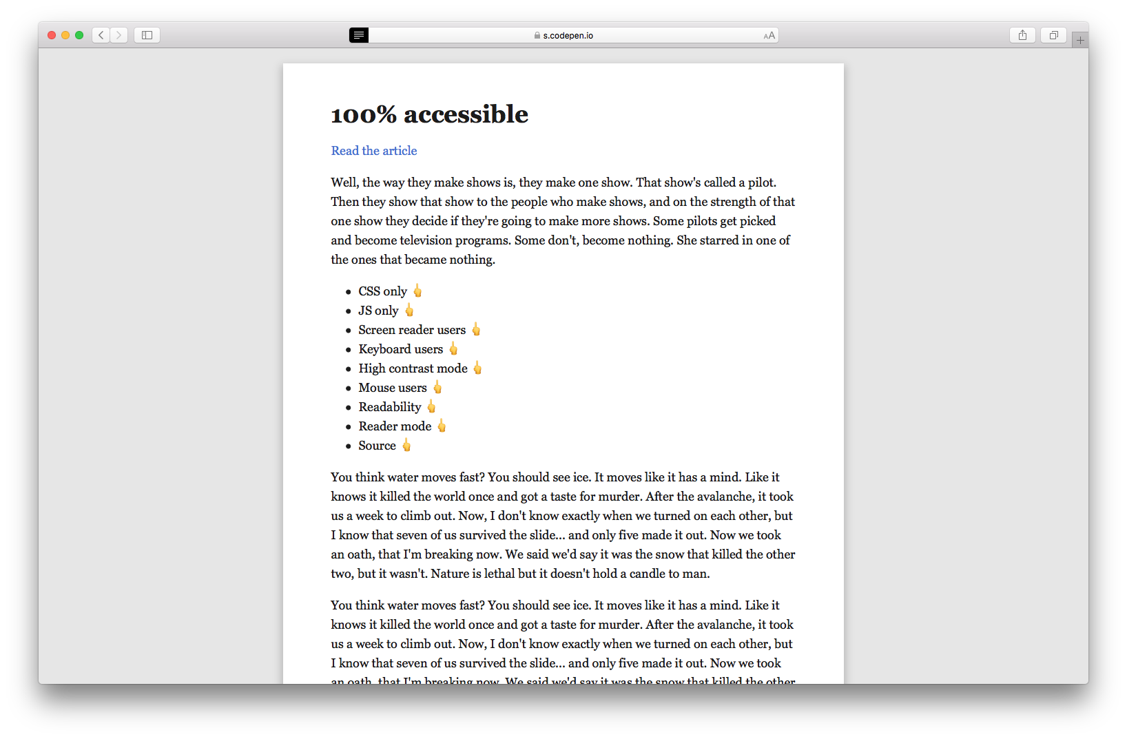
As it turned out, you can disable this mode, if you specify the minimum font size in the
CodePen: 100% availability, step 8
The site is not available for people with low and good eyesight, users of the mouse, keyboard and screen readers.
If an experienced user gets to such a site, an internal hacker can wake up in it and he will try to hack it. I mean, view the source of the page.
The cherry on the cake is the inaccessibility of our site - converting text into HTML mnemonics . These entity mnemonics are commonly used to display reserved, invisible characters and those that are difficult to enter using a standard keyboard. We use them for obfuscation.
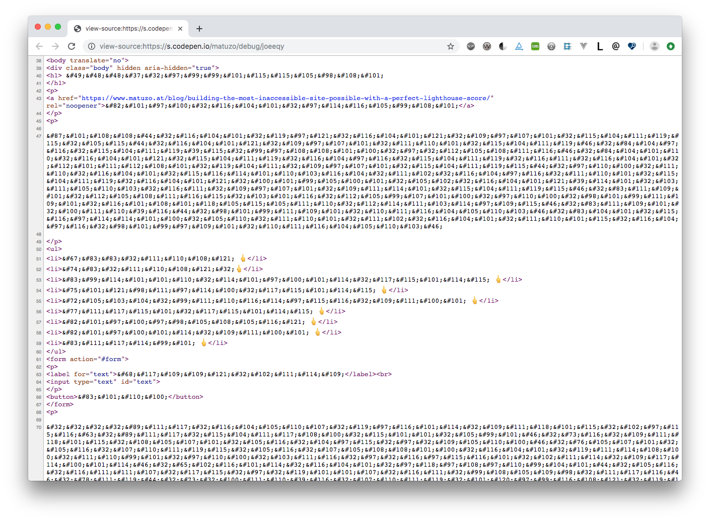
CodePen: 100% availability, step 9
And the last test.
In the article I did not want to make fun of the Lighthouse system or its ax-core engine. I regularly use both tools and I am glad that they are.
This is an article about us. Estimates indicate the quality of our applications and sites, but we should not blindly trust these numbers. We need to understand that automated testing is only the first step.
The next time you see the Lighthouse's high score, read the text next to the score.
We are testing and optimizing sites for the sake of a pleasant feeling, which gives a high score. We do this for people: to make the site available to as many users as possible. In design and programming, we do not fully rely on automation. So in testing you should not do this.
Thanks to Eric for proofreading and feedback.
It's always nice to see people brag on Twitter for their Lighthouse ratings: that means they care about quality.
')
Lighthouse rewards the best sites with a green circle with the number 100, which you proudly show clients and friends.
Evaluation of the quality of the code is important, but it is even more important to correctly interpret it. If the automatic tool says that the site is 100% accessible, this is not necessarily the case. It only means that we laid the foundation for manual testing. For tests, Lighthouse uses the ax-core library with its own set of rules . She brings out some bad practices, but not all. Other practices are not bad in themselves, but can be harmful if abused.
You won't get good quality with automated testing alone. To prove this, I created a maximally inaccessible website with a perfect Lighthouse rating.
Prehistory
Zach Leterman recently tweeted:
Free idea for an article:
How to build the slowest website with the perfect Lighthouse rating
And the answer Vadim Makeeva inspired me to work.
It would be interesting to read! Throw up a little idea:
<img src = picture.png alt = picture.png>
I thought it was a great idea: not only to confuse the maximum number of site visitors, but also to get the ideal Lighthouse rating from above.
Cut as many people as possible
Take this simple, well accessible page as a basis.
CodePen: 100% availability, step 0
Required CSS
Let's start with the simple. I want to make sure my perfect website doesn't work without CSS. To do this, add the
hidden attribute to the body element. This is the HTML equivalent of display: none; in CSS (if you want to read about content hiding while maintaining accessibility, see Scott O'Hara's “Inclusive Hiding” ).HTML
<body hidden> ... </body> Perfect clean page
hidden visually hides the content and removes it from the accessibility tree. This alone is enough to eliminate absolutely all visitors and pass the Lighthouse tests, but we are not looking for easy ways. I want to create a site that is completely unavailable and technically still displays content. So, add CSS and return the content back.HTML
<head> <link rel="stylesheet" href="style.css"> </head> <body class="loaded" hidden> ... </body> CSS
.loaded { display: block; } We are back to what was before, but now CSS should be loaded.
CodePen: 100% availability, step 1
Required JS
Add another dependency. I now add the class for displaying content not in HTML, but through JS.
HTML
<head> <link rel="stylesheet" href="style.css"> <script src="script.js"></script> </head> <body hidden> ... </body> Js
document.querySelector('body').classList.add('loaded'); Great! The site still has not changed, but in order to display at least some content, CSS and JS files must be loaded and work correctly.
CodePen: 100% availability, step 2
It seems the time has come for the first test of the Lighthouse. Cross your fingers!
The perfect result on the site with CSS and JS. It's great, but we can do better.
To hell with screen readers
There are many ways to prevent screen readers from working. The easiest and most effective is to use the
aria-hidden="true" attribute. This powerful attribute should be used with care because it removes items from the accessibility tree. It is usually used to help people with screen readers, removing excess or extraneous content . On our website we prescribe this attribute for the body element.HTML
<body hidden aria-hidden="true"> ... </body> Now people with screen readers will experience one of those “rare” moments when they encounter an inaccessible site .
CodePen: 100% availability, step 3
We cut off users with keyboards
Keyboard users can move around the page by pressing the Tab key to move from one interactive element to another. The browser shows the outline around the elements in focus.
Let's get rid of it.
CSS
*:focus { outline: none !important; } With just three lines of CSS, we cut off a whole group of people from the site. Technically, they can still interact with the page: by pressing Tab, there is still a transition between interactive elements, just the focus indicator is no longer shown. Since in our experiment it is required to completely limit the capabilities of people, let's turn off the keyboard altogether.
Js
document.addEventListener('keydown', function(e) { e.preventDefault(); }) Our application now removes the default functionality of all keys.
CodePen: 100% availability, step 4
Time for the next test.
Still perfect.
Okay, it's time for dirty tricks.
Exploit for high contrast mode
In Windows, people with low vision can improve contrast by turning on the so-called high contrast mode .
Then the entire operating system begins to use a contrasting scheme for all applications, including browsers.
We can target the
media property specifically for these users.CSS
@media screen and (-ms-high-contrast: active) { /* High contrast styling rules */ * { color: #000000; } } These rules apply only if high contrast mode is enabled in Windows. Unfortunately, we do not know what colors the theme uses: light or dark. Setting the color
#000000 for all elements may or may not work, depending on user preferences. Such a probability of 50% does not suit me, but we are lucky: the contrasting colors of Windows are compared with the keywords of the system CSS color . You can use these keywords and make sure that our text always matches the color of any background in high contrast mode. The background color in the OS is matched with the color of windows in CSS. So, we will indicate this color for all text on the page.CSS
@media screen and (-ms-high-contrast: active) { * { color: window !important; } } Oh my God. This is so mean. Now I’m getting job offers from Facebook and Uber.
CodePen: 100% availability, step 5
To hell with mouse users
It's very easy here: just remove the cursor from the screen.
CSS
*, *:hover { cursor: none; } For a user with a mouse, the
cursor: none; property cursor: none; does the same thing that the outline: none; property does for the keyboard user outline: none; . Without a cursor, it is difficult to navigate at first, but the elements are still clickable. Let's improve the quality of our application, once again cutting off the available interface to users.CSS
body { pointer-events: none; } Well, another thing. After specifying
pointer-events: none; users can no longer click on any item. This property is well supported, but for the function to work on as many browsers as possible, it is desirable to apply the principle of progressive degradation.Js
function removeA11y() { if ("pointerEvents" in document.body.style) { console.log('pointer-events supported') return; } document.addEventListener('click', function(e) { e.preventDefault(); }) } removeA11y(); This backup script runs and removes click events from all elements if the browser does not support the
pointer-events property.CodePen: 100% availability, step 6
Great! The site is still perfectly available!
To hell with readability
We can no longer use the mouse or keyboard, but still see the text on the page. Disorder.
CSS
body { opacity: 0.03; } Content remained on the page, but almost invisible. Awesome!
CodePen: 100% availability, step 7
Exploit read mode in Safari
Testing the site in different browsers, I noticed that it is still available in Safari in read mode.
As it turned out, you can disable this mode, if you specify the minimum font size in the
body .CSS
body { opacity: 0.03; font-size: 1px; } CodePen: 100% availability, step 8
Down view the source
The site is not available for people with low and good eyesight, users of the mouse, keyboard and screen readers.
If an experienced user gets to such a site, an internal hacker can wake up in it and he will try to hack it. I mean, view the source of the page.
The cherry on the cake is the inaccessibility of our site - converting text into HTML mnemonics . These entity mnemonics are commonly used to display reserved, invisible characters and those that are difficult to enter using a standard keyboard. We use them for obfuscation.
CodePen: 100% availability, step 9
And the last test.
findings
In the article I did not want to make fun of the Lighthouse system or its ax-core engine. I regularly use both tools and I am glad that they are.
This is an article about us. Estimates indicate the quality of our applications and sites, but we should not blindly trust these numbers. We need to understand that automated testing is only the first step.
The next time you see the Lighthouse's high score, read the text next to the score.
“This test identifies opportunities to improve the availability of your web application . Automatic testing is able to detect only part of the problems, so it is recommended to also conduct manual testing. ”
We are testing and optimizing sites for the sake of a pleasant feeling, which gives a high score. We do this for people: to make the site available to as many users as possible. In design and programming, we do not fully rely on automation. So in testing you should not do this.
Thanks to Eric for proofreading and feedback.
Links and resources
Source: https://habr.com/ru/post/455016/
All Articles