Uibook - a tool for visual testing of React-components with media queries
Hello! My name is Vitaly Rizo, I am a front-end developer at Amplifer. We made Uibook - a simple tool for visual testing of React-components with real media queries. I'll tell you how it works and how it can be useful to you.


Why did and what is the use
When creating new components, we suffered when refactoring - to check, we had to change attributes through DevTools manually, we could miss some trifles. Therefore, we decided to make a page where you can quickly test components.
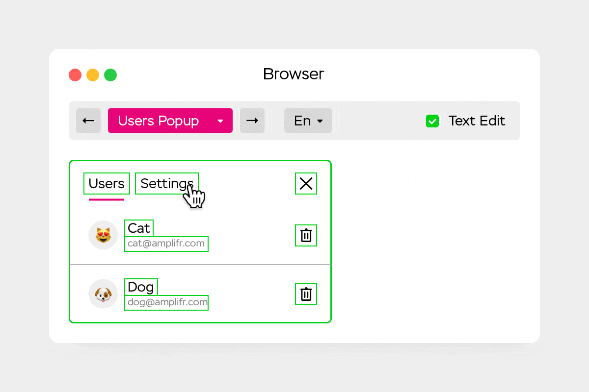
Uibook allows you to quickly see components in any states and combinations of parameters (props). With support for media queries, the developer can display desktop and mobile versions of components on one page. But Uibook is not only useful for developers:
- designers can, on their device, without raising the local server, look at all sorts of component states and submit edits;
- managers see that even a simple, seemingly popup, can contain a bunch of boundary conditions that developers have to take into account - this helps them to better understand the device interface of the product from the inside;
- Editors can use the Live Text Editing mode to try on the text for the interface in real components so that it looks flawless.
What is different from analogues

You may ask why reinvent the wheel when there are ready-made Storybook, Styleguidist and similar solutions? My project has a different approach and I highlight three main differences:
- In Uibook, you can immediately see the components in conditions of limited width and height of devices;
- It does not require a separate builder and easily connects to an existing project with a couple of lines in the configuration file;
- It is understood that the pages with the components will be publicly accessible, so that any user can find errors and leave feedback.
Uibook is needed mainly for visual testing, not development, although it is convenient to develop the “representing” part of the project with it. Did you have to make global changes to the project? Go through all the pages to make sure all components are displayed correctly.
Technical implementation
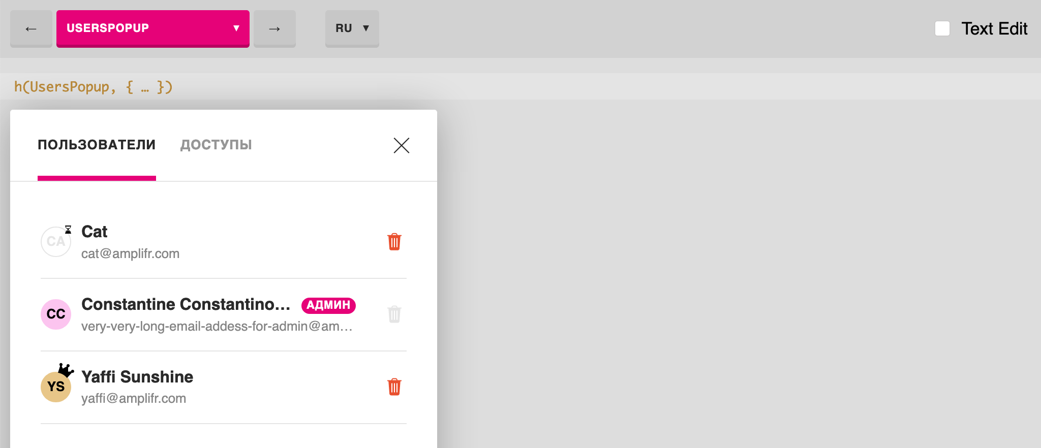
Uibook is a React-application in which the Pages are transferred - sets of "cases", that is, states of one component (props and callbacks). Next, Uibook renders the selected Page on one screen using two controllers: with and without media queries.
Since it is impossible to emulate media queries using CSS and JavaScript, we went a simple way: render the component inside the <iframe> if the user specified the width or height of the screen.
The main controller wraps the component in any custom wrapper, and also allows you to select values in the browser. In the iframe data is transmitted via a link. Also, the main controller adds hotkeys and the ability to edit text.
I did not want to have separate builders for the project and visual testing. Other products force you to do this, which is why you have to store more files, dependencies, it all takes longer to configure, it starts up longer, it’s harder to build and deploy. Uibook integrates into the project collector, as it is simply added as a Webpack plugin:
plugins: [ … new UibookPlugin({ controller: path.join(__dirname, '../controllers/uibook.js') }) ] webpack.config.js
Uibook creates a separate chunk and does not increase the size of the main application. It works through WebPack SingleEntryPlugin or MultiEntryPlugin . It tightens styles and scripts from the main application, taking into account caching ("cachebuster"). Here is how the plugin gets the list of necessary files:
let files = compilation.chunks.find(function (i) { return i.name === 'uibook' }).files It then generates the HTML file without dependencies. After all, this is a very simple task, there is no need to pull the library for this. We take a template, add imports, add to the issue:
compilation.assets[outputPath + '/index.html'] = { … } But if you still have HtmlWebpackPlugin connected, you will have to add uibook to the exceptions, which Uibook will kindly remind you of.

Uibook is very simple
It only has React, Webpack dependencies and create-react-class . It is written in ES5, so it will work, even if you do not have Babel in the project. And if there is, then there will be no plug-in conflicts. Hints are built into Uibook if something is wrong in the configuration file.

Uibook is flexible

You can wrap all the components in your controller. It can be a wrapper for Redux, Context or all at once. Here is an example with a new Context API:
export default UibookStarter({ wrapper: (children, props) => <Context.Provider value={ props }> { children } </Context.Provider>, values: { locale: ['ru', 'en'], theme: ['dark', 'light'] }, … }) The list of user keys and their values will be displayed in the top navigation menu.
How to implement Uibook in the project
For example, we want to add the Button component, which lies in src/button.js . You need to install the uibook package, create a file controller and a page file. The file controller is used to import your Uibook tests, and the file page is a set of "cases", combinations of parameters for one component.
Here's how to do it:
1) Proceed, $ yarn add uibook ;
2) Here you can use the $ npm init uibook , which will create sample files, or you can do everything manually. Approximately the structure will be as follows:
your-project ├── uibook │ ├── button.uibook.js │ └── uibook-controller.js ├── src │ └── button.js ├── webpack.config.js └── package.json 3) Connect the plugin in the Webpack configuration file:
let UibookPlugin = require('uibook/plugin') module.exports = { … plugins: [ new UibookPlugin({ controller: path.join(__dirname, '../src/uibook-controller.js'), }) ], } webpack.config.js
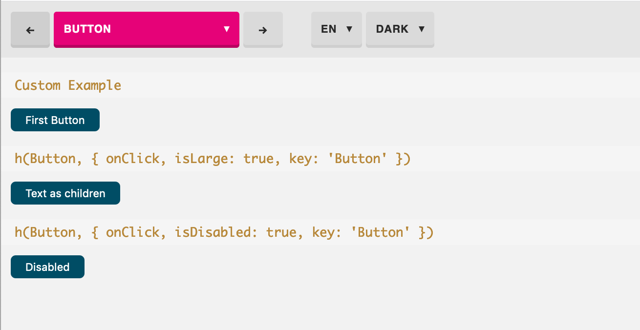
4) Write the test in uibook/button.uibook.js . If you used the init command, this example has already been created:
import UibookCase from 'uibook/case' import Button from '../src/button.js' const PROPS = { onClick: UibookCase.event('onClick') } const ButtonUibook = { component: Button, name: 'Button', cases: [ () => <UibookCase props={{ ...PROPS, isLarge: true }}> Large Button </UibookCase>, () => <UibookCase props={{ ...PROPS, isDisabled: true }}> Disabled Button </UibookCase> ] } export default ButtonUibook button.uibook.js
5) Import and transfer this uibook test in the file controller:
import UibookStarter from 'uibook/starter' import ButtonUibook from './button.uibook' export default UibookStarter({ pages: { Button: ButtonUibook, } }) uibook-controller.js
6) Done! We start our project as usual (for example, $ yarn start ) and open the /uibook in the browser. We will see three cases with a button (if you have the /src/button.js component, of course):
How Uibook Helped Us
We use Uibook in our work for more than a year with the whole team. Front-end tenders develop new components only through Uibook, simultaneously creating a test file with boundary parameters (props). It is much faster than writing a parallel controller to see the component in a real web application. Moreover, this test file will be used later for visual testing after any global changes.
Andrei Sitnik Iskin , a leading frontend developer at Evil Martians, notes that Uibook makes work calmer:
Uibook finally gave us the confidence that after updating normalize.css, nothing broke. Just open and view all the components in a row. This is where the main feature, @media support, helps a lot. Developers have less fears, managers have fewer bugs. Everyone is happy.
And the testing process itself has been simplified. Now the front-end is writing a new component (view-component), simultaneously creating a file with parameters (props). The controller is not needed at the same time - you can deploy it in the course of development without implementing the component in the web application itself.
Other front-end developers review the component using a local or closed Uibook: you can click on all the buttons and check that callbacks are invoked. So we save up to 30 hours each month for testing components.
Damir Melnikov, frontend developer of Amplifer, also notes the possibility of working together with designers, products and editors:
Uibook allows me to quickly work on components - try on new styles, follow the mobile version, learn how the component behaves with different input. In addition, Uibook allows you to quickly share your work with the designer (live layout), editor (for reading interface texts) and other front-end developers.
Content-lead "Amplifer" Alexander Marficnyn notes how Uibook simplified the writing of interface texts:
When you make texts for an interface, you often work blindly and do not see what the inscriptions will look like in a “live” product. Uibook solves this problem. You can not only read old texts, but also create new ones, relying on the limitations of the components and trying on your own drafts on a real interface. All text elements are editable, it allows you to get a solid result - from the title to even the smallest inscription.
And the work process itself has become more transparent - with Uibook you better understand the device of the product and the interface from the inside, you begin to better understand the importance of good text for the interface.
⌘⌘⌘
I hope that Uibook will be used in your project. If you have any questions, then see the detailed instructions in the repository on Gitkhab. Or email me on twitter or email .
Thanks to Alexander Marfitsin marfitsin for help in preparing the article.
')
Source: https://habr.com/ru/post/454176/
All Articles