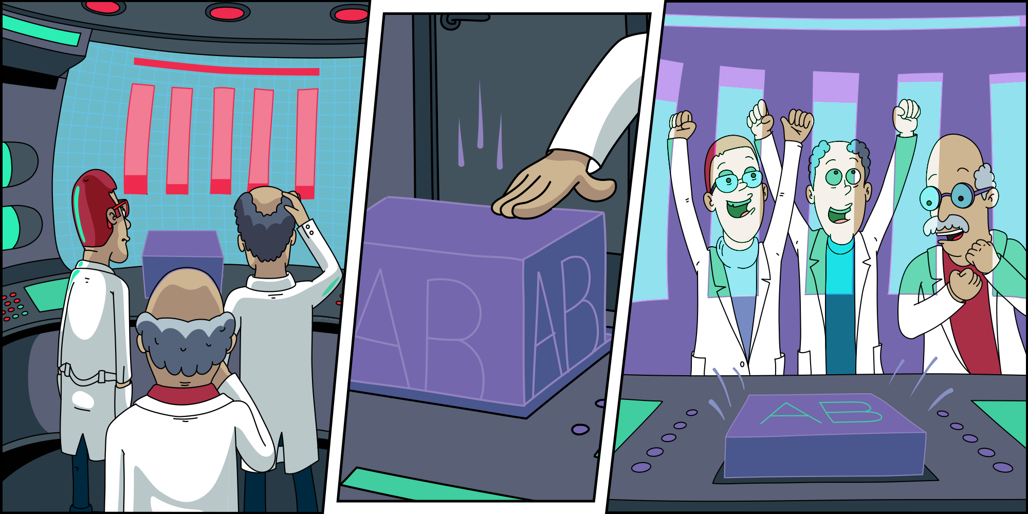
How does A / B testing in Avito
Hello. My name is Daniel, I work in a team that develops the analytical infrastructure in Avito. A / B testing is central to this infrastructure.
A / B experiments are a key decision-making tool in Avito. In our product development cycle, the A / B test is a mandatory step. We test every hypothesis and roll out only positive changes.
We collect hundreds of metrics and are able to drill them down to business sections: verticals, regions, authorized users, etc. We do this automatically using a single platform for experiments. In the article I will describe in some detail how the platform is arranged and we will dive into some interesting technical details.
The main functions of the platform A / B we formulate as follows.
- Helps to quickly run experiments.
- Controls unwanted intersection experiments
- Counts metrics, stat. tests, visualizes the results
In other words, the platform helps to make quick and accurate decisions.
If you leave out the process of developing features that are sent to testing, the full cycle of the experiment looks like this:

- The customer (analyst or product manager) configures the experiment parameters through the admin panel.
- Split service, according to these parameters, distributes the required A / B group to the client device.
- User actions are collected in raw logs that go through aggregation and turn into metrics.
- Metrics are “run” through statistical tests.
- Results are visualized on the internal portal on the day after launch.
All data transport in a cycle takes one day. Experiments usually last a week, but the customer receives an increment of results every day.
Now let's dive into the details.
Experiment Management
In the admin to configure the experiments using the YAML format.

This is a convenient solution for a small team: the refinement of the capabilities of the config goes without a front. The use of text configurations simplifies the work for the user: you need to make fewer mouse clicks. A similar solution is used by the Airbnb A / B framework ).
To divide traffic into groups, we use the common salt hashing technique.
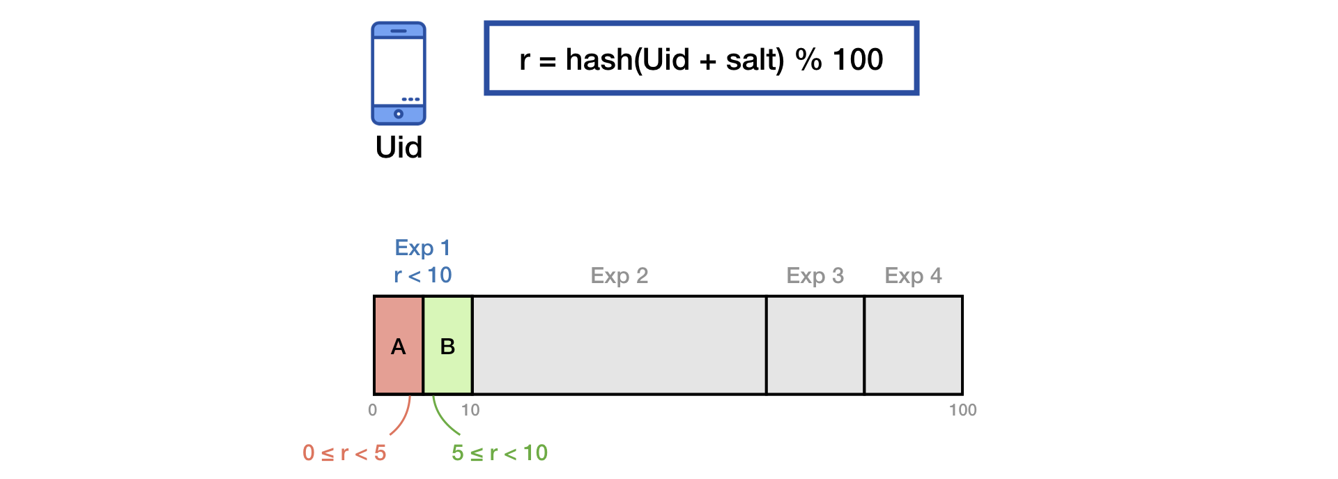
To eliminate the effect of the “memory” of users, when starting a new experiment, we do additional mixing with the second salt:
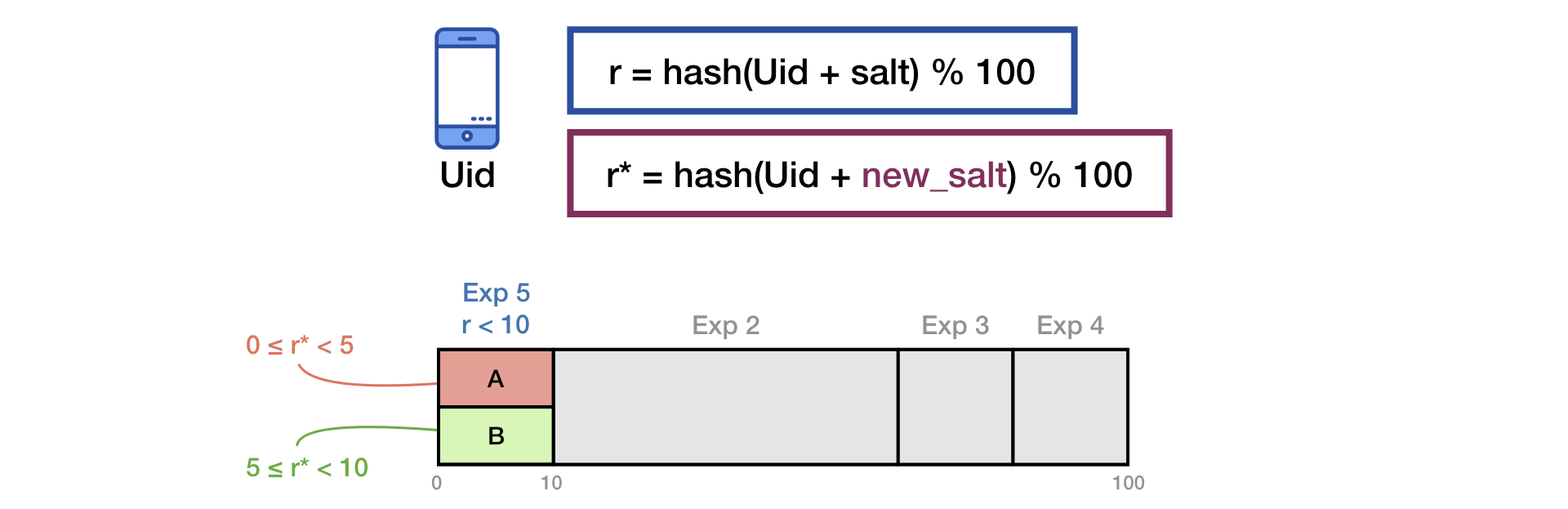
The same principle is described in the presentation of Yandex .
In order to avoid potentially dangerous intersections of experiments, we use logic similar to “layers” in Google .
Metrics collection
We lay out raw logs in Vertica and aggregate into spreadsheets with the structure:

Observations are, as a rule, simple event counters. Observations are used as components in a metric formula.
The formula for calculating any metric is a fraction, the numerator and denominator of which is the sum of observations:

In one of the reports of Yandex, metrics were divided into two types: by users and Ratio. There is a business sense in this, but in the infrastructure it is more convenient to consider all metrics uniformly in the form of Ratio. This generalization is valid because the “pointer” metric is obviously representable as a fraction:

We summarize the observations in the numerator and denominator of the metric in two ways.
Simple:

This is the usual sum of any set of observations: the number of searches, clicks on ads, etc.
And more difficult:

A unique number of keys, grouped by which the sum of observations is greater than the specified threshold.
Such formulas are easily defined using the YAML-config:

The groupby and threshold parameters are optional. Just they determine the second method of summation.
The described standards allow you to configure almost any online metric that you can think of. At the same time, simple logic is preserved, which does not impose an excessive load on the infrastructure.
Statistical criterion
We measure the significance of deviations by metrics using classical methods: T-test , Mann-Whitney U-test . The main prerequisite for applying these criteria is that the observations in the sample should not depend on each other. In almost all of our experiments, we believe that users (Uid) satisfy this condition.

Now the question arises: how to conduct T-test and MW-test for Ratio-metrics? For T-test, you need to be able to consider the variance of the sample, and for MW, the sample must be “by the switch”.

Answer: you need to decompose the Ratio in a Taylor series to the first order at the point :

This formula converts two samples (numerator and denominator) into one, keeping the mean and variance (asymptotically), which allows the use of the classic stat. tests.

A similar idea colleagues from Yandex called the method of linearization Ratio (performances one and two ).
Scale performance
Use of CPU quick stats. criteria makes it possible to spend millions of iterations (comparisons treatment vs. control) in minutes on a completely normal server with 56 cores. But in the case of large amounts of data, performance rests primarily on storage and read time from disk.
The calculation of Uid metrics daily generates samples with a total size of hundreds of billions of values (due to the large number of simultaneous experiments, hundreds of metrics and cumulative accumulation). Every day it’s too difficult to remove such volumes from the disk (despite the large cluster of the Vertica column base). Therefore, we are forced to reduce the cardinality of the data. But we do it almost without losing information about the dispersion using a technique that we call “Buckets”.
The idea is simple: we hash Uids and, based on the remainder of the division, “scatter” them into a number of buckets (we denote their number by B):

Now go to the new experimental unit - bakt. Observations in the bake summarize (numerator and denominator independently):

With such a transformation, the condition on the independence of the observations is fulfilled, the value of the metric does not change, and it is easy to check that the variance of the metric (the average for the sample of observations) is preserved:

The more buckets, the less information is lost, and the less error in equality. In Avito, we take B = 200.
The density of distribution of the metric after the bake conversion always becomes similar to normal.
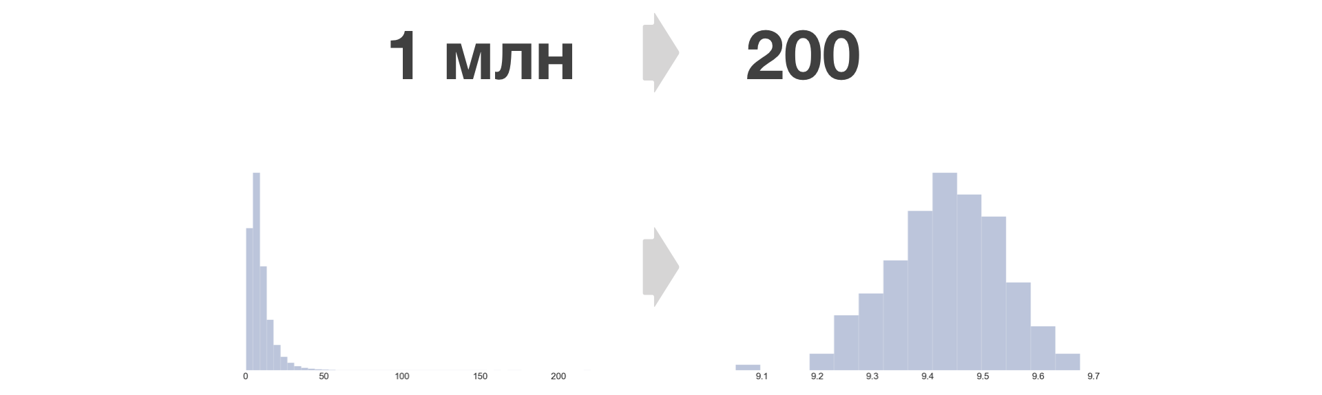
Arbitrarily large samples can be reduced to a fixed size. Growth in the amount of stored data in this case depends only linearly on the number of experiments and metrics.
Results visualization
As a visualization tool, we use Tableau and a web view on the Tableau Server. Every Avito employee has access there. It should be noted that Tableau handles the task well. Implementing a similar solution using a full-fledged back-front development would be a far more resource-intensive task.
The results of each experiment are a sheet of several thousand numbers. Visualization should be such as to minimize the wrong conclusions in the case of the implementation of errors of the I and II kind , and not to “overlook” changes in important metrics and sections.
First, we monitor the “health" metrics of the experiments. That is, we answer the questions: "Is the number of participants" equal "poured" into each of the groups? "," Is there an equal number of authorized or new users? ".
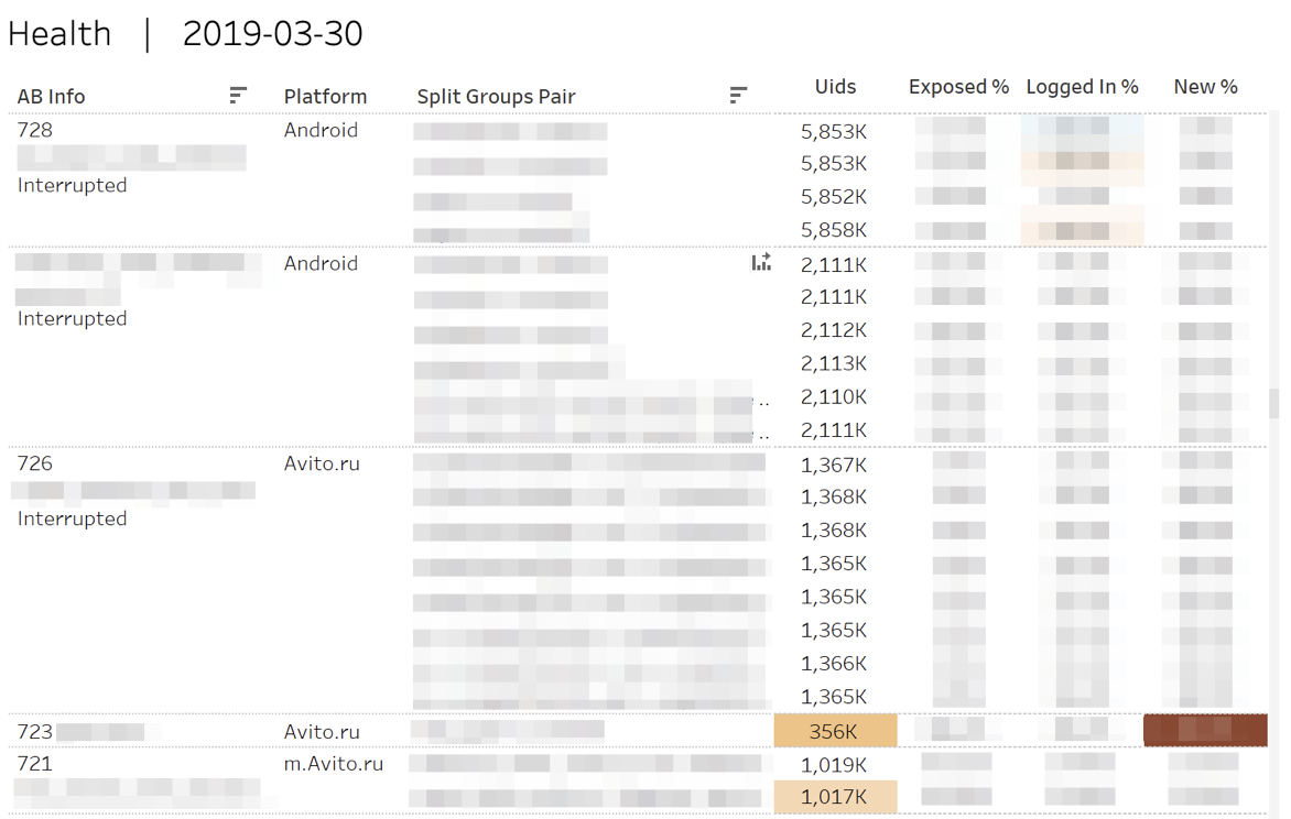
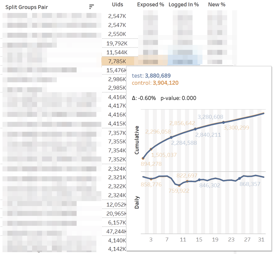
In the case of statistically significant deviations, the corresponding cells are highlighted. Hovering over any number displays cumulative daily dynamics.
The main dashboard with metrics looks like this:
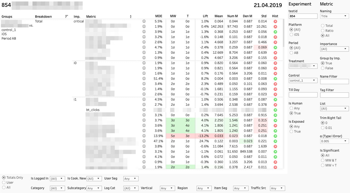
Each line is a comparison of groups on a specific metric in a specific section. On the right is a panel with filters for experiments and metrics. Below - a panel of filters on the cuts.
Each metric comparison consists of several indicators. Let us analyze their values from left to right:
1. MDE. Minimum Detectable Effect

And β are preselected probabilities of errors of types I and II. MDE is very important if the change is not statistically significant. When making a decision, the customer should remember that the absence of a stat. significance is not equivalent to the absence of effect. Sure enough, we can only say that the possible effect is no more than MDE.
2. MW | T. Results Mann-Whitney U- and T-test
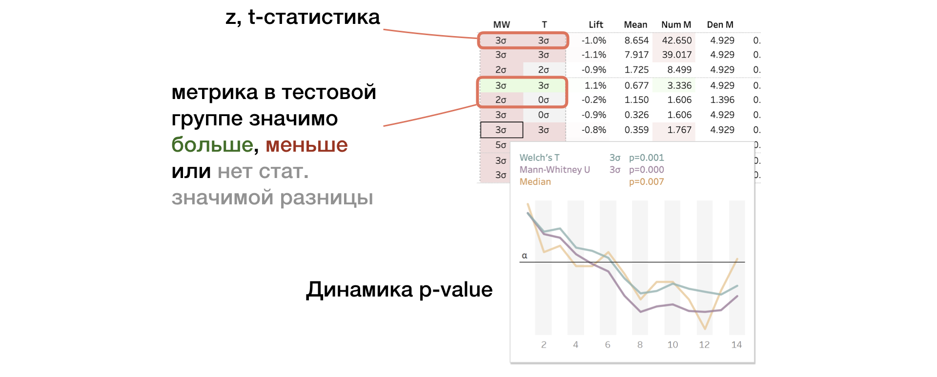
The panel displays the value of z-and t-statistics (for MW and T, respectively). In tooltip - p-value dynamics. If the change is significant, the cell is highlighted in red or green depending on the sign of the difference between the groups. In this case, we say that the metric is “painted over”.
3. Lift. Percentage difference between groups

4. Mean | Num | Den. The value of the metric, as well as the numerator and denominator separately
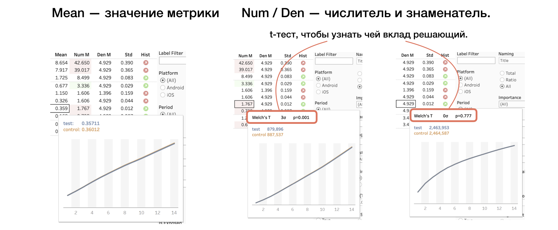
We apply another T-test to the numerator and denominator, which helps to understand whose contribution is decisive.
5. Std. Selective Standard Deviation
6. Hist. Shapiro-Wilk test for normal "bake" distribution.
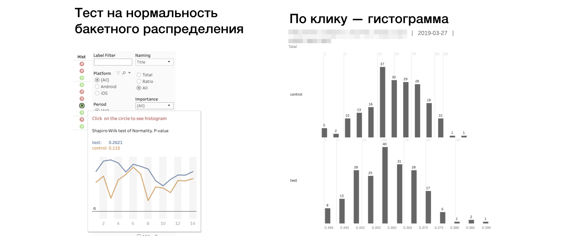
If the indicator is red, then there may be outliers or an abnormally long tail in the sample. In this case, the result for this metric should be taken carefully, or not taken at all. Clicking on the indicator opens the histograms of the metric by groups. By the histogram, anomalies are clearly visible - it is easier to draw conclusions.
Conclusion
The advent of the A / B platform in Avito is a turning point when our product began to grow faster. Every day we accept green experiments that charge the team; and "red", which provide useful food for thought.
We managed to build an effective A / B testing system and metrics. Often we solved complicated problems with simple methods. Due to this simplicity, the infrastructure has a good margin of safety.
I’m sure those who are going to build an A / B platform in their company have found some interesting insights in the article. I am pleased to share with you our experience.
Write questions and comments - we will try to answer them.
')
Source: https://habr.com/ru/post/454164/
All Articles