Development of an online store to preserve the nature of Kamchatka
How to develop an online store, whose main goal is not revenue, but help to nature? A store where there are no screaming banners, super-actions and lists of advantages, but there are quality products and the big idea is a responsible attitude to the environment.
Movement for the preservation of the environment, fair working conditions and equal rights can be called the trend of the 21st century. Brands that adhere to these same values are today associated by consumers with high quality, environmental friendliness, and uniqueness. Such brands are called socially responsible. According to a global survey by Nielsen, 62% of Russians are ready to change their habits in order to preserve the environment.
Demand creates supply, therefore in Russia there are more and more companies that focus not on the product, but on the idea of caring for nature. And marketing for such companies requires a completely different one.
')
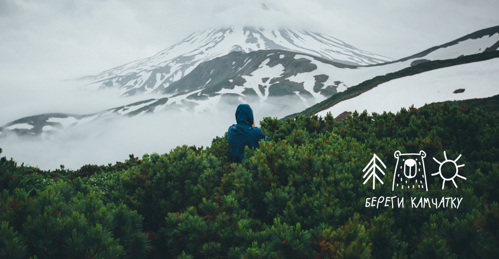
The creators of the project “Protect Kamchatka” Taras and Tatiana Sharyga addressed us. He created this brand with his wife Tatiana. If you look at the project site, it is immediately difficult to give an unequivocal answer, what “Take care of Kamchatka” is doing - this is both a photoblog about the beauty of nature, non-consumerism towards it, and the personal story of two people who have found each other, and their own clothing brand with author’s drawings. In addition, part of the funds from each item sold goes to the fund of the Kronotsky Biosphere Reserve, with which the project plans to refine several rookeries for sea lions - sea lions - in Kamchatka. Therefore, the language does not turn to call "Take care of Kamchatka" as an ordinary online store.
Working on this project, we, of course, broke our heads.

Starting point - to the store for inspiration.
The project already had a site on Tilda, which created some technical limitations. We needed to build a new solution from scratch, on a more flexible CMS and in a fresh design. Tatiana and Taras needed a site on which it is convenient to add new content, whether it be articles or collections of clothes. For visitors, it had to become a place where one wanted to return - for new stories about Kamchatka, for gifts for oneself and close people, for photos and inspiration. The site was supposed to inspire good deeds no less than the social network project.

Page "Take care of Kamchatka" on Instagram
It was an interesting task - just humanly and from a technical point of view.
Design of the project - warmth and freedom
For many residents of Central Russia, Kamchatka is associated with something unattainably distant. In developing the site, we wanted to make it closer, more accessible to all. Atypical aspiration, if you are developing an online store, right?
A bet made on the visual part. The founders have a lot of high-quality photographic materials about Kamchatka, accumulated during their travels around the peninsula. Tatiana herself draws prints for clothes and also created the company logo herself. These elements we used in the design. As a result of the combination of illustrations, photographs created by the founders of the project, and our experience in the development turned out the site at the intersection of technology and free creativity. Visitors feel the warmth and freedom that this approach has allowed us to invest in this online store.
Basic design elements
- Huge photos from edge to edge of the screen
- Navigation elements - light and contour, so that nothing distracts.
- Photos for each block. Where appropriate - did responsive animation.
- The big widgets of social networks on the main page - “Beregi Kamchatka” publishes amazing content.
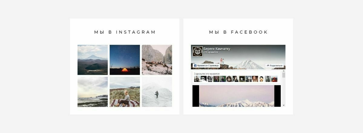
We wrapped up the social network widgets in such a way that they harmonize with the page design. For Instagram, we bought LightWidget and tuned it up, and for Facebook, we took the standard one and customized it for a responsive design.
“Take care of Kamchatka” has a large loyal audience. So that it expands, we added a subscription form to the newsletter. Many will want to leave their email in order to be the first to know about the project news, to receive alerts about new collections and articles in the blog.
Development and integration - taking care of the user
Although, at first glance, the commercial component is not the main thing on this site, it was important to make a quality online store. The weightlessness and spirit of freedom that we conveyed in the design could easily destroy the careless attitude to the user's needs.
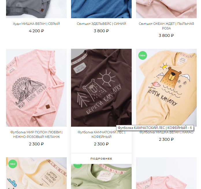
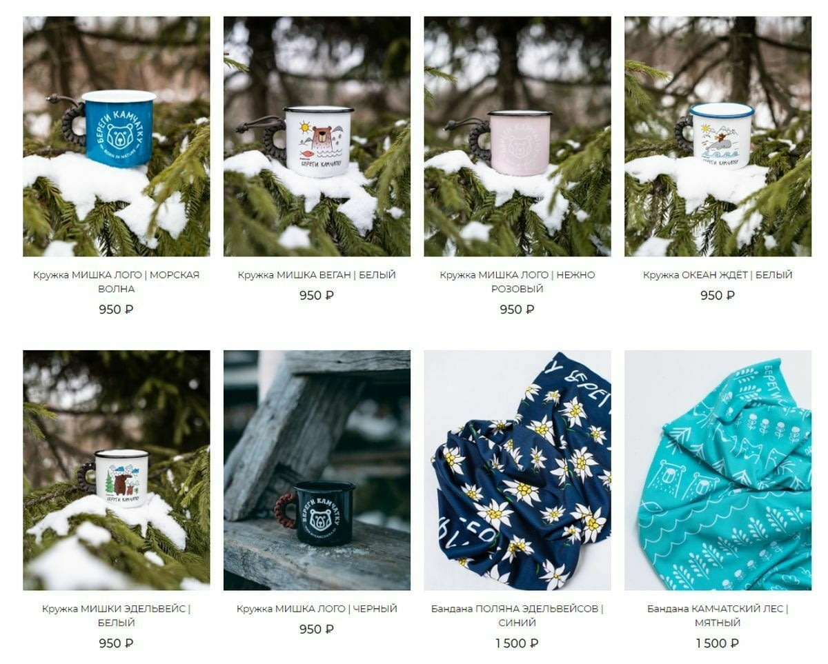
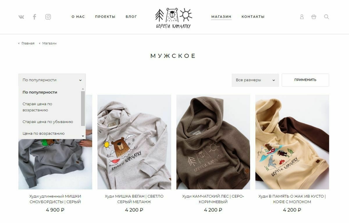
Therefore, we have created a convenient design of the list of products, the most vivid and concise.
Modified the standard sorting panel.
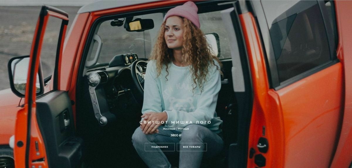
On the product detail page, a large block with a photo gallery was displayed - for each product a whole photo album is loaded, everything can be increased and viewed. In the photo, by the way, Taras and Tatiana themselves.
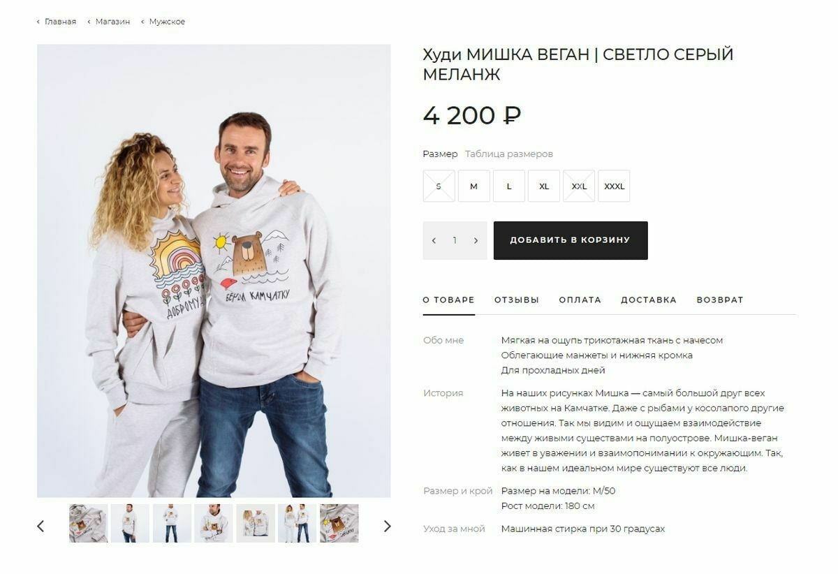
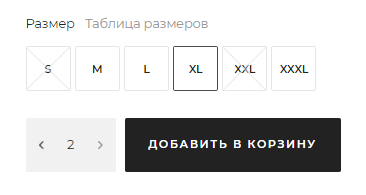
Clever table of the sizes and the full information on the goods
Provided a table of sizes, placed the main characteristics of the goods. For the convenience of customers, information on payment, delivery and return was added to each product.
Like any clothing store, “Beregi Kamchatka” does not always have all the sizes available. Therefore, we have programmed the ability to specify in the administration system how many items are left in each size. This information is used in the public part for users - you cannot add more goods to the cart and pay for them than they actually exist.
It could have seemed a trifle to some people - they would have given up on it: “Then we will sort it out, replace it or return the money.” But not in our case. Any inconvenience will leave a residue, and all the good intentions of the founders will fade into the background. We take care of site visitors, even when they are not aware of this.
Delivery aggregator
We also connected the eDost delivery methods aggregator, which appears at the checkout stage. The buyer specifies his data, and depending on the chosen city, he is offered a drop-down list of all possible types of delivery (including international) with their price. After selection, the price is automatically added to the order amount, which is convenient for both the site owner and the buyer.
Publication and results of the project
In total, all the works took about three months - the time from the initial receipt of information to the final publication of the approved result. Given the custom design, improvements and the need to fill the site - this is a reasonable time.
The team employed two project managers, art director, interface designer, frontend developer, two backend developers, two testing specialists.
Money and labor:
Commercial projects often fail due to insufficiently developed strategies for interacting with a potential buyer. Today, typing any combination of letters in the address bar, you are likely to get to the online store. Competition in the field of online sales just mad.
| Budget | 160 000 rubles |
| Development time | 60 working days |
One mistake - and your visitor will go where it is more convenient, cheaper, wider choice. The double responsibility lies with the founders of “Beregi Kamchatka”.
- First, like any commercial project, it must be profitable.
- Secondly, the founders committed themselves to helping the reserve, and without sales on the website and payments to the reserve fund, the risk of sea lions disappearing will only increase.
Every little thing matters, because we tried to provide the most comfortable user interface - from entering the site to making a purchase - filling it with freedom and the atmosphere of the protected Kamchatka.
The experience of this project has shown that some of the implemented user functions are perfect for any site, and they need to be built into the basic configuration of our CMS, so that sites with a large number of useful functions would cost our customers less.
Working with such good, socially responsible projects always inspires, I want to become better myself, to be more attentive and caring.
Take care of nature and make good sites :)
Source: https://habr.com/ru/post/454110/
All Articles