How we created an online bank for business. Part One: Rebranding
This is the first article about the history of creating an online bank for business. Stories that I am incredibly proud of and which I want to share not only with my Fintech colleagues, but also with entrepreneurs.
Two years ago, I joined the ForBank team and led the development of online services interfaces: UX / UI Internet Banking, mobile applications and the site. Our goal was to digitize all the services of a classic bank, starting with the opening of an account and enter the top five online banks for entrepreneurs.
')
In January 2018, we released the first version of the Internet bank, developing it from scratch in six months, and in the summer we launched the process of remote opening of a current account. We have become the fourth online bank in the country working remotely with a business.
But it all started with a complete change of corporate identity.
Let's deal with the concept itself. Simply put, rebranding is a combination of internal and visual changes of the company associated with the new positioning. You change the product to the needs of a new audience, change business processes and, of course, reflect these changes in the new logo, slogan and corporate style in general.
At some point, the bank decided to become a digital platform, and for this, a classic bank needs to restructure its DNA, which in the corporate world means rebranding.
You do not need to be a marketer to understand the relevance of rebranding for ForBank:
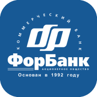
Once such a logo and color solutions were modern and even successful, but not today.
The usual practice of offline banks in such cases is the creation of a separate structure and the output of a digital platform under a new brand. But the name “ForBank” sounded quite modern, and a good reputation was earned for decades - there was no point starting from scratch.
Corporate identity is a graphic expression of how one company differs from others. Looking at the visual elements of your brand, customers should experience the emotions that you want them to cause.
At the heart of corporate identity is the logo. And now I will show you how we created it.
First of all, they compiled a list of words and meanings with which the logo should be associated (and therefore the brand): reliability, originality, modernity, honesty, purposefulness, activity, persistence.
We proceed to the visual part. Take the letter “F” from the name of the bank and begin to “twist” it:

At some point, they saw that an unsuccessful type looks like a sign of infinity. Very strong character:

For a sign need a background. We take the first part of the name ForBank and the brain creates an association with the number “4". The four is a square, the square is too simple a figure for our products, therefore we take a cube:

And what if you turn the cube ...

The result is a honeycomb, and a honeycomb honeycomb is also a very strong symbol! In nature, a hexagon is one of the most durable and capacious geometric figures - the maximum volume at the lowest cost. Stylized to infinity "F" and the most durable figure. Perfect hit:

Draft ready. Postpone it and pick up the font style. This process is not so interesting, you simply go through a hundred fonts and are looking for the most suitable logo. We chose this option:
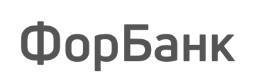
A harmonious grotesque — both strict and friendly at the expense of rounding. Now we connect the graphic part with the font, add emphasis to impart dynamics (remember the “activity” and “purposefulness” in the semantic core) and see what happened:

The logo itself turned out to be so successful that there was no dispute over it at all, which cannot be said about the choice of color:
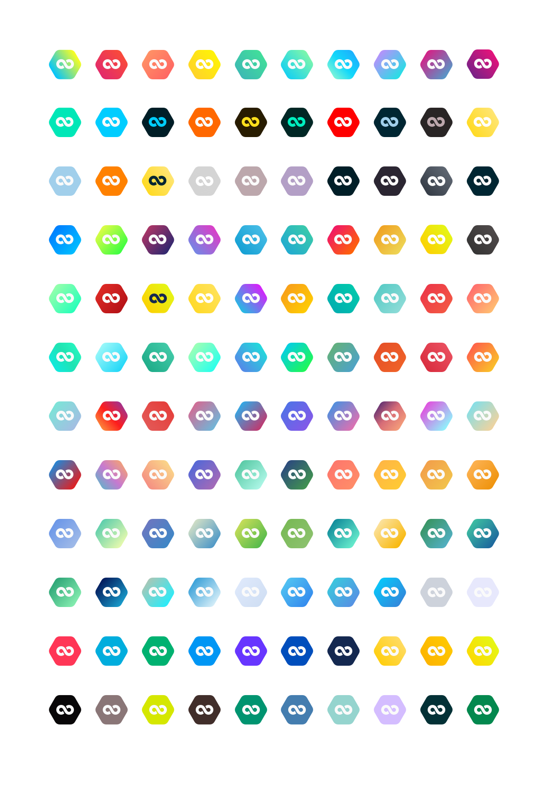
There are several flowers “occupied” by large banks. For example, if you say “yellow bank”, everyone will immediately think about who you know. The same with green, red and blue. Personally, I liked two options: a green-yellow gradient and yellow:
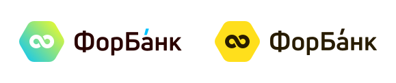
Green-yellow was rejected for the similarity with the colors of one of the online banks, while yellow was missed into the final vote along with fiery and blue (purple was brought out of the competition, since it is almost not used in banks and this is important - originality):
By the decision of the majority of votes, a fiery-flaming version was chosen:

At the last moment we changed the direction of the line of the sign of infinity to aspire
oh up.
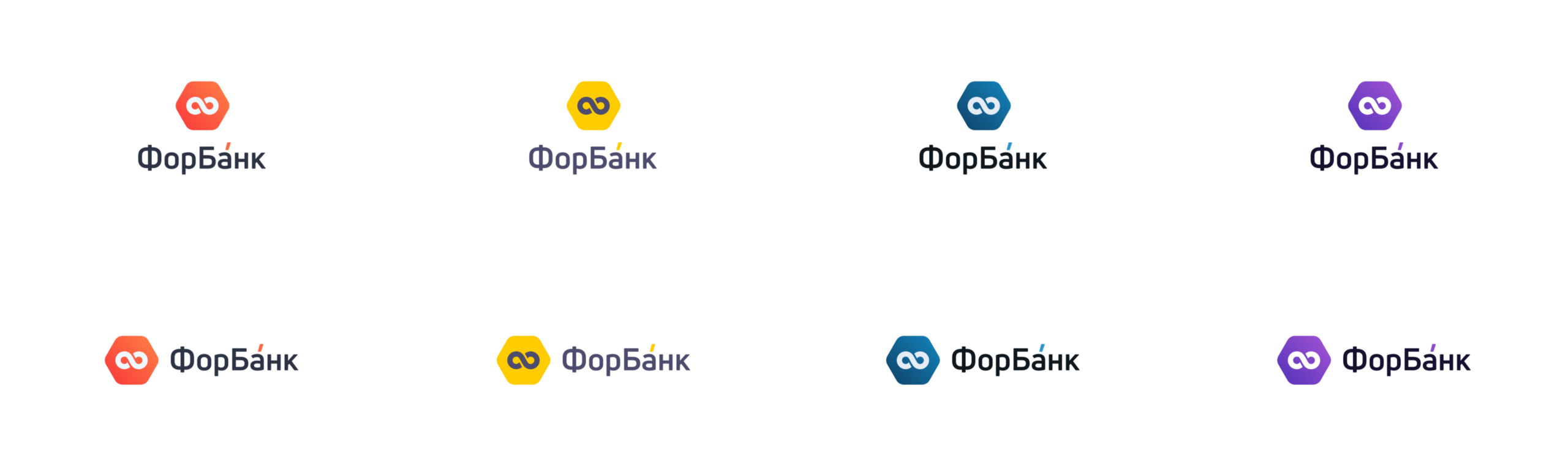
“Fiery-fiery” we called him for a reason. In search of a better color combination, stumbled upon this image:
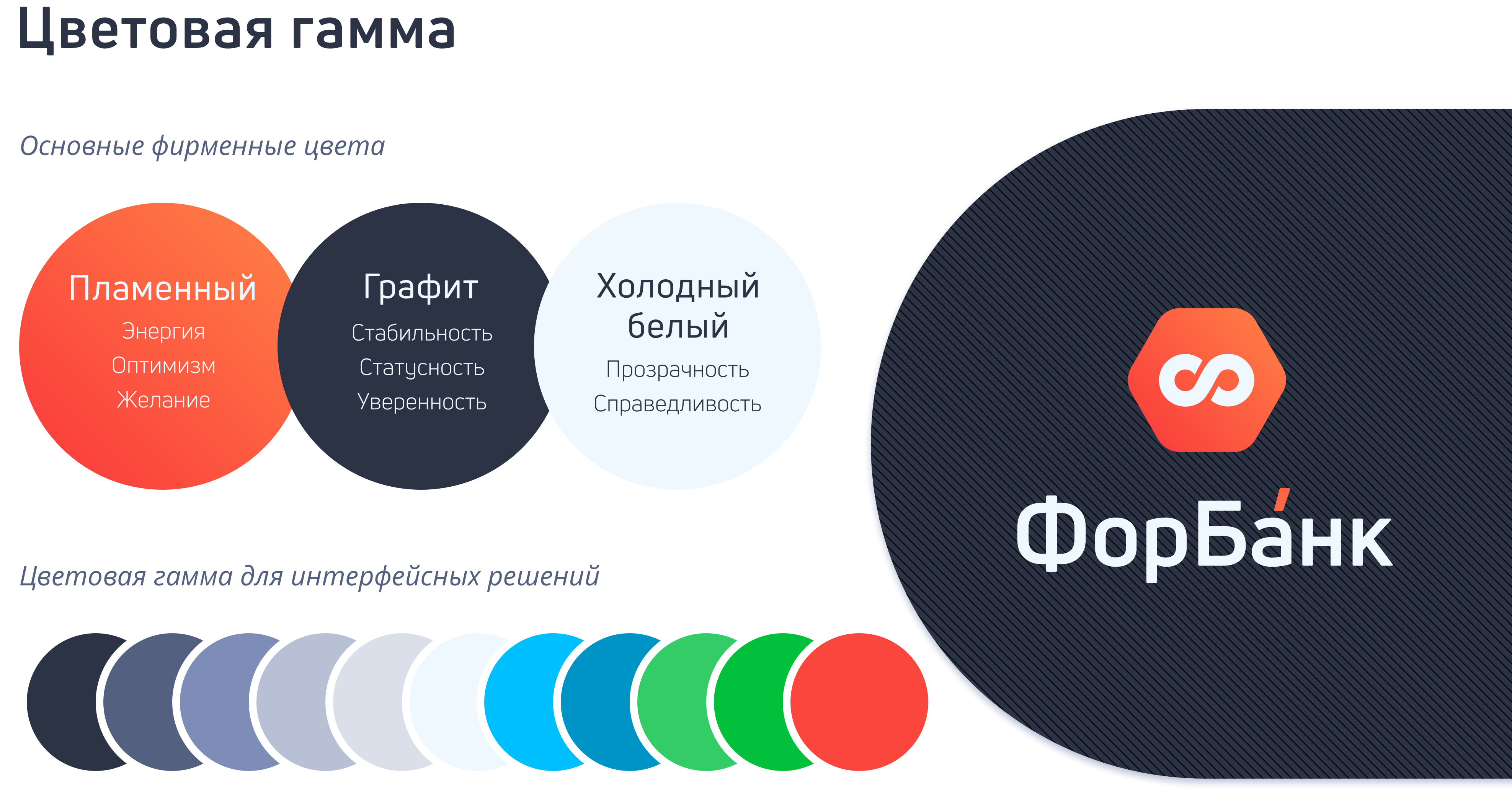
Lava has become the main color of the logo, the ashes turned into a font. Even lightning has become part of the corporate identity - “cool white” for various backgrounds:
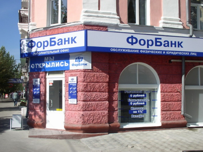
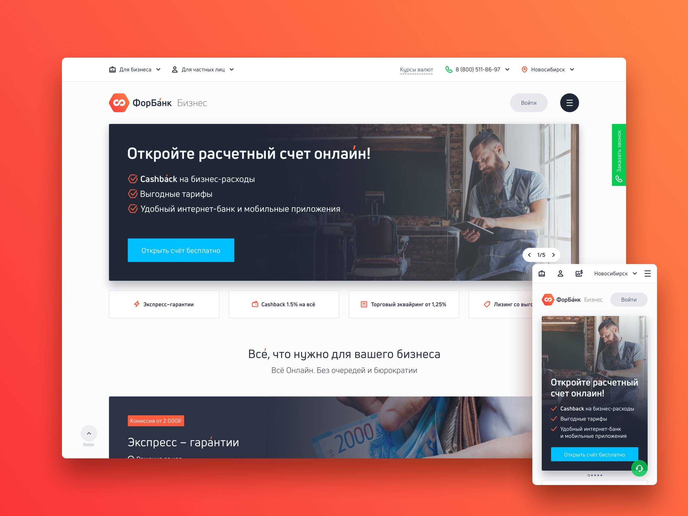
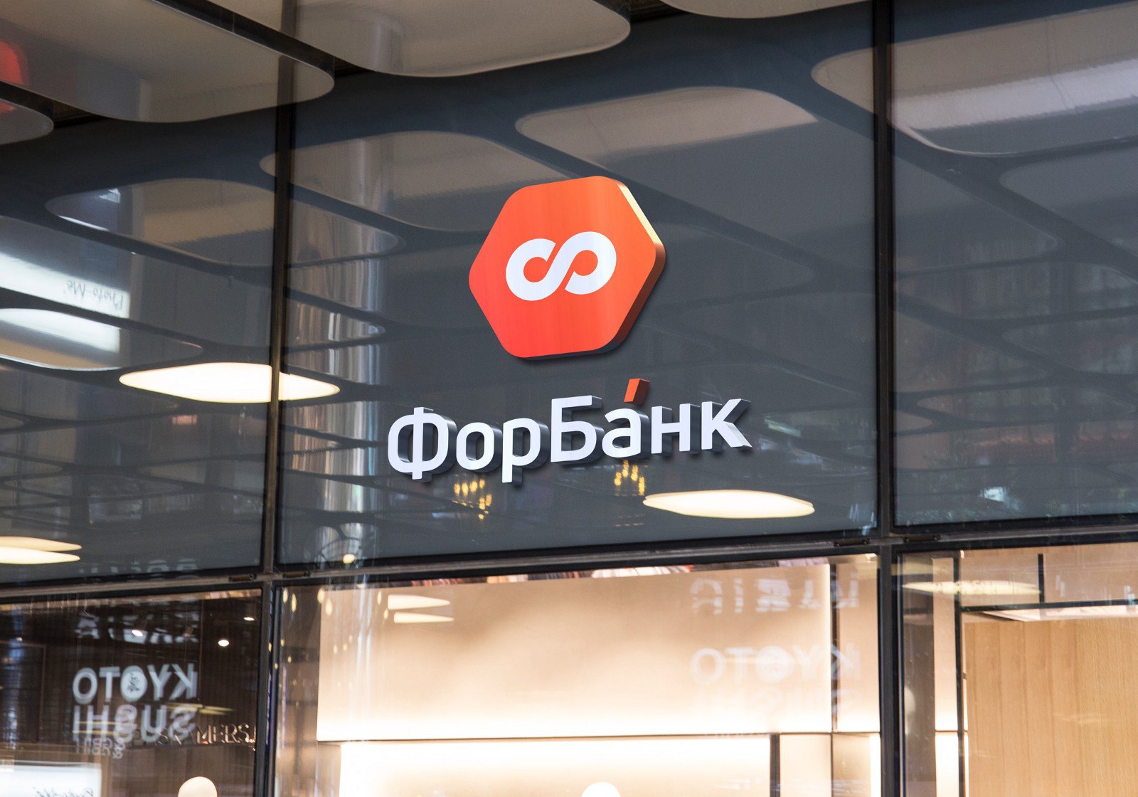
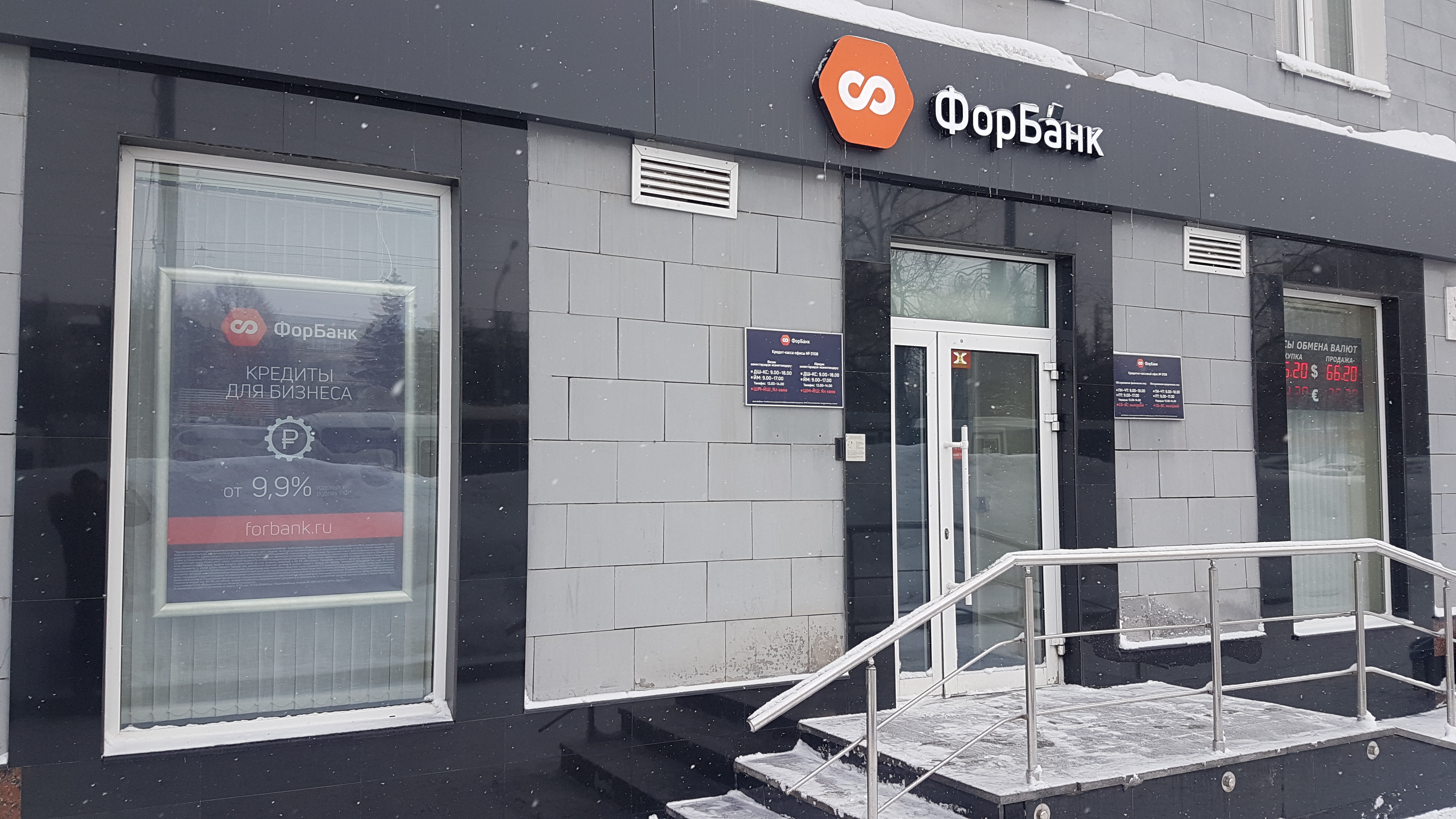
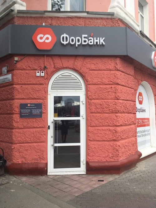
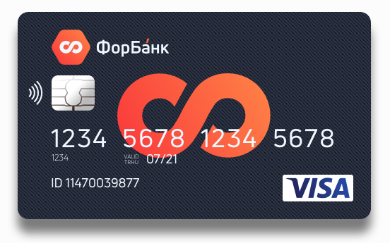
Step by step, we began to change the logo on all media: website, signs, business cards, bank cards.
I showed you a tenth of how the creation of corporate identity. This is a rather complicated, but very fascinating process. I hope you were interested too.
- Killer feature Forbank for entrepreneurs
- How we created an online bank
- The evolution of opening bank accounts in online banks
- Site development and the appearance of the first landing pages
Two years ago, I joined the ForBank team and led the development of online services interfaces: UX / UI Internet Banking, mobile applications and the site. Our goal was to digitize all the services of a classic bank, starting with the opening of an account and enter the top five online banks for entrepreneurs.
Information about the bank. JSCB “ForBank” has been operating in the market since 1992 and has been providing all types of services to legal entities and individuals. Nine cities of presence with the main office in Moscow. As of April 1, 2019, the bank ranks 228th in terms of assets and 169th in terms of net profit.
')
In January 2018, we released the first version of the Internet bank, developing it from scratch in six months, and in the summer we launched the process of remote opening of a current account. We have become the fourth online bank in the country working remotely with a business.
But it all started with a complete change of corporate identity.
Rebranding Reasons
Let's deal with the concept itself. Simply put, rebranding is a combination of internal and visual changes of the company associated with the new positioning. You change the product to the needs of a new audience, change business processes and, of course, reflect these changes in the new logo, slogan and corporate style in general.
At some point, the bank decided to become a digital platform, and for this, a classic bank needs to restructure its DNA, which in the corporate world means rebranding.
“What have we got here?”
You do not need to be a marketer to understand the relevance of rebranding for ForBank:
Once such a logo and color solutions were modern and even successful, but not today.
The usual practice of offline banks in such cases is the creation of a separate structure and the output of a digital platform under a new brand. But the name “ForBank” sounded quite modern, and a good reputation was earned for decades - there was no point starting from scratch.
Logo creation magic
Corporate identity is a graphic expression of how one company differs from others. Looking at the visual elements of your brand, customers should experience the emotions that you want them to cause.
At the heart of corporate identity is the logo. And now I will show you how we created it.
First of all, they compiled a list of words and meanings with which the logo should be associated (and therefore the brand): reliability, originality, modernity, honesty, purposefulness, activity, persistence.
We proceed to the visual part. Take the letter “F” from the name of the bank and begin to “twist” it:
At some point, they saw that an unsuccessful type looks like a sign of infinity. Very strong character:
For a sign need a background. We take the first part of the name ForBank and the brain creates an association with the number “4". The four is a square, the square is too simple a figure for our products, therefore we take a cube:
And what if you turn the cube ...
The result is a honeycomb, and a honeycomb honeycomb is also a very strong symbol! In nature, a hexagon is one of the most durable and capacious geometric figures - the maximum volume at the lowest cost. Stylized to infinity "F" and the most durable figure. Perfect hit:
Draft ready. Postpone it and pick up the font style. This process is not so interesting, you simply go through a hundred fonts and are looking for the most suitable logo. We chose this option:
A harmonious grotesque — both strict and friendly at the expense of rounding. Now we connect the graphic part with the font, add emphasis to impart dynamics (remember the “activity” and “purposefulness” in the semantic core) and see what happened:
The choice of corporate color
The logo itself turned out to be so successful that there was no dispute over it at all, which cannot be said about the choice of color:
There are several flowers “occupied” by large banks. For example, if you say “yellow bank”, everyone will immediately think about who you know. The same with green, red and blue. Personally, I liked two options: a green-yellow gradient and yellow:
Green-yellow was rejected for the similarity with the colors of one of the online banks, while yellow was missed into the final vote along with fiery and blue (purple was brought out of the competition, since it is almost not used in banks and this is important - originality):
Our new logo
By the decision of the majority of votes, a fiery-flaming version was chosen:
At the last moment we changed the direction of the line of the sign of infinity to aspire
oh up.
“Fiery-fiery” we called him for a reason. In search of a better color combination, stumbled upon this image:
Lava has become the main color of the logo, the ashes turned into a font. Even lightning has become part of the corporate identity - “cool white” for various backgrounds:
New life
Step by step, we began to change the logo on all media: website, signs, business cards, bank cards.
I showed you a tenth of how the creation of corporate identity. This is a rather complicated, but very fascinating process. I hope you were interested too.
Read in the following issues:
- Killer feature Forbank for entrepreneurs
- How we created an online bank
- The evolution of opening bank accounts in online banks
- Site development and the appearance of the first landing pages
Source: https://habr.com/ru/post/453778/
All Articles