Flexible tables on CSS Grid
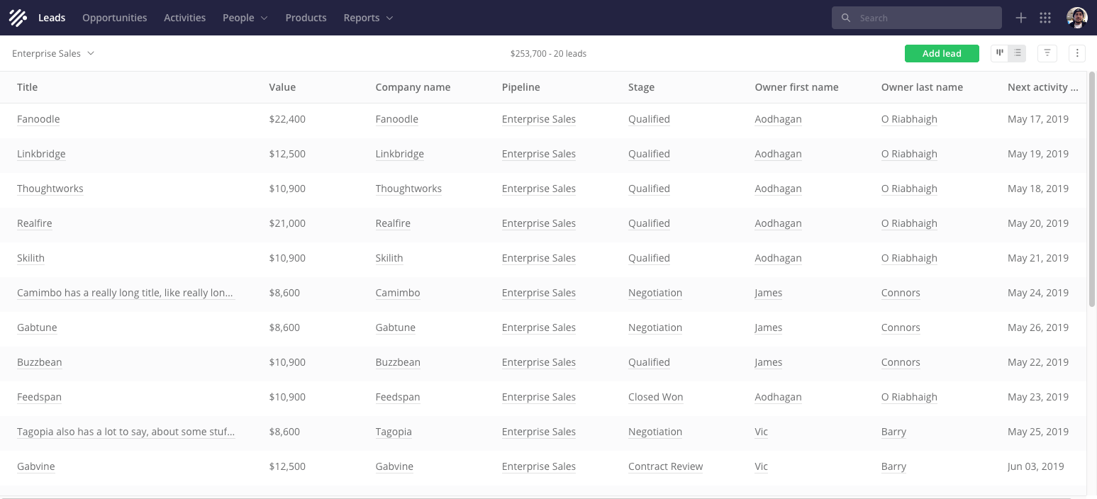
View a list of leads ("cold" contacts)
Since we have already started, I can finally tell you about a secret project that I have been working on for the last two years. One of the interesting features of Teamwork CRM is a list view.
This is a powerful component that occurs seven times in an application. In fact, the table on steroids. I could tell a lot, but do not want to bore you. Focusing on how we implemented this flexibility with just a few lines of CSS (Grid). Namely, how we lay out heavy data tables, how we support column resizing and more.
')
First, you need to explain the context, starting with the goal and objectives of the design of these tables. If this does not interest, feel free to go directly to the technical implementation .
First of all, our solution allows customers to quickly browse lists, for example, leads or contacts, and notice important details. This is not similar to an Excel spreadsheet — we better cope with data layouts if there are a lot of them.
Absolutely everything works in an adaptive, flexible design. We start with the narrowest option and customize the layout based on the content, design and use cases (we do not have device-oriented brekpoints).
At the minimum width of the screen, the columns are stacked vertically, occupying the entire width of the screen.
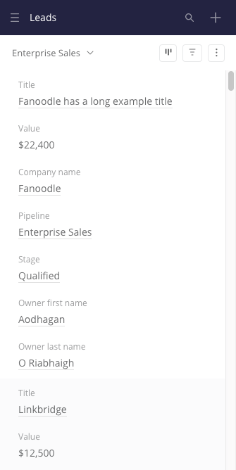
How the list looks on a narrow screen
Flexible tables are not easy to do. You can choose from several existing templates . Think about what information users are looking for, and choose wisely.
Once we have enough pixels on the screen, we switch to a more typical layout, so the speakers ... well, become the speakers. Then there are no major changes in the layout, but we still want to display the columns as conveniently as possible for the client.
Suppose we have a lot of columns (later we will look at how the user can customize them). First, the table should at least fill the width of the screen. Secondly, the width of the columns should be determined by their contents and type of values. For example, short / long text, date, number, URL, etc. Date columns should take up less space than long text columns.
The columns should have a minimum width. The result is often a table that scrolls both vertically and horizontally.
How the layout depends on the width of the window. Sorry for the tattered gif, later I will give a few interactive examples
Let's start with the fact that we are using the usual old school CSS for the table to the maximum. Then we improve it using CSS Grid. Then I will show how Grid users resize columns, which was much more inconvenient with regular CSS.
Well, show already CSS Grid
I'm not a CSS Grid expert, but I like him. This is an extremely powerful and simple tool that implements complex layouts with a minimal amount of code. Here I will skip the introduction to technology. You can read Rachel Andrew 's New CSS Layouts or the Complete Grid Guide . When you finish thinking about where this tool has been all your life, come back to me.
First, we apply
display:grid to <table> to turn the table into a grid. It will not break anything: if the browser does not support the Grid, then apply display:table . The <thead> and <tbody> elements become grid elements. We don't need to think about <thead> , <tbody> or even <tr> . We want to put our <th> and <td> on this grid by applying display:grid to each of them (i.e. the grids inside the grids), but this is not ideal. Each <tr> grid will be independent of the others, and this is not good (you will see later that the same problem with the Flexbox).A workaround is to use
display:contents on <thead> , <tbody> and <tr> . This basically removes them from the grid layout, pushing forward child elements ( <th> and <td> ).Then we use the
grid-template-columns magic rule to control the grid elements. Yes, just one line of CSS. For example, if we have a date column and a URL column, we’ll have something like this: grid-template-columns: minmax(150px, 1.33fr) minmax(150px, 2.33fr); We use the same minimum size for all columns, but the maximum value (
fr ) is determined by the data type of the column. I tried auto and max-content , but we came up with a better option. Here is a simplified example: an interactive table with code . Try resizing the window.Changing column widths with a grid
In addition, in our tables, you can swap, change the width and hide the columns. The latter is important because so many columns with different data types are supported: these are properties of the element itself (for example, leads), properties of related elements (for example, a company associated with a lead), and custom fields.
For example, a user can create a custom field (date) for contacts called “Date of birth”, which will be tracked in the system for each contact.
Since the creation of a custom field selects the type "Date", the system will process this field taking into account this type. First I will explain how the width changes.
- When the user hovers the cursor over a column heading, a resize handle appears on the right. We are listening to the
mousedownevent in the resize slider. - When the user clicks the slider, we bind a few more methods to listen for
mousemoveandmousedownevents (to thewindow). At this stage, we also add some classes for decoration. - When the user moves the mouse, we calculate the new width of the column, taking into account the position of the cursor, the scrolling position of the table and the set minimum. Then re-establish the
grid-template-columnsrule for<table>(via thestyleattribute), this time replacing the maximum value (fr) with the pixel one. For example,grid-template-columns: minmax(150px, 1.33fr) 296px;. This is done usingrequestAnimationFrameto provide as smooth animation as possible. - When
mouseuparrives, we cancel event listeners and remove classes.
Try on this simplified example .
It's great to update only one item in the DOM, and not every cell.
We always develop UI with touch input, but in this case it’s quite normal not to support it. This is too precise an action. Even if I wanted to change the size of the touchscreen column, I would probably expect another interaction, for example, through a multitouch gesture.
Fixed-width speakers
You may have noticed that something was silent. In fact, the width of not one, but all columns changes. Maybe you didn’t even notice this, because this is how it should work.
Initially, I thought users would like it: when they stretch or squeeze the columns, others also adjust. If the columns beautifully fill the width of the screen, and you narrow one of them, then the others can expand if there is content there that does not fit in one line. Try this example .
But after a little user testing, it turned out that for people this is unexpected behavior. The user feels some loss of control when his actions cause unpredictable side effects.
We should not make assumptions on the basis of the columns with which the interaction occurred, and with which not. When resizing one column, the user could already make an implicit decision that the width of the rest is perfect.
Therefore, if you open the application for the first time, the columns are laid out in an optimal way. If you change the screen size, the columns also change according to the same principle. As soon as you touch the slider to resize any column, the width of all visible columns is fixed.
Before, during and after changing the width of the column. Again, I apologize that the gif is twitching a bit
Each time a column is resized or fixed, we create an independent localStorage entry that maps the column identifier to the pixel value in order to preserve the user settings.
I can not remember exactly why we decided to set a fixed value in pixels, and not an adaptive option. Maybe for simplicity. Or because, in the absence of Grid and
display:contents support, there is a rollback to a more archaic approach to setting the width of columns.Probably, the adaptive option in any case will not correspond to the intentions of the user. We cannot assume that the most important thing for him is to make all the columns smaller so that they all remain on the screen. If a person has changed the width of a column, he wants to see a certain amount of content in this column. If we have an adaptive block, and then it narrows in a smaller window, then we ignore the choice of the person. He will have to change the width of the column again to see the same content. It is unlikely that the user thinks: "Hmm, I want this column to occupy 20% of the window, even if I change it." However, I’m too deep into a borderline situation: in fact, users rarely change the size of windows.
Moving and deleting columns

Interface for customizing displayed columns
Imagine a user changing a set of columns through this interface. If none of the selected columns has changed before, they will be displayed using the default
grid-template-column values depending on the data type. For example, minmax(150px, 3.33fr) .If the width of a column is fixed in localStorage, we fix the width of all the selected columns and also store these values in localStorage.
Over time, more and more columns retain a fixed width. For users, the only way to return to responsive design is to reset the columns.
We also store an array of column identifiers in localStorage, separate from the width entries.
“Why didn't you just use {{libraryName}}?”
With the JavaScript library, the solution will be cumbersome, jerky, will not provide interactivity, and may not even support the <table> at all. I also did not want to write something like that. I thought, "There must be a better way."
“Why didn't you just use the Flexbox?”
Each row will be evaluated / displayed independently of each other. The column may not be aligned with the column above due to the different contents of the column.
I could switch to <div> 's for columns with vertical grouping of cells inside. But did not want to do this. I wanted to use <table>. In addition, we could easily encounter other problems: for example, the mismatch of the cells in height between the columns.
“Why didn't you just use <colgroup> ?”
Indeed, <colgroup> is a convenient old element. After defining columns with <col>, styles applied to one will be effectively applied to all the cells in that column.
But this turned out to be a too limited solution. We tried, but very quickly abandoned it. So fast that I can no longer remember exactly what the problems were. I am almost sure that it was impossible to achieve the desired level of adaptability and it did not work with Flexbox and Grid.
“Why didn't you just use table-layout: fixed?”
I could apply a
table-layout: fixed rule to <table> and set the width of the columns in percent. But looking at the examples and playing with this rule, it seemed that it works only on tables with a width of 100%. In addition, changing the size of one column causes the size of the other columns to change to a total of 100% of the width.“But you could do with simple tables!”
Yes, the tables out of the box are capable of many clever things, but they cannot effectively support everything that I wanted to implement. Do not agree? Well, wizard, teach me.
Do not overdo it with display: contents
The
display: contents value allowed to save the table layout. Use it only when you really need it. Some browsers have or at least have accessibility problems and screen readers.We found a strange
display: contents bug with native drag and drop in Firefox.Fortunately, the subgrid function will be released soon, which will allow child elements to be properly embedded in the grids. In our application, we only want to simplify the markup, but the subgrid will open the doors to wild multidimensional grid orgies. See “Why display: contents is not a CSS Grid Layout subgrid . ”
I guess I forgot something
It seems there was still a problem with the overflow of the text when the size of the columns was changed, but I don’t remember exactly.
To save the table headings when scrolling down, we use
position: sticky . This is a great improvement, and it degrades well in older browsers. However, for IE11 users, we have backup javascript. In fact, I would not recommend position: sticky due to difficulties with horizontal scrolling.I didn't even mention some of the features of our list views. For example, users can apply, save and share custom filters (for example, show leads above $ 500 with potential customers in Europe). In these filters, you can memorize a set of columns to always display specific columns for a particular workflow.
Soon we are going to implement bulk editing in the list view, as well as export the custom view to CSV.
Anyway, thanks for reading.
Source: https://habr.com/ru/post/452922/
All Articles