The classification of land cover using eo-learn. Part 2
The classification of land cover using eo-learn. Part 2
Moving from data to results without leaving your computer
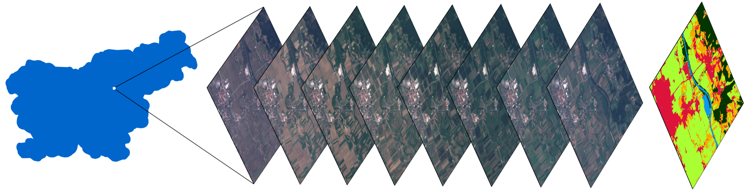
A stack of images of a small zone in Slovenia, and a map with a classified cover of land, obtained using the methods described in the article.
Foreword
The second part of a series of articles about the classification of land cover using the eo-learn library. We remind you that in the first article the following was demonstrated:
- The division of the AOI (area of interest) into fragments called EOPatch
- Acquire images and cloud masks from Sentinel-2 satellites
- Calculation of additional information, such as NDWI , NDVI
- Creating a reference mask and adding it to the source data
In addition, we conducted a superficial study of the data, which is an extremely important step before the start of immersion in machine learning. The aforementioned tasks were supplemented with an example in the form of a notebook of Jupyter Notebook , which now contains material from this article.
In this article, we will complete the data preparation, as well as build the first model for building land cover maps for Slovenia in 2017.
Data preparation
The amount of code that is directly related to machine learning is rather small compared to the full program. The lion's share of work consists in clearing data, manipulating data in such a way as to ensure seamless use with the classifier. Further this part of work will be described.

The machine learning pipeline diagram, which shows that the code itself using ML is a small part of the whole process. A source
Cloud Filtering
Clouds are entities that usually appear on a scale larger than our average EOPatch (1000x1000 pixels, 10m resolution). This means that any area can be completely covered with clouds on random dates. Such images do not contain useful information and only consume resources, so we skip them, based on the ratio of valid pixels to the total number, and set the threshold. We can call valid all pixels that are not classified as clouds and are inside the satellite image. Note also that we do not use the masks supplied with the Sentinel-2 images, since they are calculated at the level of full images (the size of the full S2 image is 10980x10980 pixels, approximately 110x110 km), which means for the most part are not needed for our AOI. To define clouds, we will use the algorithm from the s2cloudless package to get the cloud pixel mask.
In our notebook, the threshold is set to 0.8, so we only select images filled with normal data by 80%. This may sound like a fairly high value, but since clouds are not too big a problem for our AOI, we can afford it. It is worth considering that such an approach cannot be thoughtlessly applied to any point on the planet, since your chosen terrain may be covered with clouds in a significant part of the year.
Temporal interpolation
Due to the fact that images on some dates may be missed, as well as due to non-permanent dates of receiving images by AOI, the lack of data is a very frequent phenomenon in the field of Earth observation. One way to solve this problem is to overlay the mask of pixel validity (from the previous step) and interpolate the values for "fill holes". As a result of the interpolation process, the missing pixel values can be calculated to create an EOPatch, which contains snapshots of evenly distributed days. In this example, we used linear interpolation, but there are other methods, some of which are already implemented in eo-learn.
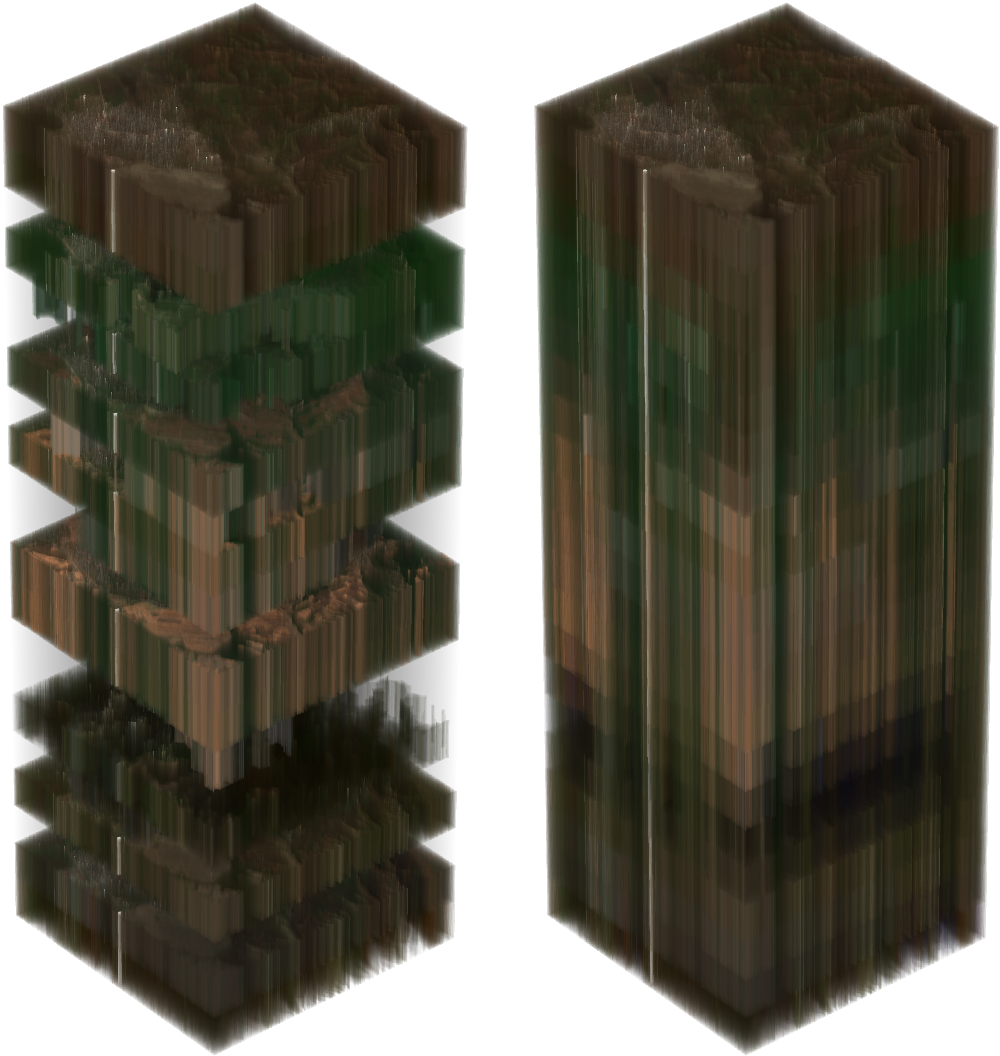
On the left is a stack of Sentinel-2 snapshots from a randomly selected AOI. Transparent pixels imply missing data due to clouds. The image on the right shows the stack after interpolation, taking into account cloud masks.
Temporal information is extremely important in the classification of cover, and even more important in the problem of determining the germinating culture. This is all due to the fact that a large amount of information about the land cover is concealed in how the plot changes throughout the year. For example, when viewing interpolated NDVI values, you can see that the values on the territories of forests and fields reach their maximums in the spring / summer and fall strongly in the autumn / winter, while the water and artificial surfaces keep these values approximately constant throughout the year. Artificial surfaces have slightly higher NDVI values compared to water, and partly repeat the development of forests and fields, because in cities you can often find parks and other vegetation. You should also consider the limitations associated with the resolution of images - often in the area that covers one pixel, you can observe several types of coverage simultaneously.
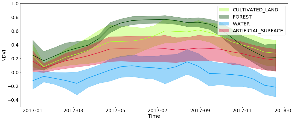
The temporal development of NDVI values for pixels from specific types of ground cover throughout the year
Negative buffering
Although the resolution of images in 10m is sufficient for a very wide range of tasks, the side effects of small objects are very significant. Such objects are located on the border between different types of cover, and only one of these types is assigned to these pixels. Because of this, there is extra noise in the input data when training the classifier, which degrades the result. In addition, roads and other objects 1 pixel wide are present on the source map, although it is extremely difficult to identify them from images. We apply 1px negative buffering to the reference map, removing almost all problem areas from the input data.
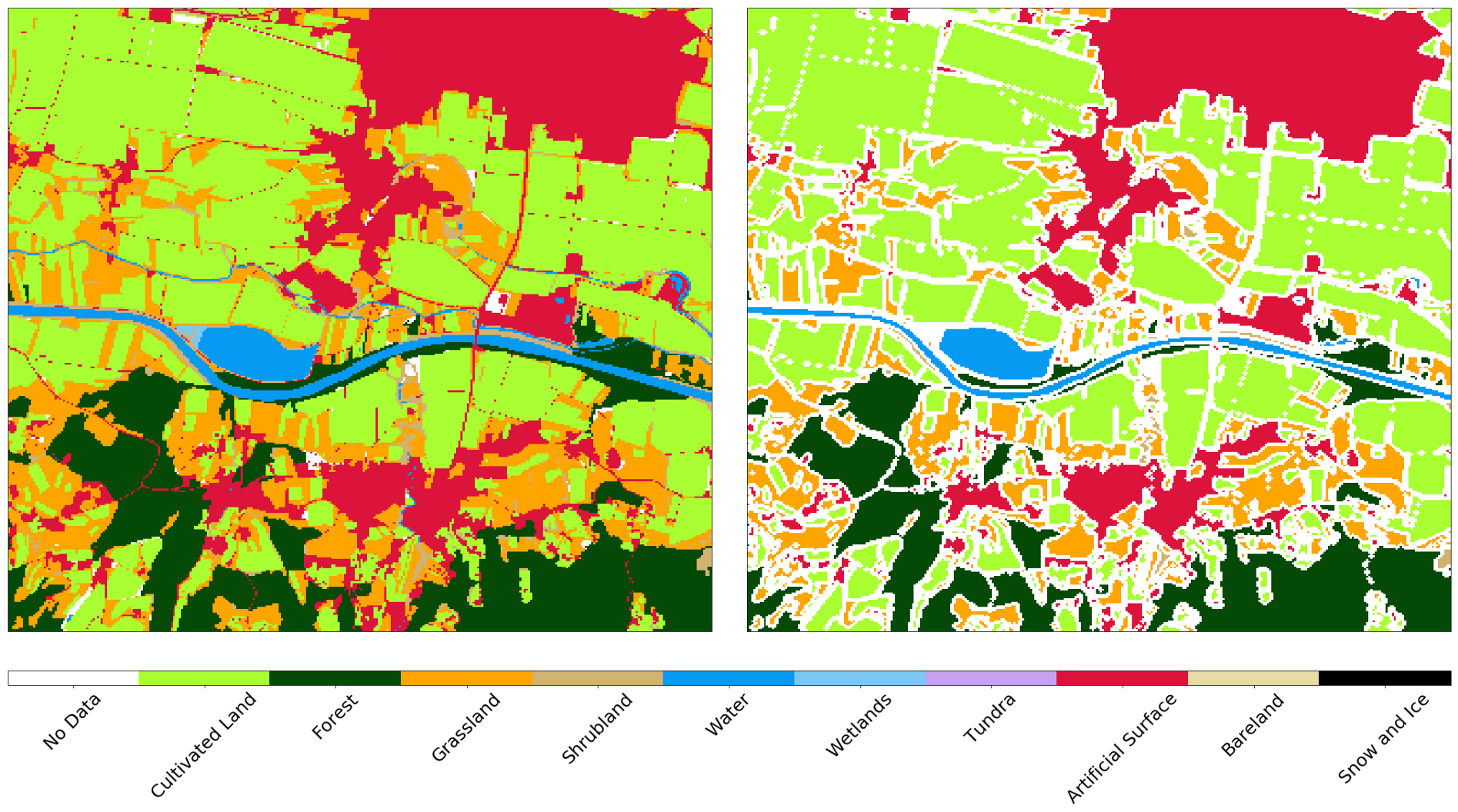
AOI reference map before (left) and after (right) negative buffering
Random data selection
As mentioned in the last article, the full AOI is divided into approximately 300 fragments, each of which consists of ~ 1 million pixels. This is quite an impressive amount of these very pixels, so we evenly take about 40,000 pixels for each EOPatch to get a data set of 12 million copies. Since the pixels are taken evenly, a large number do not matter on the reference map, since these data are unknown (or were lost after the previous step). It makes sense to weed out such data to simplify the training of the classifier, since we do not need to teach him to identify the "no data" label. We repeat the same procedure for the test set, since such data artificially degrade the quality indicators of the classifier predictions.
Separation and formation of data
We divided the input data into training / testing sets in the ratio of 80/20%, respectively, at the EOPatch level, which guarantees that these sets do not overlap. We also divide the pixels from the training set into sets for testing and cross-validation in the same way. After separation, we get an array of numpy.ndarray dimension (p,t,w,h,d) , where:p is the number of EOPatch in the data set t is the number of interpolated images for each EOPatch
* w, h, d - width, height, and number of layers in images, respectively.
After selecting the subsets, the width w corresponds to the number of selected pixels (eg 40000), with the dimension h equal to 1. The difference in the shape of the array does not change anything, this procedure is necessary only to simplify working with images.
The data from the sensors and the d mask in any snapshot t define the input data for training, where there are such instances in the sum of p*w*h . In order to convert the data into a form that is digestible for the classifier, we must reduce the dimension of the array from 5 to the matrix, the form (p*w*h, d*t) . This is easily done using the following code:
import numpy as np p, t, w, h, d = features_array.shape # t axis 1 3 features_array = np.moveaxis(features_array, 1, 3) # features_array = features_array.reshape(p*w*h, t*d) This procedure will allow you to make a prediction on the new data of the same form, and then convert them back and visualize them with standard means.
Creating a model for machine learning
The optimal choice of the classifier is highly dependent on the specific task, and even with the right choice we must not forget about the parameters of a particular model, which need to be changed from task to task. It is usually necessary to carry out a set of experiments with different sets of parameters in order to say exactly what is needed in a particular situation.
In this series of articles, we use the LightGBM package, because it is an intuitive, fast, distributed and productive framework for building models based on decision trees. For the selection of hyper-parameters of the classifier, it is possible to use different approaches, such as a search by lattice , which should be tested on a test set. For the sake of simplicity, we skip this step and use the default parameters.
Decision trees in LightGBM. A source
The implementation of the model is quite simple, and since the data already comes in the form of a matrix, we simply feed this data to the input of the model and wait. Congratulations! Now you can tell everyone that you are learning machine and will be the most fashionable guy in the party, while your mother will be nervous about the uprising of robots and the death of humanity.
Model validation
Training models in machine learning is easy. The difficulty is to train them well . For this, we need a suitable algorithm, a reliable reference card, and a sufficient amount of computing resources. But even in this case, the results may not be what you wanted, so checking the classifier with error matrices and other metrics is absolutely necessary for at least some confidence in the results of your work.
Error matrix
Error matrices are the first thing to look at when assessing the quality of classifiers. They show the number of correctly and incorrectly predicted labels for each label from the reference map and vice versa. Usually, a normalized matrix is used, where all the values in the lines are divided by the total amount. This shows whether the classifier does not have an offset towards a certain type of cover relative to another
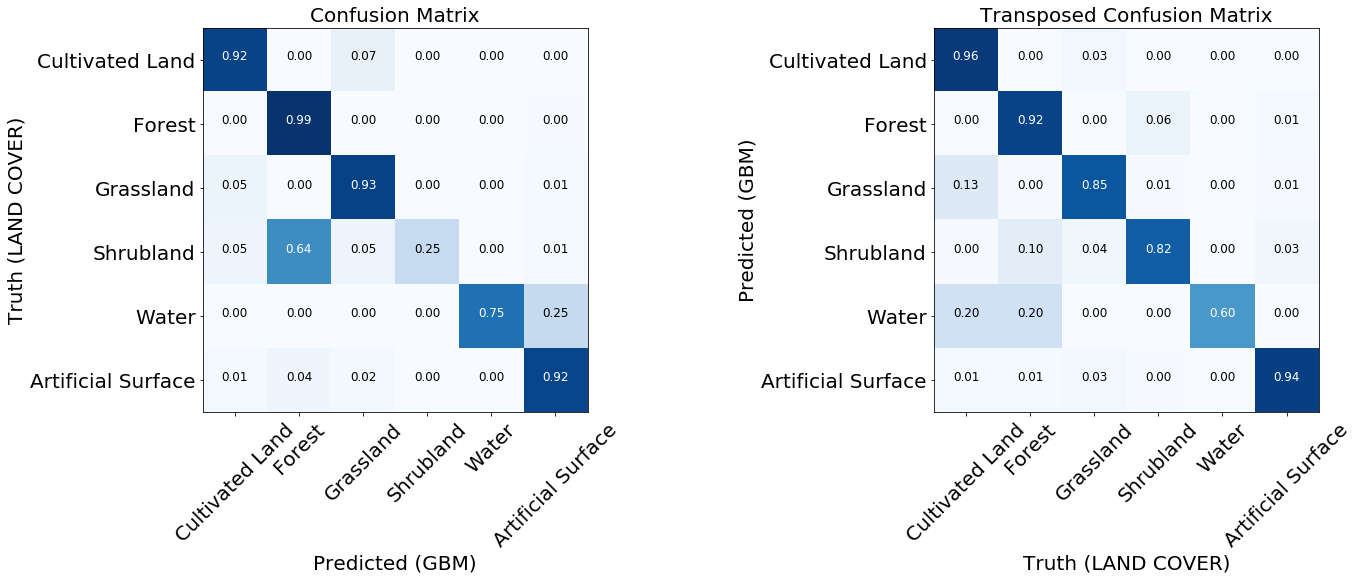
Two normalized error matrices of the trained model.
For most classes, the model shows good results. For some classes errors occur due to unbalanced input data. We see that the problem is, for example, bushes and water, for which a model often confuses pixel labels and identifies them incorrectly. On the other hand, what is labeled as a bush or water is related quite well to the reference map. From the following image, we can see that problems arise for classes that have a small number of training instances - mainly because of the small amount of data in our example, but this problem can occur in any real-world task.

The frequency of occurrence of pixels of each class in the training set.
Reciever Operating Characteristic - ROC curve
Classifiers predict labels with a certain confidence, but this threshold for a particular label can be changed. The ROC curve shows the ability of the classifier to correctly predict when the sensitivity threshold is changed. Usually this graph is used for binary systems, but it can be used in our case, if we count the characteristic "label against all others" for each class. False-positive results are displayed along the x-axis (we need to minimize their number), while true-positive results are shown along the y-axis (we need to increase their number) at different thresholds. A good classifier can be described by a curve, under which the area of the curve is maximum. This indicator is also known as area under curve, AUC. From the graphs of ROC curves, the same conclusions can be drawn about the insufficient number of examples of the “bush” class, although the curve for water looks much better - this is because visually the water is very different from other classes, even with an insufficient number of examples in the data.

ROC curves of the classifier, in the form of "one against all" for each class. The numbers in parentheses are the AUC values.
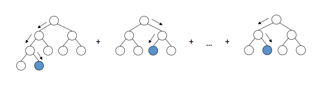
Importance of symptoms
If you want to dig deeper into the subtleties of the classifier, you can look at the graph of the importance of signs (feature importance), which tells us which of the signs more strongly influenced the final result. Some machine learning algorithms, for example, which we used in this article, return these values. For other models, this metric needs to be read by itself.

Matrix of importance of attributes for the classifier from the example
Although other signs in spring (NDVI) are generally more important, we see that there is an exact date when one of the signs (B2 is blue) is the most important. If you look at the pictures, it turns out that the AOI was covered with snow during this period. It can be concluded that snow reveals information about the underlying cover, which greatly helps the classifier to determine the type of surface. It is worth remembering that this phenomenon is specific to the observed AOI and, in general, cannot be relied upon.
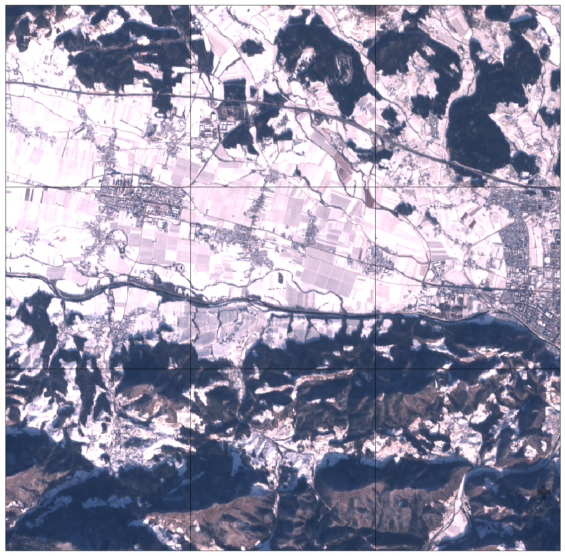
Part of AOI in the form of a 3x3 EOPatch mesh covered with snow
Prediction results
After validation, we better understand the advantages and disadvantages of our model. If we are not satisfied with the current state of affairs, you can make changes to the pipeline and try again. After optimizing the model, we define a simple EOTask, which accepts EOPatch and the classifier model, makes a prediction and applies it to the fragment.
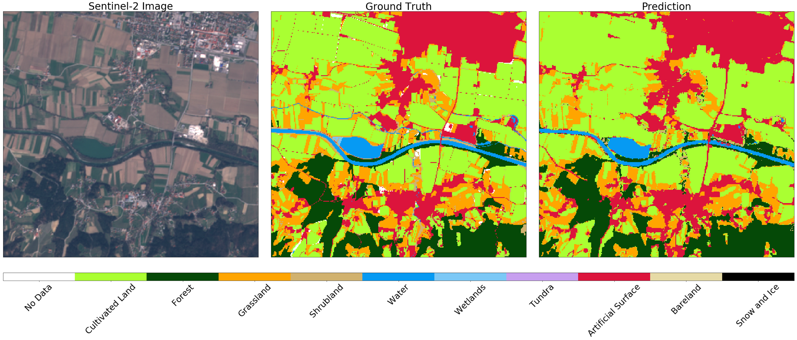
Image Sentinel-2 (left), true (center) and prediction (right) for a random fragment of AOI. You may notice some differences in the images that can be explained by applying negative buffering on the original map. In general, the result for this example is satisfactory.
Further path is clear. You must repeat the procedure for all fragments. You can even export them in GeoTIFF format, and glue them together using gdal_merge.py .
We uploaded glued GeoTIFF to our portal GeoPedia, you can see the results in detail here.
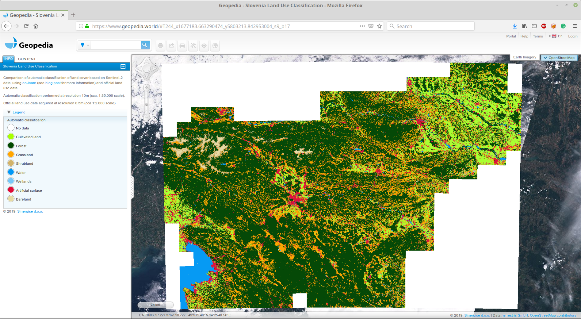
Screenshot prediction cover the land of Slovenia 2017 using the approach from this post. Available in an interactive format at the link above.
You can also compare official data with the result of the classifier. Note the difference between land use and land cover , which is often found in machine learning tasks - it is not always possible to easily display data from official registries to classes in nature. As an example, we will show two airports in Slovenia. The first is Levec, near the town of Celje . This airport is small, mainly used for private jets, and is covered with grass. Officially, the territory is marked as an artificial surface, although the classifier is able to correctly identify the territory as grass, see below.

Image Sentinel-2 (left), true (center), and prediction (right) for the area around the small sports airport. The categorizer defines the landing strip as grass, although it is marked as an artificial surface in the actual data.
On the other hand, at the largest airport in Slovenia, Ljubljana , zones marked as artificial surface on the map are roads. In this case, the classifier distinguishes buildings, while correctly distinguishing grass and fields in the neighboring territory.
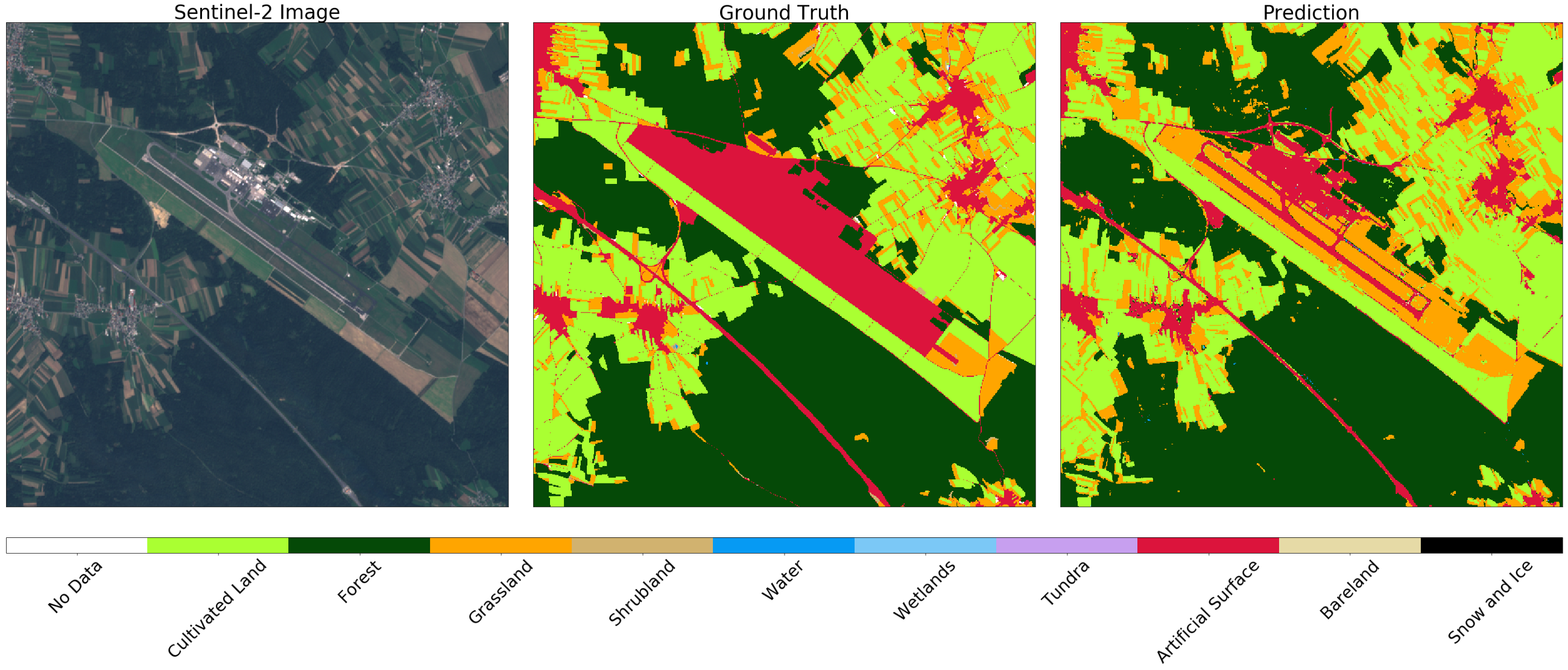
Image Sentinel-2 (left), true (center), and prediction (right) for the zone around Ljubljana. The classifier determines the runway and the road, while correctly distinguishing grass and fields in the neighborhood
Voila!
Now you know how to create a reliable model for the whole country! Remember to add this to your resume.
')
Source: https://habr.com/ru/post/452378/
All Articles