All about SVG animation
In this article I want to highlight the subtleties of working with SVG graphics, SVG animation (including the path), problems and ways to solve them, as well as a variety of pitfalls, of which there is a huge variety in SVG. I position this article as a detailed guide.

There will be no plug-ins, libraries and other things, it will be only pure SVG.
The only tool that I will use is Adobe Illustrator.
It all started with a boring lecture and in the hope of occupying myself at least with something, I decided to study SVG graphics, namely animation. To my surprise, there was very little information on the Internet. Information explaining the basics was duplicated everywhere, but about 2-3 animations in general are based on links with absolutely identical information, which is a translation of the article A Guide to SVG Animations (SMIL) by Sarah Sweaidan.
')
Her article talks about everything, but superficially. Nevertheless, I highly recommend it. * Link to translation *
I spent the next few weeks collecting information in pieces from various sources. The result of this search is this article.
This section focuses on the features and problems of Adobe Illustrator, so if you are not using Illustrator, you can skip this section.
Preparing a document for animation is a very important stage, the neglect of which can lead to very unpleasant consequences. Teaching you the best way to draw in Illustrator I will not. The only thing I will say is that when drawing the figures, you should monitor the values, it is desirable that they have only one decimal point, and it is better to be integers. It is not necessary to follow this rule, but it will reduce the file size, simplify further animation and visually reduce the amount of information. Take a look
In the example, the same curve, but in the first case one digit after the comma, and in the second three. So the curve has only 4 points, and the second example is one third longer than the first. Imagine how much space the curve will take from 20 points.
After the frame is drawn, you need to save the image as an SVG file. There are two ways to do this - “Save As” or “Export As”. But which way to choose? If you trust me, it's better to use “save as”. If you want to know why, then turn around the spoiler.
Before I proceed directly to the animation, I want to talk about how to embed SVG on the page. Each method has its own "features" that have a direct impact on the animation. And if you don’t talk about them, the article will not be complete.
Assume that you already have a ready-made SVG with interactive animation and it remains to embed this document on the site. How to do it?
Option number one - remember that SVG is also an image and can be imported using standard HTML tools. You can create an <img> tag with a link to the document.
Or set the SVG as a background image.
The main disadvantage of this method is the isolation of the image. SVG as an exhibit in a museum - you can watch, you can not touch it. Animation inside will work, but there can be no interactivity about speech. If, for example, an animation is started by a user’s click or there is a need to dynamically change the contents of an SVG document, then this method is not for you.
Option number two is to create an object from SVG using the <object> or <embed> tags. It is also possible to use <iframe> to create a frame, but I do not recommend using this method. requires a crutch for all browsers so that this option is displayed correctly
Here things are already better. Animations can be interactive, but only if they are declared inside the SVG document, and the content is available for external JavaScript. Another <object> and <iframe> may show a stub, if suddenly the image does not load.
Option number three - just insert the contents of the SVG document directly into the inside of HTML. Yes, you can. SVG support appeared in the HTML5 standard . Since SVG is essentially a part of the page itself, access to it is everywhere. Animations and styles of elements can be declared both inside the SVG and in external files. The downside is that such images are just not cached separately from the page.
There are two main ways to animate an SVG element:
Personally, I separate them as an “external” and “internal” animation. This division is arbitrary, but they still have functional differences. If we talk about the differences in general: CSS - has better browser support; SMIL - has great functionality. It is difficult to say what to use better. they are very similar. The choice depends on the task, so I’ll just say the main reasons, use SMIL instead of CSS
SMIL - when needed:
If I wrote that SMIL should be used for interactive animations, this does not mean that the same cannot be done with CSS. SMIL is simply a more functional and sophisticated tool. And that is why it should be used only when necessary. If the animation is simple and you can do with CSS, then this should be done.
There is nothing new here. We can animate any SVG element in the same way as we do with HTML. All animations are created using @keyframes . Since CSS-animation is another topic, I will not dwell on this point in detail, the network is full of documentation and manuals on this topic. Everything described there applies to SVG, and I will just give a few examples.
The SVG document has internal style sheets; here we’ll write animations
Animate the SVG attribute is as easy as CSS attributes.
You can set values as a percentage, and with the from-to construct
Then you just need to apply the created animations to the desired element.
All that I described above is static animations, there’s no interactivity there. What to do if you already really want? Well, something can still be made interactive on CSS. For example, if you use transition in combination with the hover pseudo- class
Attribute animation and a small piece of interactivity - this is where the features of CSS animation end. But this functionality is enough, because most of the tasks are reduced to the animation of an attribute. Almost any SVG attribute can be animated. And when I write almost any, I mean that if you choose a random attribute and it will not be animated, then you are VERY lucky.
Immediately it should be said that SMIL animation is as old as the world and it is slowly dying out, browser support is decent, but still less than that of CSS Animation, but there is a reason why SMIL is still attractive - it can because CSS cannot.
I will talk more about SMIL, because there are a lot of pitfalls about which they rarely write about. And this theme is less popular than CSS. The main tags for animation are <animate> , <set> , <animateTransform> , <animateMotion> .
Let's start with heavy artillery. <animate> - used to animate any attribute and is the main tool. The rest of the tags are highly specialized, but about everything in order.
How to apply animation to an element?
You can specify the element to which the animation will be applied in two ways.
With SVG 2, the xlink: href attribute is deprecated; instead, the specification recommends using href , which does not need to define the xlink namespace.
But here, not everything is so smooth - href is not supported by Safari. It turns out a stalemate, one attribute is outdated, the other is partially not supported. So what method to use is decided by everyone for himself.
For those who have noticed the similarity with CSS selectors, I hasten to disappoint: it’s impossible to turn to elements of the class
How to specify an attribute for animation?
There is an attributeName for this. The value is the name of the attribute that we will animate.
What is attributeType and why don't you need it?
Because he is useless
In theory, there may be a time when the attribute names in CSS and XML will match, which can lead to problems. And to resolve this conflict, you must explicitly specify the namespace. There are two ways tostool : specify a prefix or use attributeType . Let's start with the prefix.
Everywhere they write about the following:
To explicitly indicate what the animated attribute belongs to, use attributeType . It takes 3 css , xml , auto values. Unless you explicitly specify attributeType , auto will be used. In this case, CSS properties are first checked and, if there are no matches, the attributes of the target element are checked. In the example, we indicate that we are going to animate the CSS property
Well, attributeType allows you to easily and without crutches indicate what the animated attribute belongs to, thereby solving a “problem” that doesn't even exist.
Suddenly, right? As I said at the beginning of the chapter - SMIL is dying out and this is due to the fact that the animation is transferred to CSS rails. Most duplicate attributes are absolutely identical to each other, i.e. no matter the attribute belongs to CSS or SMIL the result will be the same. And in combination with the default auto value, there is no need to explicitly define attributeType .
Minute of interesting facts: attributeType attribute is not supported by SVG. Where did he come from then? He came to us from SMIL Animation, on which SVG animation is based. And attributeType removed after SVG 1.1 Second Edition. All proofs here
How to determine the meaning of animation?
Specifying an attribute for an animation is not enough; you must define its values. From here , from , to , by , values .
Let's start with a couple, which is always together from and to . The meaning of their existence is obvious, from indicates the beginning, to the end
Even though I said that they are always together, to can also be used without explicitly declaring from . In this case, from will take the value defined in the target element. For the example above, the animation will start from 25.
If there is a need to specify a set of several values, values are used. Values are separated by a semicolon.
Last in line by . He does not care "where" and "where", all that he is interested in is "how much". In other words, instead of absolute values, it works with relative
There is also a legend that says “ by can be used to indicate the amount by which the animation should advance . ” I understand it this way: if from = 20 , to = 50 , and given by = 10 , then this path must be overcome by “jumps” by 10, i.e. 20, 30, 40, 50. But no matter how I tried, that with by , that without it, the animation did not change a bit. I also did not find confirmation in the specification. It looks like it's just a mistake.
Values have the highest priority, then from - to , the last by . The lowest priority of by explains why the "legend" cannot work in principle. However, by works in conjunction with from , in this variant from simply overrides the current position of the element.
More about relative animations
You can make the rest of the attributes work in the same way as by . This is done using the additive attribute, which has two positions — replace and sum .The first is the default, so we are interested in the second. With a value of sum, all attributes will be added to the current value of the target element, i.e. when animating a radius of 20, with form = 5 and to = 15 , the animation will be from 20 + 5 to 20 + 15
When performing animation, there will be a sharp jump to position 25, which is not good (unless, of course, this is not intended). This can be avoided with form = 0 , but then the sense of using sum is lost because the same effect can be obtained without additive using by
Where to specify the duration of the animation?
There is the last required attribute to make a working animation - and this is dur . The attribute value defines the duration of the animation, which can be specified both in seconds and in milliseconds.
You can also specify values in minutes and even hours
For other attributes, temporary values are set in the same forms
What to do so that the animation does not return to Start?
The fill attribute (do not confuse this attribute with its namesake) is responsible for the behavior of the element after the animation ends. There are two options:
Is it possible to loop animation?
The answer is yes. To do this, the repeatCount attribute specifies the value indefinite . The attribute defines the number of repetitions of the animation and defaults to 1, but you can specify any number
Now infinite animations enrage me, can I turn it off after a while?
For such irritable people did repeatDur . This attribute stops the animation playback, after a certain time from the beginning of the animation playback! Simply put, repeatDur limits the duration of the animation. The main difference from repeatCount is that the animation can be stopped in the middle
And what if I want the animation not to start right away?
Then for you, my friend, the begin attribute is provided. He is responsible for when the animation begins. This attribute is very useful, because it is also used to synchronize several animations, but more on that later.
If you need to specify the usual launch delay, then we write after what period of time the animation should start after the document is opened
You can also specify a negative value. Then the animation will not start from the beginning, but in the place where it would be after a specified period of time.
Making the animations interactive.
As the begin value,you can specify the event at which the animation will start, but without the “on” prefix. For example, if you want to make an animation by clicking, then instead of “onclick” we write click
In the example above, the animation will start when you click on the element to which the animation is applied. If you need to start the animation on the event from another element, you need to specify its id
You can also specify several conditions for the start of the animation. To do this, list them separated by a semicolon.
. Not all events are supported, but most mouse-related events work. I will not list them all, available events can be found somewhere here . Also, no one has canceled the method of scientific spear.
The animation restarts before it reaches the end, how to fix it?
I will give a simple example. Here the animation begins on click. If the user doesn’t click, it will automatically start in 3 seconds
But there is a problem: if the user presses the automatic timer, then when the animation has passed for 3 seconds, it will restart, never reaching the end. The restart attribute in the whenNotActive value comes to the rescue . He has a total of three.
Synchronization of animations
In addition to standard events, by the type of click, there are events of the beginning, end, repetition of animation. In order to bind the event, you must specify theanimation id and through the begin , end , repeat point,respectively
If everything is clear with the first two, then with repeat everything is not so obvious. The number of repetition is written in brackets, after which you need to start the animation (this number cannot be the last repetition)
. You can also specify a delay relative to the event. For example, if I want to play an animation 2 seconds after the start of another
Or run the animation for a second, before the end of the other
What else can begin ...
I wanted to name this section, but it would be more correct to call it "What should he be able, but not able?". According to my favorite spec , begin should have two more values that it should accept. The first is accessKey , which starts the animation by pressing the key specified in Unicode format. The second wallclock , which defines the beginning of the animation in real time. And there you can specify not only the clock, but even the month and year, in general, a complete set.
Unfortunately, none of them wanted to work. Although the loss is not great, because the need for them is still dubious
Can I interrupt the animation?
This can be done with the end attribute. It is identical to begin in its use, you can also specify time, events, etc. As you can see, this is not the first (and not the last) way to interrupt the animation, because there is a repeatDur where you can also fix the duration of the animation. And even in the end , you can also specify the time directly, its distinctive features are binding to events and the ability to specify a list of values.
Suppose we have an element that has a state of rest and activity. The second is activated when you click. And we want to interrupt the rest animation with the start of activity. You can implement a similar idea like this
Combining the end and begin attributes
As already known, begin and end can take a list of values, but it is still not clear how the animation will behave if you specify a list in both attributes. And it turns out, a kind of repetition with customizable duration and intervals between them ... do not you understand? Now I will explain everything.
The first thing to know is that the number of values in the lists must match. Each pair of begin - end valuesdefines one repetition. And the time between the end of one “repetition” and the beginning of the next determines the delay. It is not by chance that I call them “repetitions”, the animation does not pause and continue, but stops and starts from the beginning. It turns out that we can separately adjust the duration of each repetition and set different delays after each repetition.
Can you still interrupt the animation somehow?
Another couple of useless attributes in the piggy bank
Koneeeeeekno, there are as many as two attributes - min and max . As the name implies min determines the minimum and max the maximum duration. First, the duration of the animation is calculated by the values of dur , repeatCount , repeatDur ,end . And after that, the obtained duration is adjusted to the frames set by min and max . On paper, everything is beautiful, let's see how it works in practice.
With max, everything is simple, this is another attribute that defines the upper bound. If the calculated duration is less than max , then it is ignored, and if it is longer, then the duration of the animation becomes equal to max.
But min , less fortunate. If the calculated animation duration is greater than min , then it is ignored, which is logical. However, if the calculated duration is less than min , then it ... is sometimes ignored and sometimes not.
Why, why ?! It is very easy to get confused in this moment, so read carefully.
We have two options when the calculated duration is less than min :
Due to the abundance of attributes that interrupt animation, there is a lot of confusion. As a result, there is no big sense in max and min , because well-written animation eliminates the need for them.
How to manage keyframes and where to specify the function of time?
To do this, you need to know the attributes keyTimes , keySplines , calcMode . Specifying a list of values , we declare key frames, but they are evenly distributed. Thanks to the keyTimes attributewe can speed up or slow down the transition from one state to another. It also lists the values for each frame. The values represent the position of the keyframe on the time axis as a percentage, relative to the duration of the entire animation (0 - 0%; 0.5 - 50%; 1 - 100%).
There are several rules: each value represents a floating point number from 0 to 1, the number of values in the lists must match, the first value is necessarily 0, and the last is 1, each following value must be greater than the previous one. I think you understand that there is no point in using keyTimes without values . And now an example
By default, all conversions occur linearly, in order to change this you need to specify a different mode in calcMode . And there are not many options:
Unfortunately, these are all built-in functions, here you will not find ease in \ out like in CSS. So these needs will have to be met by the regime, which I called "manual."
The most difficult to understand is paced so I will explain it in more detail. First, see how the animation works in standard mode. The duration of the animation is 2 seconds and we have 3 keyframes - initial, intermediate, final
If you watch the animation, it becomes obvious that the movement between keyframes takes place at equal intervals of time. The distance between the first and second is 100, and between the second and third is 50, i.e. half from the first path. By no tricky calculations, it becomes clear that the element will go through the second segment two times slower than the first. Now add calcMode = "paced" and see what has changed.
And the speed of the element has changed. Now it is designed in such a way as to cover the entire distance at the same speed, in other words, the element will move both segments evenly.
Now let's take a look at the spline mode and the keySplines attribute . They have some similarities ... hmm ...

If spline specifies manual mode, then the keySplines attribute defines values for this mode. Obviously, one without the other does not work. The values in keySplines are specified in a list where the coordinates of two points for a cubic Bezier are indicated.
The number of values in keySplines must be 1 less than values . This is due to the fact that we specify values not for key frames, but for intervals between them.
The first and most unpleasant minus is that you cannot set a common time function for all keyframes; you will have to duplicate the function for each frame.
Secondly, if you want to set the time function for the attributes from - to or by , then you need a crutch: you will have to set keyTimes with values “0; one"
How to implement cumulative animations?
First, a little theory - the next repetition of the cumulative animation will continue where the previous one ended. As if cool, but not very ... It is sad that the cumulative animations work only within repetitions.
Now how to make the animation cumulative: you need to set the accumulate attribute(which is none by default) to sum
It should be borne in mind that if you use values or from - to , then all repetitions, except the first, they will behave as if additive = "sum ". And accumulate is ignored if only one to is given .
Comprehend the morph contour
Now that I have explained the basics, it's time to move on to really cool and complex things. I am sure that someone opened this article solely for the sake of this section.
Contour morphing is an animation of the d attribute on the path tag , which allows you to create the effect of a smooth change in the shape of the shape. At the moment, the built-in tools can only do this using SMIL. ATvalues specifies a list of values for the attribute d through which the element will pass. You can also use from - to . In general, the contour morph looks like
And now let's move on to the subtleties of this process:
For those who are in the tank - the attribute d contains a set of points, which are then alternately connected and the figure is obtained. A closer look reveals that the list of values is similar to the instruction set for a CNC machine tool (or “robot” in computer science lessons). There are a lot of teams, some are responsible for “moving the cursor”, others for “drawing”, some for how much the curve will be, etc. ( all commands here ).
For morph to work, the number of commands must match , and they must be of the same type . If you ignore this condition, the interpolation will be absent - the animation will jump from one state to another ascalcMode = "discrete" . At first glance, nothing complicated, and this is true if you animate shapes without curves. If not, then the difficulties begin.
When creating complex graphics, everyone uses vector editors, and they have a habit of optimizing the “code” as much as possible. This is usually a plus, but not in our case. At the exit, wemay have a list of the same length, but with teams of different types, and this is a violation of one of the rules. I used Adobe Illustrator and did not find an option that could improve the situation. Sometimes, at the behest of the gods, this problem is absent. But seriously, the probability of occurrence of the problem is directly proportional to the complexity of the shape and morphing.
At the moment, the only solution to the problem is the “curved code” conversion in the Shape Shifter web application . This is the option that I use. In addition to fixing the broken code, Shape Shifter allows you to see the result, if you wish, add other types of animations and export the result in a convenient format.
Next will be a step by step tutorial, where I will tell you how to make such a beautiful animation.

The set tag is a shortened version of animate , except that it cannot interpolate. It is used to instantly change an attribute for a certain period of time, i.e. works on the switch principle. As a consequence, it ignores attributes associated with interpolation and does not support accumulative or relative animations. The value is set exclusively with the help of the attribute to , the values , from , by attributes are ignored
If you do not specify the dur attribute, the element will remain in this state until the document is reloaded. The rest of it is similar to animate .
As the name implies, is used to apply to the element of various kinds of transformations. All transformation types are identical to CSS transformations. When using CSS and SMIL transformations at the same time, they will override each other, so it’s better to use one thing or to watch so that they do not overlap.
How to transform?
As an animated attribute performs the transform . The transformation mode is specified in the type attribute and accepts 4 types of values - movement, rotation, scaling, shift along the axes.
translate - moving an element relative to its current position. As the values takes the offset in the format [x, y] , where y is optional
rotate - member rotates about the rotational center. It takes the rotation angle and the coordinates of the center of rotation [deg, x, y] as values, the coordinates of the center are optional. By default, the rotation center is in the upper left corner of the SVG document.
Also, the center of rotation can be changed using CSS properties of the transform-origin , where in addition to the coordinates, you can specify percentages. By default, percentage values are calculated by the size of the entire document, so that percentages are calculated relative to the element, you need to set the CSS property transform-box with the value fill-box .
scale - scales the element. As values, it accepts floating-point numbers in the [scale] formatfor both axes, or separately for each [scaleX, scaleY] axis(1 corresponds to the normal size of the element). If you do not change the transform-box, which I mentioned above, the element is scaled relative to the entire document. The empty space around the element also changes with it, so visually it seems that the element is shifting towards
skewX or skewY - shifts the element relative to the axis. As the value takes the angle of [deg] . By default, the center of the shift is the upper left corner, so the same joke works with transform-box and transform-origin as in other transformations.
Summation and redefinition of transformations
In the animateTransform , you can still make cumulative and relative animations, but here the additive attributelifts itself differently. In the value of replace , the transformation overrides all previous ones. In sum, the transformation is summed up with the previous one.
It is necessary to animate the movement of an element along a trajectory. animateMotion supports attributes animate and has 3 of its own - path , the rotate , Keypoints .
Path definition options
You can define a motion path in several ways — using the familiar attributes from , to , by, or values , the new path attribute, or a child <mpath> tag . I have listed the ways to increase the priority and I will explain them in the same manner.
Attributes from , to, by , the coordinates of the points are indicated, the values are the same, but already in the form of a list
The effect of this method is comparable to the usual transformation of the movement. The element moves straight from one point to another. And here also, as in the animateTransform , the coordinates are relative . The point 0,0 indicates not the upper left corner of the document, but the current position of the target element. This feature is also present in other ways to determine the trajectory.
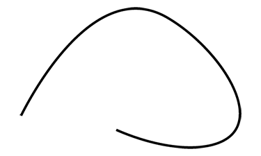
The path attribute indicates a set of commands, as for the attribute d . If in the attribute d commands are interpreted as a shape outline, then in the path attribute they are the line along which the element will move. The coordinates of the points are also relative, so the path starts from the point 0.0
This path describes such a curve.
The last way is to use a third-party <path> element as a path . To do this, in the <mpath> tag you need to specify a link to this element, and the tag itself must be placed inside <animateMotion> . This option has the same feature with relative coordinates. In essence, this method “copies”, as it were, an element from the value of the attribute d to the attribute <path>
Rotation of the element relative to the trajectory.
It is possible to make the element rotate in the direction of movement using the rotate attribute. It accepts 3 types of values: auto , auto-reverse and a number indicating rotation in degrees
By default, rotate is set to 0. Any numerical value fixes the angle throughout the entire animation. Automatic modes auto and auto-reverse change the angle of rotation of the element, respectively, tangent to the trajectory. And different direction of this tangent. In auto, it is directed forward, and in auto-reverse, backward.

How to manage the movement along the trajectory?
The trajectory is a curve that has a beginning and an end; these points are denoted by the numbers 0 and 1, respectively. Any position on the curve can be determined by a number in this range. By listing the points in the keyPoints attribute, you can define any kind of movement along a path. But this is not enough to manage the movement, for this you need a whole system of attributes.
First you need to set the calcMode to the position of linear or spline . Unlike other tags, animateMotion defaults to paced (for some reason, the animation does not want to work in this mode). It is also necessary to specify the attributekeyTimes . Only by completing these steps, the animation will work as it should.
PS
Understanding the animateMotion, I came across information that you can do the same thing, sort of like, on CSS. But at the end of the writing of the article I had neither the strength nor the desire to deal with it. For enthusiasts, I just leave a link to the documentation.
There will be no plug-ins, libraries and other things, it will be only pure SVG.
The only tool that I will use is Adobe Illustrator.
Foreword
It all started with a boring lecture and in the hope of occupying myself at least with something, I decided to study SVG graphics, namely animation. To my surprise, there was very little information on the Internet. Information explaining the basics was duplicated everywhere, but about 2-3 animations in general are based on links with absolutely identical information, which is a translation of the article A Guide to SVG Animations (SMIL) by Sarah Sweaidan.
')
Her article talks about everything, but superficially. Nevertheless, I highly recommend it. * Link to translation *
I spent the next few weeks collecting information in pieces from various sources. The result of this search is this article.
Correct SVG export from Illustrator
This section focuses on the features and problems of Adobe Illustrator, so if you are not using Illustrator, you can skip this section.
Preparing a document for animation is a very important stage, the neglect of which can lead to very unpleasant consequences. Teaching you the best way to draw in Illustrator I will not. The only thing I will say is that when drawing the figures, you should monitor the values, it is desirable that they have only one decimal point, and it is better to be integers. It is not necessary to follow this rule, but it will reduce the file size, simplify further animation and visually reduce the amount of information. Take a look
<path d="M 17.7 29 C 28.2 12.9 47 5.6 62.8 10.4 c 28.2 8.5 30 50.5 24.8 53.1 c -2.6 1.3 -10.4 -6.1 -29.2 -34.6"/> <path d="M 17.651 28.956 c 10.56 -16.04 29.351 -23.359 45.12 -18.589 c 28.151 8.516 29.957 50.5 24.841 53.063 c -2.631 1.318 -10.381 -6.148 -29.235 -34.643"/> In the example, the same curve, but in the first case one digit after the comma, and in the second three. So the curve has only 4 points, and the second example is one third longer than the first. Imagine how much space the curve will take from 20 points.
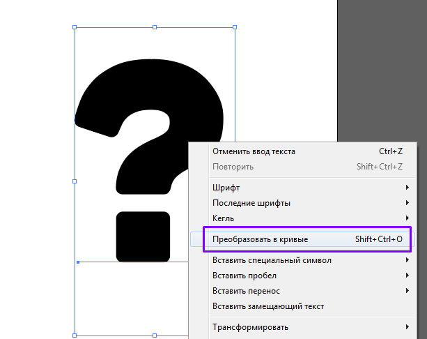
After the frame is drawn, you need to save the image as an SVG file. There are two ways to do this - “Save As” or “Export As”. But which way to choose? If you trust me, it's better to use “save as”. If you want to know why, then turn around the spoiler.
So why?
At first glance, there is no difference, because in the end we will get the .svg file with our image. However, the differences begin at the stage of export options

I don’t see the point of explaining all the parameters in detail. Illustrator itself does an excellent job in the Description section.
As you can see, “save” has more settings than “export”, and for some it will be a good reason to refuse to export, but we will continue.
If you open the files saved in both ways in the browser, we will not notice the difference. However, at the moment we are more interested in not the appearance, but the filling, so we will do the same, but through a text editor. Here the differences will become more obvious. I suggest you look and draw your own conclusions, I did not change anything in the files, just copied as is.
Export
Save
In addition to the differences in the naming of CSS classes and design in general, which someone may consider taste, there are other problems. When "exporting" the whole image decreased by 2 times. This can be judged by the size of the figures and the viewBox attribute. Since this vector graphics is not worse from this, but still not nice. "Saving" left the dimensions that I specified in Illustrator.
But all this flowers compared to what a pig can put "export". Specifically, there is no such problem in these examples, probably because the image is very simple. However, I ran into it when I exported my other work. Here is her screenshot

The file size is large enough, so I will give only the problem part
Did you notice anything unusual? If you look askance at the transform attribute, then you are right. It is he who spoils the whole raspberry. When “exporting” an image, Illustrator assigns it to ALL <path> elements. In this case, such a problem is not observed when "saving".
If you still do not understand my indignation, then I will explain: if you want to animate the movement of such an element, it will shift to the side. In this case, 5.5 on both axes. This is due to the fact that the motion animation changes the transform attribute, resetting all past values. Of course, this can be circumvented, but is it not better to avoid the problem than to correct its consequences later ...
At the moment, I happened to notice only this problem, but this does not mean that it is the only one. If it is sensible to assess the situation, it turns out that “save as” wins in everything. That is why I advise you to use it.
I don’t see the point of explaining all the parameters in detail. Illustrator itself does an excellent job in the Description section.
As you can see, “save” has more settings than “export”, and for some it will be a good reason to refuse to export, but we will continue.
If you open the files saved in both ways in the browser, we will not notice the difference. However, at the moment we are more interested in not the appearance, but the filling, so we will do the same, but through a text editor. Here the differences will become more obvious. I suggest you look and draw your own conclusions, I did not change anything in the files, just copied as is.
Export
<svg id="_1" data-name=" 1" xmlns="http://www.w3.org/2000/svg" viewBox="0 0 51 51"> <defs> <style> .cls-1 { fill: none; stroke: #4ec931; stroke-miterlimit: 10; } .cls-2 { fill: #4ec931; } .cls-3 { fill: #fff; } </style> </defs> <title>my_icon_E</title> <circle class="cls-1" cx="25.5" cy="25.5" r="20"/> <circle class="cls-1" cx="25.5" cy="25.5" r="25"/> <g id="_2" data-name=" 2"> <circle class="cls-2" cx="25.5" cy="25.5" r="15"/> <polygon class="cls-3" points="25.5 34.8 34 20.3 17 20.3 25.5 34.8"/> </g> </svg> Save
<?xml version="1.0" encoding="utf-8"?> <!-- Generator: Adobe Illustrator 23.0.2, SVG Export Plug-In . SVG Version: 6.00 Build 0) --> <svg version="1.1" id="_1" xmlns="http://www.w3.org/2000/svg" xmlns:xlink="http://www.w3.org/1999/xlink" x="0px" y="0px" viewBox="0 0 100 100" style="enable-background:new 0 0 100 100;" xml:space="preserve"> <style type="text/css"> .st0{fill:none;stroke:#4EC931;stroke-miterlimit:10;} .st1{fill:#4EC931;} .st2{fill:#FFFFFF;} </style> <circle class="st0" cx="50" cy="50" r="20"/> <circle class="st0" cx="50" cy="50" r="25"/> <g id="_2"> <circle class="st1" cx="50" cy="50" r="15"/> <polygon class="st2" points="50,59.3 58.5,44.8 41.5,44.8 "/> </g> </svg> In addition to the differences in the naming of CSS classes and design in general, which someone may consider taste, there are other problems. When "exporting" the whole image decreased by 2 times. This can be judged by the size of the figures and the viewBox attribute. Since this vector graphics is not worse from this, but still not nice. "Saving" left the dimensions that I specified in Illustrator.
But all this flowers compared to what a pig can put "export". Specifically, there is no such problem in these examples, probably because the image is very simple. However, I ran into it when I exported my other work. Here is her screenshot
The file size is large enough, so I will give only the problem part
<g id="-21" data-name=""> <path class="cls-9" d="M477.94,456.75a1.83,1.83,0,0,1-.9,1.36l-4.91,3.1a7.29,7.29,0,0,1-7.5,0l-16.29-9.72a1.85,1.85,0,0,1-.92-1.56v-3.68a1.85,1.85,0,0,0,.92,1.56l.38.23,15.91,9.49a7.29,7.29,0,0,0,7.5,0l4.53-2.86.38-.23a1.87,1.87,0,0,0,.9-1.36Z" transform="translate(-5.5 -5.5)"/> <path class="cls-10" d="M477,451.19l-16.38-9.5a7.28,7.28,0,0,0-7.32,0l-5,2.9a1.88,1.88,0,0,0-.94,1.51v.17a1.85,1.85,0,0,0,.92,1.56l.38.23,15.91,9.49a7.29,7.29,0,0,0,7.5,0l4.53-2.86.38-.23a1.87,1.87,0,0,0,.9-1.36v-.51A1.88,1.88,0,0,0,477,451.19Z" transform="translate(-5.5 -5.5)"/> </g> <g id="-22" data-name=""> <path class="cls-9" d="M525.37,557.86a1.85,1.85,0,0,1-.9,1.36l-33.22,19.64a7.29,7.29,0,0,1-7.5,0l-16.29-9.72a1.85,1.85,0,0,1-.92-1.56v-3.68a1.85,1.85,0,0,0,.92,1.56l.38.23,15.91,9.49a7.29,7.29,0,0,0,7.5,0l32.84-19.41.38-.23a1.83,1.83,0,0,0,.9-1.36Z" transform="translate(-5.5 -5.5)"/> <path class="cls-10" d="M524.45,552.3l-16.38-9.51a7.31,7.31,0,0,0-7.32,0l-33.27,19.44a1.89,1.89,0,0,0-.94,1.51v.17a1.85,1.85,0,0,0,.92,1.56l.38.23,15.91,9.49a7.29,7.29,0,0,0,7.5,0l32.84-19.41.38-.23a1.83,1.83,0,0,0,.9-1.36v-.5A1.86,1.86,0,0,0,524.45,552.3Z" transform="translate(-5.5 -5.5)"/> </g> Did you notice anything unusual? If you look askance at the transform attribute, then you are right. It is he who spoils the whole raspberry. When “exporting” an image, Illustrator assigns it to ALL <path> elements. In this case, such a problem is not observed when "saving".
If you still do not understand my indignation, then I will explain: if you want to animate the movement of such an element, it will shift to the side. In this case, 5.5 on both axes. This is due to the fact that the motion animation changes the transform attribute, resetting all past values. Of course, this can be circumvented, but is it not better to avoid the problem than to correct its consequences later ...
At the moment, I happened to notice only this problem, but this does not mean that it is the only one. If it is sensible to assess the situation, it turns out that “save as” wins in everything. That is why I advise you to use it.
Ways to import an SVG document into HTML
Before I proceed directly to the animation, I want to talk about how to embed SVG on the page. Each method has its own "features" that have a direct impact on the animation. And if you don’t talk about them, the article will not be complete.
Assume that you already have a ready-made SVG with interactive animation and it remains to embed this document on the site. How to do it?
Option number one - remember that SVG is also an image and can be imported using standard HTML tools. You can create an <img> tag with a link to the document.
<img src="Hello_SVG.svg" /> Or set the SVG as a background image.
#box { background-image: url("Hello_again.svg"); } The main disadvantage of this method is the isolation of the image. SVG as an exhibit in a museum - you can watch, you can not touch it. Animation inside will work, but there can be no interactivity about speech. If, for example, an animation is started by a user’s click or there is a need to dynamically change the contents of an SVG document, then this method is not for you.
Option number two is to create an object from SVG using the <object> or <embed> tags. It is also possible to use <iframe> to create a frame, but I do not recommend using this method. requires a crutch for all browsers so that this option is displayed correctly
<object data="My_SVG.svg" type="image/svg+xml"></object> <embed src="My_SVG.svg" type="image/svg+xml" /> <iframe src="My_SVG.svg"></iframe> Here things are already better. Animations can be interactive, but only if they are declared inside the SVG document, and the content is available for external JavaScript. Another <object> and <iframe> may show a stub, if suddenly the image does not load.
Option number three - just insert the contents of the SVG document directly into the inside of HTML. Yes, you can. SVG support appeared in the HTML5 standard . Since SVG is essentially a part of the page itself, access to it is everywhere. Animations and styles of elements can be declared both inside the SVG and in external files. The downside is that such images are just not cached separately from the page.
<body> ... <svg> <!-- --> </svg> </body> Svg animation
There are two main ways to animate an SVG element:
- CSS animation
- SMIL animation embedded in SVG (in fact, this is SVG animation, which is based on SMIL and extends its functionality)
Personally, I separate them as an “external” and “internal” animation. This division is arbitrary, but they still have functional differences. If we talk about the differences in general: CSS - has better browser support; SMIL - has great functionality. It is difficult to say what to use better. they are very similar. The choice depends on the task, so I’ll just say the main reasons, use SMIL instead of CSS
SMIL - when needed:
- Do something that could not CSS (animate unsupported attribute, etc.)
- Have more precise control over the animation
- Make a contour morph (animation of the d attribute at the path tag)
- Sync animations
- Make interactive animations
If I wrote that SMIL should be used for interactive animations, this does not mean that the same cannot be done with CSS. SMIL is simply a more functional and sophisticated tool. And that is why it should be used only when necessary. If the animation is simple and you can do with CSS, then this should be done.
CSS animations
There is nothing new here. We can animate any SVG element in the same way as we do with HTML. All animations are created using @keyframes . Since CSS-animation is another topic, I will not dwell on this point in detail, the network is full of documentation and manuals on this topic. Everything described there applies to SVG, and I will just give a few examples.
The SVG document has internal style sheets; here we’ll write animations
<svg> <style> <!-- --> </style> <!-- SVG --> </svg> Animate the SVG attribute is as easy as CSS attributes.
@keyframes reduce_radius { from { r: 10; } to { r: 3; } } @keyframes change_fill { 0% { fill: #49549E; } 75% { fill: #1bceb1; } 100% { fill: #1bce4f; } } You can set values as a percentage, and with the from-to construct
Then you just need to apply the created animations to the desired element.
.circle { animation: change_fill 1s, popup 2s; } All that I described above is static animations, there’s no interactivity there. What to do if you already really want? Well, something can still be made interactive on CSS. For example, if you use transition in combination with the hover pseudo- class
.circle { fill: #49549E; transition: .3s; } .circle:hover { fill: #1bceb1; } When you hover over an item, it will change its color from blue to blue for 300msAttribute animation and a small piece of interactivity - this is where the features of CSS animation end. But this functionality is enough, because most of the tasks are reduced to the animation of an attribute. Almost any SVG attribute can be animated. And when I write almost any, I mean that if you choose a random attribute and it will not be animated, then you are VERY lucky.
Smil animation
Immediately it should be said that SMIL animation is as old as the world and it is slowly dying out, browser support is decent, but still less than that of CSS Animation, but there is a reason why SMIL is still attractive - it can because CSS cannot.
I will talk more about SMIL, because there are a lot of pitfalls about which they rarely write about. And this theme is less popular than CSS. The main tags for animation are <animate> , <set> , <animateTransform> , <animateMotion> .
<animate>
Let's start with heavy artillery. <animate> - used to animate any attribute and is the main tool. The rest of the tags are highly specialized, but about everything in order.
How to apply animation to an element?
You can specify the element to which the animation will be applied in two ways.
- Put the tag inside the item. This method allows you to encapsulate the animation inside the object, which makes it easier to read the code.
<circle ...> <animate .../> </circle> - Send link to item. It would be useful if you would like all the animations to be collected in one place.
<svg xmlns:xlink="http://www.w3.org/1999/xlink"> <circle id="blue" .../> ... <animate xlink:href="#blue" .../> </svg>
With SVG 2, the xlink: href attribute is deprecated; instead, the specification recommends using href , which does not need to define the xlink namespace.
<circle id="blue" .../> ... <animate href="#blue" .../> But here, not everything is so smooth - href is not supported by Safari. It turns out a stalemate, one attribute is outdated, the other is partially not supported. So what method to use is decided by everyone for himself.
For those who have noticed the similarity with CSS selectors, I hasten to disappoint: it’s impossible to turn to elements of the class
<circle class="blue_circle" .../> <animate href=".blue_circle" .../> This does not work!How to specify an attribute for animation?
There is an attributeName for this. The value is the name of the attribute that we will animate.
<circle r="25" ...> <animate attributeName="r" ... /> </circle> By specifying the attributeName value r, we inform that we are going to animate the radius of the circleWhat is attributeType and why don't you need it?
Because he is useless
In theory, there may be a time when the attribute names in CSS and XML will match, which can lead to problems. And to resolve this conflict, you must explicitly specify the namespace. There are two ways to
Everywhere they write about the following:
You can specify an XMLNS prefix for an attribute to explicitly specify its namespace.This method is mentioned casually and without examples. So I will not change the traditions. (I advise you to stop here, forget about prefixes like a bad dream and go to attributeType , I warned you)
"I am a masochist"
The content of this spoiler is more entertaining and exploratory in nature. No useful information, except the fact that the prefixes do not work, then you will not know
First you need to find a more accurate definition, and, as you know, the most accurate definitions in the specifications and standards.
I understood it literally and thought it should look like this.
I thought and safely forgot about this method before writing this article. The problems started when I decided to test it in practice. I think I won’t surprise anyone if I say that it doesn’t work. After several hours of unsuccessful searches, I googled "xmlns prefix" and to my surprise, I saw that xmlns is not the prefix itself, but (concentrate now it will be difficult) the namespace definition design with prefixes .
It looks like this:
After another couple of hours, I finally found what I was looking for in Namespaces in XML . Here is an original example:
But you know what's funny? It still does not work. Although all done on the book
There are no errors and should not be, because everything is done according to the rules, but the problem is that we will get a circle with no radius. The same result will be if you just do not write the attribute r .
Epilogue : SVG ignores attributes with a prefix. As a result, even if SMIL really animates an attribute with a prefix, you will not see the result of this animation.
In my defense, I’ll say that I only dealt with SVG, namely with its animation, so the XML guru is trying to put torches and pitchforks aside. If you know how to make this way work, you are welcome in the comments.
First you need to find a more accurate definition, and, as you know, the most accurate definitions in the specifications and standards.
Short guide how to give up on life
The translation of the definition reads as follows:- Open the specification for SVG animation for March 14, 2019
- In the section on attributeName, we see that it inherits the SMIL Animation standard for (oh, horror) 2001
- Reading attributeName definition
- Profit!
“Identifies the name of the target attribute. The XMLNS prefix can be used to specify the XML namespace for an attribute. The prefix will be interpreted in the scope of the animation element. ”Hmm, it doesn't get any easier. What would come to mind to a person who does not know XML, after reading such a definition? Right. Same as me.
I understood it literally and thought it should look like this.
<animate attributeName="xmlns:* *"/> I thought and safely forgot about this method before writing this article. The problems started when I decided to test it in practice. I think I won’t surprise anyone if I say that it doesn’t work. After several hours of unsuccessful searches, I googled "xmlns prefix" and to my surprise, I saw that xmlns is not the prefix itself, but (concentrate now it will be difficult) the namespace definition design with prefixes .
It looks like this:
<** xmlns:**="* url *" ...> Then I realized that I did not understand anything ... at the very beginning ... and now, in principle, tooAfter another couple of hours, I finally found what I was looking for in Namespaces in XML . Here is an original example:
<x xmlns:n1="http://www.w3.org" xmlns="http://www.w3.org" > <good a="1" n1:a="2" /> </x> But you know what's funny? It still does not work. Although all done on the book
<svg version="1.1" xmlns="http://www.w3.org/2000/svg" xmlns:n1="http://www.w3.org/2000/svg"> <circle id="www" n1:r="10" .../> <animate href="#www" attributeName="n1:r" .../> </svg> There are no errors and should not be, because everything is done according to the rules, but the problem is that we will get a circle with no radius. The same result will be if you just do not write the attribute r .
Epilogue : SVG ignores attributes with a prefix. As a result, even if SMIL really animates an attribute with a prefix, you will not see the result of this animation.
In my defense, I’ll say that I only dealt with SVG, namely with its animation, so the XML guru is trying to put torches and pitchforks aside. If you know how to make this way work, you are welcome in the comments.
To explicitly indicate what the animated attribute belongs to, use attributeType . It takes 3 css , xml , auto values. Unless you explicitly specify attributeType , auto will be used. In this case, CSS properties are first checked and, if there are no matches, the attributes of the target element are checked. In the example, we indicate that we are going to animate the CSS property
<animate attributeType="CSS" attributeName="opacity" .../> Well, attributeType allows you to easily and without crutches indicate what the animated attribute belongs to, thereby solving a “problem” that doesn't even exist.
Suddenly, right? As I said at the beginning of the chapter - SMIL is dying out and this is due to the fact that the animation is transferred to CSS rails. Most duplicate attributes are absolutely identical to each other, i.e. no matter the attribute belongs to CSS or SMIL the result will be the same. And in combination with the default auto value, there is no need to explicitly define attributeType .
Minute of interesting facts: attributeType attribute is not supported by SVG. Where did he come from then? He came to us from SMIL Animation, on which SVG animation is based. And attributeType removed after SVG 1.1 Second Edition. All proofs here
How to determine the meaning of animation?
Specifying an attribute for an animation is not enough; you must define its values. From here , from , to , by , values .
Let's start with a couple, which is always together from and to . The meaning of their existence is obvious, from indicates the beginning, to the end
<circle r="25" ...> <animate attributeName="r" from="10" to="45" .../> </circle> The result of the animation will be a smooth change in the radius of the circle from 10 to 45Even though I said that they are always together, to can also be used without explicitly declaring from . In this case, from will take the value defined in the target element. For the example above, the animation will start from 25.
If there is a need to specify a set of several values, values are used. Values are separated by a semicolon.
<circle r="25" ...> <animate attributeName="r" values="15;50;25" .../> </circle> The radius value will decrease to 15, then increase to 50 and then return to the initial position.Last in line by . He does not care "where" and "where", all that he is interested in is "how much". In other words, instead of absolute values, it works with relative
<circle r="25" ...> <animate attributeName="r" by="15" .../> </circle> As a result of the animation - the radius will increase by 15, that is 25 + 15 = 40There is also a legend that says “ by can be used to indicate the amount by which the animation should advance . ” I understand it this way: if from = 20 , to = 50 , and given by = 10 , then this path must be overcome by “jumps” by 10, i.e. 20, 30, 40, 50. But no matter how I tried, that with by , that without it, the animation did not change a bit. I also did not find confirmation in the specification. It looks like it's just a mistake.
Values have the highest priority, then from - to , the last by . The lowest priority of by explains why the "legend" cannot work in principle. However, by works in conjunction with from , in this variant from simply overrides the current position of the element.
<circle cy="50" ...> <animate attributeName="cy" from="70" by="30" .../> </circle> Here, instead of 50, the animation will start from 70 and end on 100More about relative animations
You can make the rest of the attributes work in the same way as by . This is done using the additive attribute, which has two positions — replace and sum .The first is the default, so we are interested in the second. With a value of sum, all attributes will be added to the current value of the target element, i.e. when animating a radius of 20, with form = 5 and to = 15 , the animation will be from 20 + 5 to 20 + 15
<circle r="20" ...> <animate attributeName="r" from="5" to="15" additive="sum" .../> </circle> When performing animation, there will be a sharp jump to position 25, which is not good (unless, of course, this is not intended). This can be avoided with form = 0 , but then the sense of using sum is lost because the same effect can be obtained without additive using by
<animate attributeName="r" from="0" to="15" additive="sum" .../> <animate attributeName="r" by="15" .../> As for me, the second method is much clearer and more convenient.Where to specify the duration of the animation?
There is the last required attribute to make a working animation - and this is dur . The attribute value defines the duration of the animation, which can be specified both in seconds and in milliseconds.
<animate dur="0.5s" .../> <animate dur="500ms" .../> <animate dur="00:00:00.5" .../> On the last line, you can guess that there is something else ...You can also specify values in minutes and even hours
<animate dur="1.2min" .../> <animate dur="0.02h" .../> Fuck knows, why the hell have you given up to indicate the values in the clock, but I don’t bother with other people's affairs, do you want, then you have something ...For other attributes, temporary values are set in the same forms
What to do so that the animation does not return to Start?
The fill attribute (do not confuse this attribute with its namesake) is responsible for the behavior of the element after the animation ends. There are two options:
- remove (default value) - as soon as the animation reaches its end, all conversions are reset and the element takes on the state as before the animation
- freeze - the element freezes in the final position of the animation
Is it possible to loop animation?
The answer is yes. To do this, the repeatCount attribute specifies the value indefinite . The attribute defines the number of repetitions of the animation and defaults to 1, but you can specify any number
<animate repeatCount="indefinite" .../> <animate repeatCount="3" .../> The first one will repeat endlessly, the second one will work 3 times.Now infinite animations enrage me, can I turn it off after a while?
For such irritable people did repeatDur . This attribute stops the animation playback, after a certain time from the beginning of the animation playback! Simply put, repeatDur limits the duration of the animation. The main difference from repeatCount is that the animation can be stopped in the middle
<animate dur="2s" repeatCount="indefinite" repeatDur="3s" .../> The animation will stop in the middle of the second iteration.And what if I want the animation not to start right away?
Then for you, my friend, the begin attribute is provided. He is responsible for when the animation begins. This attribute is very useful, because it is also used to synchronize several animations, but more on that later.
If you need to specify the usual launch delay, then we write after what period of time the animation should start after the document is opened
<animate begin="1.5s" .../> Playback will start in 1.5 seconds.You can also specify a negative value. Then the animation will not start from the beginning, but in the place where it would be after a specified period of time.
<animate begin="-2s" dur="4s" .../> The animation will start with the opening of the document, but will be played from the middle.Making the animations interactive.
As the begin value,you can specify the event at which the animation will start, but without the “on” prefix. For example, if you want to make an animation by clicking, then instead of “onclick” we write click
<circle ...> <animate begin="click" .../> </circle> In the example above, the animation will start when you click on the element to which the animation is applied. If you need to start the animation on the event from another element, you need to specify its id
<circle id="button" .../> ... <animate begin="button.click" .../> You can also specify several conditions for the start of the animation. To do this, list them separated by a semicolon.
<animate begin="click; 0s" .../> Animation will start when the document is loaded and click-through. Not all events are supported, but most mouse-related events work. I will not list them all, available events can be found
The animation restarts before it reaches the end, how to fix it?
I will give a simple example. Here the animation begins on click. If the user doesn’t click, it will automatically start in 3 seconds
<animate begin="click; 3s" dur="7s" .../> But there is a problem: if the user presses the automatic timer, then when the animation has passed for 3 seconds, it will restart, never reaching the end. The restart attribute in the whenNotActive value comes to the rescue . He has a total of three.
- always is default - allows restarting animation at any time
- whenNotActive - the animation can be started if it is not already playing.
- never - prohibits restarting animation
<animate begin="click; 3s" dur="7s" restart="whenNotActive" .../> The problem is solved, although in most cases it is possible to do without this attribute simply by properly building dependencies.Synchronization of animations
In addition to standard events, by the type of click, there are events of the beginning, end, repetition of animation. In order to bind the event, you must specify theanimation id and through the begin , end , repeat point,respectively
<animate id="pop" begin="click" .../> <animate begin="pop.begin" .../> <animate begin="pop.end" .../> If everything is clear with the first two, then with repeat everything is not so obvious. The number of repetition is written in brackets, after which you need to start the animation (this number cannot be the last repetition)
<animate id="flip" repeatCount="5" .../> <animate begin="flip.repeat(2)" .../> The animation will start after two repetitions, not every 2 repetitions. You can also specify a delay relative to the event. For example, if I want to play an animation 2 seconds after the start of another
<animate id="another" .../> <animate begin="another.begin + 2s" .../> Or run the animation for a second, before the end of the other
<animate begin="another.end - 1s" .../> What else can begin ...
I wanted to name this section, but it would be more correct to call it "What should he be able, but not able?". According to my favorite spec , begin should have two more values that it should accept. The first is accessKey , which starts the animation by pressing the key specified in Unicode format. The second wallclock , which defines the beginning of the animation in real time. And there you can specify not only the clock, but even the month and year, in general, a complete set.
Unfortunately, none of them wanted to work. Although the loss is not great, because the need for them is still dubious
<animate begin="accessKey(\u0077)" .../> <animate begin="wallclock(2019-04-09T19:56:00.0Z);" .../> I do not know what the problem is, maybe my browser does not support them, but maybe something else ...Can I interrupt the animation?
This can be done with the end attribute. It is identical to begin in its use, you can also specify time, events, etc. As you can see, this is not the first (and not the last) way to interrupt the animation, because there is a repeatDur where you can also fix the duration of the animation. And even in the end , you can also specify the time directly, its distinctive features are binding to events and the ability to specify a list of values.
Suppose we have an element that has a state of rest and activity. The second is activated when you click. And we want to interrupt the rest animation with the start of activity. You can implement a similar idea like this
<animate id="idle" end="action.begin" begin="0s" repeatCount="indefinite" .../> <animate id="action" begin="click" .../> Resting animation is running by default. When you click on an element, the animation of activity will start and interrupt the rest animation.Combining the end and begin attributes
As already known, begin and end can take a list of values, but it is still not clear how the animation will behave if you specify a list in both attributes. And it turns out, a kind of repetition with customizable duration and intervals between them ... do not you understand? Now I will explain everything.
The first thing to know is that the number of values in the lists must match. Each pair of begin - end valuesdefines one repetition. And the time between the end of one “repetition” and the beginning of the next determines the delay. It is not by chance that I call them “repetitions”, the animation does not pause and continue, but stops and starts from the beginning. It turns out that we can separately adjust the duration of each repetition and set different delays after each repetition.
<animate dur="3s" begin="1s; 5s; 9s" end = "2s; 8s; 11s" .../> In the example, the animation has 3 “repetitions”. The first will begin a second after loading the document and last only one second out of three. Then a delay of 3 seconds, and after it a full animation in 3 seconds. Again the delay, but in 1 second. The last repetition will be interrupted after two seconds of animation.Can you still interrupt the animation somehow?
Another couple of useless attributes in the piggy bank
Koneeeeeekno, there are as many as two attributes - min and max . As the name implies min determines the minimum and max the maximum duration. First, the duration of the animation is calculated by the values of dur , repeatCount , repeatDur ,end . And after that, the obtained duration is adjusted to the frames set by min and max . On paper, everything is beautiful, let's see how it works in practice.
With max, everything is simple, this is another attribute that defines the upper bound. If the calculated duration is less than max , then it is ignored, and if it is longer, then the duration of the animation becomes equal to max.
<animate dur="10s" repeatDur="7s" end="5s" max="4s" .../> Interrupted for 4 secondsBut min , less fortunate. If the calculated animation duration is greater than min , then it is ignored, which is logical. However, if the calculated duration is less than min , then it ... is sometimes ignored and sometimes not.
Why, why ?! It is very easy to get confused in this moment, so read carefully.
We have two options when the calculated duration is less than min :
- Because the animation itself is over, i.e. dur * repeatCount < min
<animate dur="2s" repeatCount="2" min="5s" .../> - repeatDur end .
- repeatDur , , min , min
<animate dur="1s" repeatCount ="indefinite" repeatDur="3s" end="5s" min="4s" .../> - repeatDur , end min , end , min
<animate dur="1s" repeatCount ="indefinite" end="2s" min="4s" .../>
- repeatDur , , min , min
Due to the abundance of attributes that interrupt animation, there is a lot of confusion. As a result, there is no big sense in max and min , because well-written animation eliminates the need for them.
How to manage keyframes and where to specify the function of time?
To do this, you need to know the attributes keyTimes , keySplines , calcMode . Specifying a list of values , we declare key frames, but they are evenly distributed. Thanks to the keyTimes attributewe can speed up or slow down the transition from one state to another. It also lists the values for each frame. The values represent the position of the keyframe on the time axis as a percentage, relative to the duration of the entire animation (0 - 0%; 0.5 - 50%; 1 - 100%).
There are several rules: each value represents a floating point number from 0 to 1, the number of values in the lists must match, the first value is necessarily 0, and the last is 1, each following value must be greater than the previous one. I think you understand that there is no point in using keyTimes without values . And now an example
<animate values="15; 10; 45; 55; 50" keyTimes="0; 0.1; 0.6; 0.9; 1" .../> By default, all conversions occur linearly, in order to change this you need to specify a different mode in calcMode . And there are not many options:
- linear - standard value, does not need an explanation
- paced - time intervals are calculated so that the speed between key frames is constant
- discrete - the animation switches between keyframes of jumps, without interpolation
- spline - we can say that this is a manual control mode (about it later)
Unfortunately, these are all built-in functions, here you will not find ease in \ out like in CSS. So these needs will have to be met by the regime, which I called "manual."
The most difficult to understand is paced so I will explain it in more detail. First, see how the animation works in standard mode. The duration of the animation is 2 seconds and we have 3 keyframes - initial, intermediate, final
<animate dur="2s" values="100; 200; 150" .../> If you watch the animation, it becomes obvious that the movement between keyframes takes place at equal intervals of time. The distance between the first and second is 100, and between the second and third is 50, i.e. half from the first path. By no tricky calculations, it becomes clear that the element will go through the second segment two times slower than the first. Now add calcMode = "paced" and see what has changed.
<animate dur="2s" values="100; 200; 150" calcMode="paced" .../> And the speed of the element has changed. Now it is designed in such a way as to cover the entire distance at the same speed, in other words, the element will move both segments evenly.
Now let's take a look at the spline mode and the keySplines attribute . They have some similarities ... hmm ...
If spline specifies manual mode, then the keySplines attribute defines values for this mode. Obviously, one without the other does not work. The values in keySplines are specified in a list where the coordinates of two points for a cubic Bezier are indicated.
Learn more about the cubic Bezier function.

The number of values in keySplines must be 1 less than values . This is due to the fact that we specify values not for key frames, but for intervals between them.
<animate values="100; 200; 150" keySplines=".25 .1 .25 1; 0 0 .58 1" calcMode="spline" .../> The coordinates of the Bezier function points are separated by spaces or commas, and the list values separated by a semicolon.The first and most unpleasant minus is that you cannot set a common time function for all keyframes; you will have to duplicate the function for each frame.
Secondly, if you want to set the time function for the attributes from - to or by , then you need a crutch: you will have to set keyTimes with values “0; one"
<animate from="10" to="50" keyTimes="0; 1" keySplines=".25 .1 .25 1;" calcMode="spline" .../> If instead of from - to use values with two values, then there will be no such problem.How to implement cumulative animations?
First, a little theory - the next repetition of the cumulative animation will continue where the previous one ended. As if cool, but not very ... It is sad that the cumulative animations work only within repetitions.
Now how to make the animation cumulative: you need to set the accumulate attribute(which is none by default) to sum
<animate by="100" repeatCount="3" accumulate="sum".../> It should be borne in mind that if you use values or from - to , then all repetitions, except the first, they will behave as if additive = "sum ". And accumulate is ignored if only one to is given .
Comprehend the morph contour
Now that I have explained the basics, it's time to move on to really cool and complex things. I am sure that someone opened this article solely for the sake of this section.
Contour morphing is an animation of the d attribute on the path tag , which allows you to create the effect of a smooth change in the shape of the shape. At the moment, the built-in tools can only do this using SMIL. ATvalues specifies a list of values for the attribute d through which the element will pass. You can also use from - to . In general, the contour morph looks like
<animate attributeName="d" values=" 1; 2; ..." .../> And now let's move on to the subtleties of this process:
For those who are in the tank - the attribute d contains a set of points, which are then alternately connected and the figure is obtained. A closer look reveals that the list of values is similar to the instruction set for a CNC machine tool (or “robot” in computer science lessons). There are a lot of teams, some are responsible for “moving the cursor”, others for “drawing”, some for how much the curve will be, etc. ( all commands here ).
For morph to work, the number of commands must match , and they must be of the same type . If you ignore this condition, the interpolation will be absent - the animation will jump from one state to another ascalcMode = "discrete" . At first glance, nothing complicated, and this is true if you animate shapes without curves. If not, then the difficulties begin.
When creating complex graphics, everyone uses vector editors, and they have a habit of optimizing the “code” as much as possible. This is usually a plus, but not in our case. At the exit, we
At the moment, the only solution to the problem is the “curved code” conversion in the Shape Shifter web application . This is the option that I use. In addition to fixing the broken code, Shape Shifter allows you to see the result, if you wish, add other types of animations and export the result in a convenient format.
Next will be a step by step tutorial, where I will tell you how to make such a beautiful animation.
Teach me!
: SVG Adobe Illustrator, , Shape Shifter . CSS, SMIL .
. Illustrator. . 200x200 .
, , . «».

. . « »
, . , , ,

. , , . . SVG , . …

. , . SVG . ( Illustrator )
, Illustrator <path> , <circle> . . , , . ( SVGO ), . .
d , )
CSS , , . . , . . CSS . :
_transformer , . «» <animateTransform> .
- : , Illustrator? …
– . , . <path> , .

, ! – , . , – . circle , . animate , 3

, . : , , . - :

. - , . ,
, . . , <use> , <path> ; <defs>
That's what happens

, . . ,
. . CSS , SMIL.

, . — , . ,
. additive=«sum»
, , . Result:

.
? - , . stroke-dashoffset , , . ,
- . ,
, ,
, . ,
, . , , «». : CSS , . SMIL, 3 , , 7. , , …
– - , . CSS, SMIL.
Particles_active ,
<set> , , ( set )
:

. , , . 3D , . , , .
Adobe Illustrator, . , . - , . ,

d .

, . Shape Shifter.
, , . , Shape Shifter
SVG . Shape Shifter , «» SVG. Illustrator. . , pathData
toValue. . «»

. ,
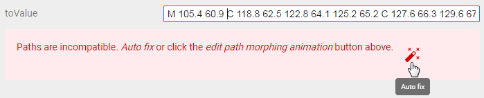
Shape Shifter , , , . , toValue fromValue .
. ,
1 – , 2 –

. Codepen.
https://codepen.io/TosterHolokoster/pen/wZOrqr
, SVG – , . ,
. Illustrator. . 200x200 .
, , . «».
. . « »
, . , , ,
. , , . . SVG , . …
. , . SVG . ( Illustrator )
, Illustrator <path> , <circle> . . , , . ( SVGO ), . .
d , )
<?xml version="1.0" encoding="utf-8"?> <!-- Generator: Adobe Illustrator 23.0.2, SVG Export Plug-In . SVG Version: 6.00 Build 0) --> <svg version="1.1" xmlns="http://www.w3.org/2000/svg" xmlns:xlink="http://www.w3.org/1999/xlink" x="0px" y="0px" viewBox="0 0 200 200" style="enable-background:new 0 0 200 200;" xml:space="preserve"> <style type="text/css"> .st0{fill:#D38911;} .st1{fill:#87872B;} .st2{fill:#CEB629;} .st3{fill:none;stroke:#DD913E;stroke-width:5;stroke-linecap:round;stroke-linejoin:round;stroke-miterlimit:10;stroke-dasharray:12,200;} </style> <g id="Pulse"> <g> <path class="st0" d="M100,87c44.1,0,80,35.9,80,80s-35.9,80-80,80s-80-35.9-80-80S55.9,87,100,87 M100,82c-46.9,0-85,38.1-85,85 s38.1,85,85,85s85-38.1,85-85S146.9,82,100,82L100,82z"/> </g> </g> <g id="_x3F__1_"> <path id="side" class="st1" d=" "/> <path id="front" class="st2" d=" "/> </g> <g id="Particles"> <line class="st3" x1="80" y1="162.9" x2="42" y2="59.1"/> <line class="st3" x1="90.1" y1="148.8" x2="59.8" y2="28.8"/> <line class="st3" x1="107.9" y1="155.6" x2="124.9" y2="15.9"/> <line class="st3" x1="94.4" y1="160.4" x2="154.3" y2="7.2"/> <line class="st3" x1="119.3" y1="157" x2="159.2" y2="75.5"/> <line class="st3" x1="98" y1="169" x2="87.7" y2="10.7"/> <line class="st3" x1="80.4" y1="147.6" x2="63.2" y2="14.1"/> </g> </svg> <?xml version="1.0" encoding="utf-8"?> <svg version="1.1" xmlns="http://www.w3.org/2000/svg" viewBox="0 0 200 200"> <style type="text/css"> #Pulse{fill: none; stroke: #D38911; stroke-width: 5;} #side{fill:#87872B;} #front{fill:#CEB629;} .particles{fill:none;stroke:#DD913E;stroke-width:5;stroke-linecap:round;stroke-linejoin:round;stroke-miterlimit:10;stroke-dasharray:12,200;} </style> <circle id="Pulse" cx="100" cy="167" r="85"/> <g id="Sign"> <path id="side" d=" "/> <path id="front" d=" "/> </g> <g id="Particles"> <line class="particles" x1="80" y1="162.9" x2="42" y2="59.1"/> <line class="particles" x1="90.1" y1="148.8" x2="59.8" y2="28.8"/> <line class="particles" x1="107.9" y1="155.6" x2="124.9" y2="15.9"/> <line class="particles" x1="94.4" y1="160.4" x2="154.3" y2="7.2"/> <line class="particles" x1="119.3" y1="157" x2="159.2" y2="75.5"/> <line class="particles" x1="98" y1="169" x2="87.7" y2="10.7"/> <line class="particles" x1="80.4" y1="147.6" x2="63.2" y2="14.1"/> </g> </svg> , , . , ,CSS , , . . , . . CSS . :
#Pulse{fill: none; stroke: #D38911; stroke-width: 5; transform: rotateX(80deg);} ._transformer{transform-box: fill-box; transform-origin: center;} _transformer , . «» <animateTransform> .
- : , Illustrator? …
– . , . <path> , .
, ! – , . , – . circle , . animate , 3
<circle id="Pulse" class="_transformer" cx="100" cy="167" r="0"> <animate id="doPulse" attributeName="r" values="0;85;" dur=".8s" begin="Sign.click" calcMode="spline" keySplines="0,0,.58,1"/> <animate attributeName="stroke-width" values="5;12;" dur=".8s" begin="doPulse.begin"/> <animate attributeName="opacity" values="0.5;1;1;0" keyTimes="0;0.2;0.5;1" dur=".8s" begin="doPulse.begin"/> </circle> , CSS, . : , , . - :
. - , . ,
<linearGradient id="light-gradient"> <stop offset="0%" stop-color="#ffffff00"/> <stop offset="10%" stop-color="#FFF"/> <stop offset="90%" stop-color="#FFF"/> <stop offset="100%" stop-color="#ffffff00"/> </linearGradient> <mask id="light-mask"> <rect y="0" x="90" class="_transformer" width="20" height="220" fill="url(#light-gradient)" /> </mask> , . . , <use> , <path> ; <defs>
<defs> <path id="question" d=" "/> </defs> ... <use id="front" href="#question"/> <use id="light" href="#question" mask="url(#light-mask)"/> That's what happens
, . . ,
#light-mask rect{ animation: highlight 4s infinite; } @keyframes highlight { 0% { transform: translate(-100px,0) rotate(-50deg); } 30% { transform: translate(100px,0) rotate(-50deg); } 100% { transform: translate(100px,0) rotate(-50deg); } } . . CSS , SMIL.
, . — , . ,
<g id="Sign" class="_transformer"> <path id="side" d=" "/> <use id="front" href="#question"/> <use id="light" href="#question" mask="url(#light-mask)"/> <animateTransform id="idle" attributeName="transform" type="translate" values="0,0;0,-5;0,0" dur="6s" begin="0s; jump.end" end="click" repeatCount="indefinite" /> <animateTransform id="jump" attributeName="transform" type="translate" calMode="spline" values="0,0;0,10;0,-35;0,5;0,0" keyTimes="0;0.1;0.35;0.6;1" keySpline="0,0,.58,1;0,0,.58,1;.42,0,1,1;0,0,.58,1" dur="1s" begin="idle.end" /> </g> ,. additive=«sum»
<animateTransform attributeName="transform" type="scale" additive="sum" values="1,1;1.1,0.8;0.9,1.2;1.1,0.8;1,1" keyTimes="0;0.1;0.35;0.7;1" dur="1s" begin="idle.end" /> , , . Result:
.
? - , . stroke-dashoffset , , . ,
- . ,
<g id="Particles"> ... </g> <g id="Sign" class="_transformer"> ... </g> , ,
.particles{ opacity:.7; stroke-width:0; ... } , . ,
@keyframes sparks { 0% { stroke-dasharray: 20,200; stroke-width: 5px; } 100% { stroke-dasharray: 4,200; stroke-width: 0px; stroke-dashoffset: -180; } } , . , , «». : CSS , . SMIL, 3 , , 7. , , …
– - , . CSS, SMIL.
Particles_active ,
.Particles_active .particles{ animation: sparks .7s; } <set> , , ( set )
<g id="Particles"> <line class="particles" x1="80" y1="162.9" x2="42" y2="59.1"/> ... <line class="particles" x1="80.4" y1="147.6" x2="63.2" y2="14.1"/> <set attributeName="class" to="Particles_active" dur=".7s" begin="jump.begin + .5s"/> </g> :
- ;
- ;
- , , , ;
- ;
. , , . 3D , . , , .
Adobe Illustrator, . , . - , . ,
d .
, . Shape Shifter.
, , . , Shape Shifter
SVG . Shape Shifter , «» SVG. Illustrator. . , pathData
toValue. . «»
. ,
Shape Shifter , , , . , toValue fromValue .
. ,
<animate attributeName="d" calMode="spline" values=" 1; 2; 1" dur="5s" keySpline=".42,0,.58,1;.42,0,.58,1" repeatCount="indefinite" /> 1 – , 2 –
. Codepen.
https://codepen.io/TosterHolokoster/pen/wZOrqr
, SVG – , . ,
<set>
The set tag is a shortened version of animate , except that it cannot interpolate. It is used to instantly change an attribute for a certain period of time, i.e. works on the switch principle. As a consequence, it ignores attributes associated with interpolation and does not support accumulative or relative animations. The value is set exclusively with the help of the attribute to , the values , from , by attributes are ignored
<set attributeName="cx" to="200" begin="click" dur="5s" .../> The element will change its position on click, after 5 seconds it returns to its original place.If you do not specify the dur attribute, the element will remain in this state until the document is reloaded. The rest of it is similar to animate .
<animateTransform>
As the name implies, is used to apply to the element of various kinds of transformations. All transformation types are identical to CSS transformations. When using CSS and SMIL transformations at the same time, they will override each other, so it’s better to use one thing or to watch so that they do not overlap.
How to transform?
As an animated attribute performs the transform . The transformation mode is specified in the type attribute and accepts 4 types of values - movement, rotation, scaling, shift along the axes.
translate - moving an element relative to its current position. As the values takes the offset in the format [x, y] , where y is optional
<animateTransform attributeName="transform" type="translate" from="0, -10" to="0, 10" .../> Moves element according to Y axisrotate - member rotates about the rotational center. It takes the rotation angle and the coordinates of the center of rotation [deg, x, y] as values, the coordinates of the center are optional. By default, the rotation center is in the upper left corner of the SVG document.
<animateTransform attributeName="transform" type="rotate" from="0, 150, 150" to="45, 150, 150" .../> Rotate by 45 degrees around the point with coordinates 150, 150Also, the center of rotation can be changed using CSS properties of the transform-origin , where in addition to the coordinates, you can specify percentages. By default, percentage values are calculated by the size of the entire document, so that percentages are calculated relative to the element, you need to set the CSS property transform-box with the value fill-box .
scale - scales the element. As values, it accepts floating-point numbers in the [scale] formatfor both axes, or separately for each [scaleX, scaleY] axis(1 corresponds to the normal size of the element). If you do not change the transform-box, which I mentioned above, the element is scaled relative to the entire document. The empty space around the element also changes with it, so visually it seems that the element is shifting towards
<animateTransform attributeName="transform" type="scale" from="1, 1" to="2, 1" .../> Stretches an element along the X axisskewX or skewY - shifts the element relative to the axis. As the value takes the angle of [deg] . By default, the center of the shift is the upper left corner, so the same joke works with transform-box and transform-origin as in other transformations.
<animateTransform attributeName="transform" type="skewX" from="0" to="45" .../> <animateTransform attributeName="transform" type="skewY" from="90" to="0" .../> One shifts by X another by YSummation and redefinition of transformations
In the animateTransform , you can still make cumulative and relative animations, but here the additive attributelifts itself differently. In the value of replace , the transformation overrides all previous ones. In sum, the transformation is summed up with the previous one.
<rect transform="skewY(115)" ...> <animateTransform type="translate" from="-10" to="10" additive="replace" .../> <animateTransform type="rotate" from="0" to="90" additive="sum" .../> </rect> In this example, the shift of the rectangle will be redefined, to move and rotate<animateMotion>
It is necessary to animate the movement of an element along a trajectory. animateMotion supports attributes animate and has 3 of its own - path , the rotate , Keypoints .
Path definition options
You can define a motion path in several ways — using the familiar attributes from , to , by, or values , the new path attribute, or a child <mpath> tag . I have listed the ways to increase the priority and I will explain them in the same manner.
Attributes from , to, by , the coordinates of the points are indicated, the values are the same, but already in the form of a list
<animateMotion from="0,0" to="50,100" .../> <animateMotion values="0,0; 0,100; 100,100; 0,0" .../> The effect of this method is comparable to the usual transformation of the movement. The element moves straight from one point to another. And here also, as in the animateTransform , the coordinates are relative . The point 0,0 indicates not the upper left corner of the document, but the current position of the target element. This feature is also present in other ways to determine the trajectory.
The path attribute indicates a set of commands, as for the attribute d . If in the attribute d commands are interpreted as a shape outline, then in the path attribute they are the line along which the element will move. The coordinates of the points are also relative, so the path starts from the point 0.0
<animateMotion path="M 0 0 c 3.4 -6.8 27.8 -54.2 56 -37.7 C 73.3 -27.5 89.6 -5.1 81.9 5.9 c -5.8 8.3 -24.7 8.7 -45.4 -0.4" .../> This path describes such a curve.
The last way is to use a third-party <path> element as a path . To do this, in the <mpath> tag you need to specify a link to this element, and the tag itself must be placed inside <animateMotion> . This option has the same feature with relative coordinates. In essence, this method “copies”, as it were, an element from the value of the attribute d to the attribute <path>
<path id="movement" .../> ... <animateMotion ...> <mpath href="#movement"/> </animateMotion> The element that defines the path may not even appear in the document. It can be simply defined in <defs>Rotation of the element relative to the trajectory.
It is possible to make the element rotate in the direction of movement using the rotate attribute. It accepts 3 types of values: auto , auto-reverse and a number indicating rotation in degrees
<animateMotion rotate="auto" .../> By default, rotate is set to 0. Any numerical value fixes the angle throughout the entire animation. Automatic modes auto and auto-reverse change the angle of rotation of the element, respectively, tangent to the trajectory. And different direction of this tangent. In auto, it is directed forward, and in auto-reverse, backward.
How to manage the movement along the trajectory?
The trajectory is a curve that has a beginning and an end; these points are denoted by the numbers 0 and 1, respectively. Any position on the curve can be determined by a number in this range. By listing the points in the keyPoints attribute, you can define any kind of movement along a path. But this is not enough to manage the movement, for this you need a whole system of attributes.
First you need to set the calcMode to the position of linear or spline . Unlike other tags, animateMotion defaults to paced (for some reason, the animation does not want to work in this mode). It is also necessary to specify the attributekeyTimes . Only by completing these steps, the animation will work as it should.
<animateMotion keyPoints="0.5; 1; 0; 0.5" keyTimes="0; 0.25; 0.75; 1" calcMode="linear" .../> In the example, the animation starts in the middle of the trajectory, moves to the end, then to the beginning, and ends the movement again in the middlePS
Understanding the animateMotion, I came across information that you can do the same thing, sort of like, on CSS. But at the end of the writing of the article I had neither the strength nor the desire to deal with it. For enthusiasts, I just leave a link to the documentation.
Source: https://habr.com/ru/post/450924/
All Articles