The book "CSS for pros"
 The world of cascading style sheets is continuously being improved. More and more web developers realize that, although they seem to know CSS, they are far from being fully understood. In recent years, the language has evolved greatly, so even those developers who were once skilled in CSS can now get completely new skills to catch up. This book is designed to meet these needs: to provide profound knowledge of the language and lead to success in new developments and the application of the latest features of CSS.
This book is called “CSS for Pros,” but it is also a comprehensive book. In cases where some concepts or principles are difficult or, as a rule, are interpreted incorrectly, the author explains in detail what they mean or how they work and why this is so. Other chapters may not be so comprehensive, but Keith Grant gives you enough information so that you can work effectively and move in the right direction if you want to expand your knowledge. In general, this book will fill in the gaps in your theoretical knowledge.
Some topics: animation, typography, flexible containers, and even a CSS stack are worthy of individual books. The goals of the author are to concretize your knowledge, help eliminate gaps in them and instill in you a love for CSS.
Excerpt 4.1. Purpose of the floating elements
Despite the fact that the floating elements were not designed to construct the layout of the page, they coped well with this work. However, in order to understand the meaning of the floating elements, we must understand their original purpose.
')
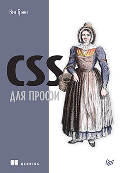
A floating element is an object (often an image) aligned on one side of the container, which allows the flow of a document to flow around it (Fig. 4.1). This layout is often found in newspapers and magazines, so to achieve the described effect, floating elements were added to CSS.
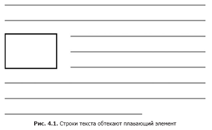 In this illustration, the element is left aligned, but you could also place it at the right edge. The floating element is extracted from the normal flow of the document and aligned on one side of the container, after which the flow of the document will flow around the area where this element is now located. If you align two floating elements on one side, they line up one after the other (Fig. 4.2).
 If you have been writing CSS-code for some time, then this behavior is not new to you, but it should be noted: not always floating elements are used in this way, despite the fact that this is their original purpose.
Already in the early days of CSS, developers realized that they could use this simple tool to move sections of a page in the layout of all types of layouts. Floating elements have not been a page layout tool, but for almost two decades we have been using them precisely for this purpose.
We did it because it was the only option. In the end, it became possible to use the display: inline-block or display: table properties - alternative, albeit very limited. Until recently, until flex-containers and CSS grids were added, floating elements remained a trump when making page layouts. Let's see how they work. For example, create the page shown in Figure. 4.3.
In the examples in this chapter, you will use floating elements to position each of the four gray fields. And inside the fields, place the floating images next to the text. Create a blank page and connect it to the style sheet you created earlier, then add the code in Listing 4.1 to the page.
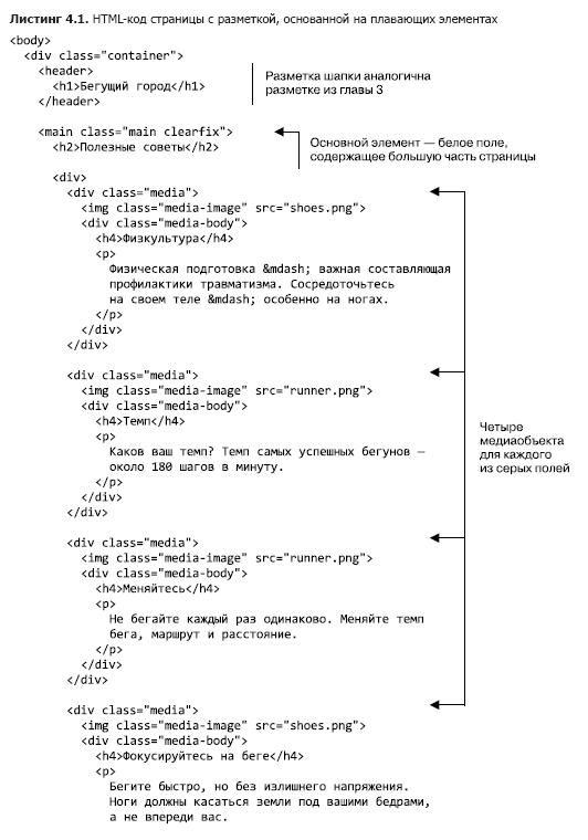
This listing gives the page structure: a heading and a main element containing all the page material. Inside the main element are the name of the page, as well as an anonymous div container, that is, a div element that does not have a class or identifier. This allows you to group four gray media objects, in the body element of each of which there is an image.
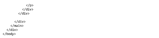
Before you start working with floating elements, you need to build the external structure of the page. Add listing 4.2 to the style sheet file.
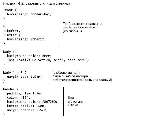
This code allows you to set some basic styles for the page, including the correction of the box-sizing property and the lobotomical owl selector (see Chapter 3). Next, you need to limit the width of the page content (Fig. 4.4). Pay attention to the light gray fields on both sides, as well as the fact that the cap and the main container are the same width.
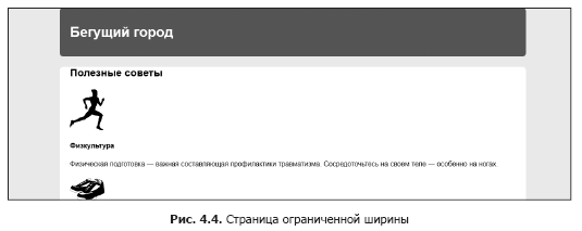
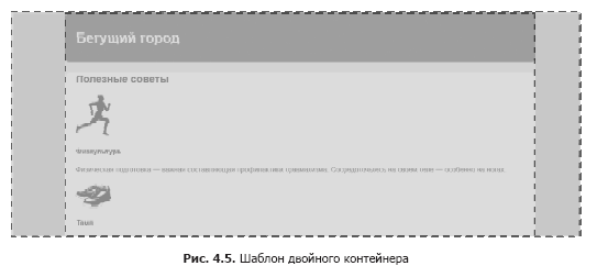
This markup is often used to center page content. You can achieve this by placing the content inside two nested containers and setting the fields of the inner container so that it does not go beyond the outer one (Fig. 4.5). Web developer Brad Westfall (Brad Westfall) calls this approach a dual container template.
In our example, the body element plays the role of an external container. By default, this element takes up 100% of the page width, so you don’t have to apply new styles to it. We have packed all the page content inside this element into an element that plays the role of an internal container. Add the code from listing 4.3 to your style sheet.
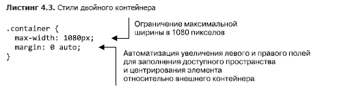
By using the max-width property instead of the width property, the element is compressed to values less than 1080 pixels if the resolution of the viewing area is below this value. In other words, the container will fill smaller viewing areas, but in large viewing areas it will expand to 1080 pixels. This is important in order to avoid horizontal scrolling on devices with a small viewing area.
4.2. Container collapse and clearfix
In the past, browser errors distorted the behavior of floating elements, however, it was typical mainly for Internet Explorer 6 and 7. I am almost convinced that you no longer need to support these browsers, so you should not worry about these errors. Now you can be sure that browsers will handle floating elements correctly.
However, some features of the behavior of floating elements can take you by surprise today. These are not bugs, floating elements behave exactly as they should. Consider how they work and how you can customize their behavior to create the desired markup.
4.2.1. What is a container collapse
Align the four floating media objects on the page along the left edge - and the problems will not take long to wait (Fig. 4.6).
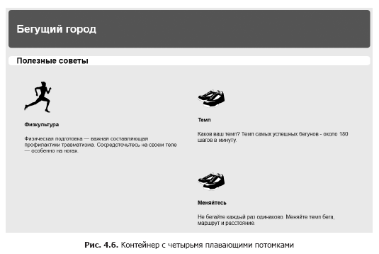
What happened to the white background? We see it behind the page title (“Good Tips”), but this is what limits it to, instead of expanding down and including all media objects. To see this on your page, add the code from Listing 4.4 to the style sheet. Then consider why this happens and how to fix it.
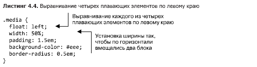
We set a light gray background for each media object, expecting the white background of the container to be behind (or, more precisely, around) them. However, instead, the white background disappears at the top edge of the media objects. Why is that?
The problem is that, unlike the elements of a normal document flow, floating elements do not add height to the parent elements. This may seem strange, but this property goes back to the original purpose of the floating elements.
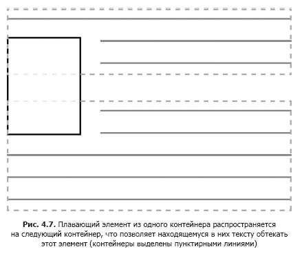
As you learned at the beginning of this chapter, floating elements are designed to wrap text around them. When you place a floating image in a paragraph of text, this paragraph is not enlarged to fit the image. So, if the height of the image is greater than the height of the paragraph, then the text of the next paragraph will begin immediately under the text of the first paragraph, therefore, the text of both paragraphs will flow around this floating image. The described is illustrated in fig. 4.7.
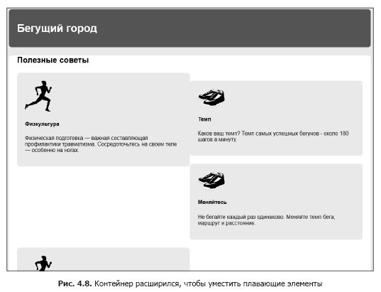
On your page, everything located inside the main element, with the exception of the page name, is a floating element. Thus, only the name contributes to the height of the container, leaving all floating media objects to expand downwards, beyond the white background of the main container. For us, this behavior is undesirable, so fix it. The main element should expand downwards and contain gray blocks (Fig. 4.8).
One way to adjust is to use clear - an adjacent property.
floating element. If you put an item at the end of the main container
and use the clear property, this will cause the container to expand to
bottom edge of the floating elements. The code in Listing 4.5 illustrates in principle
what needs to be done. You can temporarily add it to your page to
see how it works.
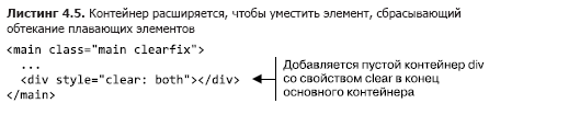
The clear: both declaration causes this element to move below the floating elements, instead of being located next to them. You can assign this property one of the values, left or right, to reset the flow around only floating elements that are aligned with the left or right edge, respectively.
This allows you to set the desired size, but this approach is a bit like hacking, as it adds unwanted markup to the HTML code, which is why it takes over the functions of CSS. Therefore, you should remove the empty div container. Consider a way to perform the same task using only CSS code.
4.2.2. What is clearfix
Instead of adding another div container to the markup, we use a pseudo-element. Using the :: after pseudo-element selector, you can effectively insert an element into the DOM at the end of the container without adding it to the markup.
Listing 4.6 shows a general approach to solving the problem of accommodating floating elements, called clearfix. (Some developers prefer to abbreviate the class name to cf, which is convenient, since at the same time this abbreviation of the phrase containing floats is the accommodation of floating elements.) Add the following code to your style sheet.
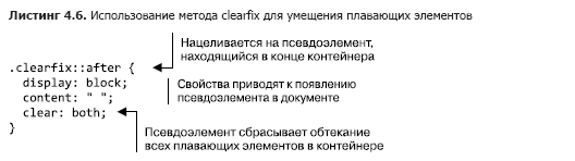
It is important to know that the clearfix class applies to an element that contains floating elements. A common mistake is the application of this class to an unsuitable element, for example, directly to a floating element or a container standing after a container with floating elements.
However, the clearfix method has one problem: the fields of the enclosed floating elements will not collapse outside the container with clearfix applied, and the fields of non-floating elements will collapse as usual. You can see it on your page, where the “Useful Tips” heading is tightly pressed against the top edge of the white main element (see fig. 4.8): its field collapsed outside the container.
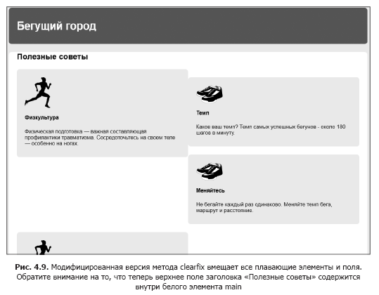
Sometimes, developers prefer to use a modified version of the clearfix method, which will hold all fields and be more predictable. Adding this version to your page will prevent the top field of the page title from collapsing outside the main element (Fig. 4.9), which will leave the required distance above the title.
To use the modified version, update the clearfix method code in your stylesheet, as shown in Listing 4.7.
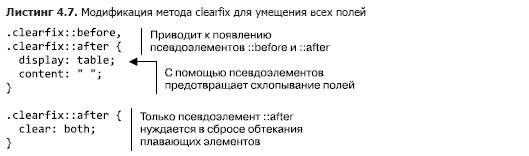
This version uses the display: table property, not display: block. By applying it to both pseudo-elements, :: before and :: after, you can fit any fields of child elements in the upper and lower parts of the container. The sidebar “The clearfix method and the display: table property” below explains in more detail how this works.
You decide which version of the clearfix method to use in your projects. Some developers give the following argument: field collapse is a fundamental feature of CSS, so they prefer not to fit the fields in a container. But since no version accommodates floating element fields, other developers prefer the more streamlined behavior of the modified version. Each argument has its own reason.
The clearfix method and the display: table property
Applying the display: table property in the clearfix method fits fields thanks to some CSS features. Creating a tabular element (or in this case a pseudo-element) implicitly creates a table row within this element, as well as a table cell in the row. Since the fields do not collapse through tabular elements (as mentioned in Chapter 3), the fields will not collapse through a table pseudo-element.
It may seem that when you use the display: table-cell property, you would get the same effect. However, the clear property only works for block elements, which is not a table cell. Thus, the clear property cannot be used with the display: table-cell property. In general, to fit the margins, reset the flow around all floating elements and the implied cell, use the display: table property.
4.3. Unexpected "capture" of the floating element
Now, when the white container contains floating media objects, another problem becomes apparent: four media objects do not form two identical lines as we need. Instead, the first two blocks (“Physical Education” and “Temp”) are on the same line, as expected, but the third block (“Change”) is located on the right, under the second block. With this arrangement, a large gap remains under the first block, this is due to the fact that the browser places the floating elements as high as possible.
In fig. 4.10 shows a simplified diagram.
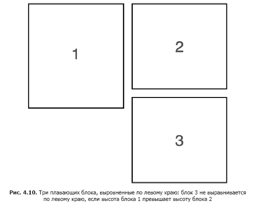
Since block 2 is below block 1, for block 3 there is simply no space under block 1. Instead of bypassing block 1, block 3 “captures” it. In other words, block 3 is not aligned to the left, but wraps around the lower corner of block 1.
The nuances of this behavior depend on the height of each floating block. Even a 1 pixel difference can cause this problem. At the same time, if block 1 is shorter than block 2, then block 3 will not have an edge for which it could catch, and you will not encounter the problem described until the content changes, which leads to a change in the height of the elements.
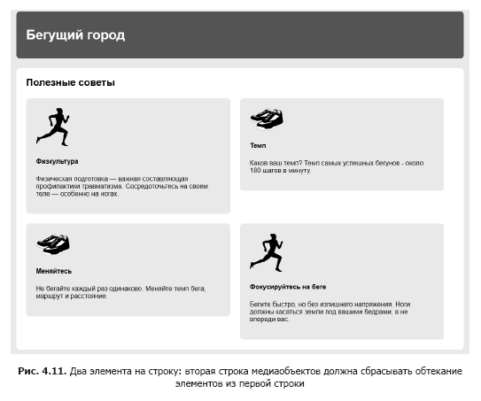
By aligning several floating elements along one edge, you can get any of a variety of layout options depending on the height of each block. Even changing the width of the browser window can rebuild everything, because it affects the flow of text lines and, accordingly, changes the height of the elements. We on the page want to see two floating blocks per line (Fig. 4.11).
To fix this problem is simple: the third floating element needs to drop the flow around the floating elements located above it. Or, in other words, the first element in each line should drop the flow around the floating element located above it. Since you have two blocks in a row, you will need every odd element to drop the flow around the parent line. You can select these elements by address using the pseudo-class selector: nth-child (). Add the following set of rules to the style sheet (Listing 4.8).
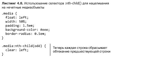
This code will work even if you later add new elements to the page. The code applies to the first, third, fifth elements, etc. If you wanted to place three elements in a line, then you could aim the selector at every third element: .media: nth-child (3n + 1) (see Appendix And for more information about using the selector: nth-child).
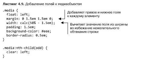
Add fields for media objects to create a gap between them. The selector of the lobotomized owl will also set the top margin to all elements except the first. This will cause the alignment of elements in the first row to fail, so you need to reset the top margin of these elements. Update your style sheet as shown in listing 4.9.
»More information about the book can be found on the publisher's website.
» Table of Contents
» Excerpt
For Habrozhiteley 25% coupon discount - CSS
Upon payment of the paper version of the book, an electronic version of the book is sent to the e-mail.
Source: https://habr.com/ru/post/450682/
All Articles